TLDR: The wrong application of high-fidelity prototyping harms UX design more than you think.
In this article, I’ll draw from my own experiences to explain the dangers of prototyping in high fidelity too early in the process.
The Undeniable Growth of UX Design
I feel extremely lucky to be part of the UX industry. I followed my passion in the early 2000s when the field was just taking off, and years later, the power of UX became universally understood.
Yes, we have many reasons to be optimistic about the future of UX. Ten years ago, it was a hardly recognizable part of the digital product development. Today, UX plays a vital role in any product-oriented organization. We’ve earned our seat at the table.
The following Google Trends chart (keyword: UX) illustrates this amazing growth:
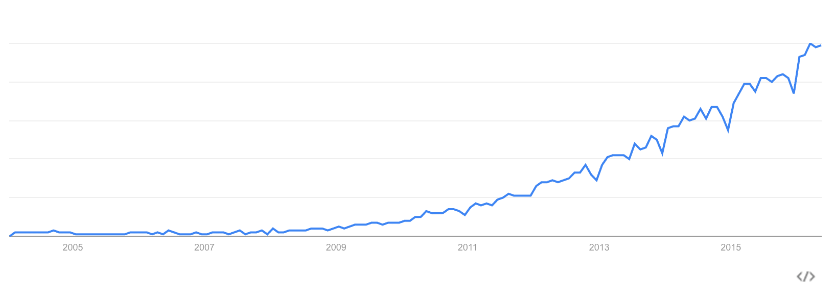
People do talk and ask about UX more and more. We definitely benefited from this growth at UXPin. Six years ago, we were a company of three people selling paper prototyping notepads. Today, over 70 people help bring our design collaboration platform to customers in 150 countries.
Along the way, we’ve conducted plenty of user research. We’ve seen multiple Lean, Agile, and waterfall variations of the design process. We noticed that even the most Lean or Agile companies can still prematurely jump into high fidelity in hopes of shortening project timelines.
When that happens, the team might save some time in initial delivery, but they almost always pay it back multiple times over in fixes or teardowns. Do it long enough, and UX loses its real value in identifying the right idea through eliminating the wrong ones.
The Danger of Prototyping the Wrong Way
I’m afraid that our most powerful weapon is turning into a toy detached from reality.
Prototyping is too often used to merely animate hi-fidelity design mockups. In many cases, it leads to expensive, bloated, siloed, and confusing design processes.
In my past life in ecommerce design, I remember working with a few UX designers from visual design backgrounds who would fall into this trap. Because Photoshop felt like second nature, they’d dive into high fidelity out of habit (I’ve admittedly also made this mistake a few times earlier in my career). Stakeholders would offer feedback on the wrong details, and users would sometimes uncover issues with the interaction model that required a complete rebuild.
While there are situations when high fidelity prototyping makes a lot of sense, it shouldn’t be our default prototyping mode. And while our product does integrate with Photoshop and Sketch, we always hope that step happens much later in the design process.
First, we have to step back and reconsider when and why we’re actually prototyping.
The Triple Cost-Cutting Value of Prototyping
Prototyping is not a new concept, nor is it exclusive to interaction design. As Michael Guggenheim argues in his excellent article “The Long History of Prototypes”:
“…prototyping is not simply understood as the development of “first forms” or “first strikes” as beta-versions of products as in industrial design, but as a more general mode of doing culture: a mode that is tentative, based on bricolage, user involvement and ongoing change and improvements of products and practices, as “open innovation”, rather than on an expert in a closed lab who turns out a finished product to be used by an unknowing user.”
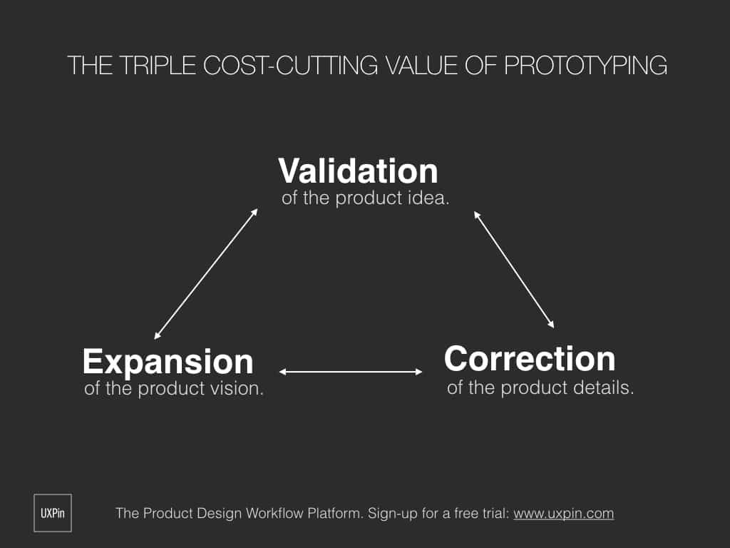
Prototyping should set the shortest possible path to the user. During the early stages of product development, prototypes connect the vision with its recipient – the customer. This is its true value. Effective prototyping empowers:
- Validation of the product idea
- Correction of the product details
- Expansion of the product vision
Validation, correction, and expansion, when driven by inexpensive prototyping (hence, not focused on visual fidelity) can dramatically cut the cost of product development. The faster you test your prototypes with the end user, the lower the probability of expensive errors in later stages. That’s why you should prototype early, using the cheapest means possible (play with fidelity, good enough is perfect for a prototype) and plan to iterate after user feedback.
If you spend a lot of time polishing the visuals, or you code animations in a script language only used for prototyping, you might create something that won’t survive first contact with users. What a waste of time and energy.
In most cases, it doesn’t make sense to create a hi-fi mockup in a graphic design tool, then connect everything into a prototype. We delay our path to the user, making exploration more difficult since we start falling in love with what we slowly perceive as a near-perfect design. The design process loses its spirit of iteration.
To make the most out of prototyping, start in low to mid fidelity, work fast, collaborate with your team and iterate based on user research.
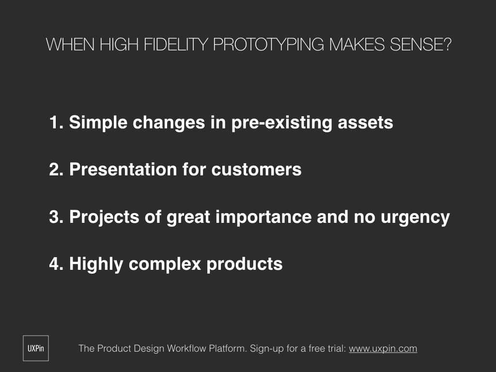
When Does Hi-fi Prototyping Makes Sense?
That being said, there are definitely cases when prototyping with high-fidelity mockups makes perfect sense.
Simple changes to existing assets
First of all, if you’re making simple changes to existing assets, there’s no point in redrawing the whole thing as a low or mid-fidelity prototype. You can make easy changes (like rearranging patterns) easily in your graphic mockup or in code. The shortest path is the best one – in that particular case, the shortest path leads through the hi-fi mocks.
Preparing a customer presentation
High fidelity prototypes based on graphic mockups also make a lot of sense if you’re preparing a customer presentation. Based on some time freelancing, I know that explaining “the fidelity level” of a prototype might destroy the wow effect of your presentation. If you already tested your design with users and you’re confident in your final interface, tie it together as a prototype for the customer. Presenting interactive, high-fidelity, prototypes to a customer greatly increases the chances for faster sign-off.
Complex products
Some projects of great importance and no urgency, or extreme complexity, might require high fidelity prototypes with access to real, dynamic, data. That usually means you have to code the prototype to fully simulate the experience.
In any of these cases, hi-fidelity prototypes are the right choice. Though expensive, they are a necessary means to meet the objectives. In any other situation, however, we should strongly consider whether investing time into a high fidelity prototype actually helps us validate risky decisions.
A Real-Life Example of Iterative Design
At UXPin, we believe that prototyping should be rapid and collaborative. We practice what we preach: unless our projects meet the criteria in the previous section, our design leadership urges our teams to start in lo-fi or mid-fi.
The recent redesign of our design editor interface is a great example of this process in action.
The overall process
After reviewing customer feedback and known issues gathered by customer support , our design team established the design principles (for example: “No distractions”, “Predictable Architecture”, “Visual consistency”…).
Afterwards, we spent two days sketching our ideas before finally prototyping multiple mid-fidelity UI concepts. Prototypes were tested with 20 users and after multiple iterations, we felt ready to invest more in the best-performing concept.
This is when we started work on the visual design. All in all, the final design was ready for development in less than two weeks (including user testing).
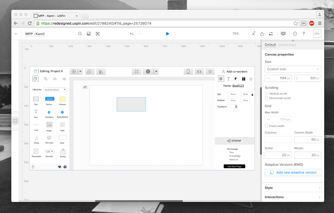
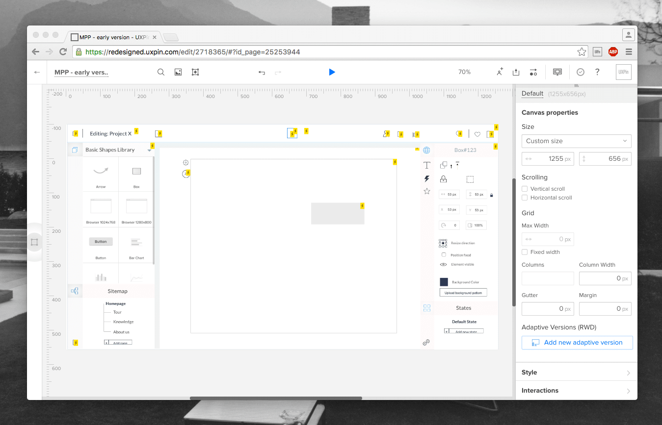
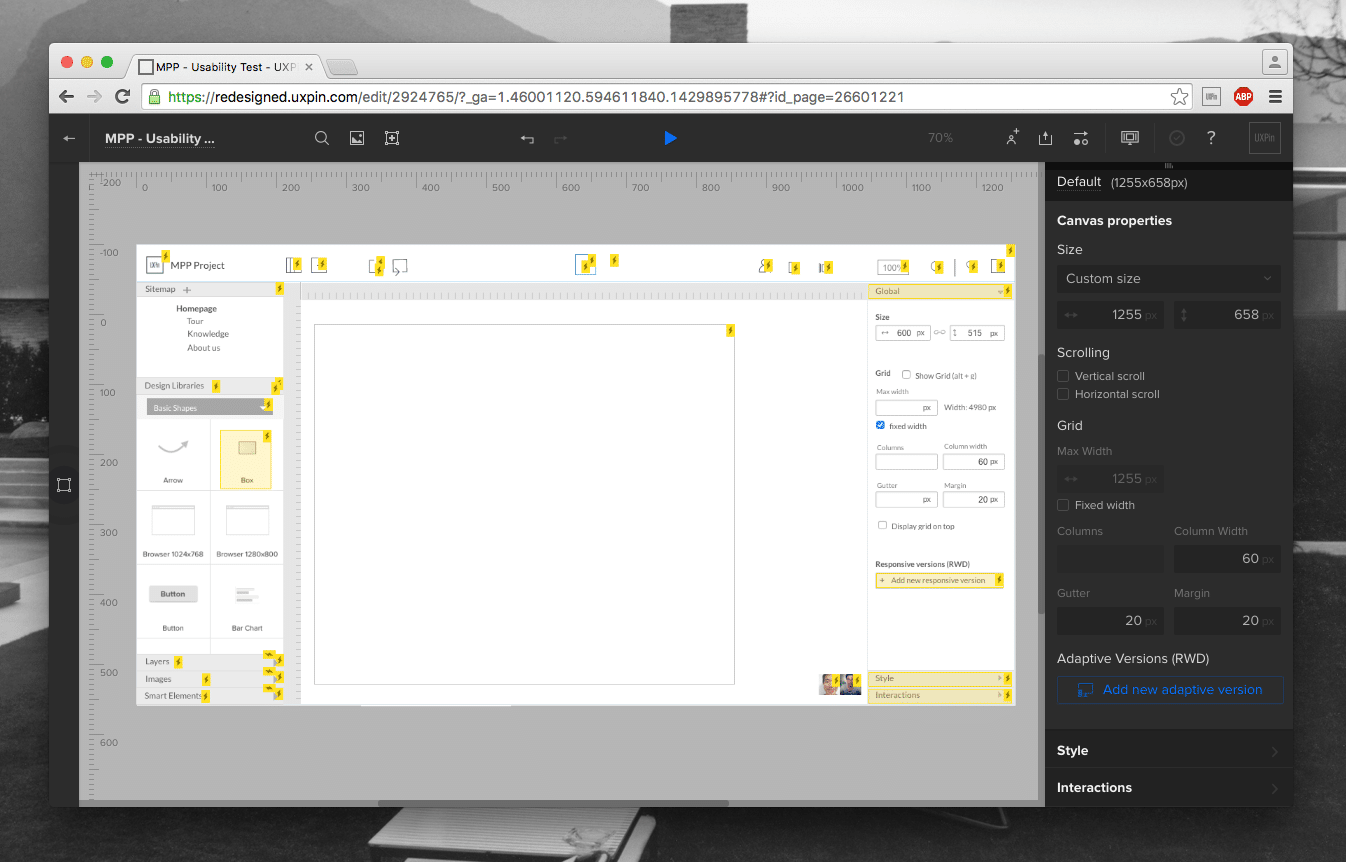
Below you can see the three early concepts of the redesigned UXPin prototype inside the final version of the new UI.
What we learned (and avoided)
Version 1
We tested multiple versions of the architecture to establish the best position of the key parts of the interface, including the navigation. The image above presents one of the first versions of the UI. Notice the sitemap placed in the bottom right corner. Through our testing, we luckily learned that the placement was inconsistent with user’s expectations.
Version 2
Designing a design editor is challenging because the interface must be simple, clear, and offer enough canvas real estate – all while housing enough advanced features.
The screen above uses a tab-like system to switch between different edit modes. While it looks elegant and users find it easy to switch between different options, we learned:
- The lack of icons’ labels harmed discoverability of features.
- The loss of about 80px of space was also hard to accept on smaller screens.
Since we didn’t invest more than 30 minutes into building this version (based on the previous version) we rejected it after a single round of testing.
Version 3
The final version of the prototype was really similar to what we launched on production servers. It incorporated all the learnings from Version 1 and Version 2.
If we heavily invested in a hi-fidelity design of Version 1, users would have trouble finding and using their sitemap (a core feature for design context). If we fell in love with Version 2, we might face an even worse problem – users wouldn’t be able to discover core features for editing their designs.
In either case, not only would the process be very expensive, we’d undoubtedly launch an inferior product.
The Final Word
UX design, like any design field, needs prototyping.
From car design to architecture, no great design exists without effective prototyping. But prototyping shouldn’t be just another step in the process. It must serve its purpose – validation of the product idea, correction of the product details, and expansion of the product vision. All done through a collaborative customer-centered process.
Let’s apply the right processes at the right time for the right reasons.

