Anticipatory design is a fairly new UX pattern that seeks to entirely remove user choice from the equation.
While this sounds creepy (and to be fair, it kind of is), decision fatigue is a real concern in UI design. In other words, anticipatory design opens up compelling possibilities by creating more personalized user flows.
The Reality of Decision Fatigue
I recently booked a cruise online, and it was in no way fun, easy, or simple—especially once I discovered the advertised rate was a lot less than I wound up paying. But let’s not get into details.
The process was loaded with decisions. Just look at the initial form I had to fill out.
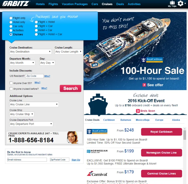
There’s a lot going on here:
- Hotel/flight packages
- Destination
- Length of trip
- Discount options
- Cruise line
- Preferred ship
- Port of departure
Before I’ve even seen what I’m going to be enjoying, that’s a lot of decisions I’m expected to make right off the bat. If Decisions = Cognitive Resources, then this interface front-loads a lot of willpower.
After the front page, it doesn’t get much easier. I’m faced with a list of cruises that meet my criteria, but with very little in the way of meaningful differentiators between the items on the list. To do any in-depth comparisons, I’m forced to open multiple tabs comparing each ship’s amenities; more, if I want to compare optional excursions at various ports of call.
The point is, my cruise was fun, but planning it was a pain to the point I skipped some of the specifics and missed out on a few tours at the destination. But that means the cruise line also missed out on additional profits that could have come from my purchase.
If this were an infomercial, right here would be the point where the audience screamed in unison:
“There’s got to be a better way!”
Well, there is. Deleting the number of options available simplifies the process by making all but the most important decisions for the user.
Anticipating User Needs
An anticipatory system bases its behavior on the user’s past and (probable) future choices. With access to user data (browsing, purchase, search, etc.), the system can make informed decisions on the user’s behalf.
This plays out in familiar patterns with well-known brands.
Netflix suggests content based on your viewing habits and ratings. Amazon suggests items based on your past purchase history. They narrow the spectrum of choice by directing user attention, but they also present new opportunities to make decisions—increasing steps, decisions, and cognitive load in the process.
Ideally, an anticipatory system aims to do just the opposite: limit options and streamline activity.
Netflix and Amazon obviously want their users to continue watching and shopping—that’s how they gather data and make more money. You can’t blame them for leveraging an element of anticipatory design to further their ends.
In contrast, the service model of an anticipatory design would minimize superfluous interactions and let the user get on with their day.
To get a better idea of what this looks like, let’s revisit my recent travel experience. While this particular booking site made it challenging to plan my itinerary, Expedia’s partnership with user-generated travel database Trippy automatically tracks and suggests popular attractions in and around my destination.
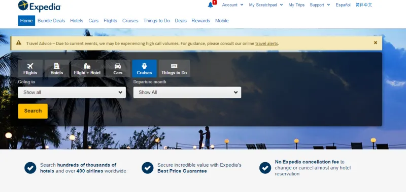
Image Credit: Expedia
Note the difference in initial choices: I’m not immediately overwhelmed by decisions, and more options aren’t presented until later in the process.
So what’s Trippy’s contribution to the UX? After completing a purchase on Expedia, Trippy chimes in with the answer to a question I haven’t articulated yet: “What will I do when I get to my destination?”
Within 3 minutes of signing up for Trippy (via an automated “Signup with Facebook plugin”—an equally anticipatory feature) I had an answer to the question.
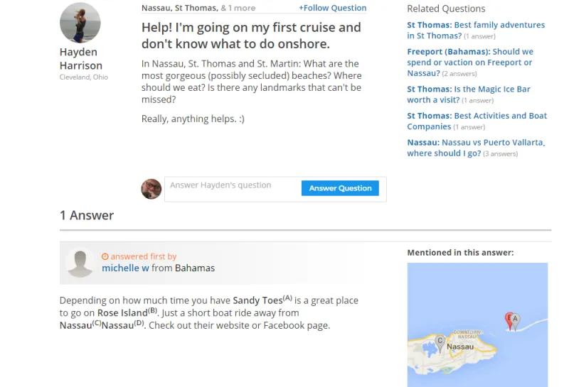
Image credit: Trippy
What’s really interesting is that these are relative baby steps.
Services are merely suggesting solutions and aiding in decision making. They’re not really reducing the tax on a user’s willpower, but they are optimizing efficiency. The endgame is automating decisions.
Automated Decision-Making
Let’s investigate a few examples of this principle.

Image credit: Digit.co
Digit is a truly anticipatory finance app that analyzes your income and purchase history. It looks for savings opportunities, then automatically transfers the extra cash flow into an FDIC insured account.
Nest
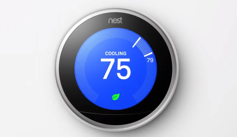
Image Credit: Nest.com
Everyone’s favorite automated thermostat learns your heating/cooling habits and then automatically adjusts the temperature of your home according to your preferences.
Pandora

Image Credit: Pandora
As anyone who’s ever painstakingly produced a playlist can attest, picking out a list of thematically related songs can be a time-consuming endeavor. Pandora is an anticipatory pioneer that algorithmically assigns values to your preferences and picks songs you’re likely to enjoy based on a simple thumbs up/down rating system.
Great examples, sure, but how can you begin implementing an anticipatory model?
5 Ways to Transition to Anticipatory Design
According to Aaron Shapiro, CEO of Huge (and huge advocate for anticipatory design), there are 5 fast steps to successful implementation:
- Imagine the business as if is a service. “How do you serve your users?”
- Allow digital access to that service.
- Think of ways to automate service delivery.
- Launch an automated version of your service.
- Carefully decide which decisions your users will be comfortable giving up, then consider the ethical implications of taking over each choice.
A few other helpful notes:
- Data collection is paramount, but intelligent analysis is at least as important.
- Always aim to simplify tasks for users.
- Look to add value to an interaction through automation.
- Leverage past choices to accurately predict future decisions.
- Pre-populate forms, whenever possible.
Additional UX Advice
If you’d like to learn more about personalized anticipatory design, check out any of the following resources:

