Product managers who build prototypes have many choices. They can give hand-drawn sketches to their design team. They can draft rough visuals in Photoshop or Sketch. Or they write exhaustive documentation to describe their vision.
All share one thing in common: They start a series of steps that leads from an idea or problem to a finished product. Too bad no one can agree names in that process. One person’s lo-fi is another person’s wireframe. Thumbnails run the gamut from doodled to digital. And at what point do you call a design high-fidelity?
Lo-fi. Hi-fi. Mockup. Wireframe. People define each term differently, but most agree that they’re different levels of detail, and one leads into the other. If only design teams could agree on the nomenclature, the design process would start on better footing.
In this article we’ll explore one set of definitions that most design teams agree upon.
Wireframes
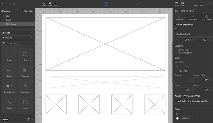
The word “wireframe” is tricky: people often use it interchangeably with “mockups” and “prototypes.” Whatever you call them, at their essence, designs begin as a series of plain boxes that denote how elements might get arranged on a page or view.
Rather than represent real content, these boxes approximate how much attention each design element should have in proportion to its neighbors. Wireframes are static low-fidelity designs — the “skeleton” of your product.

Product Managers use wireframes both to explore priorities and to express their ideas visually. It’s one thing to say “hero photo spans the whole page,” and another to see it in action — and potentially to realize it detracts from the rest of the design.
It also leads to interesting questions. What information should users see first? Would they get more out of the view if that photo was on the left? Do we need three teasers instead of four? Wireframes let PMs quickly answer these questions with their team at the web page or app view level.
Mockups
More for visual designers than project managers, mockups are high-fidelity static designs that represent the “skin” of the product.
Like wireframes, they must suggest how the design will meet the project’s goals. Unlike wireframes, mockups often take real content into account. Can we really work with a photo that measures 700 by 200 pixels, or microcopy that’s only 12 characters long? Time to ask the UX and content folks.
Confusingly, people also use the term “mock-up” as a verb at any level of fidelity, as in “to mock up a lo-fi.” But a mockup, the noun, has its place in the design process. Several, in fact, depending on fidelity.
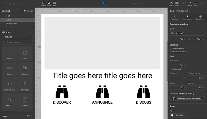
Lo-fi mockup: an approximation, sans-content
Lo-fi mockups turn wireframes or sketches into designs that approximate the finished product. Although they still use plain boxes and shapes, lo-fis solidify the arrangement of information and visuals. They’re an official blueprint for an app or site. Digital lo-fis sometimes includes links to each other, simulating a product’s flow.

Lo-fis mockups are also great for getting feedback from stakeholders. Ideally you’ve gathered feedback at each stage of the design process — even with sketches — but it’s with lo-fis that most non-designers seem to “get” how the final product will work. Sometimes lo-fis include real content to test how well they’ll hold up under real-world situations — but often that’s left to the hi-fi stage.
Often, lo-fis and higher are best left to designers to figure out. But that shouldn’t stop product managers from knowing a hi-fi when they see one.
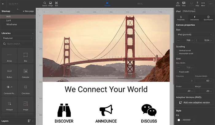
Hi-fi mockup: design for content
It’s time to get visual. Hi-fi mockups are where your aesthetics and design systems come into play. It’s also where your team starts applying real or close-to-real content.
Applying content is a critical test of your design, because content varies. Sometimes it’s short, other times it’s long. Photos may not fit the orientation you intended. Buttons may say “submit,” or they might need to fit “sign up to get 30% off.” With content-rich hi-fis you’ll discover how well the previous steps hold up to the real world.

Prototypes
A prototype (also called an “interactive mockup”) is a working simulation of the final product.
It usually includes interactions, animations, and links to different pages or views. It will often react to varying screen sizes and browser configurations on the fly. Product managers use them as proofs of concept before asking the team to formally code things up.
While lo-fi prototypes help you quickly validate user flows, hi-fi prototypes help you validate that the visual and interaction designs are cohesive.
Prototypes may include visuals from Photoshop, Illustrator, Sketch, or other app that produces visuals. They sometimes incorporate real, if not final, code.
What makes a prototype a prototype is that stakeholders can play with them in the platform on which the final product will run. Building a website? That prototype had better work in a variety of browsers. Creating a smartphone app? Those touch targets had better work.
Level-up your design process
Like most rules of design, these … aren’t rules. They’re guidelines through which you can personalize your workflow and communicate with your team. You might disagree with someone else’s idea of a “mockup,” but as long as your team agrees, productivity will run that much smoother.
That also means you and your team can start with any level, skipping any level that doesn’t make sense to your workflow. Don’t like to draw? Go straight to wireframes. Want to call everything a wireframe? Go for it.
The idea behind advancing from sketch to wireframe to prototypes and mockups is to add levels of detail only as your ideas solidify. Start fast. Then refine. Then polish. Then build. Then learn more with our free ebook: Prototyping for Product Managers.


