Website Structure 101 with Examples

According to a study on health sites, 94% of first impressions are design-related. If you don’t have a defined website structure, you may lose users to the websites with well-thought-out UI.
The look and feel of a website significantly impact a user’s perception of credibility and trustworthiness. A website structure helps users to navigate sites and find the information that they are looking for. This article will explain why site structure is important for designers and how designers can create effective site structures.
Key takeaways:
- A website structure is the way a website’s content and pages are organized and interconnected.
- It involves the hierarchical arrangement of web pages and their relationships to one another.
- Website structure helps visitors and search engines navigate and understand the website’s content.
- There are four types of website architectures: hierarchical, sequential, matrix, database.
Designing a new site? Use UXPin and build website architecture and turn it into a workable prototype. It’s an end-to-end solution that simplifies UI and UX design process up to design handoff, so your developers can extract ready HTML and CSS code to kick start website development. Try UXPin right now.
What is website structure?
Website structure is the organization and layout of the various elements and pages within a website. In web development, it refers to how the different pages of the site are linked with each other through internal links and their hierarchy. It is about how the information on a site is organized and presented, so that the users know how to move through the site whilst the web crawlers can read the context well.
Good website structure facilitates easy navigation for both users and crawlers. Apart from influencing user experience, it also affects the SEO ranking of a website in search engines.
Why is website structure important for designers?
The role of a UX designer is to create a website that has a great UX that takes care of accessibility and is easy to use. A great website structure improves the usability or user-friendliness of your website by making it easy for users to find what they are looking for. While choosing the right website structure is a UX decision, ensuring that it remains scalable, maintainable, and performant over time often depends on early collaboration with an enterprise website development agency.
For organizations running on outdated platforms, investing in UI/UX and technology modernization can help restructure legacy systems, improve scalability, and align digital experiences with modern UX standards.
4 Types of Website Structure
There are different types of web structure that you may use in UX design. They are hierarchical, sequential, matrix, and database model. What are they about?
Hierarchical website structure

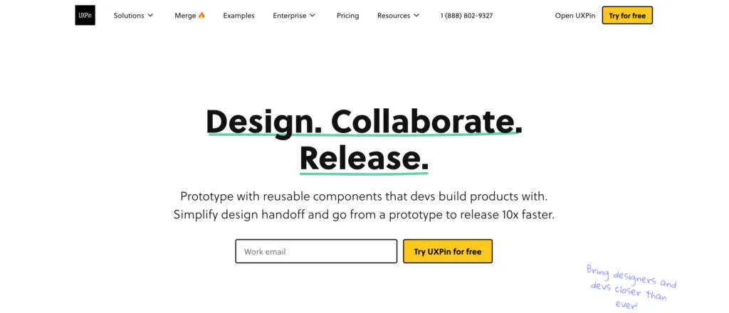
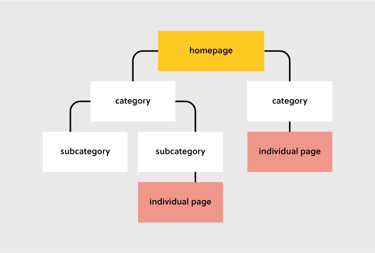
Hierarchical structure is the most common website structure is a hierarchical structure that is based on one parent page (main page) and child pages (categories and sub-categories) that flow from the main page. Think of UXPin’s page (image above).
An example of this structure is UXPin’s website. You can see a screenshot of a homepage that takes you to different child pages in its navigation bar and website footer. The user can click through pages, but they can quickly go back to homepage if needed. The website is designed to guide users through a series of steps to create an account and explore the platform’s features.
Sequential website structure

A sequential website structure is a design approach that guides users through a series of steps or a specific sequence of content to achieve a desired outcome or experience. This structure is particularly effective when you want to tell a story, present a process, or lead users through a journey with a logical progression.
An exemplary illustration of a sequential structure can be found in Growth Design‘s UX case study pages, as featured in their newsletter. In this context, the UX case study pages are meticulously organized to present information in a step-by-step manner, allowing users to follow the evolution of a project or design process. Each step in the sequence builds upon the previous one, providing a cohesive narrative and facilitating a deeper understanding of the showcased work.
Key features of a sequential website structure, as demonstrated by Growth Design’s UX case study pages, may include:
- Clear Progression – each step or section logically follows the preceding one, creating a smooth and clear progression.
- Engaging Storytelling – the structure facilitates storytelling, allowing you to present a compelling narrative that captures attention and keeps users engaged. By using a pdf to html5 flipbook, you can turn static documents into interactive experiences that bring your story to life.
- Visual Hierarchy – visual elements such as images, diagrams, and multimedia are strategically used to enhance the hierarchy and emphasize key points in the sequence.
- Focused User Journey – users are guided along a predefined path, reducing cognitive overload and helping them absorb information in a structured manner.
- Call-to-Action Integration – integration of relevant calls-to-action at appropriate points in the sequence to encourage user interaction or prompt specific actions.
Matrix web structure

A matrix structure in organizational terms refers to a management approach where employees report to both functional managers and project managers simultaneously. This dual reporting system allows for more flexibility and a balance between functional expertise and project-oriented goals.
n the context of a website structure, particularly common for online newspapers like the New York Times, the matrix structure can be used as a metaphor to describe a complex and multi-dimensional site architecture.
In a matrix-like website structure for online newspapers:
- Content Categories – the structure can be represented by various content categories, such as News, Opinion, Business, Technology, and more. Each category acts as a functional area with its own set of expertise and content creators.
- Dynamic Homepage – the homepage serves as a dynamic dashboard, showcasing a mix of the latest news across various categories. It may feature a blend of top stories, trending topics, and multimedia content, breaking away from a strictly hierarchical presentation.
- Search Functionality – the website integrates robust search functionality. Users can enter keywords, topics, or author names, and the search results dynamically pull content from different categories and sections, reflecting the matrix-like interconnectedness.
- Multidimensional Navigation – users navigate through the website based on their interests, and the navigation isn’t strictly hierarchical. Instead, it’s multidimensional, allowing users to explore various dimensions simultaneously. They can choose to follow a specific category or delve into cross-cutting topics seamlessly.
- User Personalization – the matrix structure allows for user personalization, where readers can customize their news feeds based on preferences. This customization could involve selecting favorite categories, following specific authors, or receiving tailored recommendations.
While the hierarchical model provides a clear and structured path, the matrix structure in online newspapers introduces a more dynamic and interconnected approach. It accommodates the diverse interests of readers, encourages exploration across multiple dimensions, and mirrors the complexity of the news landscape in a digital era.
Database website structure

Database model, also called dynamic website structure, is the model prevalent for sites that have a lot user-generated content. It is characterized by its reliance on a database to store, manage, and retrieve content dynamically, providing flexibility, scalability, and real-time interactivity.
Unlike static websites with fixed content, the database model offers flexibility in managing and displaying content. Content can be easily added, edited, or removed through interactions with the database, allowing the website to evolve based on user contributions.
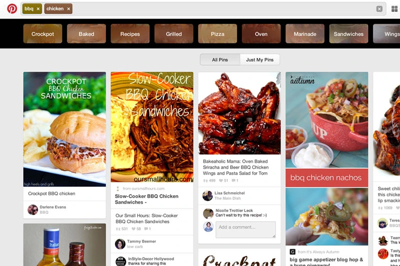
Think of sites like Pinterest. This site relies on user-generated content, such as posts, likes, comments, pins, and other contributions. The database serves as a central repository for storing and retrieving this dynamic user-generated data.
Users can interact with the site in real-time, submit content, and engage with dynamic features. Personalization features, such as customized user profiles and tailored content recommendations, are often implemented based on database-driven insights.
Given the nature of user-generated content, websites using the database model incorporate robust content moderation tools to ensure quality and adherence to community guidelines. Security measures are also implemented to protect against potential threats associated with dynamic content contributions.
How to Choose the Best Website Structure?
To create a website structure, you need to map out how you will organize the content on your site (homepage, categories, individual page, blog posts). This is why website structuring should be the first step in any web design project.
It’s a foundational principle that a skilled web development team will use to ensure the technical execution perfectly matches your structural blueprint.
The underlying principle in great website structure is Information Architecture (IA). IA ensures that content is organized, structured, and labeled effectively and consistently.
Consider the following factors to design an information architecture of your site:
- User journey: Since websites are created to serve users, it is important to consider how they might experience or interact with your site and their expectations of how your website should work. You can determine the journey of your users through interviewing them or doing a card sorting exercise.
- Content: The structure of your website will also be largely determined by the type and volume of content on your site. The structure of an e-commerce site will be different from the structure of an academic site. Read more about UX content: Content Strategy for UX.
- Context: The context of a website is determined by its business goals, the cultural context that it exists in, and the resources available. It is important to consider this fact as you structure your website.
Key Elements of Website Structure
Let’s focus on hierarchical structure of a website. This is a structure which most content websites, such as company website, eCommerce store, common blogs, etc. are based on.

Let’s look at each of these elements and how you can optimize them during your design process.
Homepage web structure
Your homepage is the top page in your website hierarchy and the central place where users navigate your website from. Ensure that all the important pages on your website are linked from this page. The relationship between your homepage and the main category pages is represented by your website’s menu or main navigation.
Here’s how to design a useful navigation/menu for your website.
Navigation or menu web structure
Your site visitors will use the navigation to understand how information is structured on a website and to find what they are looking for. Ensure that all your main category pages are represented on your menu or main navigation. Additionally, use the following rules when creating your navigation:
- Use short phrases or even one word for each element.
- Use simple language that your users can understand.
- Don’t clutter your navigation with sitelinks.
Apple’s main navigation follows these rules to create a simple but super-useful menu.

If your site has some subcategories that are useful for users such as their account information. You can create a secondary vertical menu like Asos has.
Other useful categories such as utility pages (privacy policies, disclaimers and legal information) can be placed on the footer of the website.
Categories and subcategories web structure best practices
Use categories to group website pages that have similar content which makes it easy for users to access the content. Blog posts can be grouped into categories such as ‘marketing’ and then be further subdivided into subcategories such as ‘landing pages’ and ‘email marketing.’
If you are designing an e-commerce website, you can group your products into categories such as ‘men’ and ‘women.’ If your categories are too many you can further subdivide them into subcategories. Continuing with our example of an e-commerce store example, the women category can have subcategories such as ‘clothes’, ‘shoes’, and ‘handbags’.
A great example of this is the Asos Marketplace website where their clothing category has a subcategory that shows the types of clothing available in the marketplace such as swimwear, sweatshirts, tracksuits, and hoodies.

Web structure tips for individual pages
It is important to structure your individual website pages or blog posts in a way that makes it easy for users to find what they are looking for, find similar content and understand where they are on your website. Breadcrumb trails, tags, and contextual sitelinks are used to structure information architecture on individual pages.
Take care of the headers that you put on individual pages. Make sure that they follow the right order, for example, the title of the blog post is H1 and that they all have metadata. Metadata are important part of UX, too. You don’t want to confuse users what your site is about.
Use breadcrumb trails
You can add navigation on your pages or posts in the form of a breadcrumb trail. A breadcrumb trail is made up of clickable sitelinks that show users exactly where they are on your site plus your site structure. Breadcrumb trails like the one used by Mailchimp improve usability and user experience.

Add tags and categories
Tags are another useful way of grouping similar content on a specific page. Tagging enhances content discoverability and user navigation. This enables users to explore related content more effectively, thereby increasing engagement.
The difference between tags and categories is that categories have a hierarchy and can be further subdivided into subcategories but tags have no hierarchy. They simply group similar content.
For example, Grammarly’s blog uses categories and tags, such as ‘how to,’ ‘product’ and ‘inspiration’ to group blog content.

The usefulness of these tags is displayed when a user clicks on one of the posts tagged ‘how to’ and they are shown other posts that are also tagged ‘how to’ at the end of the blog post. This is a great example of how website structure makes it easy for users to find information.
Tags can also be used in e-commerce websites to group products according to brand and direct users to similar products.
Here are 3 best practices for creating tags:
- Don’t create too many tags or a new tag for every post.
- Place tags in a place where site visitors can easily see them such as your sidebar or at the end of your blog posts/product pages.
- Make sure that the tags are clickable and users can view similar content if they need to.
Contextual links
These are links on webpages or blog posts that point to other relevant content on other webpages. Contextual links are useful in showing users related content. In the context of a blog post, contextual links can be used to point users to other blog posts that have similar content. Grammarly does this in their blog post as shown below.

Contextual links can also be used in e-commerce pages to link to pages that have related items, what other people have bought, or which products are often bought together.
Identifying Site Structure Issues
An effective website structure is crucial for ensuring a seamless user experience and achieving business goals. However, structural issues can often go unnoticed until they start negatively impacting usability, SEO, or content management. By identifying these issues early, a Web development service can maintain project quality and avoid costly revisions later in the development process. Here are some common site structure problems to look out for and how to address them:
Confusing Navigation & Hierarchy
When users struggle to find key information, it’s often a sign of poor navigation and content hierarchy. Overly complex menus, inconsistent labeling, or too many layers in the navigation can frustrate visitors and lead to higher bounce rates. To identify these issues:
- Perform a navigation audit: Test each menu item and link to ensure they lead to relevant pages.
- Analyze user behavior data: Tools like heatmaps and session recordings can reveal which paths users follow and where they drop off.
- Conduct usability testing: Ask real users to complete tasks and observe where they struggle.
Solution: Simplify the navigation, keep category names consistent, and minimize menu layers. Use breadcrumbs or secondary menus to improve the discoverability of deeper content.
Orphaned Pages or Broken Links
Orphaned pages are those not linked from any other page on the site, making them difficult for users (and search engines) to discover. Broken links, on the other hand, can frustrate visitors and hurt your SEO efforts.
- Run a site crawl: Use tools like Screaming Frog or Ahrefs to identify orphaned pages and broken links.
- Check internal linking: Ensure each page has at least one internal link pointing to it, preferably from a related high-traffic page.
Solution: Fix broken links and add internal links to orphaned pages from relevant sections of your site. Regularly update your site’s internal linking structure as new content is added.
Overlapping or Redundant Content
When multiple pages target the same keyword or topic, it can create competition between your own pages—often referred to as keyword cannibalization. This can dilute the value of each page and confuse users about which page to visit.
- Conduct a content audit: Review all pages and group them by topic. Look for instances where multiple pages serve a similar purpose.
- Use analytics data: Determine which pages perform best for their intended keywords and consider consolidating weaker pages.
Solution: Merge similar pages into a single, comprehensive resource. Use redirects to ensure that any traffic to the original pages is redirected to the new, optimized page.
Lack of Responsive Design
With more users accessing websites on mobile devices, a lack of responsiveness can significantly impact usability and engagement. Pages that don’t adjust to different screen sizes lead to poor navigation and readability issues.
- Test on multiple devices: Use tools like Chrome DevTools or BrowserStack to test your site across various screen sizes and devices.
- Check component behavior: Verify that interactive elements like buttons, menus, and forms are usable on mobile.
Solution: Ensure your site’s CSS is built with responsiveness in mind. Use frameworks like Bootstrap or apply CSS media queries to optimize layouts and component sizes for different devices.
Unclear Information Architecture
A poorly structured information architecture can make it difficult for users to understand the relationship between different content sections. This issue often arises when new pages or sections are added without considering the overall structure.
- Create a sitemap: Outline your website’s structure and evaluate if each page fits logically within the hierarchy.
- Card sorting exercises: Use card sorting with real users to see how they naturally group content and structure your IA accordingly.
Solution: Adjust your IA so that related content is grouped together under clear, distinct categories. Make sure there’s a logical flow from top-level categories down to specific pages.
By proactively identifying and addressing these common site structure issues, designers can ensure that their projects maintain a high standard of quality, enhance user experience, and support the website’s long-term goals. Regular audits and usability testing can help keep your site’s structure in check as it evolves over time.
Easily Incorporate Website Structure In Your Designs
Web structure is how information is organized and interconnected on a website. An effective site structure improves usability and user experience which makes web structuring an important step in the web design process. The UXPin design tool makes it easy for you to design, prototype and structure a website, as you collaborate with other team members and designers. Try UXPin now.


