Web animation was once thought of as just ornamentation. But as technology advances and internet connections accelerate, designers are embracing the practical benefits.
The sooner you recognize its full potency, the better.
Photo credit: http://www.denisechandler.com/
We’ll explain web animation’s 5 most effective uses, as well as what to expect the near future. But in order to understand where animation is at now and where it’s going, you must first know where it came from.
Pre-Internet Roots
Like other recent design trends (minimalism, for example), animation has a rich history reaching far back before digital design.
Photo credit:http://en.nebo-studio.com/
Two Disney animators, Frank Thomas and Ollie Johnston, published one of the best go-to books on the subject, Illusion of Life: Disney Animation. The 12 principles outlined in this book still hold true today, and — with slight modifications — apply just as well to the web as to film.
While we explore each of these 12 principles in detail in Interaction Design Best Practices: Book 2, we’ll go ahead and give a quick overview:
- Squash and stretch
- Anticipation
- Staging
- Straight Ahead Action and Pose to Pose
- Follow Through and Overlapping Action
- Slow In and Slow Out
- Arc
- Secondary Action
- Timing
- Exaggeration
- Solid Drawing
- Appeal
These principles outline how to do animation right, whether with a cartoon dog or a window on a website. To see them in action, animator Cento Lodigiani recreated each one as a GIF using simple shapes.
5 Main Uses for Web Animation
As we mentioned above, animation has practical benefits beyond just visual appeal. Web animation creates a smoother and more polished user experience. Let’s take a look at some helpful tactics.
1.Revealing Information
Animated effects help get your message across more clearly. As a communication aid, animation is most commonly used to reveal information, usually through hovering or clicking.
Visuals like a slow fade, a box crawling in from the side, or a UI card spinning to reveal more information are far more preferable than the content suddenly appearing out of nowhere. Animation makes the revelation less jarring — not to mention provides an opportunity to add some delightful character to your site.

Photo credit: https://www.flickr.com/
A popular example is Flickr, where the capture slowly fades in when you hover over the picture.
2. Transition
New information windows aren’t the only potentially jarring experience with site interaction. Switching pages, tabs, scrolling, activating buttons — all these can benefit from an animated transition. The eyes need the motion of animation to avoid an otherwise abrupt change.
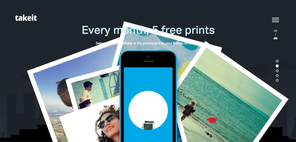
Photo credit: https://www.takeitapp.co/en
The scroll-based site for the Take It apps uses transitional animations well. As you scroll down through the different pages…
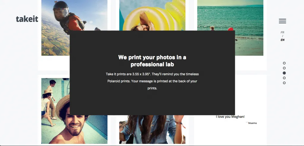
Photo credit: https://www.takeitapp.co/en
… The same six photographs move and change with you. This makes moving through the pages smooth, comprehensible, and fun — plus it helps demonstrates the points of each page.
3. Notification
Because the human eye is attracted to motion, animation is the perfect way to announce a change. This is especially useful for ecommerce sites, as it helps recreate the instant gratification of in-shop purchases.
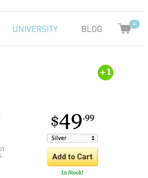
Photo credit: http://photojojo.com/store/
The Photojojo Store takes advantage of this by using an animated “+1” that flies to the shopping cart when users select an item. This also draws attention to cart itself, notifying users where to click for checkout.
4. Emphasis
The attention-grabbing property of the motion applies to more than notifications. It can also direct the user’s focus to any point on the screen. As long as there are not many other competing elements on the screen, even the slightest bit of motion will grab attention. That’s why the cursor in text fields blinks when idle.
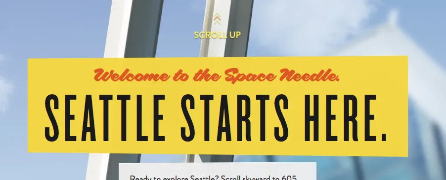
Photo credit: http://www.spaceneedle.com/home/
Seattle’s Space Needle site takes advantage of this subtlety. Since the site’s upward scrolling seems counter-intuitive (but makes sense given the context of exploring the tower), they draw attention to the instructions with a minor — but effective — animation in the up arrows.
5. Delight
Sometimes animation can be used for no other reason than delight. Like we described in the guide Web Design Trends 2015-16, this is especially useful as a distraction from an otherwise unpleasant experience — such as loading time or a missing page.
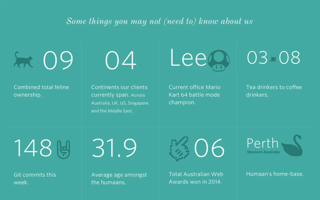
Photo credit: http://humaan.com/about/
For example, Humaan uses animated backgrounds, scroll-activated motion, and hover-revealed text (in conjunction with the content) to add personality and humanity to what would otherwise be just another dull “About Us” page.
A Note about Timing
One key component to all animation is timing. For animations triggered by the user, try to make want the effect to occur within 0.1 seconds of activation to make the interface feel responsive. We follow this rule ourselves (shown below in a sample UXPin prototype created with our free UI kit).
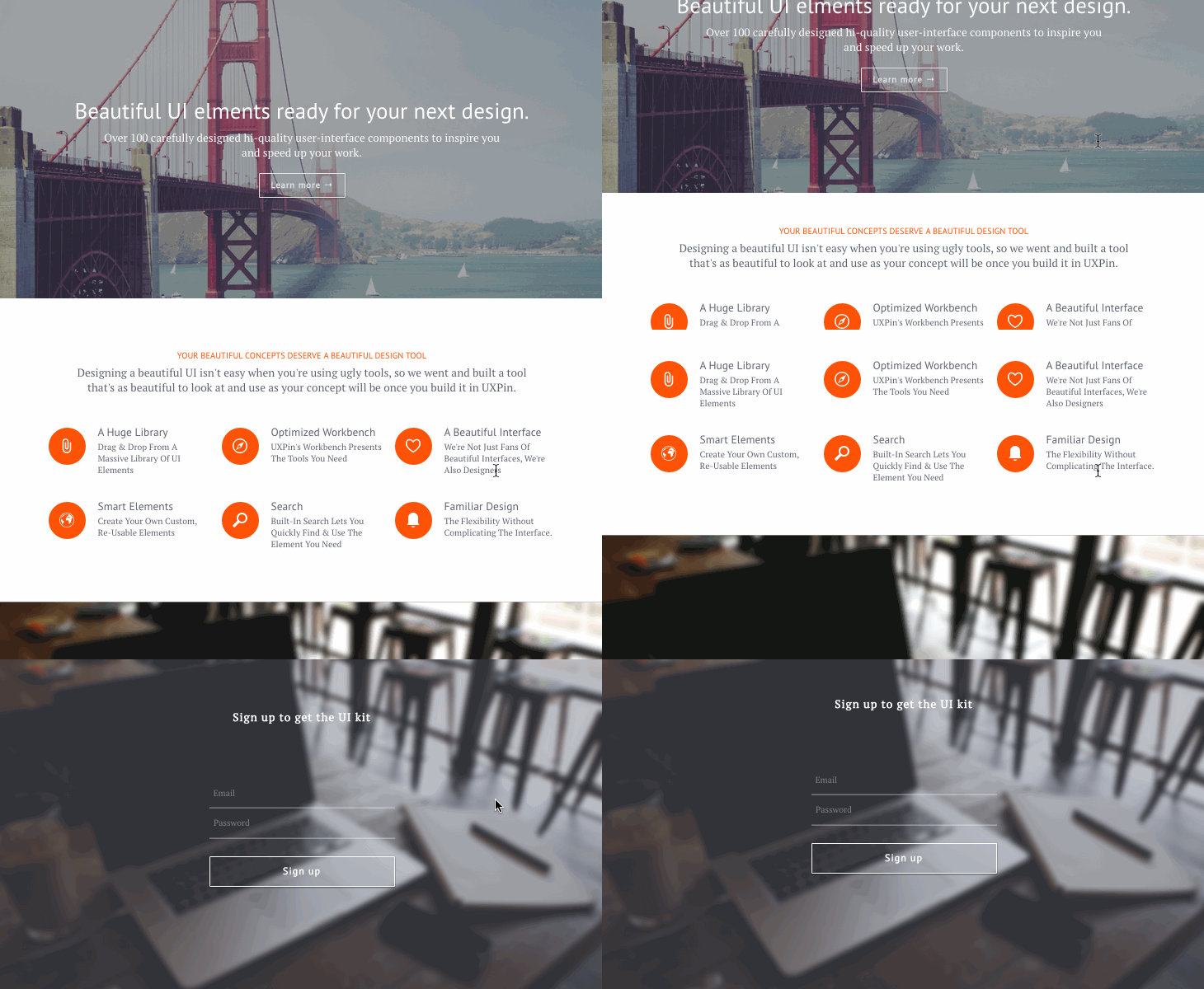
After scrolling to the bottom, the signup form appears within 300 ms. This is an intentional effect we added to support a snappy feel without creating a jarring effect.
The Future of Web Animation
Now that animation is shedding its association with cartoons, more professional industries like financial or medical institutions are using it with a more refined style.
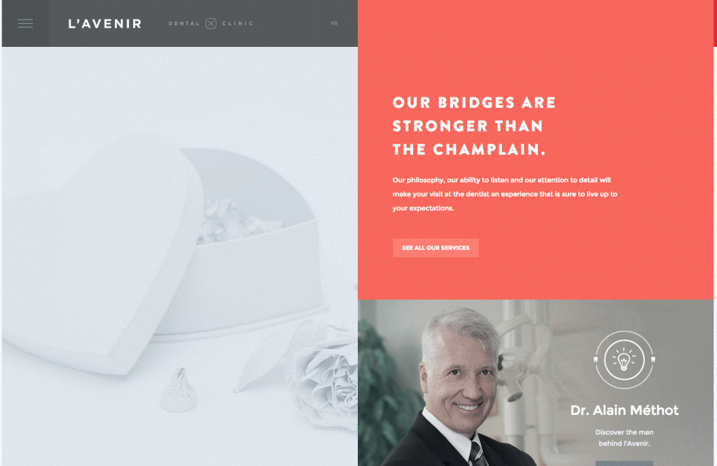
Photo credit: http://avenirclinic.com/
Dentistry is historically an industry that takes itself seriously, so L’Avenir Dental Clinic uses conservative animated effects: scrolling activates new windows to slide open. No need for bouncy icons.
Ecommerce, too, can take advantage of animation for practical purposes — namely the 360-degree rotation of products pictures. This gives the user more security when shopping online, one less advantage in-person shopping has left.
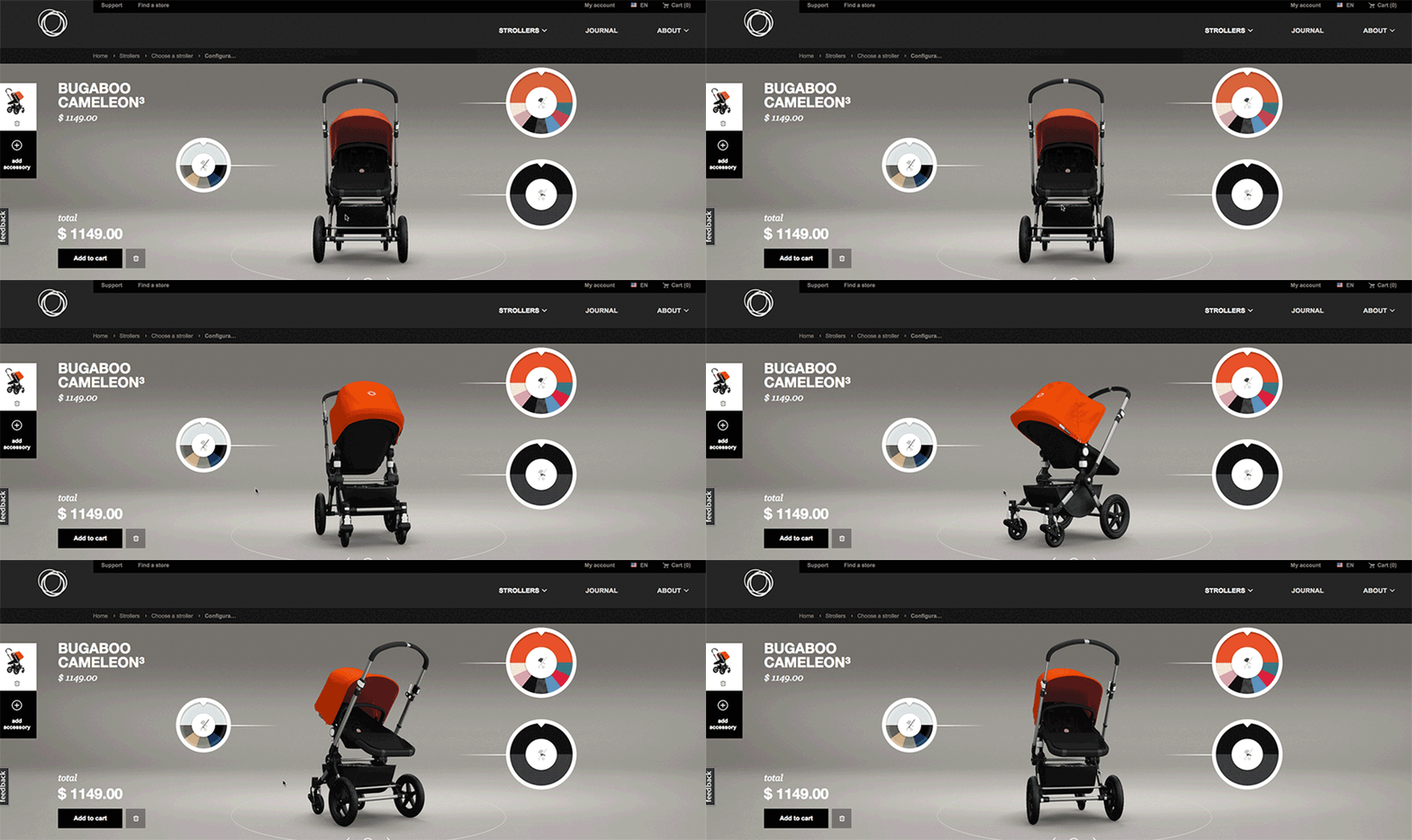
Photo credit: Bugaboo
As more designers embrace Google’s Material Design philosophy, their take on the technique will become more prominent. Their documentation describes animation in this way:
“Just as the shape of an object indicates how it might behave, watching an object move demonstrates whether it’s light or heavy, flexible or rigid, small or large. In the world of material design, motion describes spatial relationships, functionality, and intention with beauty and fluidity.”
Not only is animation expanding its range of industries, it’s also evolving in its application. As a means to combine animation with realism, animated photography is emerging as an up-and-coming trend.
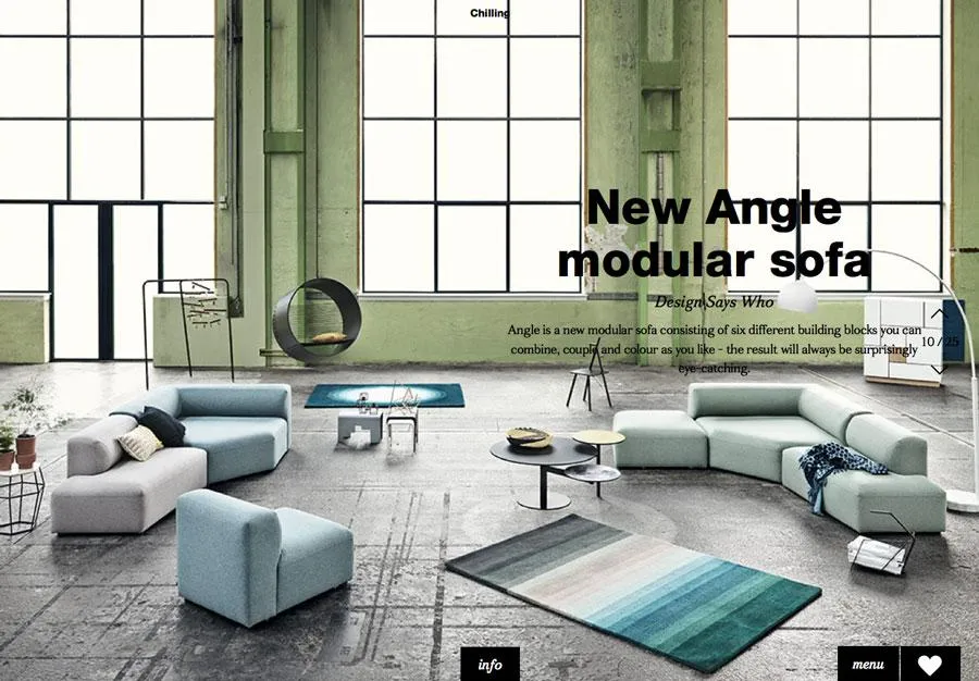
Photo credit: http://lookbook.bolia.com/chilling/
Bolia blends real photography and scrolling animation to immerse their users in their online experience. This blurring of the lines of reality is only going to become more popular as technology allows it.
Additional UX Knowledge
For more analysis of the web animations — as well as 9 other current web design trends — check out the free ebook Web Design Trends 2015-2016.
You’ll find 166 hand-picked examples from companies like Adidas, Intercom, Apple, Google, Versace, and others. To help speed up the design process, there’s also a curated list of 100 free resources.
Feature photo credit: Squarespace

