Keyboard accessibility ensures that every user can navigate and interact with your website or application using only a keyboard. This is essential for people with motor disabilities, visual impairments, repetitive strain injuries, or temporary injuries that prevent mouse use. WCAG 2.1.1 — a Level A success criterion — requires all interactive elements to be fully operable through a keyboard interface.
Key takeaways:
- Full keyboard control: Users must be able to navigate with Tab, Shift+Tab, Enter, Space, Arrow keys, and Escape.
- No timing constraints: Keyboard operations must not depend on specific timing.
- Avoid keyboard traps: Users must be able to exit every component (modals, dropdowns, widgets) with the keyboard.
- Visible focus indicators: A minimum 3:1 contrast ratio between focused and unfocused states.
- Legal compliance: Required under the ADA Title III, Section 508, and similar legislation worldwide.
Build accessible prototypes from the start with production-ready components. UXPin Merge lets you design with coded components that include built-in keyboard support and ARIA attributes — so accessibility is baked into every screen. Try UXPin for free.
Core Requirements of WCAG 2.1.1
To meet WCAG 2.1.1, every interactive element on your page must be fully navigable and functional using a keyboard alone. Here are the key areas:
Basic Keyboard Controls
Keyboard navigation should be straightforward and intuitive. The Tab key moves focus forward through interactive elements, while Shift+Tab moves it backward. Essential keystrokes:
- Enter/Return: Activates buttons, links, and form controls.
- Space: Toggles checkboxes and activates buttons.
- Arrow keys: Navigate within dropdown menus, radio buttons, and sliders.
- Escape: Closes modals, popups, and expanded menus.
Arrange elements in a logical order — typically top-to-bottom and left-to-right — so users can predictably move through the interface.
Preventing Keyboard Traps
Keyboard traps — situations where a user can enter a component but cannot leave using the keyboard — are direct violations of WCAG 2.1.1. How to avoid them:
- Modal Windows: Always allow users to close modals with the Escape key.
- Focus Management: When opening overlays or popups, trap focus within them until closed, then return focus to the trigger element.
- Custom Widgets: Provide clear keyboard shortcuts to exit custom elements.
- Skip Links: Offer skip links to help users bypass repetitive navigation sections.
Focus State Design
Visible focus states are non-negotiable under WCAG 2.1.1. They help users understand which element is currently active. Best practices:
- Contrast ratio: A minimum 3:1 contrast ratio between focused and unfocused states.
- Multiple indicators: Combine visual cues — color changes, outlines, box shadows.
- Consistent styling: Apply the same focus indicators to similar elements throughout the interface.
- Size and spacing: Make focus indicators prominent — a border width of at least 2px.
Example CSS for an accessible focus indicator:
:focus {
  outline: 3px solid #1E90FF;
  outline-offset: 2px;
  box-shadow: 0 0 0 2px rgba(30, 144, 255, 0.3);
}
Implementation Guide
Building keyboard-accessible interfaces requires semantic HTML, proper ARIA attributes, and thoughtful custom controls. This extends the focus-management principles above into practical code.
HTML Best Practices
Start with semantic HTML to get built-in keyboard functionality for free:
<!-- Good: Native button with inherent keyboard support -->
<button type="button" onclick="toggleMenu()">
    Open Menu
</button>

<!-- Bad: Div that needs custom keyboard handling -->
<div role="button" onclick="toggleMenu()">
    Open Menu
</div>
Use these native elements whenever possible:
<button>: For actions<a>: For navigation links<input>,<select>,<textarea>: For form fields<details>and<summary>: For collapsible sections
Custom Keyboard Controls
For complex components, add JavaScript to handle keyboard interactions:
element.addEventListener('keydown', (event) => {
  switch(event.key) {
    case 'ArrowDown':
      event.preventDefault();
      focusNextItem();
      break;
    case 'Escape':
      event.preventDefault();
      closeDropdown();
      break;
  }
});
For custom widgets like carousels or sliders, include:
- Left/Right arrows: Navigate horizontally
- Up/Down arrows: Navigate vertically
- Home/End keys: Jump to first or last item
- Page Up/Down: Move in larger increments
ARIA for Complex Elements
ARIA attributes are essential for making advanced components accessible to assistive technology:
<div
  role="combobox"
  aria-expanded="false"
  aria-controls="dropdown-list"
  aria-haspopup="listbox"
  tabindex="0">
  <span id="selected-value">Select an option</span>
  <ul id="dropdown-list" role="listbox" aria-hidden="true">
    <!-- List items here -->
  </ul>
</div>
Key ARIA attributes:
aria-expanded: Whether an element is expanded or collapsedaria-selected: Highlights selected items in a listaria-controls: Links the element to a related controlaria-live: Announces updates to dynamic contentrole: Defines the expected behavior of a component
Keep ARIA attributes in sync with the actual visual and functional state of each element.
Testing Keyboard Accessibility
Testing involves a mix of manual evaluation and automated tools to ensure full WCAG 2.1.1 compliance.
Manual Testing Steps
Put away the mouse and navigate your entire interface using only the keyboard:
- Navigation testing: Use Tab/Shift+Tab to move through all interactive elements. Test Enter and Space for activation. Verify Arrow keys within composite widgets. Confirm Escape closes overlays.
- Focus management: All interactive elements should show a clear focus outline. Tab order should follow the visual flow. Focus should move seamlessly into and out of dynamic content. After closing a modal, focus should return to the trigger element.
- Keyboard trap testing: Open and close every modal, dropdown, and widget. Ensure no element permanently traps focus.
Automated Testing Tools
Pair manual testing with tools to catch issues you might miss:
| Tool | Primary Features | Best For |
|---|---|---|
| Axe | Automated scans, real-time detection | Keyboard functionality gaps |
| WAVE | Visual feedback, detailed reports | Focus indicator checks |
| Lighthouse | Performance + accessibility audits | Overall compliance scoring |
| NVDA/JAWS | Screen reader testing | Assistive technology compatibility |
Building Accessible Prototypes in UXPin
Catching accessibility issues early — at the prototype stage — is dramatically cheaper than fixing them in production code. UXPin helps teams build keyboard-accessible prototypes from day one.
Using Merge for Accessible Components
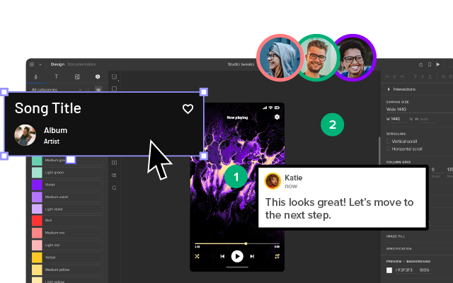
UXPin Merge lets teams design with production-ready coded components that include built-in keyboard accessibility:
- Pre-built keyboard support: Libraries like MUI and Ant Design come with pre-configured keyboard interactions, focus management, and ARIA attributes.
- Custom components: Sync your own Git-based component libraries — complete with keyboard interactions — directly into the design canvas.
- Interactive customization: Designers can adjust focus states and keyboard behaviors within prototypes.
Enterprise teams using Merge report a 50 % reduction in engineering time — partly because accessibility is handled at the component level, not rediscovered and patched during QA.
AI-Assisted Accessible Design with Forge
UXPin Forge generates layouts from text descriptions using your production component library. Because those components already include keyboard support and ARIA attributes, Forge-generated screens inherit accessibility by default. You can set Design System Guidelines to enforce accessibility rules across every AI-generated screen.
Focus State Testing in Prototypes
UXPin’s code-based prototyping engine lets you test keyboard navigation before any development begins:
- Real-time previews: See how interactive states function as you design.
- Custom focus states: Set and test specific focus behaviors per component.
- Tab order verification: Ensure proper navigation flow and focus trapping in modals.
- Dynamic content testing: Test keyboard accessibility for conditionally-rendered elements.
WCAG 2.1.1 Compliance Checklist
Use this quick-reference table to audit your implementation:
| Aspect | Implementation | Impact |
|---|---|---|
| Design System Integration | Keyboard support built into coded components | Consistent accessibility across all products |
| Focus Management | Visible indicators with 3:1 contrast, logical tab order | Smooth navigation for keyboard users |
| Interactive Elements | Semantic HTML + ARIA attributes for custom controls | Full assistive technology compatibility |
| Testing Protocol | Manual keyboard testing + automated scanning | Fewer accessibility issues reaching production |
Ready to build accessible prototypes from production components? Try UXPin for free.
Frequently Asked Questions About WCAG 2.1.1 Keyboard Accessibility
What is WCAG 2.1.1 keyboard accessibility?
WCAG 2.1.1 is a Level A success criterion requiring all functionality to be operable through a keyboard interface without specific timing requirements. The only exception is functions that inherently require path-dependent input, such as freehand drawing.
What is a keyboard trap and how do I prevent one?
A keyboard trap occurs when a user gets stuck inside a component and cannot exit using standard keyboard controls. Prevent traps by allowing Escape to close overlays, implementing proper focus trapping that returns focus on close, and testing all components with keyboard-only navigation.
What keyboard controls does WCAG require?
At minimum: Tab/Shift+Tab for forward/backward navigation, Enter and Space for activation, Arrow keys for composite widgets, and Escape to close overlays. Elements should follow a logical tab order matching the visual layout.
How do I design accessible focus states?
Ensure a minimum 3:1 contrast ratio, use visible outlines (at least 2px wide), apply consistent styles across all interactive elements, and never remove focus indicators without providing an alternative.
How do I test keyboard accessibility?
Start with manual testing — navigate your entire interface using only the keyboard. Check for visible focus, logical tab order, and absence of traps. Supplement with automated tools like Axe, WAVE, or Lighthouse.
How does UXPin help with keyboard accessibility?
UXPin Merge lets you design with production components that include built-in keyboard support and ARIA attributes. Component libraries like MUI and Ant Design ship with pre-configured keyboard interactions. Forge generates accessible layouts by default because it uses these same components.