The 6 UX Methods That Proved to Be Effective in Driving Results
Most designers want to create something beautiful, but beauty alone in the UI & UX world is not enough. If it doesn’t support the goals of your business or your clients – it just won’t last very long.. A product can only last when the client makes money from it. A UX that doesn’t drive results will ultimately fail and disappear.
In the following article, you will learn about UX methodologies that have helped other companies drive impressive results. You can always express your creative ideas by twisting the concepts a bit, but you will want to follow the core methods to get results that clients will notice.
Before you start learning in-depth methods, consider that users abandon 80-90% of apps after using them just once. You face a lot of competition, so you need to follow a UX design methodology that drives impressive results.
Table of Contents
- Study the UX of Top Market Competitors
- Run Lean UX Workshops with Clients and Stakeholders
- Understand the Consumer’s Journey Map
- Create CTAs and Microcopy That Motivate and Convert
- Use Usability Testing to Get Feedback
- Perform Research to Find the Right UX Techniques for Products
- Create and Share UX Designs With UXPin
Study the UX of Top Market Competitors
Start researching UX methodologies that already work within your product’s niche. You don’t need to reinvent the wheel, but you can improve on its design.
If you have a client that wants a pet-themed app, for example, you can start by exploring the top-ranked apps in that niche, such as::
- MyPet Reminders
- The Bark: Dog Culture Magazine
- Rover
- PetParent
After reviewing the above examples, your client will choose something they like from each. Having a shortlist of your client’s preferences, needs, and expectations, you can already start building the user experience.

You decide that you can create a better UX design methodology by adding UI dialogs that will transform the user’s journey.
When you present your first wireframe to your colleagues, you show them that the user gets to make small decisions that lead to a superior result. Upon opening the app, the user chooses between “dog or cat.”
The answer takes the user to the next step in the process. Users that choose “dog” are asked if they need services “when you’re away” or “when you’re at work.”
The “away” answer takes them to a screen with icons for boarding, house sitting, and drop-in visits. The “work” answer takes them to a screen with icons for dog walking and doggie daycare.
Regardless of the answer, they have to select a size that best represents their dog.
Users who choose “cat” get taken to a new screen with icons for boarding, house sitting, and drop-in visits.
No matter how users answer, the final screens ask for their locations and when they need the services.
Their answers produce a list of results that show well-vetted service providers and their prices. The users can schedule with one of the providers, enter their payment information, and expect their pets to receive excellent care.
Notice that the new UX techniques don’t deviate much from Rover’s original. It just takes a complex form and simplifies the user’s journey by breaking the form into a series of simple questions.
Run Lean UX Workshops with Clients and Stakeholders
Your clients, which may include your project manager, agency owner, or client, need to be included in the entire design process. This is part of the Lean UX framework which advises to include as many stakeholders as possible from the start.
Therefore, before you spend too much time developing a prototype, talk to your client about defining and tracing goals. Do they want to see a quick financial return on their investment? Do they want the product to direct new users to an existing service?
The answers to these questions will help you design a product that reaches the proper goals.
Understand the Consumer’s Journey Map
Put yourself in the user’s “shoes” and think about how you would experience the product. Taking this step will send you on a journey to create a better user experience.
While you use your product, ask yourself:
- Does this experience prioritize my needs?
- Does the product keep me front and center, or does it meander in other directions?
- What steps could you add or subtract to make your experience better?
Some people find it harder than others to step outside of their perspective and look at products objectively. If you know that this method won’t work well for you, recruit colleagues who don’t feel attached to the project. Hopefully, they can give you unbiased feedback that helps you understand and improve the consumer’s journey map.
Create CTAs and Microcopy That Motivate and Convert
Microcopy plays a major role in how users respond to your designs. Inserting a well-written call-to-action in your design can motivate and convert users.
Your CTAs can drive results by using short statements that tell people how to respond.
As people become more tech-savvy, though, designers and writers need to reconsider the types of messages they use. Many people don’t trust tech companies. Some surveys show that 61% of people in developed markets believe that tech companies too often want to trick them into something, which in turn evokes the sense of mistrust..
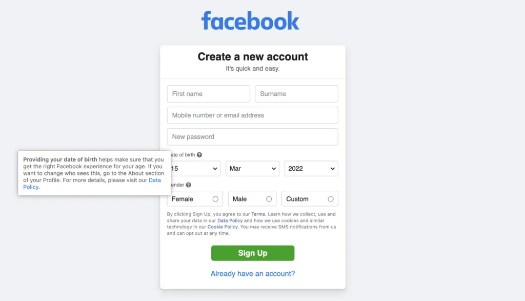
Microcopy can help alleviate some feelings of mistrust and fear. Consider what Facebook has done to put new users at ease.

The sign-up form tells potential members that the service is “free and always will be.” Anyone worried that Facebook would start charging members can take some solace in that statement.
The sign-up form also provides links to additional information. Potential users can learn why Facebook wants to know their birthday. They can also read Facebook’s terms of service, data policy, and cookie use policy.
Most people never read policies. Anyone who questions Facebook’s motivations, though, can sift through the legalese to learn more about how the company operates and what it plans to do with member data.
Use Usability Testing to Get Feedback
Once you have a basic design of your product, create a functional prototype, distribute the prototype among test users, and conduct interviews to learn more about what they liked and didn’t like.
Other designers and stakeholders may have prejudices that make it difficult for them to give you unbiased feedback. A random person without any stake in the product’s success, though, can give you an unfiltered opinion.
Feedback may include everything from “I really like the way scrolling down the screen expands individual options and makes them easier to read” to “this is the dumbest thing I’ve ever seen!”
It goes without saying that you should take some criticism with an entire shaker of salt. Disregard off-the-wall comments. Pay attention to sincere responses that can shape the future of your product and business, though. You never know who will give you insight that leads to better results.
Perform Research to Find the Right UX Techniques for Products

Interviews can help you see your product’s UX design methodology from more perspectives, which can lead to significant improvements in your designs.
Few options outperform data-driven research, though. The Interaction Decision Foundation uses a process that includes:
- Insight
- Building
- Measuring
- Learning
- Results
Measuring sits in the middle of this process because it bridges the differences between artistic insight and data-driven testing.
To see how people respond to your product, you can lead a whole product with data-driven testing as it lives and grows. Based on different UX methodologies, you can optimize the product as it is already live. For example, running a/b tests, and drawing conclusions from them will give you some solid data-driven results.
Then, Watch data evolve as your people use your product. If you see poor performance, you can recruit artificial intelligence to help you spot patterns in behavior. Make adjustments to the product to see how the changes influence user behavior. You may find that a few tweaks can generate considerably more conversions.
Create and Share UX Designs With UXPin
When it comes to prototyping tools that support your UX processes and methodologies, look no further – UXPin does the job perfectly. It is full of design, prototyping, and collaboration features to let you and your team align and work in context. UXPin lets teams work on the same design – not only designers but also stakeholders who don’t have an account can collaborate. This takes so much frustration out of the review process and puts an end on the never-ending emails with feedback. All you have to do is send someone a preview link so that they can start reviewing the design.
Start with a free UXPin trial to discover and try all the features yourself.

