UX Design Principles: The 16 Rules Every Product Team Must Follow in 2026
UX design principles are the evidence-based rules that keep product teams from shipping interfaces based on gut feel, stakeholder preferences, or aesthetic trends. Grounded in cognitive psychology, human-computer interaction research, and decades of usability testing, they provide a reliable decision-making framework for every screen, interaction, and user flow you design.
Yet knowing the principles is not enough — the teams that consistently deliver great products are the ones who operationalize them: encoding rules into design systems, validating them through prototyping and testing, and enforcing them automatically through code-backed tooling and AI-assisted design.
This guide covers all 16 principles in depth, explains why each one matters, shows how to apply them in practice, and demonstrates how modern tools make it possible to scale principle-driven design across even the largest product organizations.
Key takeaways:
- UX design principles are decision-making frameworks rooted in cognitive science — not subjective style preferences.
- Consistency, simplicity, and accessibility form the non-negotiable foundation of every usable product.
- Principles like visual hierarchy, feedback loops, and progressive disclosure reduce cognitive load and measurably improve task completion rates.
- A well-governed design system is the most effective way to operationalize these principles at scale.
- Tools like UXPin Merge enforce UX principles automatically by letting teams design with production-ready code components that already embed accessibility, spacing, and interaction patterns.
- AI design assistants like UXPin Forge can apply these principles at speed — generating layouts from real component libraries that already encode your team’s UX standards.
Ready to put these principles into practice? Start a free UXPin trial and build prototypes with real components from your team’s design system.
What Are UX Design Principles?
UX design principles are a shared set of guidelines that inform how teams approach every aspect of product creation — from information architecture and navigation to micro-interactions and error handling. They are rooted in research, not opinion, and they serve as a decision-making lens that filters every layout, interaction, and user flow through the question: Does this serve the person using the product?
The most widely cited UX principles come from foundational thinkers:
- Don Norman — The Design of Everyday Things introduced affordances, signifiers, and the concept of human-centered design.
- Jakob Nielsen — Nielsen’s 10 usability heuristics remain the standard evaluation framework for interface usability.
- Steve Krug — Don’t Make Me Think crystallized the principle that interfaces should be self-evident, not self-explanatory.
- Dieter Rams — His ten principles for good design emphasize that design should be innovative, useful, understandable, and as little design as possible.
What these frameworks share is a relentless focus on reducing friction. Every principle below targets a specific type of friction — cognitive, visual, motor, or emotional — that stands between a user and their goal.
The 16 UX Design Principles Every Product Team Needs
Each principle below includes a definition, the research behind it, practical applications, and common violations to watch for.
1. Put the User at the Center of Every Decision
User-centricity is the meta-principle from which every other UX guideline flows. It means basing design decisions on validated research — interviews, analytics, usability tests — rather than on team preferences or executive opinions.
Many practitioners now prefer the term human-centered design because it emphasizes that we are designing for real people with emotions, cognitive limitations, and varying abilities — not abstract personas.
How to apply it:
- Empathize — Observe users in their natural context. Use interviews, diary studies, and contextual inquiry.
- Define — Articulate the core problem as a “How Might We” statement grounded in research data.
- Ideate — Generate a wide range of solutions. Diverge before converging.
- Prototype — Build testable representations. Use code-based prototypes for high-fidelity validation.
- Test — Validate with real users, measure success against defined criteria, and iterate.
The most common violation of this principle is designing for edge cases before solving the primary use case. Solve the 80% first, then refine. AI design tools like Forge can accelerate the initial 80% by generating layouts from your component library, freeing designers to focus their expertise on the nuanced 20%.
2. Maintain Consistency Across Every Touchpoint
Design consistency means that similar elements look the same, behave the same, and appear in the same locations throughout the product. When users encounter inconsistencies — a button that changes color between views, a navigation bar that shifts position — they lose trust and must re-learn the interface on every page.
Consistency operates at three levels:
- Visual consistency: Unified colors, typography, spacing, iconography, and component styling.
- Functional consistency: Identical interactions produce identical results across every context.
- External consistency: Your product follows platform conventions (iOS, Android, web) that users already understand.
The most scalable way to enforce consistency is through a code-backed design system. With UXPin Merge, teams design with the exact same React components that developers ship to production. This eliminates the visual drift that inevitably occurs when designers and engineers interpret the same specifications differently.
3. Design for Scannability, Not Just Readability
Users scan before they read. Eye-tracking studies consistently show that people follow F-shaped or Z-shaped patterns, looking for headings, bold text, and visual anchors before committing to reading any paragraph in full. If your interface does not support scanning, users leave before they ever reach your content.
Design for scannability by using:
- Clear headings and subheadings that describe the content that follows — never clever or vague.
- Short paragraphs (2–4 sentences maximum) and bulleted or numbered lists.
- Visual cues like icons, bold keywords, and generous whitespace.
- Step-by-step layouts for complex workflows or multi-stage processes.
4. Never Make Users Think Unnecessarily
Steve Krug’s foundational principle holds: every question mark that appears in a user’s mind — “Is this clickable?”, “Where do I go next?”, “What does this icon mean?” — adds cognitive load that competes with their actual goal. Self-evident interfaces outperform self-explanatory ones every time.
Practical applications:
- Place navigation where conventions dictate — primary navigation at the top, secondary in the sidebar, utility actions in the upper right.
- Make buttons and links visually distinct. Use adequate contrast, consistent styling, and meaningful labels (never “Click here”).
- Use established patterns: search bars, shopping carts, hamburger menus on mobile, breadcrumbs for deep hierarchies.
- Minimize the number of decisions per screen. Every additional choice increases decision fatigue and decreases task completion.
5. Use Visual Grammar to Create Structure
First codified by the Bauhaus school, visual grammar defines the building blocks of all design: points, lines, and planes. Every UI element — from a single pixel indicator to a full-width hero banner — is composed of these primitives.
Key applications in digital product design:
- Proximity: Group related elements together; separate unrelated ones. Gestalt psychology confirms that users perceive proximity as relationship.
- Alignment: Align elements to a consistent grid. Misaligned elements introduce visual noise.
- Contrast: Use size, color, and weight differences to distinguish primary actions from secondary ones.
- Repetition: Repeat patterns and component styles to build rhythm and predictability.
6. Define the Problem Before Designing the Solution
The most expensive UX mistake is solving the wrong problem beautifully. Before any wireframe is drawn or any prototype built, the team must articulate — in writing — what problem they are solving, for whom, and how they will know if the solution works.
A solid problem statement includes:
- The target user segment and their context
- The specific pain point or unmet need, validated through research
- The measurable outcome that defines success (task completion rate, error reduction, time-on-task)
7. Use Simple, Clear Language Everywhere
Every label, tooltip, error message, and onboarding prompt is a UX design decision. Complex or jargon-heavy language creates friction just as surely as a confusing navigation pattern.
Language guidelines for product interfaces:
- Write at a reading level appropriate for your audience — typically 8th-grade level for consumer products.
- Use active voice and specific verbs. “Save your changes” is clearer than “Changes can be saved.”
- Keep microcopy short. Button labels should be 1–3 words; tooltips should be one sentence.
- Avoid internal product jargon in user-facing interfaces. Test labels with real users if you are unsure.
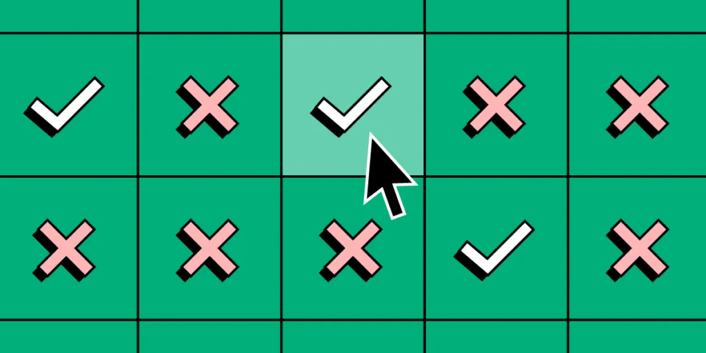
8. Provide Immediate, Meaningful Feedback
Every action a user takes should produce visible, understandable feedback within 100 milliseconds. When feedback is delayed or absent, users wonder whether their action registered — and they often click again, creating errors, duplicate submissions, and frustration.
Feedback design patterns:
- Button state changes: Pressed → loading spinner → success confirmation. Never leave a button in its default state after a click.
- Inline validation: Validate form fields as users complete them, not after they submit the entire form.
- Progress indicators: For operations longer than 1 second, show a progress bar or skeleton screen. For operations longer than 10 seconds, show estimated time remaining.
- Toast notifications: Confirm successful actions (“Changes saved”) and explain failures (“Couldn’t connect — check your internet and try again”).
9. Establish a Clear Visual Hierarchy
Visual hierarchy guides the user’s eye from the most important information to the least important, in the order the designer intends. Without a clear hierarchy, users must scan the entire screen to determine what matters.
Hierarchy is established through:
- Size: Larger elements attract attention first.
- Color and contrast: High-contrast elements stand out against muted backgrounds.
- Position: Elements at the top and left of the viewport receive priority attention (in LTR languages).
- Typography: Heading sizes, weights, and styles create a content outline that mirrors the information hierarchy.
- Whitespace: Space isolates important elements, drawing the eye toward them.
A practical test: blur your design to 10% resolution. If you can still identify the primary action and the content hierarchy, your visual hierarchy is working.
10. Make Accessibility a Design Requirement, Not an Afterthought
Accessibility is not a feature to add later — it is a core design principle that affects every decision from color selection to interaction patterns. Approximately 16% of the global population lives with some form of disability, and accessible design benefits all users.
Fundamental accessibility practices:
- Color contrast: Minimum 4.5:1 ratio for body text, 3:1 for large text (WCAG 2.2 AA).
- Keyboard navigation: Every interactive element must be reachable and operable via keyboard alone.
- Screen reader support: Use semantic HTML, ARIA labels where necessary, and logical heading hierarchy.
- Touch targets: Minimum 44×44px on mobile (WCAG) with adequate spacing between targets.
- Motion sensitivity: Honor
prefers-reduced-motionand never use flashing content above 3Hz.
Design systems make accessibility scalable. When components are built with accessibility baked in — proper ARIA attributes, keyboard handlers, contrast-checked color tokens — every new screen automatically inherits those standards. UXPin Merge reinforces this by letting designers use the same accessible production components that ship to users.
11. Give Users Control Over Their Experience
Users should always feel in control of the product — never trapped, forced, or confused about how to undo an action. Control is the foundation of trust, and trust is the foundation of retention.
Design for user control by:
- Providing undo/redo for destructive or significant actions.
- Allowing users to cancel or back out of multi-step flows at any point without losing progress.
- Offering customization options (dark mode, notification preferences, dashboard layouts) where appropriate.
- Never auto-playing media, forcing pop-ups, or hijacking scroll behavior without explicit user consent.
12. Use Whitespace as a Functional Design Element
Whitespace (or negative space) is not wasted space — it is a functional design element that improves comprehension, reduces cognitive load, and directs attention. Research from the Wichita State University found that appropriate whitespace between paragraphs and in margins increases reading comprehension by up to 20%.
Whitespace best practices:
- Macro whitespace: Large areas of space between major content sections signal topic shifts and give users a visual “breather.”
- Micro whitespace: Consistent padding and margin within components improves readability and touch accuracy.
- Spacing systems: Use a consistent spacing scale (e.g., 4px, 8px, 16px, 24px, 32px) to maintain rhythm. Design tokens codify this into your system.
13. Design for Error Prevention and Graceful Recovery
The best error handling is preventing errors from occurring in the first place. When they do occur, the system should explain what happened, why, and exactly what the user can do to fix it — in plain language, not error codes.
Error prevention strategies:
- Use input constraints (date pickers instead of free text, dropdowns instead of open fields) to eliminate formatting errors.
- Disable unavailable actions rather than letting users click and fail.
- Show confirmation dialogs for destructive actions (“Delete this project? This cannot be undone.”).
Error recovery strategies:
- Display error messages next to the field that caused them, not in a banner at the top of the page.
- Use natural language: “That email address doesn’t look right — did you mean @gmail.com?” is better than “Error 422: Invalid input.”
- Auto-save user input so that errors don’t cause data loss.
14. Reveal Complexity Gradually with Progressive Disclosure
Progressive disclosure means showing only the information and options relevant to the user’s current task, and revealing additional complexity as needed. It reduces cognitive load on first exposure while still providing full functionality for advanced users.
Common progressive disclosure patterns:
- Expandable sections: “Show advanced settings” links that reveal additional options on demand.
- Wizards and stepped flows: Multi-step processes that show one stage at a time.
- Tooltips and contextual help: Information available on hover or click rather than permanently displayed.
- Default values: Pre-fill settings with sensible defaults so that most users never need to configure anything.
15. Leverage Existing Mental Models
Mental models are the assumptions users carry about how things work, formed by their experience with other products. A shopping cart icon means “checkout.” A floppy disk icon means “save.” A red asterisk means “required field.”
When your interface matches a user’s mental model, the learning curve disappears. When it violates their expectations, every interaction requires conscious thought.
How to work with mental models:
- Study the products your users already use. Adopt their patterns where appropriate.
- Use card sorting and tree testing to understand how users expect content to be organized.
- When you must introduce a novel interaction, pair it with a familiar one as a bridge (e.g., “drag to reorder, or use the arrow buttons”).
16. Iterate Continuously Based on Evidence
UX design is never finished. Products exist in dynamic environments — user needs evolve, technology changes, competitors iterate, and business goals shift. The teams that win are the ones that treat every shipped feature as a hypothesis to be validated.
Build an iteration feedback loop:
- Quantitative signals: Monitor analytics (task completion, drop-off rates, error rates, time-on-task) to detect problems at scale.
- Qualitative signals: Run regular usability tests (every 2–4 weeks) to understand the “why” behind the numbers.
- A/B testing: For high-traffic features, test variations to make data-driven decisions.
- Feedback channels: In-app surveys, support ticket analysis, and NPS scores provide continuous signal.
Code-based prototyping tools accelerate this loop. With UXPin Merge, teams can update a prototype with new production components, test it with users, and hand the validated design directly to engineering — because the prototype is already built from real code.
How to Apply UX Design Principles at Scale
Knowing the principles is the first step. Operationalizing them across a product organization is where real impact happens. Here is a practical framework.
Encode Principles into Your Design System
A design system translates abstract principles into concrete, reusable components. When your button component already enforces contrast ratios, your form component already includes inline validation, and your layout grid already provides consistent spacing — designers cannot accidentally violate the principles.
UXPin Merge takes this further by syncing your production React, Vue, or Angular components directly into the design tool. Designers drag and drop the same elements that developers deploy, so the design automatically inherits every accessibility attribute, interaction behavior, and spacing token from the codebase. Enterprise teams like PayPal use this approach — their 5-person UX team supports 60+ products and over 1,000 developers because principles are encoded in the system itself, not policed manually.
Use AI to Apply Principles at Speed
AI design tools can accelerate principle-driven design — but only when the AI is constrained to your design system. Generic AI tools produce layouts that look plausible but violate your specific brand rules, component APIs, and accessibility standards.
UXPin Forge generates layouts using your team’s actual component library, guided by Design System Guidelines that enforce brand rules, spacing, and approved patterns. Teams report up to 8.6x faster design-to-prototype cycles when Forge handles the initial 80% of a layout, leaving designers to focus on the nuanced refinements that require human judgment.
Prototype Early, Test Often, and Iterate
Principles are validated through testing, not through design reviews. Establish a regular cadence of prototype testing — ideally with code-based prototypes that behave like the real product, so test participants respond to realistic interactions rather than static mockups.
Popular component libraries available through UXPin Merge include MUI (Material UI), shadcn/ui, Bootstrap, and Ant Design. Teams can also sync their own proprietary component library via Git integration.
Try UXPin for free and build your first interactive prototype with production components in minutes.
UX Design Principles vs. Usability Heuristics: What’s the Difference?
UX design principles and usability heuristics are related but serve different purposes:
- UX design principles are proactive guidelines used during the design process to make better decisions from the start. They are broad enough to apply across all product categories.
- Usability heuristics (like Nielsen’s 10 heuristics) are primarily used as an evaluation tool — a checklist for identifying problems in existing interfaces through expert review.
In practice, the most effective teams use both: principles to guide design decisions, and heuristics to evaluate the results. Many principles (consistency, error prevention, user control) appear in both frameworks because they are grounded in the same cognitive science research.
Frequently Asked Questions About UX Design Principles
What are UX design principles?
UX design principles are evidence-based guidelines that help product teams create intuitive, usable digital experiences. They include concepts such as user-centricity, consistency, accessibility, visual hierarchy, and meaningful feedback. Rooted in cognitive psychology and usability research, these principles serve as a decision-making framework for every interface design choice.
Why are UX design principles important for product teams?
UX design principles keep product decisions anchored to validated user needs rather than assumptions or stakeholder opinions. They reduce usability issues, build user trust, improve task completion rates, and create products that achieve both user satisfaction and business objectives. Teams that follow established principles ship better products faster because they spend less time debating subjective preferences.
Which UX design principle is the most important?
User-centricity — designing based on validated user needs — is widely considered the most fundamental UX principle. Every other principle, from simplicity to accessibility, exists to serve this goal. Without user research as the foundation, even perfectly consistent, accessible, and visually polished products can fail because they solve the wrong problem.
How do design systems help enforce UX principles?
Design systems codify UX principles into reusable components, tokens, and patterns. A well-built design system enforces consistency, accessibility, and visual hierarchy automatically — every new screen inherits these properties from the component library. Tools like UXPin Merge extend this by syncing production code components into the design tool, so designers work with elements that already meet accessibility and interaction standards.
What tools help apply UX design principles effectively?
Design and prototyping tools like UXPin help teams apply UX principles through built-in design systems, interactive prototyping, and usability testing capabilities. UXPin Forge uses AI to generate principle-compliant designs constrained to your component library, and UXPin Merge ensures design-to-code consistency by using real production components throughout the design process.
How often should teams revisit their UX design principles?
UX design principles should be reviewed after major product launches, significant usability research findings, platform changes, or shifts in user expectations. Treat them as living guidelines that evolve with your product and users — not static rules carved into stone. A quarterly review cadence works well for most teams.

