16 UX Design Principles for Better Product Design in 2026
UX design principles are the foundational guidelines that help product teams create intuitive, usable, and satisfying digital experiences. Whether you’re designing a mobile app, a SaaS dashboard, or an enterprise platform, applying these principles ensures every decision stays centered on real user needs.
This guide covers 16 essential UX design principles — from user-centricity and consistency to accessibility and feedback — with practical advice on how to apply each one in your design workflow.
Key takeaways:
- UX design principles keep product decisions anchored to user needs rather than assumptions or personal bias.
- Consistency, simplicity, and accessibility are non-negotiable foundations for any well-designed product.
- Principles like visual hierarchy, feedback, and progressive disclosure directly reduce cognitive load and improve task completion rates.
- A robust design system operationalizes these principles across every screen and interaction.
- Tools like UXPin Merge help enforce UX principles by letting designers work with production-ready components that already embed accessibility, spacing, and interaction patterns.
Ready to apply these principles in practice? Start a free UXPin trial and build prototypes with real components from your team’s design system.
What Are UX Design Principles?
UX design principles are a set of guidelines that inform how designers approach product creation. They are rooted in cognitive psychology, human-computer interaction research, and decades of usability testing data. Rather than rigid rules, they serve as a decision-making framework — a lens through which every layout, interaction, and user flow should be evaluated.
The most widely recognized UX principles originate from thought leaders like Don Norman (The Design of Everyday Things), Jakob Nielsen (Nielsen’s heuristics), and Steve Krug (Don’t Make Me Think). What they all share is a focus on reducing friction and making the user’s path through a product as natural as possible.
1. Focus on the User
While it might seem obvious, many designers still make decisions based on personal preference or stakeholder opinions rather than validated user needs. Creativity and technical innovation are valuable — but only when they serve the people using the product.
Many UX professionals prefer the term human-centered design because it reinforces that we’re designing for real people with emotions, constraints, and varying abilities — not abstract “users.”
Build your design process on the design thinking framework to keep users front and center:
- Empathize — understand your users through research and observation
- Define — articulate the core problem you’re solving
- Ideate — generate a wide range of potential solutions
- Prototype — build testable representations of your ideas
- Test — validate with real users and iterate
2. Be Consistent
Design consistency means that similar elements behave and look the same throughout your product. When users encounter inconsistencies — a button that’s blue in one view and green in another, or navigation that changes position between pages — they lose trust and have to relearn the interface.
Consistency operates at three levels:
- Visual consistency: same colors, typography, spacing, and iconography
- Functional consistency: similar interactions produce similar results
- External consistency: your product aligns with platform conventions users already know
The most effective way to enforce consistency at scale is through a design system. With UXPin Merge, teams can design with the same React components that developers use in production — which eliminates visual drift between design files and shipped code.
3. Make Content Easy to Digest
Users scan before they read. They look for the fastest path to the information they need, and if your product doesn’t provide that, someone else’s will.
Design for scannability by using:
- Clear headings and subheadings that describe content
- Short paragraphs and bullet points
- Visual cues like icons, bold text, and whitespace
- Step-by-step instructions for complex workflows
If your product requires onboarding, make documentation easy to follow. The UXPin documentation is a good example — it uses categorized navigation, step-by-step instructions, and video walkthroughs to help users find answers quickly.
4. Don’t Make Users Think
Steve Krug’s famous principle from Don’t Make Me Think captures a fundamental truth: users should never have to wonder whether something is clickable, where navigation lives, or what will happen next.
Follow established design conventions:
- Place navigation where users expect it
- Make buttons and links visually distinct and obviously interactive
- Use familiar patterns (shopping carts, search bars, hamburger menus on mobile)
- Minimize the number of decisions required to complete a task
Innovation should come from solving problems better — not from reinventing interactions users already understand.
5. Understand Visual Grammar
First defined by the Bauhaus school in the early 1900s, the building blocks of all design consist of three core elements: points, lines, and planes.
Understanding visual grammar helps designers:
- Create clear relationships between elements
- Establish hierarchy through size, weight, and position
- Reduce complexity by using simple geometric foundations
When a design feels too complex, return to these basics. Often, simplifying the underlying structure reveals a cleaner, more intuitive layout.
6. Identify the Problem First
Effective UX starts with identifying the right problem — not jumping to solutions. This requires rigorous research: user interviews, analytics, support ticket analysis, and usability testing.
Keep asking why a problem exists until you reach the root cause. Testing prototypes with real users is the most reliable way to validate whether you’ve found the right problem and the right solution.
UXPin’s prototyping and testing capabilities help teams validate ideas quickly. With Merge, designers can build high-fidelity prototypes using real components, so usability test participants interact with something that behaves like the actual product — producing more reliable feedback.
7. Use Simple Language
Interface copy should be as clear and concise as possible. Avoid jargon, technical terminology, and insider language unless you’re designing exclusively for expert users who expect it.
Best practices for UX writing:
- Use active voice and short sentences
- Label buttons with verbs that describe the action (“Save Draft,” not “OK”)
- Write error messages that explain what went wrong and how to fix it
- Test your copy with real users — what’s obvious to your team may confuse your audience
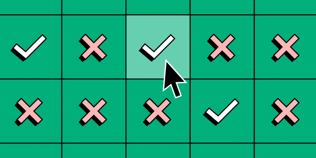
8. Provide Useful Feedback
Every user action should produce clear feedback. When someone clicks a button, submits a form, or triggers an error, the interface must communicate what happened and what to do next.
Effective feedback includes:
- Loading indicators for async operations
- Success confirmations after form submissions
- Inline validation that catches errors before submit
- Progress bars for multi-step flows
- Undo options to recover from mistakes
Products that feel “responsive” and “alive” almost always excel at feedback design. It builds user confidence and reduces anxiety, especially in high-stakes tasks like payments or data entry.
9. Establish Visual Hierarchy
Visual hierarchy guides the user’s eye through the interface in a deliberate order. It ensures that the most important information or action receives attention first.
Use these tools to create hierarchy:
- Size: larger elements draw attention first
- Color and contrast: high-contrast elements stand out
- Spacing: whitespace isolates and elevates important content
- Typography: weight, size, and style signal importance
- Position: users start scanning from the top-left in LTR languages
10. Design for Accessibility
Accessible design isn’t optional — it’s a UX design principle that ensures your product works for everyone, including the estimated 1.3 billion people worldwide living with disabilities.
Key accessibility practices:
- Meet WCAG 2.2 AA contrast ratios for text and interactive elements
- Support keyboard navigation throughout the interface
- Provide alt text for images and labels for form fields
- Don’t rely on color alone to convey meaning
- Test with screen readers and other assistive technologies
When teams use component libraries that bake in accessibility from the start, they reduce the risk of shipping inaccessible UIs. UXPin’s MUI library, for example, includes components built with ARIA attributes and keyboard support out of the box.
11. Put the User in Control
Users should always feel in command of the interface. They need to be able to undo actions, navigate back, and exit processes without penalty.
Design patterns that support user control:
- Undo/redo for destructive actions
- Clear “Cancel” and “Back” options in multi-step flows
- Confirmation dialogs for irreversible operations
- Customizable settings and preferences
12. Embrace White Space
White space (also called negative space) is not wasted space — it’s one of the most powerful design tools available. It improves readability, creates breathing room between elements, and directs focus to what matters.
Generous white space signals sophistication and confidence in your content. Cramped layouts, on the other hand, overwhelm users and make everything compete for attention.
13. Design for Error Prevention and Recovery
Good UX anticipates mistakes and prevents them. Great UX also makes recovery painless when errors do occur.
Error prevention techniques:
- Constrain input with appropriate form controls (date pickers instead of free text)
- Provide inline validation as users type
- Use sensible defaults and auto-complete
- Disable actions that aren’t available in the current context
Error recovery techniques:
- Write error messages in plain language with clear next steps
- Preserve user input when errors occur
- Provide auto-save for long forms and content creation
14. Apply Progressive Disclosure
Progressive disclosure means showing users only the information and options they need at each stage of a task. Advanced features are available but not in the way until the user is ready for them.
This principle is especially important in complex products like enterprise dashboards, analytics tools, and design software. It keeps the initial experience approachable while still offering power-user depth.
15. Leverage Existing Mental Models
Mental models are the assumptions users bring with them based on past experience. A shopping cart icon should open a cart. A trash can icon should delete. A floppy disk icon (yes, still) should save.
When your product breaks established mental models, users get confused and frustrated. Reserve novelty for the problems you’re solving — not for basic navigation and interaction patterns.
16. Iterate Continuously Based on Data
UX design is never “done.” The best product teams treat UX principles as a continuous practice — gathering analytics, running usability tests, analyzing support tickets, and iterating based on real evidence.
Build a feedback loop into your process:
- Ship a design or feature
- Measure user behavior (task completion, error rates, satisfaction)
- Identify friction points
- Prototype improvements
- Test with users
- Ship the iteration
Tools that speed up prototyping make this cycle faster and cheaper. With UXPin Forge, designers can generate UI layouts from a text prompt using their team’s actual component library — getting to a testable prototype in minutes rather than hours. From there, designers can refine using UXPin’s professional design tools for pixel-perfect control.
How to Apply UX Design Principles in Practice
Knowing these principles is one thing. Embedding them into your team’s workflow is another. Here’s how to make UX principles actionable:
- Build a design system that codifies your principles into reusable components, patterns, and guidelines. A design system ensures consistency and accessibility are built-in, not bolted on.
- Prototype early and often. High-fidelity prototypes catch usability issues before engineering begins — saving time and money. UXPin Merge lets designers prototype with production components, so what you test is what users get.
- Test with real users. Assumptions are dangerous. Regular usability testing is the only reliable way to validate that your principles are translating into good experiences.
- Create shared standards. Document your team’s UX principles and share them across design, product, and engineering. When everyone operates from the same playbook, products feel cohesive.
Frequently Asked Questions About UX Design Principles
What are UX design principles?
UX design principles are foundational guidelines that help designers create products focused on user needs. They include concepts like user-centricity, consistency, accessibility, visual hierarchy, and providing clear feedback. These principles serve as a decision-making framework throughout the design process, ensuring that every interaction is intuitive and satisfying.
Why are UX design principles important?
UX design principles ensure products are intuitive, usable, and effective. They help teams make consistent design decisions, reduce usability issues, build user trust, and create products that achieve both user satisfaction and business goals. Without guiding principles, design decisions become arbitrary and products feel disjointed.
What is the most important UX design principle?
User-centricity — focusing on the user — is widely considered the most fundamental UX design principle. Every other principle, from simplicity to accessibility, stems from understanding and prioritizing user needs. When teams lose sight of the user, even technically excellent products fail to deliver value.
How do UX design principles relate to design systems?
Design systems operationalize UX design principles by codifying them into reusable components, patterns, and guidelines. A well-built design system enforces principles like consistency, accessibility, and visual hierarchy across every screen and interaction. Tools like UXPin Merge take this further by letting designers use the same production components that developers ship.
What tools help designers apply UX design principles?
Design and prototyping tools like UXPin help teams apply UX principles through built-in design systems, interactive prototyping, and usability testing. UXPin Forge uses AI to generate designs constrained to your team’s component library, ensuring consistency from the first draft. UXPin Merge enables design-to-development consistency by using real production code throughout the design process.
How often should UX design principles be reviewed?
UX design principles should be reviewed continuously — especially after major product launches, new user research findings, or shifts in technology and user expectations. The best product teams treat principles as living guidelines that evolve alongside their understanding of users rather than static rules set once and forgotten.

