8 Tips for Shaping Product Aesthetics with UI Mood Boards
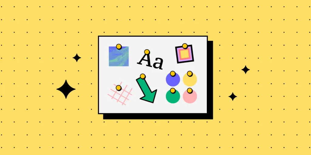
Mood boards are a compilation of illustrations, newspaper cutouts, images or pieces of text put together on a physical or digital board. The purpose of a mood board is to make everyone agree on the creative direction of a project. You can use it for any creative endeavour, and it’s immensely useful in product design. Let’s see do’s and dont’s of UI moodboards.
Keep everyone on the same page, collaborate easily, and make sure you’re meeting your design goals. Try UXPin for free and find out how it streamlines prototyping, user testing, and design handoff. Sign up for a 14-day free trial.
What are mood boards?
A mood board is a visual tool that designers use to capture ideas and communicate them to each other. They can ‘pin’ various visual scraps, illustrations, or fonts to see if they work with one another and help build a unique style for the product. Since they support conceptual work, designers usually create them before proceeding with later stages of UI design, such as mockups.
As a result, all stakeholders can get a rough idea of how the product might look and feel.
Mood boards can either be physical or digital, depending on what tools designers prefers to use. However, most people today use the latter as they’re more accessible, easy to work on collaboratively, and more affordable in the long run. We discuss this in further detail next.
Physical vs digital mood boards
So, what do designers take into account while choosing between the two? It mostly comes down to their preferences and project goals. From a technical standpoint, how do these two mood board types differ?
Physical mood boards involve the use of tangible materials. Such assets include pages from magazines, various types of paper, fabric swatches, and other ‘tangible’ elements.
Some designers may prefer the tactile and immersive experience of physical mood boards. They can be particularly useful when collaborating in person, as well as when you need to feel the texture of what you’re designing.
If the entire design team is based in-house, it’s easy to use physical boards in on-site brainstorming sessions and to apply real-time adjustments. The downside is that creating physical mood boards is more time-consuming. It can also be more costly, since they require printed materials.
Digital mood boards, on the other hand, involve compiling several elements into a digital collage. One of the more distinct types are UI mood boards, which let designers work on digital product interfaces.
Among others, these online boards can feature color palettes, typography samples, and screenshots from inspiring websites or apps. They offer several benefits over physical ones. Two of them stand out the most – convenience and flexibility.
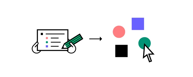
To sum up, if you’re working on a UI, digital mood boards will likely be the best option. They make it easy to share your concepts not only with fellow design team members, but also developers and other project stakeholders.
When choosing between the two, consider all factors. These may include the size of the product development team, project requirements, budget, and whether you cooperate with others entirely on-site or remotely.
How to Integrate Mood Boards in Your Design Process
To make the most of your mood board, you have to effectively integrate it into your design process. Here is how you can use it for a couple of purposes.
For exploratory purposes, when you’re working on a new feature
When creating a product, mood boards can serve as a starting point for gathering inspiration and exploring different design directions. Irrespective whether you’re a solo designer or part of a team.
By curating a collection of diverse visuals, color palettes, typography samples, videos, and other design elements, designers can ignite their creativity and explore various possibilities before deciding on a specific aesthetic. Better yet, mood boards can help you spot any potential issues, well before you work on your wireframes.
For example, say that you’re thinking of using a highly-decorative, serif font. After adding it onto your website mood board, you realize that it wouldn’t be consistent with the remaining elements of the design. Or, that serif type could be challenging to read on smaller screens.
To figure out product branding
You can use brand mood boards to ensure that your design ideas are on-brand. For instance, if you are creating a mobile app for a fashion company, a mood board could include photos from the catwalk, vibrant color palettes, and sleek typography. You could experiment with layout from traditional fashion magazines to see if they would work for your project.
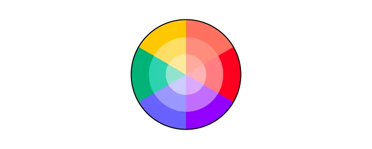
Or, if you are working on a website for a meditation platform, you might want to create a UI mood board consisting of serene nature images, soft color palettes, and minimalistic font.
As you can see, having those elements on the mood board can set the tone for the entire design. It ensures that it’s appealing to the target audience and evokes the right emotions. In fact, studies show that 94% of consumers are likely to recommend a brand with which they are emotionally engaged.
Boosting understanding and collaboration across the product design team
Though indirectly, mood boards serve as an effective communication tool. Particularly, if there are multiple stakeholders involved in the product ideation stage, including your clients.
Sharing the mood board ahead of any brainstorming sessions lets everyone take note of how the current design direction makes them feel. If anyone on your team believes that part of your board doesn’t fit the style, they can share their opinion, and come up with an alternative solution.
Such feedback can influence the direction of the entire project.
Maximizing UI Mood Board’s Potential – Do’s & Don’ts
As mentioned earlier, mood boards can be a great tool in the design process, but you need to know how to use them to get the best results. Here are some do’s and don’ts that you can follow to make the most out of your mood boards.
Clearly define your goals
Before adding any elements to your mood board, set clear goals and objectives for your design project.
- Why are you designing the website or app?
- Who is your target audience and why would they use a product like yours?
- What message do you want to convey?
You should also consider any project requirements or limitations you’re aware of. Also worth noting? Having clear objectives will make it easier to choose the best UI mood board template for your project, if you don’t want to start from scratch.
Diversify your sources of inspiration
Whether you’re creating a digital or physical product, you don’t have to reinvent the wheel. Seek inspiration from various sources, even those that don’t seem to be connected to an industry like yours.
Peruse various websites, magazines, art, and nature. Opening yourself up to more diverse sources means exceeding assumptions and boosting your creativity.
Continuously reference your mood board
The main goal of your app or website mood board is to inspire and remind your team of the core narrative, or their vision, that they must consider when making certain design choices.
Encourage everyone on the team to refer back to the mood board when in doubt, as a guiding reference.
Don’t get attached to your initial concepts
Despite being a source of inspiration and direction, mood boards are not meant to be static. You should look at your mood board as a living document
It should evolve alongside your design and new information on your target audience.
Don’t overcrowd the mood board
Even though mood boards are meant to inspire and guide design teams, it is crucial to keep them simple and well-organized. So, you should resist the temptation to include every interesting piece of design you come across.
Overcrowding the brand mood board can lead to visual clutter and confusion as to which elements take precedence over others. You should only include the most impactful and relevant design elements that align with your goals and convey your desired message.
UI mood boards – the perfect tool for design ideation
As we’ve demonstrated in this piece, UI mood boards enable designers to create digital products that are not only aesthetic, but also trigger the right emotional response. They’re a true source of inspiration for designers, particularly in the first stages of the design process.
Not to mention they create a common understanding between design and software teams, clients, and other project stakeholders, early on in the product development process.
Increase transparency and understanding between designers and other people on the team. Use one of the most collaborative prototyping tools out there. Sign up for a free UXPin trial.


