13 UI Examples to Get Inspired by in 2025

User interface design plays a crucial role in shaping how users interact with digital products. A well-designed UI not only enhances usability but also creates a seamless experience that keeps users engaged. Whether you’re working on a SaaS platform, an eCommerce site, or a mobile app, understanding the best UI practices can elevate your design process.
In this article, we’ll explore UI examples from top brands like Slack, Airbnb, and Spotify. These examples will highlight key design elements, interactive features, and responsive layouts to inspire your next project.
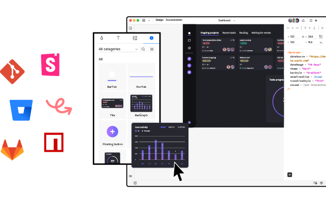
With UXPin Merge, you can design using real, code-based components to ensure that your UI matches development from the start, creating a consistent, production-ready user experience across your projects. Request access to UXPin Merge.
Table of Contents
UI Examples by Industry
Different industries have unique challenges and requirements when it comes to UI design. A well-executed user interface must not only look good but also align with the specific needs of users in that sector.
In this section, we’ll explore UI examples from key industries like SaaS platforms, eCommerce, and marketplaces. By analyzing successful interfaces from each, we can uncover design principles that can be applied across projects, helping designers create more intuitive, engaging experiences tailored to each industry’s unique demands.
SaaS UI Examples
Slack: Excellent Navigation and Intuitive Messaging System
Slack is a great example of UI design in the SaaS industry, particularly for its clear navigation and intuitive messaging interface. The platform excels at organizing a large amount of content into manageable, easy-to-access sections. Its left-hand navigation provides quick access to channels, direct messages, and threads, allowing users to efficiently manage their communications.
Icons in Slack are clear and minimalistic, reducing cognitive load while enhancing navigation. The use of subtle animations and microinteractions, such as hover states and status indicators, improve usability without overwhelming the user. Slack’s messaging system integrates clean, responsive layouts that adapt smoothly across devices, offering a consistent experience.
Slack’s emphasis on simplicity, functionality, and visual clarity makes it a strong UI example for SaaS platforms, especially when dealing with complex communication systems.
Notion: A Flexible Workspace with Customizable UI Components
Notion stands out in the SaaS industry for its flexible, modular workspace design that adapts to different user needs. Its clean and minimalistic UI ensures a clutter-free experience while allowing users to organize information in various ways. With drag-and-drop functionality, users can easily customize pages by adding blocks for text, images, databases, and more.
The UI is designed to be highly adaptable, offering a customizable structure that makes it easy for users to create dashboards, wikis, or task managers based on their preferences. This flexibility makes Notion a versatile tool for individuals and teams, offering a streamlined interface without sacrificing functionality.
Dropbox: Easy-to-Use File Management with Minimalistic UI
Dropbox exemplifies simplicity in its file management system, offering a clean, minimalistic UI that prioritizes ease of use. The interface is intuitively designed, allowing users to quickly navigate through folders, upload files, and manage documents with minimal distractions. The straightforward navigation, combined with recognizable icons and well-structured menus, creates a frictionless experience for users managing files across devices.
The UI’s minimalism, combined with responsive design, ensures that Dropbox delivers a consistent, user-friendly experience across web, mobile, and desktop platforms.
eCommerce UI Examples
Amazon: Well-Organized Product Pages and Seamless Checkout Flow
Amazon’s UI exemplifies efficiency and clarity in the eCommerce world. Its product pages are highly structured, with key information—like pricing, reviews, and delivery options—presented upfront, making decision-making easy for users. The use of clear calls to action, such as “Add to Cart” and “Buy Now,” simplifies the purchasing process.
The checkout flow is designed to be frictionless, guiding users through a quick, intuitive sequence that reduces cart abandonment. Amazon’s seamless UI ensures that users can move from product discovery to purchase with minimal effort, enhancing user experience and increasing conversion rates.
Apple: A Visually Stunning Product Showcase with Responsive, Interactive Elements
Apple’s UI is a masterclass in visual storytelling, offering users an immersive product showcase. Each product page features high-quality images and videos that respond to user interactions, allowing users to explore every detail of the product. With its signature clean, minimalist design, Apple’s interface focuses on elevating the product by keeping distractions to a minimum.
Additionally, the UI is fully responsive, ensuring a seamless experience across devices. Interactive elements like smooth scrolling and animations further engage users, creating an intuitive and visually striking journey from product discovery to purchase.
Marketplace UI Examples
Airbnb: User-Friendly Navigation and Intuitive Search Filters
Airbnb offers one of the most intuitive UIs in the marketplace industry, making it easy for users to browse and book accommodations. The clean navigation allows users to search and filter results with minimal effort, thanks to visually prominent filters and well-organized layouts.
Each listing is presented with high-quality images, clear pricing, and reviews, helping users make informed decisions. The UI remains responsive and easy to navigate, whether users are browsing on desktop or mobile, enhancing the overall booking experience.
Booking.com: Data-Driven Design for Optimized User Choices
Booking.com’s UI stands out because of its data-driven design approach. Unlike many other marketplaces, Booking.com prioritizes visual clarity, but the UI is heavily optimized to influence user behavior. The use of urgency cues, such as “Only 2 rooms left” or “Booked 5 times today,” creates a sense of immediacy, driving users to make decisions quickly.
The interface is clean and functional but focuses on leveraging data to increase conversions, from its prominent filters to its organized listing layouts, designed to help users compare options efficiently.
UI Examples by Platform
Different platforms present unique challenges and opportunities for UI design. Whether you’re designing for the web, mobile, or creating cross-platform experiences, it’s essential to adapt to the specific needs of each medium.
In this section, we’ll explore web-based UI examples from websites that prioritize innovation and usability, highlight mobile UIs that excel in user engagement, and showcase cross-platform UIs that maintain consistency across web and mobile interfaces, providing a seamless experience for users on any device.
Mobile UI Examples
Google Maps: Intuitive Interaction and Real-Time Feedback
Google Maps is a prime example of a mobile UI that excels in user engagement and ease of use. The app’s clean and minimalistic interface ensures users can focus on navigating and finding locations without unnecessary distractions. Its responsive map UI allows for smooth zooming and panning, and real-time updates enhance usability.
Google Maps integrates intuitive gestures for mobile, such as pinch-to-zoom and swipe actions, while offering detailed information layers (e.g., traffic, terrain). Its combination of real-time data and smooth interactions ensures a highly engaging, user-friendly experience across devices.
Duolingo: Clean and Engaging UI for Gamified Learning
Duolingo’s mobile UI is designed to provide a fun and visually appealing learning experience. The interface leverages a clean layout with simple, colorful icons and minimal text, ensuring that users can navigate through lessons easily. The progress indicators are clear and visually engaging, with bars and icons that motivate users to keep advancing.
The use of whitespace and clear sections ensures that users aren’t overwhelmed by too much information at once, creating a structured and easy-to-follow experience.
Desktop UI Examples
BBC: An Accessibility-First UI Approach
BBC’s desktop UI exemplifies an accessibility-first approach, ensuring a wide range of users can easily navigate and interact with the website. The UI includes a high-contrast mode for users with visual impairments, enhancing readability and reducing strain.
Additionally, the interface supports full keyboard navigation, making it accessible to users who cannot use a mouse, and is screen reader compatible, ensuring visually impaired users can navigate content effectively.
Asana: Clear Hierarchical Layout for Efficient Task Management
Asana’s desktop UI is designed for efficiency and clarity, offering a clean, hierarchical layout that allows users to easily navigate between projects, tasks, and subtasks. The interface uses clear, visually distinct sections to help users prioritize their tasks and stay organized.
The minimalist design avoids clutter, while icons and color coding are strategically used to highlight important actions and deadlines.
Cross-Platform UI Examples
Gmail: Consistent and Intuitive UI Across Platforms
Gmail provides a consistent user interface across web, mobile, and desktop platforms, offering users a seamless experience when managing emails. The design maintains familiar navigation with its sidebar, action buttons, and labels, ensuring users can switch between devices without any disruption.
The responsive layout adapts efficiently to various screen sizes, ensuring email management remains intuitive on both mobile and desktop devices. Gmail’s clear use of icons, colors, and spacing keeps the interface simple yet powerful for both personal and professional use.
Trello: Unified UI for Task Management
Trello’s UI is designed for simplicity and consistency across web, desktop, and mobile platforms. The drag-and-drop interface allows users to easily organize tasks, cards, and boards with intuitive controls, making task management effortless. Trello’s UI uses a clean, visual structure, with boards and lists that are flexible and easy to customize.
Whether on a desktop or mobile device, Trello ensures a seamless user experience, maintaining the same functionality, layout, and interaction model, enabling users to work fluidly across multiple devices.
UI Design Best Practices from the UI Examples Above
- Use clear, intuitive navigation UI to enhance usability.
- Offer flexible, customizable UI components for personalized experiences.
- Prioritize minimalism and easy navigation across platforms.
- Structure product pages for fast decision-making with clear CTAs.
- Utilize responsive, interactive elements to create engaging visual experiences.
- Implement intuitive filtering systems for better user journeys.
- Use urgency cues to influence user decisions.
- Integrate real-time feedback for interactive elements.
- Keep layouts clean and progress indicators prominent.
- Ensure accessibility with features like high-contrast modes and keyboard navigation.
- Organize content with clear hierarchies and visual cues.
- Maintain consistent design across platforms for seamless user experience.
Tools for UI Design
Creating impactful UIs requires the right tools that support design, prototyping, and development workflows. Here are some essential UI design tools:
- UXPin: A powerful tool for designing with real, code-based components, ensuring seamless collaboration between designers and developers.
- Figma: A collaborative design platform for real-time interface design, wireframing, and prototyping, perfect for team collaboration.
- Sketch: A popular vector-based design tool used for UI design, offering a wide array of plugins for enhanced functionality.
- Framer: A prototyping tool that blends design and code to create highly interactive UIs and animations.
These tools enhance efficiency and collaboration, helping teams create polished, user-friendly interfaces.
Summary
Effective UI design is crucial for usability and engagement across digital products. Whether for SaaS platforms, eCommerce, or marketplaces, understanding industry-specific UI principles can elevate your design process.
This article explores UI examples from top brands like Slack, Notion, Airbnb, and Trello, highlighting how clear navigation, customization, and responsiveness improve user experience across web, mobile, and desktop platforms. With UXPin Merge, designers can create consistent, production-ready UIs using real, code-based components. Request access to UXPin Merge.


