What defines a great product designer?
Is it clarity of vision? The efficiency of iteration? A sixth sense for involving the right people at the right time?
We can speculate endlessly. Instead, we spoke with 10 experienced designers from a variety of backgrounds and industries to collect their thoughts on how to become a better designer in 2016.
We learned about their successes, their failures, and their new perspectives on design. From enterprise UX to travel sites and design agencies, here is their top advice for improving your skills within a larger product team.
1. Kick formalities to the curb
Austin Knight, UX Designer at HubSpot

This year, I paid a guy to get drunk and run a user test of HubSpot.com. Then I toured the country talking about the results.
I had the time of my life. But perhaps more importantly, I was able to change the way that my team (and many teams around the country) approach qualitative user research.
We ran an unorthodox usability test (originally as a joke), ended up gathering surprisingly valuable feedback, applied that feedback to our design, generated measurable results, and ultimately learned something new about how user testing should be conducted. None of this would have been possible without the support of the awesome, forward-thinking company that I work at.
Don’t be afraid to test everything you know about “the way design is done”. I am realizing how critical it is to work with people that are open-minded, humble, and truly motivated to make something great.
When meeting designers, I pay little attention to education or certifications, and much more attention to experience, passion, and demonstrated ability. This year, I experienced the heightened success and satisfaction that comes from working with people who focus less on formalities and more on creativity, agility, open-mindedness, and ultimately having fun along the way.
In 2016, I urge more companies and product teams to rethink the ways that they work and experiment more with new concepts and ideas.
2. Craft product personality before beauty
Jessica Phan, Founding Designer at Zugata

As the solo and founding designer at an early stage startup, I learned it is crucial to focus more on the brains and personality rather than the face and beauty of the product.
Because speed is a startup’s best friend, we have to execute quickly, sometimes at the expense of few misplaced pixels, icon inconsistencies, and type crimes.
And as much as it’s painful to lower design standards, the sacrifice must be made. We learned that what we are essentially building is still a prototype. But once we discover that product stickiness, we return and focus on the face and beauty of the product.
For new features we launch in 2016, we will continue to iterate scrappily and test quickly. And when we nail the engagement and retention for existing features, we will go back and polish up the aesthetics.
3. Scalable design systems are the future
Drew Thomas, Chief Creative Officer at Brolik
In 2015, I learned that the only way to be future-friendly is to separate everything into its most basic and versatile form.
Things are changing fast– frameworks, networks, devices, even the “Internet of Things”. The things we make today need to do a lot more tomorrow. It’s not too hard to be prepared, though. Content can be separate from front end code and accessed via API. We can create many component-specific stylesheets to be rearranged and used anywhere. UX can be built with UI kits or pattern libraries to be reused in many different places across different applications.
The point is that in 2016 and beyond, it won’t be possible to keep up with all of our digital tasks in a cost efficient way unless we standardize, organize, and see “digital” as a single system with many versatile and reusable parts.
The biggest way it’s going to affect us is we’re pushing content APIs for all of our clients. Basically, we’ll build them a “standalone” CMS that has no specific front end (website, app, whatever). We started doing this already, but we decided to build out our platform this way and make it official.
Other than that, it’s mostly atomic design-like stuff. We don’t go full on atomic and use the same terminology and everything, but we’ve been building more and more that way for each project.
We recently started creating “live” UI kits instead of a full visual design. So we combine UXPin prototypes with the UI kit elements and the design just happens. It’s much faster than creating a high-fidelity mockup from scratch.
4. Evangelize UX through a common language
Justin Mifsud, UX Designer & Founder of UsabilityGeek
While UX evangelization has remained a core aspect of the UX Designer’s role, you need even more skills and knowledge now.
For example, as a UX consultant, I have witnessed many company owners stress the importance of conversions as a result of design changes
If a UX designer is not familiar with conversion and how to implement it in their design (e.g. more prominent CTA, content design that enables the reader to focus) etc. etc. then that is a serious problem. Also, more than ever, the UX designer also needs to communicate with other stakeholders using their jargon and be able to present their ideas using notation that they can understand.
Long story short: the UX designer needs to evangelize through common knowledge. You’re better able to sell the ROI of UX when you’re able to incorporate theories from other fields such as marketing, SEO and general business strategy.
5. Pick your battles patiently
Alina Bochkacheva, Product Designer at Duo Security

In 2015, I joined the best and biggest team I have ever worked with at a 200+ person company.
When working on enterprise products, I had to learn how to make decisions and reach common ground with much bigger groups of people. What do you do when you disagree?
Sometimes you just have to step aside, look at everything as a whole and ask yourself “Is it that important? Will it make a big difference to the user?”. On the other hand, sometimes we feel very strongly about our decisions.
How do we bring our team members to the same page?
My answer is by walking them through, step by step, how we got here. And before you react to any feedback, just give it 5 minutes first.
6. Show (don’t just tell) the value of UX
Alex Gamble, Product Designer at PwC Digital

Validating business and product decisions with users is still a foreign concept for a lot of people. As product and UX designers, we need to be brave about our values.
It’s easy to become intimidated and conform to a stronger opinion but we need to be brave and stand up for our ourselves. At PwC Digital, we’ve applied human centered design to create websites, apps, parking machines, airplane seating, the flow of traffic and business strategies. We know it works.
My resolution for next year is to continue to be brave, show the value of being user centered, and encourage my peers to do the same.
Firstly, it’s important to not get flustered.
Break down resistance by telling stories using concrete examples. Talk about the benefits of being user centered and what can happen if you aren’t. Make your stories credible – talk about what Google, Apple or IDEO have done and use statistics to back up your points.
If this doesn’t work, offer to give a demonstration. Experiencing a user testing session for the first time can be an eye opener for a lot of people.
Product and UX designers will always encounter resistance. It’s part of the job. But it’s our obligation to be brave and continue to preach our values because, at the end of the day, you will create an excellent product or service if you follow the fundamental process correctly with everyone.
7. Mentoring other designers improves your own skills
Lukasz Lysakowski, Design Director at Peek

2015 was an inspiring year for me. It was a year of collaboration and mentorship. As a designer with 15 years of experience, it was my time to give back.
Right away, I became a member of Designers Guild (founded by entrepreneur, engineer, and former Apple & Yahoo designer Marissa Louie). It’s a space to give broad mentorship by providing answers and feedback to questions. Better still, the group allows me to engage designers outside of my social circle.
I also joined Cascade SF, a designer community that offers one-to-one mentoring sessions called UXNights. As a design mentor, I offer direct feedback, career guidance and general advice. I take this mentorship role with care since conversations involve careers.
The act of giving back creates confidence in my experiences and myself. My confidence builds on itself, driving me to pursue deeper avenues of mentoring.
In 2016, I seek to pursue additional avenues of mentoring such as writing and creation of educational materials. I plan to deepen my mentorship by providing sustained dialogue instead of single interactions. Through multiple paths of mentorship, I hope to improve the quality of the design practice and my own skills as a designer.
8. Identify the smallest solution with the biggest impact
Ghaida Zahran, Product Designer at Change.org
Earlier this year, I joined the awesome design team at Change.org.
I was excited to dig into the product and start identifying opportunities for improvement. Having come from mostly an agency background like ZURB, I began approaching design problems similarly to how I would have done with client projects– through redesign.
While everyone on the team is supportive and encouraging of new ideas, there weren’t a lot of tangible results from experiments involving major changes to the UI.
I then started working with product managers on smaller solutions. We got into the habit of quickly running experiments to test the impact of small changes to the interface and flows. We were able to significantly increase our numbers in key areas of the product through small, focused experiments.
9. Practice Lean & Agile UX simultaneously
Rico Lavender, Product Designer at LifeLock

The biggest lesson was learned while working with a startup company that failed to get off the ground. They just weren’t flexible enough in their design processes.
As designers, we really need to check ourselves when it comes to our processes and mindsets.
Going into 2016, my approach will start with these two questions simultaneously, not one above the other, but both holding equal weight:
Based on my technical background, I also encourage designers to approach technology differently.
Treat technology like Legos. Embrace the atomic design framework and don’t be afraid of rebuilding existing components in better ways based on the answers to the questions above.
10. Your final design ≠ final product
Ian Schoen, Product Designer at Salesforce

Working on a product team in the enterprise UX space, my #1 lesson in 2015 was that what’s designed doesn’t automatically transfer to what’s built. And that’s a good thing.
Between design and development, we designers are involved in a lot of shepherding, educating, and sometimes, compromising around design. What we consider our “final” iteration isn’t always how the product ships.
UX is a game of putting together a puzzle in which everyone holds a different piece.
For example, developers have offered up new edge cases and product managers have raised arguments around business strategy that I’d never even considered. Based on their input, I could develop upon what I once thought was the “final design”. In the end, the product ended up better for it. You need all the pieces from a product team (not just design) to build something truly good.
We talk a lot about empathizing with users, but we must empathize with other stakeholders too.
The stronger your relationship with developers and product managers, the more likely good design will be realized. This year, I attended more developer meetings, worked with developers side by side and messaged them more, even if it was just to check in to say hello. You wouldn’t think so at first, but it made a huge difference in how design was perceived and treated.
With time you could see developers getting excited about the product vision, feeling more invested in design decisions, and advocating for better UX themselves.
And so I learned final design is not a product of only yourself.
Next Steps
From our discussions with the above designers, it’s quite clear that the future of product design continues to revolve around collaboration.
Scalable designs (e.g. atomic design) empowers developers and designers alike to modify frameworks without risking inconsistency. Mastery of business concepts helps designers better advocate their ideas with other stakeholders. Small measurable iterations quickly add up to more focused feature sets.
Regardless of your title, don’t limit yourself to only crafting products. Don’t be afraid to design better business processes. Remember that great businesses are themselves designed, so the solution sometimes requires a completely new perspective on the business model itself.
Stay lightweight, stay collaborative, and keep questioning the status quo.
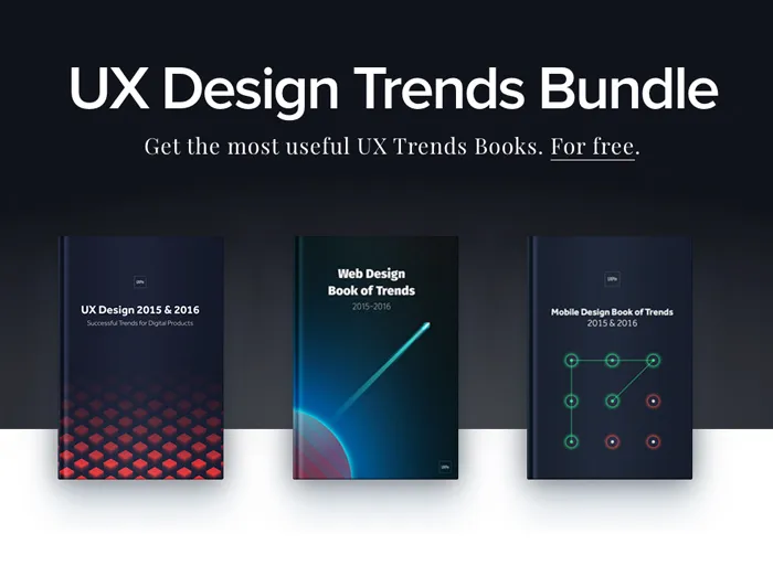
To learn more about UX and product design techniques that will prevail in 2016 and beyond, check out the free Definitive 2016 UX Design Trends e-book bundle below. You’ll get 350+ pages of advice and 300+ examples of mobile, web, and UX tactics.

