The Practical Guide to Empathy Maps: 10-Minute User Personas
Where does the empathy map come in?
UX designers know better than anyone — it’s what’s inside that counts. As in, the user’s thoughts and feelings, and how those affect what they say and do.
When created correctly, empathy maps serve as the perfect lean user persona:
- They quickly visualize user needs (especially to non-designers)
- They fit perfectly into a Lean UX workflow as a starting point for user knowledge (you’ll build more as you prototype and test)
- Because they’re quick to create, they’re easy to iterate as you revise assumptions based on real data
- They prime stakeholders for your design ideas since they’ve thought beyond their own experiences
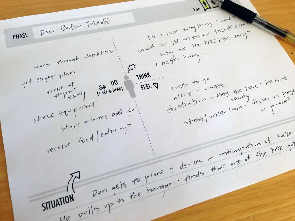
Photo credit: “How to Use Persona Empathy Mapping.” Nikki Knox (UX Magazine).
That’s what this article is about: a clear-cut, all-inclusive guide on empathy maps, answering why, when, and how to use them.
Let’s get started.
UXPin as a comprehensive design tool that facilitates empathetic design decisions by enabling real-time collaboration and feedback. With UXPin, teams can seamlessly integrate empathy maps into their design process, ensuring that user insights are effectively translated into actionable design solutions. Try UXPin for free.
Table of Contents
What Are Empathy Maps?
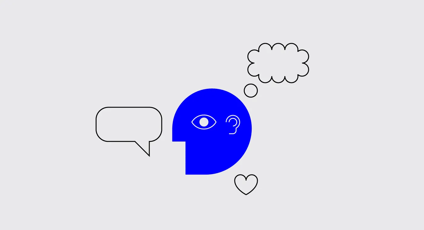
An empathy map in UX design is a collaborative tool that helps teams better understand and visualize the user’s perspective. It typically consists of four quadrants that explore what a user thinks, feels, says, and does. By filling out these sections, designers can develop a deeper understanding of user motivations, pain points, and behaviors, which helps guide more user-centered product decisions.
Empathy maps are especially useful during the early stages of the design process to align teams on user insights and drive empathetic design solutions.
When to Use Empathy Maps
Empathy maps are most useful at the beginning of the design process.
Try to complete empathy maps before the product requirements, but after the initial user research. Product strategy is about solving problems, and empathy maps shed light on which problems to solve, and how. This also makes them a great tool for redesigns as well.
When done well, empathy maps create a “UX domino effect” that affects the entire project. Empathy maps affect the product requirements, which affect the product strategy, which affects the wireframes, mockups, prototypes, etc.
However, empathy maps work better if they’re drawn from real data, so they should be made after user research like user interviews. But in a pinch, empathy maps can still be built on your existing knowledge and stakeholder feedback. Quick basic empathy maps offer valuable insight in any meeting — hence the “10-minute persona” nickname.
Empathy Map Format
A common UX empathy map is divided into four quadrants, outlining notes on four different aspects of the user’s internal experience. The quadrants can vary based on needs and preferences, but almost always contain:
- Thoughts — Quotes of what the user is thinking, i.e., “I wonder if there’s an example?” or “I hope this doesn’t take long.”
- Feelings — The user’s emotional state, i.e. “is confused by the navigation and blames themselves.”
- Actions — The user’s behaviors, whether in general or in response to a specific instigator, i.e., “returns to the home page every time they don’t know where to go.”
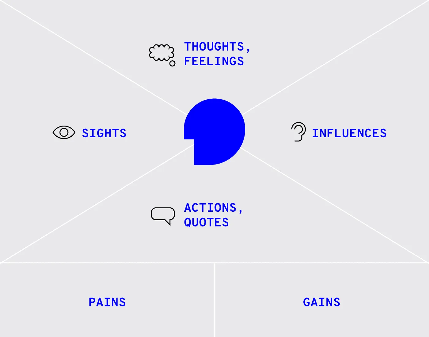
Photo credit: “Adapting empathy maps for UX design.” Paul Boag (boagworld).
Some common variants include:
- Sights — Where the user’s eyes go, i.e., “loves the colorful mascot.”
- Quotes — Things the user says, similar to thoughts. Can be pulled word-for-word from user interviews, or based on existing knowledge.
- Influences — What the user has heard from third parties that might influence how they act, i.e., “They say this is easier to use than Photoshop.”
In addition, at the bottom in some empty space, it’s always a good idea to include:
- Problems (“Pains”) — Any obstacles worth considering, i.e., an unfamiliarity with technology, or a short attention span.
- Goals (“Gains”) — What the user hopes to accomplish, i.e., complete the task within 5 minutes.
Alternatively, you can summarize the above two areas by filling in the simple statement, “The user needs a way to ________________ because ________________.” Pay attention to the second blank, since user motivation is the real raw material for feature ideas.
Last, you may want to leave a space for general notes, such as the type of device the user is accessing your product from.
Optionally, it may help to include a picture of the user to make the document feel more real.
Empathy Map – The Creation Process
It’s important to note that empathy maps can be created for a general understanding, or for specific tasks and situations. Broad empathy maps are more useful as quick user personas because they are not based on a single user scenario. If you can spare the time, you could create several task-based empathy maps to feed into more detailed personas.
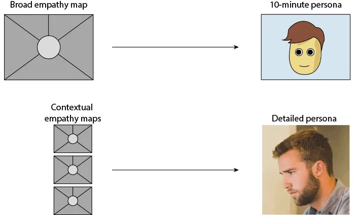
For example, if you’re working on a web app redesign and notice users having difficulty logging in, you can center around the user’s mind as they complete (or ignore) this task. But this information is most relevant to this particular context (logging in). You won’t understand why a user would want to use your web app in the first place.
Let’s examine how to create a broad empathy map as a 10-minute user persona. Before you start the exercise, you will need at least basic understanding of your user segments (e.g. Sally the College Student, Sean the Young Professional).
1. Find a whiteboard, a large flip chart, or print out this free template.
2. Set aside 30 minutes to 1 hour for the session.
3. Invite the core product team members: product manager, developers, marketers, and of course other designers.
4. Ask a broad question to help unpack everyone’s thoughts and assumptions, e.g. “Why would somebody buy a new iPhone?”
5. Set aside sheets of paper or space on the whiteboard according to the user segments (e.g. one for Sally, one for Sean).
6. Hand out sticky notes and encourage everyone to write down their thoughts regarding each of the empathy map’s four quadrants.
7. Review the completed empathy map and discuss any patterns and outliers.
As you might expect, sometimes it’s difficult to get the creative juices flowing and/or really pinpoint the issues at hand. If your team is stuck, Demian Farnworth of the Copyblogger recommends a moderator posing questions like these to help team members better visualize their users:
- What environment are the users in when using your product?
- Are they having fun, or do they want to get it over with?
- What’s their life like outside of using the product?
- What kind of day are they having?
If all else fails, try a bit of role-playing, where one person “plays” the user, and ask them questions or play the role of the product, eliciting responses.
At the end of the session, wrap up what was learned. Did anyone’s opinions change? Is there a better direction to go with the product design? Were any of the responses based on data, or pure assumption? These answers are partly why you made an empathy map in the first place.
Remember that the benefit of empathy maps are their convenience. They’re designed to be a quick collaborative exercise rather than exhaustively thorough. You’ll gather more important insights once you’ve started prototyping and testing your designs with at least 5 users.
What to Do With Finished Empathy Maps
While a large part of empathy maps’ utility are the process of making them, they are still quite useful as documentation.
Share the results of the empathy map with anyone on the product team who wasn’t able to join the exercise. Executive stakeholders, too, might be interested in the more actionable takeaways from the exercise — although you should explain the bottom line upfront, and the reasoning afterward.
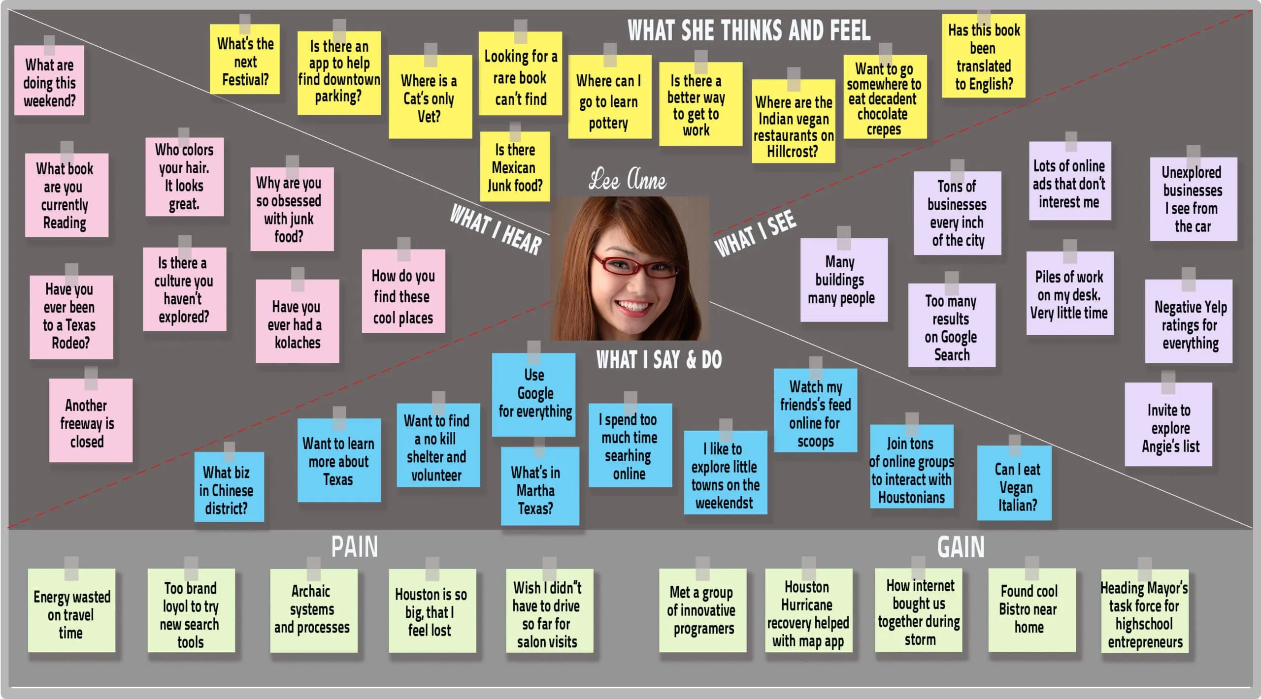
If you happen to be using UXPin, you can also upload a picture of the empathy map into your UX project so that others can comment on it as needed.
Next Steps
While broad empathy maps aren’t the most thorough personas, they certainly help everyone think more like a user while checking their own assumptions. Certainly not a bad result for a single 30-60 minute workshop.
If you’re looking for a way to integrate empathy maps into your UX design process seamlessly, consider using UXPin. It offers powerful collaboration tools that allow teams to work together in real-time, making it easier to incorporate user insights into your designs. With UXPin’s interactive prototyping and design system features, you can bring empathy-driven design to life while maintaining consistency and functionality. Try UXPin for free.


