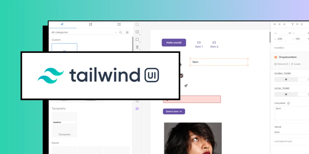
Tailwind Design System – How to Start

To build a Tailwind Design System in UXPin, begin by leveraging the built-in Tailwind UI library, customizing foundational components for brand alignment. Use UXPin’s AI Component Creator for unique elements, set global and local themes for consistent styling, and add icons with Heroicons and patterns with Hero Patterns.
Document each component to maintain accessibility and scale. For handoff, UXPin exports HTML with Tailwind classes, ensuring a streamlined design-to-development process. This approach creates a flexible, consistent, and production-ready design system. Try UXPin and build your design system today.
Table of Contents
- What is Tailwind Design System?
- Why use Tailwind for a Design System?
- Building a Tailwind Design System in UXPin
- Start with the Tailwind UI Library in UXPin
- Create Custom Tailwind Components with UXPin’s AI Component Creator
- Customize Components and Patterns
- Set Up Global and Local Themes
- Add Iconography and Patterns with Heroicons and Hero Patterns
- Documentation and Testing for Consistency
- Developer Handoff with Spec Mode and HTML Export
- Use Tailwind Design System in UXPin
What is Tailwind Design System?
Tailwind design system leverages Tailwind CSS’s utility-first approach to create a cohesive and scalable collection of design elements, such as colors, typography, spacing, and components.
By organizing and styling components with Tailwind’s utility classes, a Tailwind design system promotes consistency, flexibility, and rapid development across projects. It simplifies the implementation of UI elements directly in code, ensuring that designers and developers work seamlessly together while maintaining a unified look throughout the product.
Why use Tailwind for a Design System?
Using Tailwind for a design system offers several advantages:
- Consistency Across UI: Tailwind’s utility classes enable a consistent styling approach, ensuring every component and element follows the same design rules.
- Scalability and Flexibility: Tailwind’s modular structure allows you to build reusable, adaptable components that scale well across projects.
- Rapid Development: Utility classes make it easy to create and maintain design elements directly in code, reducing custom CSS and streamlining collaboration between design and development teams.
- Customization: Tailwind’s configuration options allow for tailored themes and responsive design, supporting brand-specific needs within the design system.
Tailwind CSS can be a powerful choice for companies looking to create fast, scalable, and cohesive design systems across their digital products. OpenAI uses Tailwind CSS for its marketing site, leveraging its quick styling capabilities and utility classes for building a cohesive, clean interface.
GitHub Next and Shopify also integrate Tailwind into their marketing and SaaS platforms, benefiting from Tailwind’s modularity, which aids in maintaining a consistent brand aesthetic across a variety of complex pages.
Building a Tailwind Design System in UXPin
Creating a design system with Tailwind CSS in UXPin leverages the power of code-backed components and UXPin’s Tailwind UI integration. This guide outlines the process step-by-step, helping you build a robust, responsive design system.
Start with the Tailwind UI Library in UXPin
UXPin offers a built-in Tailwind UI library integrated via Merge. Begin by exploring the 18 pre-built components available, including essential UI patterns and layouts. These built-in components are fully customizable, providing a solid foundation for your system.
Create Custom Tailwind Components with UXPin’s AI Component Creator
For unique elements, UXPin’s AI Component Creator streamlines the process. Describe the component you need in simple language (e.g., “responsive card with hover effects”), and the AI will generate it using Tailwind classes. Once generated, save it to your component library to expand your design system.
Customize Components and Patterns
Tailwind’s utility-based styling allows for flexible customizations. Tailor colors, sizes, and typography directly within UXPin to align with your brand’s visual guidelines. Use these foundational components as the building blocks for more complex elements in your design system.
Set Up Global and Local Themes
Tailwind UI in UXPin supports global and local theme management, allowing you to establish a consistent color palette, typography, and spacing across your design system. For consistent branding, use global themes. For tailored component variations, apply local themes to specific pages or elements.
Add Iconography and Patterns with Heroicons and Hero Patterns
Enhance your design with Tailwind’s Heroicons, high-quality SVG icons perfect for interactive elements. Hero Patterns provide seamless SVG background options, adding polish to your UI without heavy custom CSS work. These elements can be added directly within UXPin, making them available across your design system.
Documentation and Testing for Consistency
Ensure your components align with Tailwind principles and meet accessibility standards. Document each component, its purpose, and usage, using UXPin’s Design System Library. This makes it easy to share and scale the system with your team.
Developer Handoff with Spec Mode and HTML Export
One of the biggest advantages of Tailwind in UXPin is the streamlined design-to-development process. Once your design is complete, UXPin allows you to export HTML with Tailwind classes or share the design in Spec Mode for detailed, production-ready handoff. This minimizes manual coding and ensures your design matches the final product.
Use Tailwind Design System in UXPin
Using UXPin and Tailwind together empowers your team to create a flexible, scalable design system. From building foundational components to handing off production-ready HTML, this approach brings consistency, speed, and clarity to the design-to-development workflow. Discover UXPin Merge.


