Tailwind Best Practices to Follow in 2024

Most front-end developers constantly seek ways to streamline our workflows and craft responsive, aesthetically pleasing websites. Tailwind CSS, with its utility-first approach, has emerged as a powerful tool to do just that – build website interfaces. If you’re looking to optimize your use of Tailwind, you’ve come to the right place. In this article, we’ll explore Tailwind best practices to help you harness the full potential of this utility-first CSS framework.
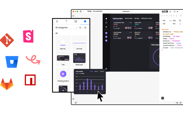
Bridge the gap between design and development by using fully coded Tailwind components in design. Use UXPin Merge with a built-in Tailwind UI library and empower your team to create consistent, high-quality user interfaces faster than ever before. Make it easier to collaborate, iterate, and innovate. Try UXPin Merge today and see how it can transform your Tailwind development process. Request access now.
What is Tailwind CSS?
Before diving into the best practices, let’s briefly discuss what Tailwind CSS is. Tailwind is a utility-first CSS framework that allows you to design directly in your markup by using classes. Unlike traditional CSS frameworks, which provide pre-designed components, Tailwind gives you low-level utility classes, such as flex, pt-4, text-center, and grid, enabling you to build custom designs without writing any CSS.
Why Tailwind CSS?
1. Flexibility and Customization
Tailwind offers unparalleled flexibility. You aren’t constrained by predefined styles and can customize your user interface to match the design specifications of your project.
2. Rapid Development
With Tailwind, you can build UIs faster. The framework’s utility classes allow for quick iterations and tweaks, enabling you to see changes in real-time as you code.
3. Maintainable Codebase
Using Tailwind leads to a more maintainable codebase. With a consistent set of utility classes, your styles remain clear and predictable, which is especially useful in large projects with multiple contributors.
Best Practices for Using Tailwind CSS
1. Leverage Tailwind’s PurgeCSS
One of the most common concerns with Tailwind is the potential for bloat due to the large number of utility classes. However, by configuring PurgeCSS, you can automatically remove unused CSS, reducing the final file size and improving performance. Tailwind makes it easy to integrate PurgeCSS into your build process:
module.exports = {
  purge: ['./src/**/*.html', './src/**/*.js'],
  // other configurations...
};
By specifying the files where your classes are used, PurgeCSS will strip out any unused styles, ensuring your CSS is as lean as possible.
2. Use Tailwind’s Configuration File
Tailwind’s configuration file (tailwind.config.js) is your best friend when it comes to customizing your design system. This file allows you to extend the default theme, add new utility classes, and even define custom screens and breakpoints.
For example, you can add custom colors to your theme:
module.exports = {
  theme: {
    extend: {
      colors: {
        brand: {
          light: '#3fbaeb',
          DEFAULT: '#0fa9e6',
          dark: '#0c87b8',
        },
      },
    },
  },
};
This not only keeps your code DRY (Don’t Repeat Yourself) but also ensures consistency across your project.
3. Adopt a Mobile-First Approach
Tailwind encourages a mobile-first design methodology, which is an industry standard in modern web development. By default, Tailwind’s breakpoints are designed with mobile-first in mind:
<div class="text-center sm:text-left md:text-right">
  <!-- Your content here -->
</div>
In this example, the text is centered by default, left-aligned on small screens (sm), and right-aligned on medium screens (md). This approach ensures that your design adapts gracefully to different screen sizes.
4. Utilize Tailwind UI
To save even more time, consider integrating Tailwind UI, a library of pre-designed components built with Tailwind CSS. Tailwind UI provides a robust set of components, from navigation bars to form elements, which you can easily integrate into your project.
<div class="bg-gray-50">
  <div class="max-w-7xl mx-auto p-4 sm:p-6 lg:p-8">
    <!-- Tailwind UI component here -->
  </div>
</div>
Tailwind UI not only accelerates development but also ensures that your designs adhere to best practices in accessibility and responsiveness.
Try a built-in Tailwind UI library in UXPin Merge, a drag-and-drop design tool that helps you visualize UI with code-backed components that engineers use in production. If you can’t see a component in UXPin, you can use Custom Component and paste in the code from the Tailwind UI website or generate one with AI Component Creator. Try it for free.
5. Optimize for Performance
Even with PurgeCSS, it’s essential to keep an eye on performance. Tailwind CSS can lead to an excessive number of classes in your markup. While this is generally not an issue, it’s good practice to use reusable components and minimize redundancy.
Moreover, consider using the @apply directive to create reusable styles within your CSS:
.btn-blue {
  @apply bg-blue-500 text-white font-bold py-2 px-4 rounded;
}
This approach reduces repetition in your HTML and keeps your codebase cleaner.
6. Stay Organized with Components
As your project grows, it’s crucial to maintain an organized codebase. Tailwind’s utility classes can lead to cluttered HTML if not managed properly. Grouping related classes together and using semantic class names can make your code more readable:
<button class="btn btn-blue">
  Click me
</button>
In this example, btn and btn-blue are reusable classes that encapsulate specific styles. This method enhances readability and simplifies future updates.
7. Integrate with a Design System
To get the most out of Tailwind CSS, integrate it with a design system. Tailwind’s utility-first approach aligns well with modern design systems, allowing you to create a consistent and scalable UI. This integration helps bridge the gap between designers and developers, ensuring that both are on the same page.
Common Pitfalls and How to Avoid Them
1. Overuse of Utility Classes
While utility classes are powerful, overusing them can lead to verbose and cluttered HTML. Strive for balance by using Tailwind’s @apply directive in your CSS to avoid repetitive code.
2. Ignoring Accessibility
Accessibility should never be an afterthought. Tailwind’s documentation provides guidance on how to build accessible UIs, but it’s your responsibility to implement these practices. Use appropriate ARIA attributes, and always consider users with disabilities.
3. Not Taking Advantage of the Full Ecosystem
Tailwind CSS is part of a larger ecosystem that includes Tailwind UI, Headless UI, and third-party plugins. Ignoring these resources can slow down your development process. Explore and integrate these tools to maximize your efficiency.
Conclusion
Tailwind CSS is a powerful framework that, when used correctly, can significantly enhance your front-end development workflow. By following the best practices outlined in this article—such as leveraging PurgeCSS, customizing the configuration file, and adopting a mobile-first approach—you can build responsive, maintainable, and scalable websites with ease.
Don’t forget to explore Tailwind UI for pre-built components that can save you time and ensure that your designs are both beautiful and functional. Tailwind’s utility-first approach might require a shift in mindset, but once mastered, it will become an indispensable part of your development toolkit.
As you refine your Tailwind CSS skills, why not take your front-end development to the next level with UXPin Merge? UXPin Merge allows you to use Tailwind UI components and create a unified design environment where design and development are perfectly aligned.
Imagine designing with real Tailwind components, complete with all the responsiveness and interactivity built in. No more static mockups or handoffs—just a seamless workflow where your designs are as close to the final product as possible. UXPin Merge ensures that what you design is exactly what you’ll get in production, saving time and reducing errors. Request access to UXPin Merge.


