Documentation must be actionable. It must have a purpose beyond creating a paper trail.
The best design documentation enhances the design process and communicates design thinking to others. If a UX document accomplishes this, it drives the strategy rather than acts as a lagging indicator.
Design documents should complement, not supplement, the design process.
In this piece, we’ll explain how to approach UX documentation as a strategic exercise. We’ve included links to some of our favorite resources, as well as described processes that worked well during our own product redesign.
The 3 Stages of UX Design
Despite its creative points, all design boils down to a methodical, almost scientific approach. While everyone’s design procedure varies according to their own personal tastes or constraints, in general the process must cover three essential stages, with plenty of iteration in between.
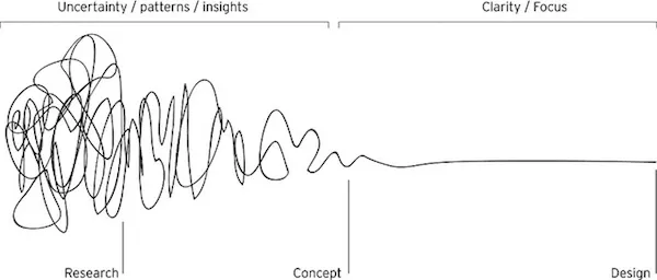
Photo credit: Rosenfeld Media
1. Research & Define — Analyze what your users want (“build the right product”), then start ideating the appropriate solution.
2. Design — Create ways to give them what they want (“build the product right”).
3. Usability Testing — Confirm your results with users, or discover what you need to change.
You’ll repeat this cycle multiple times with each iteration bringing the product closer to perfection. While the stages aren’t always one after another, testing should always occur at least twice in your design process (one for the lo-fidelity prototype, one for the hi-fidelity prototype).
And as for research, ideally you’ll want to know as much as you can before you start, so it should be the first step…but that said, it’s never a bad time to learn more about your users.
We actually kicked off the UXPin redesign process by interviewing 15 UX designers from multiple industries. Once we consolidated the insights, we created a quick UX strategy document to help shape the core product experience. The strategy document serves as a guideline rather than requirements document since we only described the basic design principles. From there, we created and tested a lo-fi prototype, then created and tested a hi-fi prototype. As we entered beta testing, we also interviewed 7 more designers.
1. User Research
Now that we’ve outlined the process, let’s talk about where documentation fits in.
If you’re creating a document just to have proof that you did something or because that’s the “standard process,” then you’re wasting your time.
While the Waterfall Model of design is outdated, there are some lessons we can take from its linear roots.
First, the research phase is where you make sure you’re going in the right direction instead of blindly sprinting ahead. Being prepared and having a solid plan means you won’t have to backtrack as much later, so a little extra work at the beginning saves you a lot of time and effort at the end.
This is the point of the design process where you really come to understand your users. Collecting data through user research (interviews, field studies, etc.), mixed with some old-fashioned empathy, will give you a good idea of whom you’re designing for, and what they want.
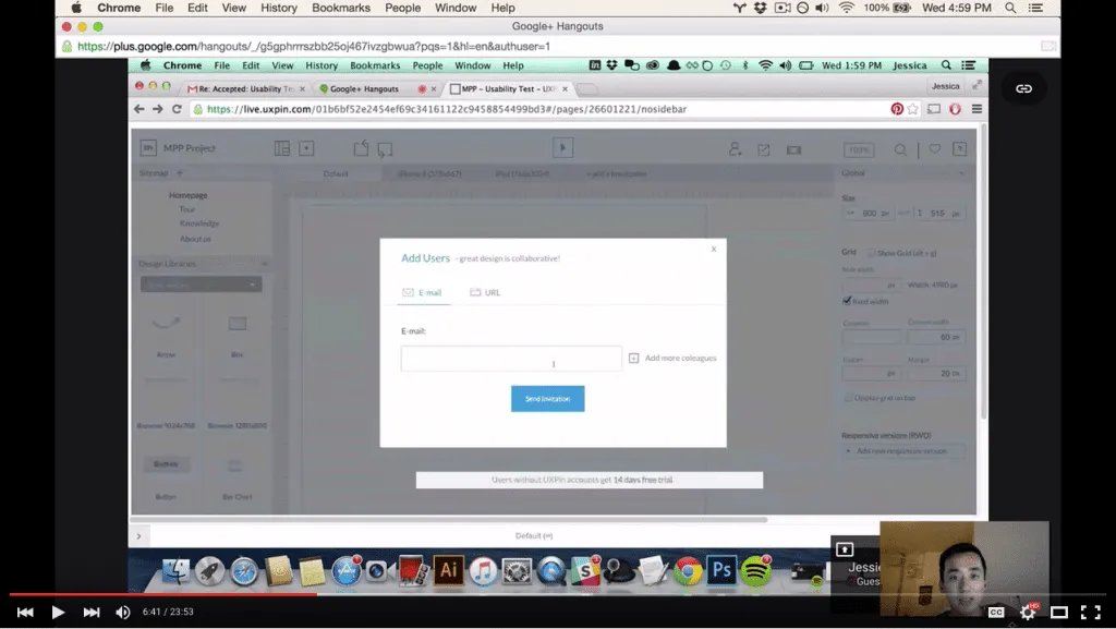
Our UX Researcher Ben Kim tests the redesigned UXPin with Designer Jessica Tiao of KissMetrics
Additionally, you’ll want to understand the needs of the stakeholders, just as important as the end-users. You could design the greatest product in the world, but it would never see the light of day unless the stakeholders are satisfied.
Strategic documentation for this stage
The research-stage documentation can be broken up into two sections: collecting the data and what you do with it.
Collecting the data:
i. Stakeholder interviews — The first thing is understand business needs and technological parameters, and the best way to do this is to ask the sources. Both the questions you ask and the notes you take on the answers will determine how close to the mark your final product hits. Since we’re a startup, our researcher Ben Kim held 30-minute stakeholder interviews with our heads of marketing, product management, UX, and our CEO Marcin Treder. He learned everyone’s preferences, concerns, and goals for the redesign.
ii. User interviews — Just like stakeholder interviews, you need to ask the right questions to get the most helpful answers. User interviews prove invaluable for understanding the people you’re designing for, which is the cornerstone of the design process. Other options for collecting initial user data are field studies and diary studies.
iii. User surveys — While not as personal as user interviews, user surveys are easier to orchestrate and can cover more people — plus they are natural documentation that are easily forwarded to teams. Surveys are great for taking a quantitative approach to qualitative data. You can create these quickly with Google Forms, or use SurveyMonkey for something more complex. Surveys are especially useful during later-stage beta testing.
iv. Competitive Audit — Examine strengths and weaknesses of your competitors using an overlaid heuristics diagram. Evaluate areas such as ease of form completion, clarity of navigation, accessibility, trust factors, etc.
Showcasing the data:
i. User personas — Once you have adequate data on your users, you can build fictional user personas. These act as stand-ins for the actual user during the design process, focusing more on behaviors rather than demographics. At UXPin, we use lightweight personas informed by user interviews and in-app data. We define the person’s role, daily responsibilities, and motivations.
ii. User scenarios — These logic exercises take personas a step further — they outline how a persona would act in a specific situation, including what pages they visit and why. In the below example created during our redesign process, you can see how we tried to imagine a realistic scenario for a marketer collaborating with a designer in UXPin. The thought exercise helps us understand that speed and ease-of-use are the top priorities when commenting on designs. For fast user scenarios, Google spreadsheets works quite well since you can also collaborate with other product team members.

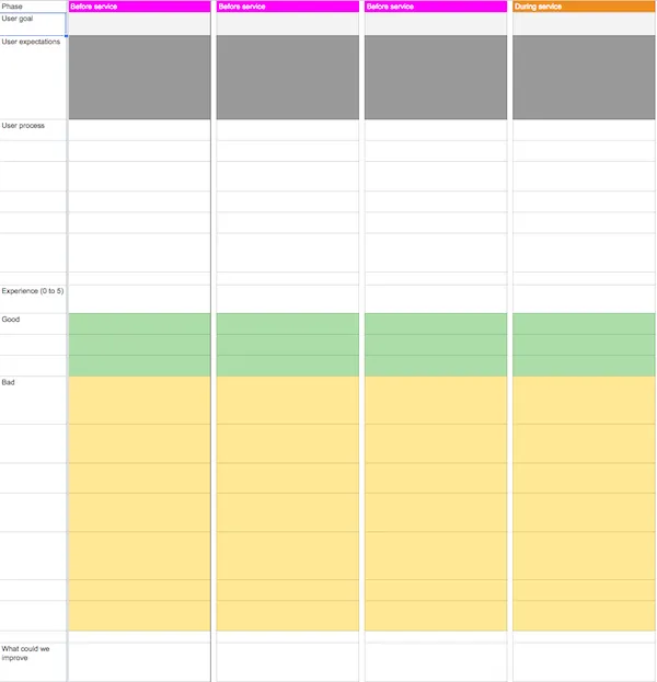
iii. Customer journey maps — The ultimate document for understanding your user, journey map out the personas and user scenarios at each step of the experience. User emotions, quality of experience, product weaknesses, and other factors can all be documented. Moreover, they cover customer touchpoints before, during, and after service so so you can gauge the lasting effect of your design. For the sake of speed and collaboration, we created our template in Google spreadsheets (see below example).
iv. Product documentation — While optional in the age of prototyping, documentation like product requirement documents and functional spec documents consolidate market and user research into a unified vision. ProductHunt’s documentation is a fantastic example. Meanwhile, style guides help ensure consistency and adherence to best practices during the design stage.
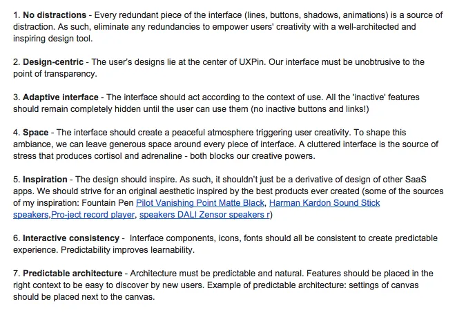
For our redesign, a simple strategy document outlining our design principles worked just fine.
2. Design
As shown in the free guide UX Design Process Best Practices, the best design documents are often some form of the physical design itself. They change in both form and complexity as the design process advances, and the types of documents, including their fidelity, vary greatly.
UX strategy is a fluid exercise, which means your main documentation must be the design itself. Otherwise, you’ll get bogged down in paper trails.
While there are many advantages to designing quickly and creating a final product as soon as possible, that’s no excuse to cut corners. Some of these documents may feel like extra work, but each of them brings something unique to the design process.
Strategic documentation for this stage
i. Sketches — Classic sketches on paper are one of the quickest and easiest ways to get your ideas down and share them with others, especially if you’re brainstorming.
ii. Site maps — Outlines of your information architecture, showing how your pages are connected to one another.
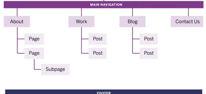
Photo credit: Interactive site maps created in UXPin by design agency Barrel
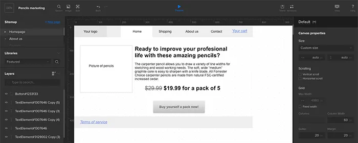
iii. Wireframes — These are the barebone structures of your product; dedicating time to building one allows you to flesh out your sitemap without more complex details distracting you.
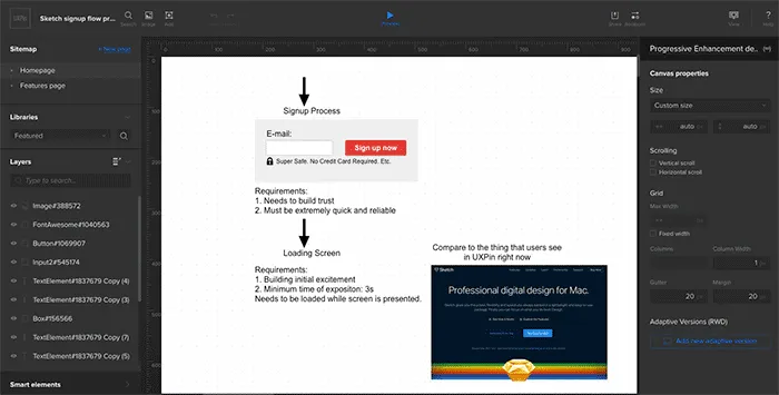
iv. User Flows — Once you’ve done enough user research, you can start outlining how the pages in your design correspond with user actions. User flows are fast shorthand notes that help you improve the efficiency of your design. You can evaluate the amount of friction at each step and minimize steps when possible. You can also try Ryan Singer’s shorthand user flows.
v. Interactive wireframes (lo-fi prototypes) — Adding a little interactivity into your wireframe allows for early product testing. As advised in the free guide UX Design Process Best Practices, the earlier you can get feedback, the easier it is to implement. No need for complex interactions (save those for a hi-fi prototype), just make important elements clickable so people can actually use the design.
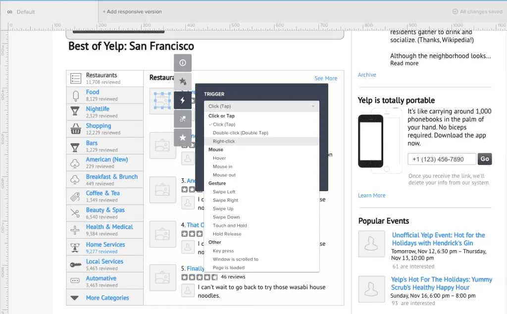
vi. Paper prototypes — The most basic form of prototyping to explore the efficiency and usability of your design. Good for brainstorming and inviting feedback from others due to its simple format. Requires a coworker act as the “human computer” to operate the prototype for usability testing. We don’t prototype on paper as much anymore since our product team just starts within our tool.
vii. Mockups — These allow you to focus solely on the visual details of your product, creating a hi-fidelity reference for how it should look. We’ll test the lo-fi prototype first, iron out usability issues, then move to visual design in a mockup with tools like Photoshop and Sketch. We can then import the Sketch or Photoshop file right back into UXPin to create a hi-fi prototype.
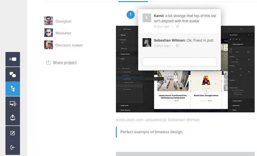
Hi-fi prototype of our new editor interface. Created by importing a Photoshop file into UXPin.
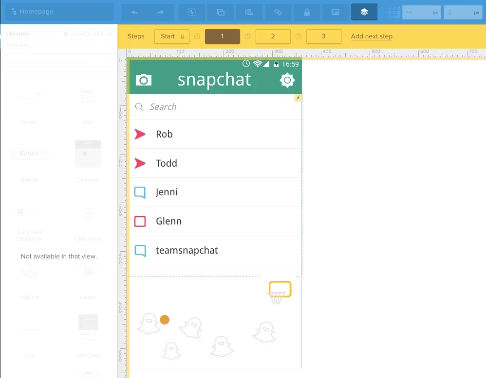
viii. Hi-fi prototypes — The last iterations of your product before the live version. Hi-fi prototypes are ideal for fine-tuning the interaction design and animations. If you use UXPin, the custom animations editor lets you map out animated prototypes step-by-step without any code.
User Testing
Usability testing is the strongest influence on design decisions. It helps ensure you aren’t forcing users into unnatural paths of behavior, and also counterbalance stakeholder feedback. Don’t confuse user testing as the final stage — usually the results of the tests lead to further research and iteration.
Don’t think this stage must only come after the designing phase. Testing should occur early and often — it should happen alongside of the design process at different intervals, so that the results can be integrated into further designs.
As a minimum, test between every iteration. For example, if you just finished a lo-fi prototype and you’re about to start a mockup, conduct a quick test first. You may need to tweak some functionality issues that will affect the site’s visuals.
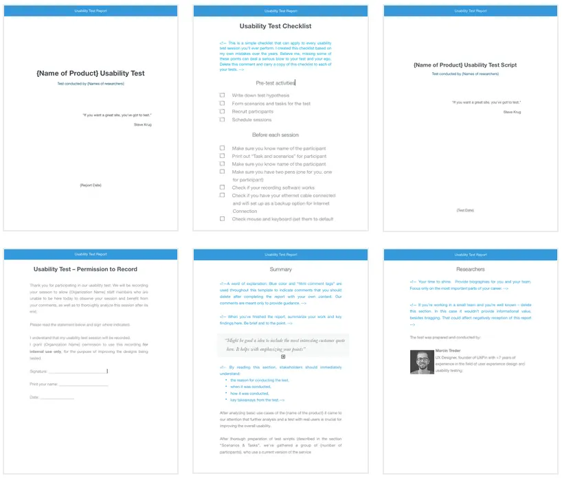
Testing documentation can come in the form of plans, the tests themselves, and the results. Share everything among the team, so a standardized form for these documents will streamline the process (you can find some in our free usability testing kit).
Strategic documentation for this stage
i. Usability test plans — These outline your test goals and procedural details such as the location and time, or even the specific questions/tasks. These are especially useful for stakeholders to understand what’s being tested and why.
ii. User tasks — You need to describe to users the exact tasks you wish for them to perform. Be specific, avoid jargon, and don’t provide too many details on the steps needed to accomplish the task (that’s for the users to show you!).
iii. Usability test script — If you’re moderating the test, you definitely need a script to ensure consistency.
iv. Usability reports — Once you have the results of the testing, you’ll need to make the data comprehensive to members of various departments who may not have your specific knowledge. The presentation of the data is crucial to ensuring that everyone interprets it correctly. For the our redesign, UX researcher Ben Kim uploaded all of his reports to Google Drive for everyone in the company to access at any time. For a fast report, try Tomer Sharon’s rainbow spreadsheet (below).

Takeaway
Any documentation that doesn’t make the process easier is wasteful, and likewise any documentation that helps, no matter have frivolous it seems, is not a waste.
Documentation should come about naturally, as a result of necessity or best practices. Staples like wireframes, mockups, and prototypes are the most common, but less popular documents like customer journey maps or test plans can, when done properly, be just as useful.
As a basic rule of thumb, if you’re writing up something just to hand it off to someone else, it probably wasn’t worth your time in the first place. Only create documentation that moves design forward.
For more real-world advice on improving UX design, check out UX Design Process Best Practices. The free 100-page guide provides tips on the whole UX process from gathering requirements to testing designs. The book also explains the types of design documentation that are most helpful to fast-moving teams based on our experience redesigning UXPin.

