See what’s new in UXPin 2.1
UXPin 2.1 brings a whole list of awesome improvements (we’re not stopping after UXPin 2.0), from elastic boxes and buttons that expand as you type, to an easier way of selecting elements and undoing deleted pages. Discover everything that’s new and dive into the details of all other enhancements and fixes.
[videojs_video url=”https://www.uxpin.com/studio/wp-content/uploads/2019/12/2-1_release_post_800x600-3.mp4″ controls=”false” autoplay=”true” loop=”true” muted=”true”]Elastic boxes and buttons
Boxes and buttons now expand as you type into them. Just uncheck the Fixed size option in the properties panel and you’re good to go! Apart from that, we’ve also enabled all text properties inside boxes and buttons. See how it works in Docs.
[videojs_video url=”https://www.uxpin.com/studio/wp-content/uploads/2019/12/NewBoxButton_Release_800x600_v2.mp4″ controls=”false” autoplay=”true” loop=”true” muted=”true”]You can now undo deleted pages
This has been one of the most frequently requested features. So we’re happy to finally say that you can now recover deleted pages seconds after you remove them.
[videojs_video url=”https://www.uxpin.com/studio/wp-content/uploads/2019/12/UndoDeletePages_Mail_800x600_v2.mp4″ controls=”false” autoplay=”true” loop=”true” muted=”true”]Hide pages from preview
If you have pages in your design that you don’t want to show on preview, just click the eye icon next to the page name. This makes them invisible on preview, excludes them from exports and the navigation. Learn more on Docs.
[videojs_video url=”https://www.uxpin.com/studio/wp-content/uploads/2019/12/HIdePagesFromPreview_800x600.mp4″ controls=”false” autoplay=”true” loop=”true” muted=”true”]Selecting elements got a lot easier
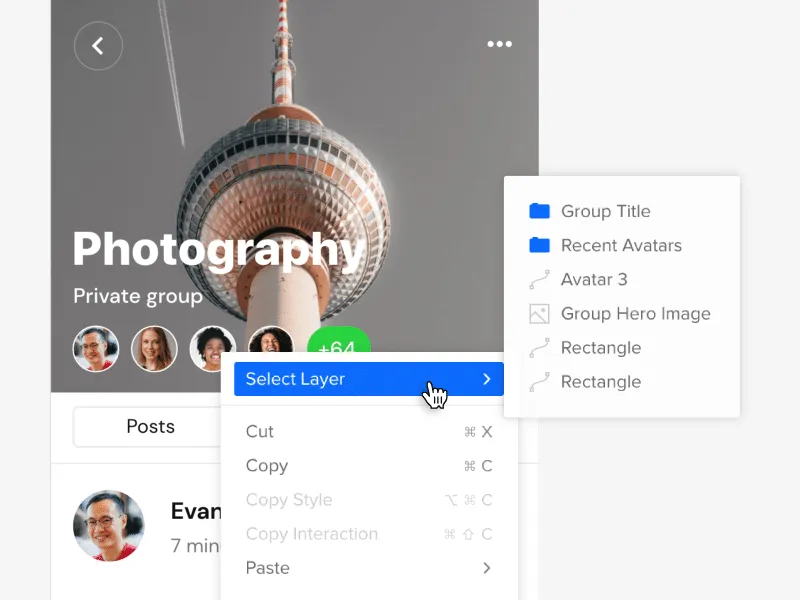
Selecting elements on the canvas is now easier. If you want to select a locked element on the canvas or elements that overlap or are hidden under one another, we’ve got you covered. Just right-click and choose Select Layer from the context menu to get down to every single layer that’s right under your cursor. Read more in the tutorial.

Improvements
- You can now move elements to a position that’s not visible in your current viewport.
- We’ve improved grid rendering on large zooms levels.
- You can now set the weight of system fonts for Windows.
- The top bar now displays up to 5 avatars in the Top bar when you’re working with the team on the same prototype.
- We’ve improved the context menu for elements by grouping actions that are relevant and adding new ones.
- We have removed unnecessary options from the canvas context menu.
- Editing large projects would cause a performance drop.
- Sometimes the Esc button would not deselect a currently selected Page.
- From now on, the possibility to open the sitemap if you have only one page is blocked.
- Groups in the Pages panel are now expanded when dragging a page into the group.
Fixed
- The icon for removing the guide was stuck when clicking very close below the vertical guide and dragged it.
- Disappearing canvas when switching between pages while editing the Master Component.
- Pinning or unpinning the Pages and Layers panel did not remember the expanded or collapsed sitemap size.
- Adding a new page from the context menu duplicated the content of the selected page.
- The project switch button worked only when you clicked on the project’s name.
- We’ve fixed the order of layers after duplicating at least 2 elements with Alt-drag.
- Copy-pasting elements with Cmd/Ctrl C and Cmd/Ctrl V would place the copied element beneath the original element.
- The properties panel disappeared when you edited some expressions.
- Zen mode did not hide all panels.
- Flip Vertically and Horizontally is now blocked in Component Instances.
- Fonts added by users would not load on Chrome [Windows].
- When moving guides with Cmd pressed, ignore snapping didn’t work.
- The context menu in the layers panel did not close after the first click.
- Adding a new page in a collapsed pages panel no longer enters the edit name mode.
- Elements didn’t snap to guides after you zoomed in.
- States for hidden elements in the Layers panel were not grayed out.
- Depending on the browser, the collaborator’s initials inside team avatars were not centered properly.
What’s Next?
Here’s what you should be looking forward to in our upcoming releases:
Color Picker
We’re rebuilding our color picker by making it faster to use. You’ll know right away which colors are at least “AA” rated and which don’t meet accessibility standards. You’ll also have the option to switch between the list and grid view for colors from all accessible Design System Libraries.
Grids: Column, Baseline, and Square
We will soon be adding more grids to UXPin. Column Grids that are perfect for organizing elements into columns., Baseline Grids to give a flowing rhythm to the text in your design, and Square Grids where you can define the size of cells.
Recent prototypes
You’ll be able to view the list of your recent prototypes and switch between them from the top left corner of the editor.
Pages overview
An overview of all your pages will soon be available in UXPin. You’ll see a new icon at the top of the Pages Panel that will take you to a separate view with all pages from your current prototype.


