It’s time to delve into the nuts and bolts of responsive web design.
As a technical medium, RWD requires a working knowledge of the code that makes it work. Designers who ignore the basics fail to understand what browsers can and can’t do.
Since I’ve been a web designer and developer for nearly 20 years, I hope to distill the technical side of responsive design into a quick crash course below. The below foundational knowledge certainly helps me improve the feasibility of my own designs when I’m creating responsive prototypes in UXPin.
First, Cascading Stylesheets, or CSS, is the language that makes responsive web design possible. CSS is a series of directives that spell out how browsers should display data depending on certain conditions like browser width. Now, understand that while most modern browsers obey the same rules in the same way, CSS rules are suggestions.
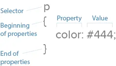
Let’s review the fundamentals. CSS works with selectors and properties.
- Selectors: HTML affected by the CSS. Examples: HTML <p> elements, <li> elements and <div> elements.
- Properties: what the CSS will change on a given selector. Examples: Text color, border and padding.
- Values: the change itself. Examples: Red, 10px and sans-serif are three values.
Now let’s put this together. “div { color: #333; }” has one selector, one property and one value.
Media Queries Are the Technical Heart of Responsive Web Design
To account for different browsing conditions, responsive web design dictates that different rules must take place under different circumstances, usually the browser’s or device’s screen (the “viewport”) width.
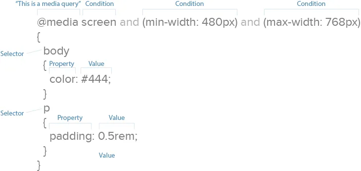
How do we define these rules? Media queries. Media queries are CSS commands that determine under what conditions other CSS selectors take effect.
For example, one media query might tell a browser, “pay attention to rules 1–10 when the screen is up to 320 pixels wide,” while another might say, “pay attention to rules 11–20 when the screen is 321 pixels wide or greater.”
Media queries are easy to identify: they begin with “@media”. Browsers read the CSS rules (e.g. selectors) listed between the media query’s { curly brackets }.
Above, CSS says to make all text red on visual devices, not screen readers.
Media queries can build upon each other. For example:
@media screen and (width: 320px) { body { color: red; } }
Rules take effect on visual devices that display exactly 320 pixels horizontally.
The different minimum and maximum widths that media queries use are called breakpoints. A query that specifies (max-width: 768px) would change layouts when the viewport measures 0–768 pixels wide. Oddly, nothing actually “breaks” at that point. The term simply means that new rules will take effect within a given range, in this case 0–768 pixels, or the width of an average tablet.
There’s no technical limit to the number of conditions a media query can display. This query is perfectly valid:
@media screen and (min-width: 480px) and (orientation: landscape) and (aspect-ratio: 4/3) and (color: true) { … }
It says that any color screen at least 480 pixels wide, held in landscape position, with an aspect ratio of 4 to 3 that’s exactly 320 pixels wide should take on certain properties.
The two most popular conditions are minimum and maximum width, the upper and lower limits a browser window can be to take on the given properties. But we can manipulate other important properties.
Resolution, for instance, suggests at what quality we should create our graphics. Screens capable of high-density graphics, e.g. Apple’s retina screens or high-res Android screens, will show text and vector art with crisp lines that make regular-density images look fuzzy.
“High-density images” are those that use more device pixels (actual dots a browser can display) vs. those defined in CSS. That means for an image to look its best, it needs four times the usual number of pixels. Something displayed at 300×300 pixels on a small screen actually needs 600×600 pixels total — when our media queries detect high-res screens.
If you’re curious, here are additional properties we can control with media queries:
- Aspect-ratio: a comparison of a browser window’s width and height.
- Color: whether a device has a color screen or not.
- Color-index: the number of colors a screen can display.
- Device-aspect-ratio: a comparison of the screen’s width and height.
- Device-height: the number of pixels a displayed vertically by a device.
- Device-width: the number of pixels a displayed horizontally by a device.
- Height: the number of pixels displayed vertically by a browser viewport screen.
- Monochrome: how many bits that pixels in a grayscale screen uses.
- Orientation: whether a user is currently holding the device horizontally or vertically.
- Resolution: the number of pixels per inch or centimeter displayed by a screen.
- Width: the number of pixels a browser viewport uses horizontally.
As web layouts become more sophisticated with technology like Flexbox, orientation and aspect ratio will help us decide how much to show users at a glance. The “fold” may not be relevant as users scroll, but what they see when they stop scrolling needs to be as self-contained as possible.
For now, though, width and resolution are most useful for responsive web design. Since contemporary site design lets us scroll up and down, width determines the available space a layout can use.
Best Practice According to the Experts
It might not surprise you to learn that Google, whose search engine reads a page’s information and ignores viewports, recommend setting media queries by content, not specific devices. That makes sense as new devices appear every month, meaning device-based CSS would need constant updates.
Here’s where media queries help us most: they allow us to plan for browsers based on content and capability, not expectations. That is, we can tell browsers that our designs look best under ranges of conditions, like 0–300 pixels vs. 301 – 600 pixels, and write our code to suit our needs rather than what the browser requires.
Google also recommends adopting a mobile-first approach which, in addition to focusing on essential content that users want, encourages designers to use the fewest breakpoints possible. That means easier troubleshooting during development and maintenance later on.
If you’d like to learn more techniques for CSS media queries, we recommend the following resources:
Grab design ebooks created by best designers
All for free


Do you want to know more about UI Design?
Download 'The 2016 Web Design Trends Bundle' FOR FREE!
Download e-book for freeCompressing Resources for Faster Load Times
Like images, we can shrink CSS files to use as few bytes as possible. Smaller files require less time to load, making websites faster and keeping users from wandering away.
Many techniques exist to keep files small, but we recommend starting with a few basics.
1. Minification
With good spacing, CSS and HTML files are easy for designers to develop and maintain. But browsers don’t care about spaces between elements, properties and selectors. Extra spaces mean extra bytes, so we want to minimize those spaces (hence the term).
Before:
body {
background: #fff;
color: #444;
}
p {
padding-bottom: 1rem;
margin: 0;
}
After:
body{background:#fff;color:#444}p{padding-bottom:1rem;margin:0}
Tools like CSS Minifier, CSS Compressor, JS Compress and HTML Minifier by Will Peavy let you quickly strip away excess spaces from production copies of your code, while keeping the original lets you easily edit the original.
Best practice: check your code and always minify copies of your HTML, CSS and JavaScript files before uploading them to the live website.
2. GZIP
Like LZW compression used in PNG and GIF files, GZIP scans files for redundant bytes. This is a deeper compression technique than minification. Google reports that this works best with text-based files like HTML, CSS and JavaScript.
Best practice: zip files after minifying them to make sites load faster, especially on smaller, less-capable devices.
HTTP requests
An often-overlooked means to speed up your sites is to reduce the number of files that a browser must download per page view. Simply put, the fewer files to download, the faster browsers can display a page.
Each request can take from 200 ms (milliseconds) to several seconds. That adds up quickly since (as we explained in the free e-book Interaction Design Best Practices) users start losing their feeling of control after a 1-2 second delay.
Once again, the advantage here is speed, especially for small devices with limited bandwidth or slow connections.
Best practice: whenever possible, save time by combining your minified CSS and JavaScript files. Every few hundred milliseconds counts.
Takeaway
Technical details like these are just as important to responsive web design as the visuals.
Designers who neglect performance and understanding media queries risk delivering poor experiences to their users.
For more responsive design advice, check out the free e-book Responsive Web Design Best Practices. As a co-author, I’ve distilled my own experiences into 100 pages of hands-on advice. We also analyze 35 responsive design case studies from top companies.