Responsive Design for UXPin Merge – What is Frames?
We’ve just launched a new feature that brings full responsiveness to UXPin Merge. With it, you can seamlessly switch between different layouts such as desktop, mobile, and other devices and your design stays responsive. The feature keeps your projects visually consistent, fully functional, and looking great on any device.
Table of Contents
What is Frames?
Frames is a versatile capability that allows designers to assign code-backed components to specific presets, making it effortless to transition between different layouts like desktop and mobile.
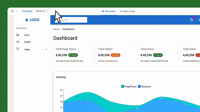
With this feature, you can preview how your designs behave across various devices directly in the Editor and Preview modes. This capability ensures that your designs are not only visually consistent but also functional across all screen sizes.
Frames come equipped with a full set of interactions — such as Resize, Scroll, Load, Click, and Hover — allowing for dynamic and engaging user experiences. This feature mirrors the flexibility and interactivity you already have enjoyed when working in UXPin’s Editor, now enhanced to support fully responsive design.
What Do You Get with Frames?
Besides being a much-needed tool for creating truly responsive designs with minimal effort, Frames comes with a host of benefits:
- Responsive Design – Frames makes it easy to design layouts that adapt seamlessly to different devices. Whether you’re designing for desktop, mobile, or any other screen size, Frames ensures that your designs are fully responsive, providing a great user experience across all platforms.
- Seamless Transitions – Easily switch between layouts such as desktop and mobile, ensuring that your design looks great on every device. With Frames, what you see in the Editor is what users will experience, reducing guesswork and revisions.
- Real-Time Previews – Designers can see how their layouts respond to different presets without leaving the Editor. This feature enables you to make adjustments on the fly, ensuring that every element of your design is optimized for various screen sizes.
- Consistency Across Projects: By using Frames to manage responsive components, you ensure a consistent look and feel across all your projects. This is particularly valuable for maintaining brand identity and user familiarity.
- Support for Media Queries: Frames support dynamic resizing and styling through media queries, including those from design systems pushed to UXPin via merge-cli.
- Isolate Components from the UXPin Interface: Placed in frames, code-backed components are isolated from the rest of the canvas. This prevents components with overlay properties from interfering with the design, ensuring a smoother workflow.
- Artboard-Like Experience in UXPin: For those of you who don’t use code-backed components, Frames is a useful feature that will make your design feel like a set of artboards, just like in vector-based design tools. Instead of clicking between pages, you can see your designs side by side.
Why Responsive Design Matters?
Responsive design is a crucial consideration at every stage of the design process, particularly during prototyping and the handoff to development.
Accurate representation of the end product
During the prototyping stage, responsive design ensures that the prototype fully imitates how the end product will behave across different devices and screen sizes.
By using Frames, designers can see exactly how the layout, content, and interactive elements will behave across devices, which helps you keep total control over the design look and feel.
Enhanced user testing
Prototyping with responsive frames helps you evaluate how your users interact with the design on different screens. It ensures that your design is user-friendly regardless of the device used.
Streamlined collaboration across the organization
A responsive prototype provides a clear, unified vision of how the design should function across all devices, reducing ambiguity and aligning everyone involved in the project.
It also facilitates more productive feedback and discussions, ensuring that all team members have a shared understanding of the design goals.
Smoother design handoff
When handing off the design to developers, a responsive prototype is invaluable. It provides developers with a comprehensive guide that includes all necessary breakpoints, layout adjustments, and interactive behaviors for different screen sizes.
This detailed information helps developers implement the design accurately and efficiently, reducing the likelihood of misunderstandings or misinterpretations that could lead to delays or additional work.
Design consistency
By integrating responsive design into your design process, you can ensure consistency across all devices from the outset. This consistency is crucial for maintaining brand identity and providing a uniform user experience.
How to Use Frames
You can change the frame’s dimension, change its properties, add actions and triggers. Let’s see how or read about it in our documentation.
Creating frames
There are a couple of ways of creating frames. Let’s see them:
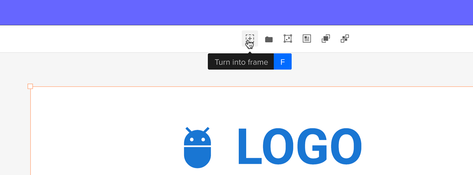
- Click “F” on your keyboard: select components that you want to put in one frame and press “F” on your keyboard.
- Use a shortcut in Top Bar: select components or layers and go to Top Bar. Click on the Icon named “Turn into Frame”.
Switching dimensions
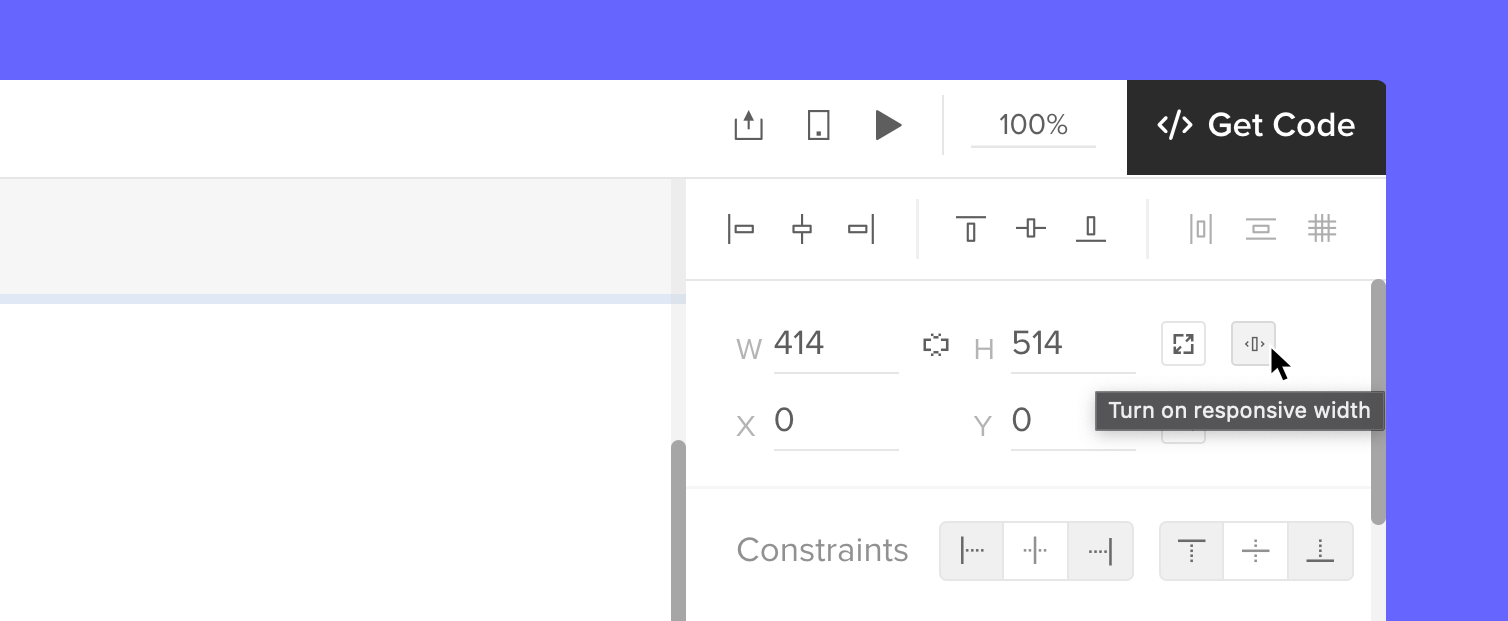
We can adjust the dimensions of our frame. A default frame is set to be 300 X 100 pixels, but we can easily change its size by dragging the frame’s corners, or typing in a specific width (W) and height (H) values in the right panel.
Enable “Responsive Width” to ensure your components automatically adjust to 100% of the frame width. See below:
Naming frames
WIth size adjusted, let’s change our frame’s name. We can rename our frame from either the Layers panel or the Top bar. The frame’s name will be reflected in the Layers panel, Top bar, and on the canvas.
Other properties
Besides changing the name, we can also adjust the look of our frame. We can add:
- Scrolling: To view components inside the frame that are outside the visible area, we can add vertical or horizontal scrolling.
- Fill: This one’s for adding a solid color, gradient, or image to the frame.
- Border: We can add a stroke to any frame that we have on the canvas.
- Shadows: Use it to apply outer or inner shadows to the selected frame.
- Blur: It works on the entire frame or its background.
Adding interactions
There are specific triggers and actions that are set just to Frames.
Frame triggers
- Scroll: Triggers when the Frame Preview is scrolled to a specified height.
- Frame Load: Triggers when the Frame is fully loaded.
- Frame Resize: Triggers when the Frame’s window preview is resized, either manually or by changing the Frame preset in the Top bar.
Frame actions
- Go to Frame: Use this action to link to other Frames within your canvas.
Preview and Share Frames
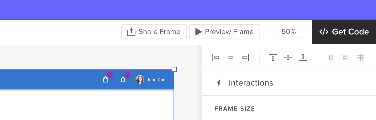
To see how your frames behave, you can preview individual Frames or the entire canvas, and share previews of specific frames (or the entire canvas) with others, just like you can when sharing a regular prototype.
We added a “Preview frame” button in the Top bar of a Preview mode to help you view and share a specific frame. You can also use a keyboard shortcut “Cmd” (or “Ctrl”) + “I” to preview a frame you clicked on.
To share a preview of the selected Frame, press “Cmd” + “Shift” + “P” or click the “Share frame” button. You’ll see the Share modal. Copy the URL or QR code of the frame or share it via email.
Note: Frames do not support comments. To add comments, you will need to do so outside of the Frame.
Start using Frames in UXPin
By using Frames, you’ll ensure that your designs are optimized for any device, reduce guesswork, and streamline your workflow. It allows you to assign code-backed components to specific presets, seamlessly transitioning between layouts like desktop and mobile. With Frames, you can preview how your designs will look across various devices directly in the Editor and Preview modes, ensuring visual consistency and functionality across all screen sizes.
Frames also come equipped with a full set of interactions—such as Resize, Scroll, Load, Click, and Hover—making it easy to create dynamic and engaging user experiences. Whether you’re working with code-backed components or not, Frames enhances your design process by supporting responsive design, providing seamless transitions, and offering real-time previews to make adjustments quickly. It also helps maintain consistency across projects, isolates components from the canvas, and offers an artboard-like experience for organizing designs side by side, much like in vector-based tools.
Frames are available for all UXPin’s users, sign up here. Those of you who don’t use code-backed components can use this feature like an artboard on the canvas and set some interactions to it. Merge users can truly benefit from full responsiveness and total control. If you’re curious about designing with code-backed design, see how it fits into your design process. Request access to UXPin Merge.


