Examples of Prototypes – From Low-Fidelity to High-Fidelity Prototypes
Mastering the art of prototyping is akin to wielding a powerful toolset that empowers designers and developers to iterate, refine, and ultimately deliver products that resonate deeply with their audience.
In this article, we embark on a journey through the spectrum of prototype fidelity, from low-fi sketches to high-fi interactive simulations. Each step of the way, we’ll unravel prototype examples that illuminate the nuances and possibilities inherent in each approach. Whether you’re a seasoned UX designer seeking inspiration or a newcomer eager to grasp the fundamentals, this exploration promises insights aplenty.
But before we dive in, allow me to introduce you to UXPin—a comprehensive prototyping platform that empowers designers to bring their visions to life with unparalleled ease and efficiency. By seamlessly integrating design and prototyping capabilities, UXPin streamlines your workflow, enabling you to iterate rapidly and collaborate seamlessly. Ready to elevate your prototyping game? Sign up for a trial today.
Table of Contents
What is a prototype?
A prototype is a preliminary version or model of a new product, system, or design that is developed to test and validate concepts, features, or functionality before proceeding with full-scale production or implementation.
Prototypes are used in various industries, including product design, software development, engineering, and manufacturing, to gather feedback, identify potential issues, and refine designs early in the development process.
Prototypes are created for several reasons, all aimed at improving the final product or system. Here are some key reasons why prototypes are created:
- To Validate Product Idea: Prototypes allow designers and developers to validate concepts and ideas early in the development process. By creating a prototype, they can test assumptions, explore different design options, and gather feedback from stakeholders before investing time and resources into full-scale development.
- To Clarify Requirements: Prototypes help clarify requirements by providing a tangible representation of the product or system. They enable stakeholders to visualize and interact with the user interface design, facilitating discussions and ensuring that everyone has a shared understanding of the project goals and expectations.
- To Identify Issues: Prototypes help identify potential issues and challenges before they become more costly to address later in the development process. By testing prototypes with users or stakeholders, designers can uncover usability problems, technical limitations, and design flaws early on and make necessary adjustments.
- To Explore Solutions: Prototypes allow designers to explore different solutions and design alternatives. By creating multiple prototypes, designers can compare different approaches, evaluate trade-offs, and determine the most effective design direction for the final product.
- To Gather Feedback: Prototypes serve as a tool for gathering feedback from real users, customers, and other stakeholders. By testing prototypes with target users, designers can gather valuable insights, preferences, and suggestions for improvement, which can inform subsequent iterations of the design.
- To Reduce Risk: Prototyping helps mitigate risks associated with the development process by allowing designers to experiment with ideas in a low-risk environment. By identifying and addressing potential issues early on, prototypes help reduce the likelihood of costly mistakes and delays during later stages of development.
- To Improve Communication: Prototypes serve as a communication tool for conveying ideas, concepts, and design decisions to potential investors. They provide a common visual reference point for discussions and facilitate collaboration among team members, ensuring that everyone is aligned and working towards the same goals.
Read about prototype definition and types in this article: What is a Prototype?
Types of prototypes
Types of prototypes include:
- Paper Prototypes: These are low-fidelity prototypes created using paper, sketches, or mockups to visualize the layout, structure, and flow of a design. Paper prototypes are inexpensive and quick to create, making them ideal for early-stage concept testing and brainstorming sessions.
- Wireframes: They are basic, skeletal representations of a design or interface, typically created using wireframing tools. They focus on layout and functionality, omitting detailed design elements such as colors and graphics. Wireframes help designers and stakeholders visualize the structure and interaction flow of a design.
- Digital Prototypes: They are interactive representations of a design or product created using prototyping tools. These prototypes can range from low-fidelity mockups to high-fidelity simulations, depending on the level of detail and realism required. Digital prototypes allow for user testing, usability evaluation, and iteration before product development.
- Functional Prototypes: Functional prototypes are fully or partially functional versions of a product or system that demonstrate key features and capabilities. These prototypes often involve interactivity to replicate the behavior of the final product. Functional prototypes are used to validate technical feasibility, performance, and user experience.
- Proof-of-Concept Prototypes: Those are experimental models created to demonstrate the feasibility of a new idea, technology, or approach. These prototypes focus on validating core concepts and principles, often with limited functionality or polish. Proof-of-concept prototypes are used to assess the viability of an idea before investing further resources in development.
- Throwaway Prototypes: Throwaway prototypes, also known as disposable or rapid prototypes, are quick and rough prototypes created with the intention of being discarded after use. These prototypes are often built using tools and are not intended to represent the final product accurately. Instead, they are used to explore ideas, experiment with design concepts, and gather feedback early in the development process. Throwaway prototypes are valuable for generating new ideas, iterating rapidly, and validating design decisions without investing significant time or resources.
- Workable Prototypes: Those prototypes are working models of a user interface. Unlike throwaway prototypes, workable prototypes are more polished and refined, aiming to closely resemble the final product in terms of functionality and performance. These prototypes may involve the use of actual components, hardware, or software code to simulate the behavior of the final product accurately. Workable prototypes are used to validate technical feasibility, test usability, and gather user feedback in real-world scenarios. They serve as a crucial step in the product development process, helping to identify and address potential issues before proceeding to full-scale production or implementation.
Prototype examples you need to see
Example 1: Paper prototype
Paper prototypes are are low-fidelity representations of user interfaces created using pen and paper. They are simple sketches of user interfaces that include rough sketches of UI elements such as buttons and tabs while every new paper piece shows a simulation of next steps of a user flow. They are great communication devices during brainstorming or talking with stakeholders.
Here is an example of a mobile app paper prototype by Aaron Barko found on Medium.
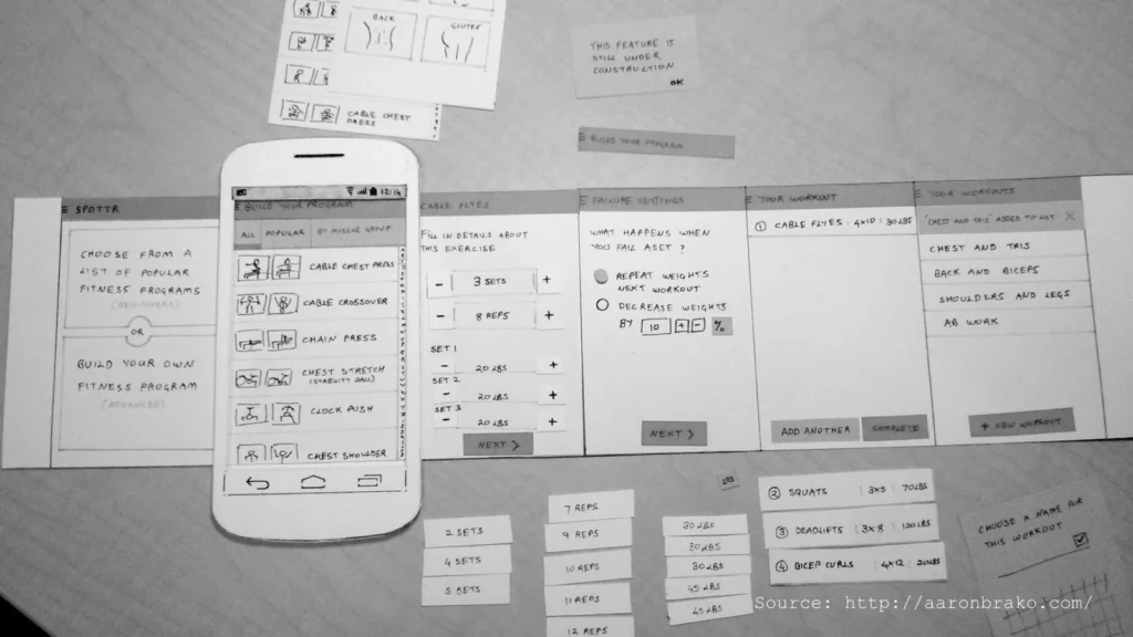
Notice that the prototype has a cut-out an iPhone and the designer can move it to indicate next step. Its kept in a black-and-white color scheme and all UX writing is written by hand. The designer prepared a smaller pieces of paper to indicate different options in a drop-down menu.
To create a paper prototype, prepare sketching materials such as pens or pencils for drawing your interface elements. Your pens may be of different thicknesses to represent different types of UI elements (e.g., thick lines for buttons, thin lines for text). You may want to have different sizes of paper depending on the complexity of your prototype and the level of detail you want to include.
Your paper prototype doesn’t have to be black and white. You can use markers or highlighters for adding emphasis to certain elements or highlighting important areas of your prototype.
Example 2: Wireframe
A wireframe is a simplified visual representation of a digital interface or product. It outlines the basic structure, layout, and functionality of the interface without getting into detailed design elements like colors, images, or typography. Wireframes are typically created using basic shapes, lines, and text to convey the placement of elements and the flow of information.
The focus is on capturing the overall layout and structure of the interface, as well as the interactions and navigation paths that users will follow. Designers usually use digital tools to make wireframes, such as UXPin, Figma or Balsamiq.
Here’s an example of a website wireframe in Balsamiq.
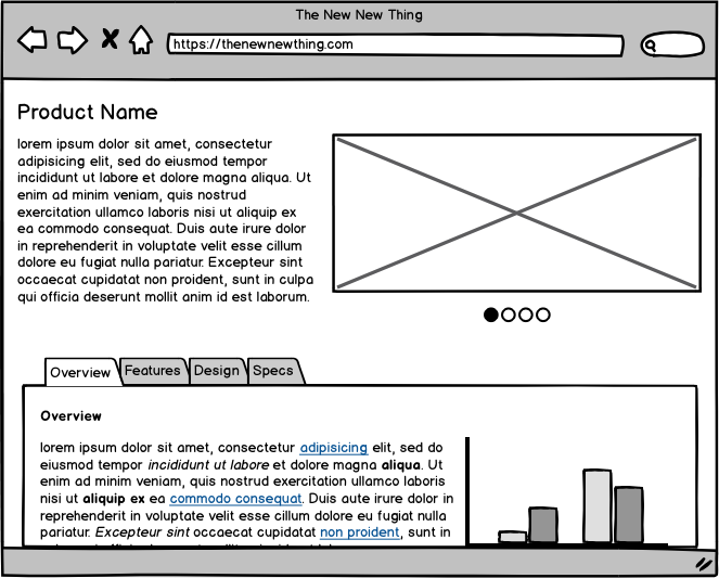
You can see that its a low-fidelity representation of a real-life website. There’s a frame for asset, some placeholder text, but overall, details don’t matter. It’s still early in the design process to be able to tell how the UI will look like beside the structure and layout.
Before diving into this type of prototyping, it’s helpful to have a clear understanding of the user flows and basic layout of your user interface. User flows map out the paths that users will take through the interface, while wireframes provide a simplified visual representation of the interface structure.
Example 3: Mockup
A mockup is a higher-fidelity representation of a digital interface or product compared to a wireframe or a paper prototype. While wireframes and paper prototypes focus on the basic structure and layout of the interface, mockups add more visual detail, including colors, typography, images, and other design elements.
Here is a design mockup found on Dribbble, a website where digital designers share static mockups, video prototypes, and graphic designs to showcase their understanding of design or prototyping process.
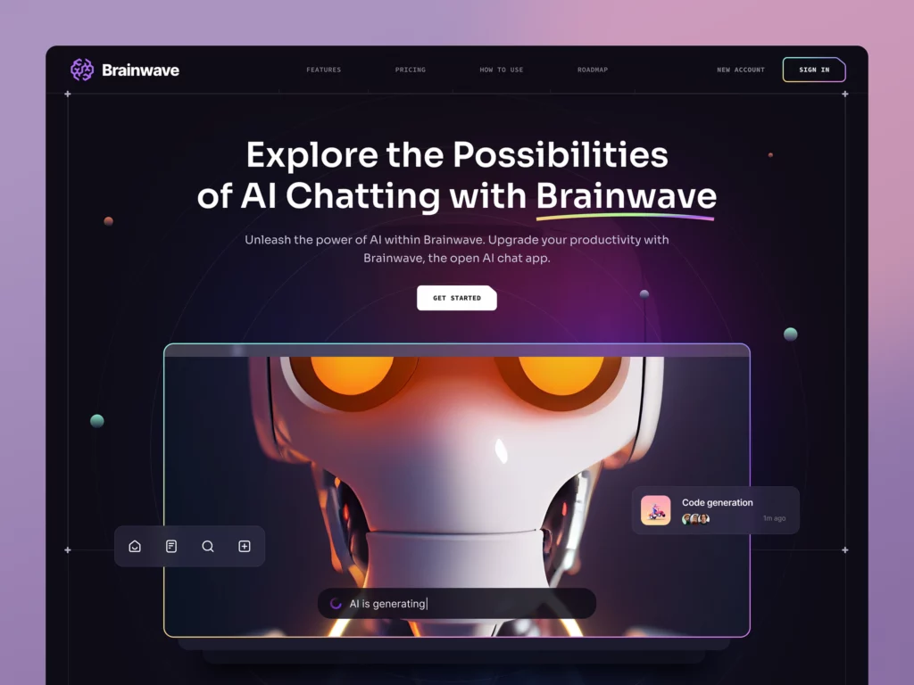
Notice that this mockup provides a more detailed representation of the final look and feel of the interface. They incorporate colors, typography, images, and other visual elements to showcase the visual style and branding of the project. They include realistic visual elements and often simulate the appearance of the final product as closely as possible.
Mockups still focus on visual design rather than functionality what makes them great for gathering feedback on the visual design and aesthetics of the interface. They are often shared with stakeholders, clients, or team members for review and approval before moving on to the prototype development phase.
Example 4: High-fidelity prototype
High-fidelity prototype can be in the form of a static mockup or functional prototype. What matters here is the level of detail. They serve as powerful communication and validation tools in the design process, allowing designers to convey their design concepts effectively and gather feedback on the user experience before moving into the product development phase.
High-fidelity prototypes closely mimic the visual appearance of the final product, including detailed graphics, typography, colors, and branding elements. They often use actual assets such as images, icons, and logos to provide a realistic representation of the interface.
One example of a high-fidelity prototype is this website made by UXPin.
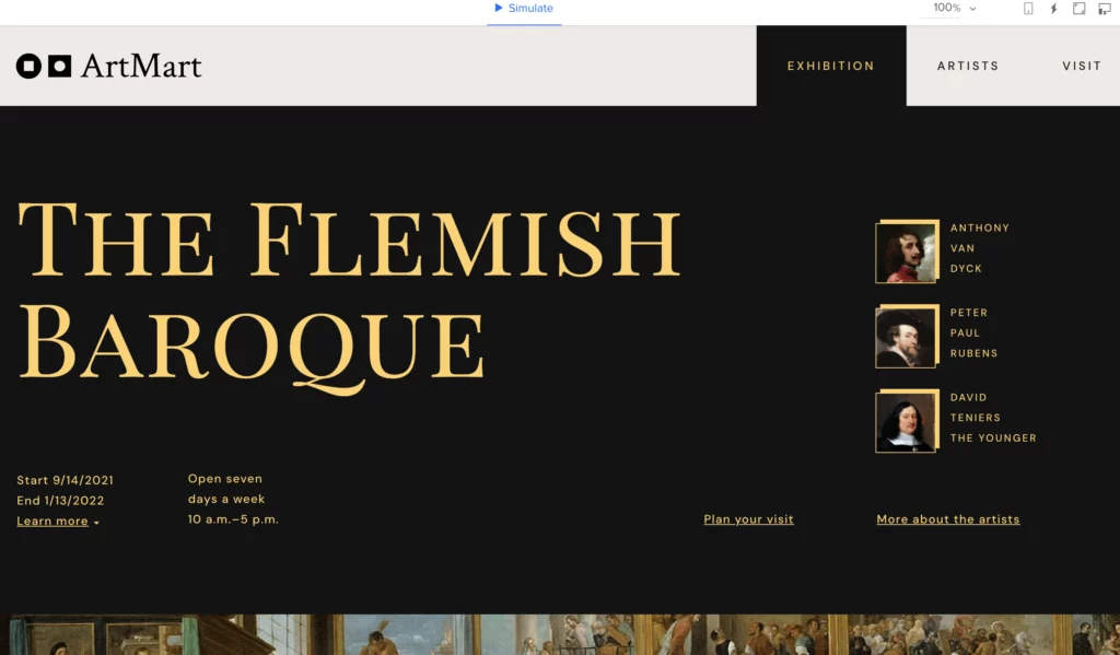
You can see that it has a well-defined color palette, carefully picked font pairing, great use of whitespace and clickable form. You can use this prototype as a template for practicing UX design, add a FAQ section, new sites, and more. Try it now by signing up for UXPin trial.
Example 5: Functional prototype
A functional prototype is a type of prototype that not only demonstrates the visual design of an interface but also simulates its functionality and behavior. Unlike static prototypes, which focus solely on the appearance of the design, functional prototypes provide a tangible representation of how the final product will work and behave.
Functional prototypes help validate the technical feasibility of the design by demonstrating how different components and features work together in a functioning system. They can identify technical issues, bottlenecks, or limitations early in the development process.
Similarly, startups may build functional prototypes to get buy-in from investors. It works similarly to a 3D model of a physical product as other people can get a feeling of what you want to build and how it will behave like. Some people need physical models to spark their imagination.
Those prototypes include interactive elements that simulate user interactions and behaviors. This may include clickable buttons, input fields, dropdown menus, and other interactive components that allow users to navigate through the prototype and perform tasks.
In some cases, functional prototypes may include real data or content to provide a more realistic user experience. This could involve integrating dynamic content feeds, sample data sets, or actual text and imagery that would be used in the final product.
Here is an example of a functional prototype by UXPin. It’s an auction app.
It’s fully clickable and it looks like a final product that has been developed by engineers. But it’s not. It’s a functional prototype. You can use it as if you use a regular app that’s on your phone. It’s responsive to user action and it transfers data from one step to the other. Such an app is possible to build in UXPin.
Example 6: Coded prototype
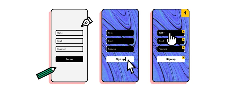
The final prototype example we want to show you is coded prototype. This prototype isn’t build in code by a developer. It’s build in a designer’s environment with coded components – a small building blocks of most apps. UXPin, unlike most design tools, renders real code, so there is always code in the background that you can hand over to development.
The example here is a sign-up flow build with UXPin. Here’s a full tutorial on how to build a sign-up form like this one.
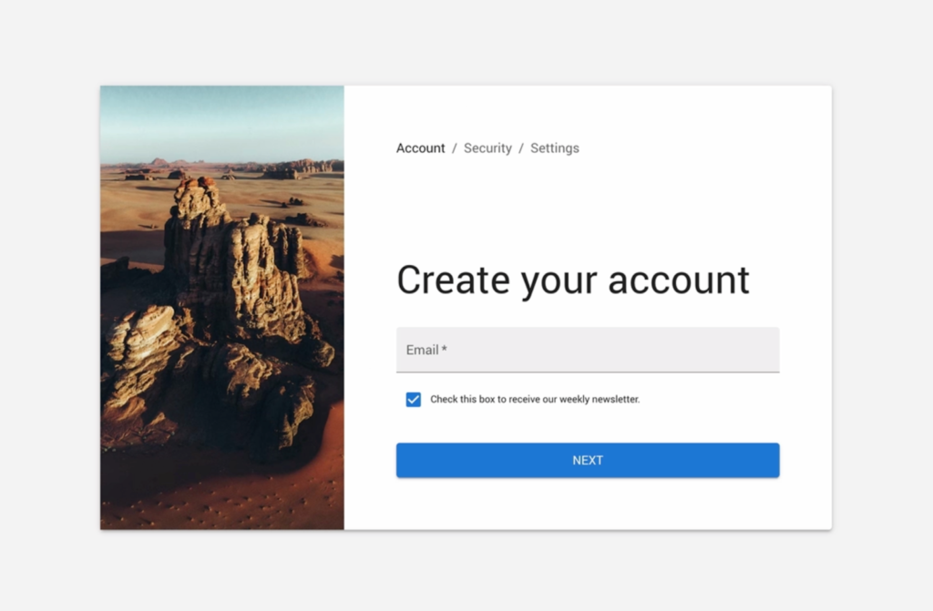
If you want to learn coded prototyping, follow our mini-course on using UXPin Merge.
Create code-first prototype with UXPin
Those prototype examples demonstrate versatility and applicability across various design contexts, including paper prototypes, wireframes, mockups, and functional prototypes. Each type of prototype serves a specific purpose in the design process, helping designers to effectively communicate ideas, test functionality, and refine designs before final implementation.
With UXPin, you can turn your ideas into reality quickly. It’s like having your design and prototype tools all in one place, saving you time and hassle. Plus, it makes teamwork a breeze, allowing you to collaborate smoothly with others. Ready to take your prototyping skills to the next level? Try UXPin for free today.


