10 Product UX Design Tips for Building Top-Notch Solutions
User experience design helps you sell your product, and keep the users’ engaged. It’s a universal principle no matter what product design role you hold, be it industrial design, graphic design, or digital product design. It’s also true regardless of the tool you’re using. It can be Figma, Sketch, or our tool – UXPin. UX can make or break your product.
We’re here to help you figure out what to do to create an outstanding user experience design of your product. Let’s start.
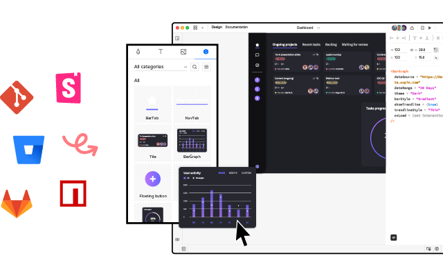
Looking for a prototyping tool that brings the whole team together? UXPin Merge is an innovative technology that allows you to prototype interactive user interfaces by dragging and dropping React components onto the canvas. See how it works. Discover UXPin Merge.
Table of Contents
- 1. Prioritize UX Writing
- 2. Test Product Design Often
- 3. Stay Close to Users
- 4. Interactive Prototyping
- 5. Observe User Behavior Regularly
- 6. Manage User Errors
- 7. Run Design Feedback Sessions
- 8. Consult Design Decisions with Devs
- 9. Don’t Fall Prey to Trends
- 10. Avoid Too Many Changes at Once
- Product UX Design is a Collaborative Game
1. Prioritize UX Writing

There are many exciting design career paths. UX writing is a great gem in the product designer’s skill set. It helps you with customer experience more than you might assume. The written word guides users through the product, helps them with problem-solving, and communicates your brand.
How can you improve your UX writing? Make sure your copy has following features.
- Succinct – Be concise and use short sentences.
- Customized – Use a language that resonates with your users.
- Clear – Avoid using passive voice.
- Easy – Use imagery to illustrate your point and guide user’s eyes.
- Digestable – Avoid long blocks of texts and make the content more scannable.
For more tips on writing and using other forms of content, check our other articles:
- Who is a UX writer? – walks you through a UX writing as a career path for user experience designers.
- How to run a content audit? – explains to you strategic content analysis, step-by-step.
- What’s content strategy? – describes what you need to set up your content for success.
2. Test Product Design Often
Product UX design testing is the process of checking how end-users interact with your product – in particular, whether they run into problems and can quickly recover from them or they are left on their own.
Running usability tests before releasing your product is always good idea. Most product teams perform tests at the design stage when there’s still room for ideation. They can afford to do a few iterations of the product because they are still figuring things out, checking what user flow or interaction design works and what doesn’t and optimize their user journey.
Many startups continue to overly focus on adding functionalities instead of solving an existing user need. This can lead to retention or engagement problems where people stop using the product shortly after downloading it.
Testing a wireframe or functional prototype before turning it into a new product helps you save design teams’ resources but it also refocus all stakeholders on what’s important – creating a great user experience for actual users. Once that is tackled, it’s way easier to meet business goals.
3. Stay Close to Users
Whether a product fulfills business needs or not is important to its growth. Yet, that growth is bound to stall if product development team forgets that they are creating the product for the user.
The best user experience design perfectly addresses users’ needs. As we covered before, it cannot be based on a hunch. Designers and product managers need to work together to keep in touch with their target group once their product is on the market. You need to get information directly from your users.
Some tools that may come in handy:
- Persona development – even though being a UX artifact at the ideation phase, UX personas are a great insight into what users you need to observe carefully.
- Qualitative analysis – reach out to your users and ask them for an interview; this is great if you want to get to the “why” behind their actions and choices; a great tool for market research before developing a new functionality.
- Quantitive analysis – use heatmaps, NPS scores, Google Analytics and other UX data that will help you observe users behavior; we will cover it below.
Talk to your users regularly and don’t fail to recognize and respond to their needs and problems.
4. Interactive Prototyping

Getting opinions on your design decision without actually showing your visual designs is close to impossible. If you want to have a constructive discussion and get feedback from all key stakeholders including your users, developers, product managers, etc. then you need an interactive prototype.
And there is no better way to create one than witth UXPin Merge. Forget about jumping between tools to bring your designs to life. Our platform allows you to build prototypes with React, Storybook or npm components that have interactivity built into them. Check more about it. Discover UXPin Merge.
5. Observe User Behavior Regularly

As designers, we might come with an assumption that users will know how to use a functionality or use it according to our vision. Still, it’s not until we actually put the designs or digital product out to the open that we can verify if we were right.
For this reason, it’s crucial to watch how your users interact with the product. The good news? It doesn’t have to be live in order for you to start collecting behavioral insights. You can run usability testing sessions with as few as 5 users to spot 75% of issues.
In your observations, make sure to do the following:
- Observe what users are doing exactly, and compare their actions to your assumptions
- Record the interactions to identify every detail and draw conclusions
- When taking note of user behaviors, consider the wider context (for example, what time of day or device are they using to complete specific actions?)
- Aim to spot repetitive patterns – if you see that users behave the same way while going through the same step of the user journey, you might be on to a wider issue.
6. Manage User Errors
Error management is one of the eight ergonomic criteria for digital interfaces. It circles around two aspects:
- How well you describe an error to a user and help them solve it, and
- Whether you analyze the mistakes to refine the user experience.
Why is it so important? Users come to your product with various objectives, levels of tech-savviness, and they use a variety of devices to access it. The same in-app mistake might be very simple to handle for one user, and completely confusing to another. Your error management process must account for this.
Make sure that you treat it holistically, i.e., extend your understanding of the word ‘error’ beyond technical glitches or feature bloat. Think of each occurrence as an opportunity to make the product more inclusive and, ultimately, user-friendly.
7. Run Design Feedback Sessions
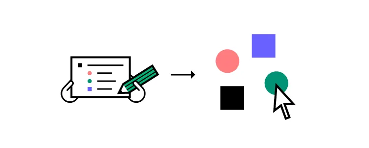
Nothing great is made alone. Collecting feedback from fellow designers is an important element of the product design process – one that companies for the likes of Spotify and Apple swear by.
There are several ways they can benefit you and the product team. Firstly, getting a pair (or several pairs) of fresh eyes on your work can help you refine your user interface design.
It opens you up to new perspectives and ideas, which might have been hidden in hindsight. Secondly, they reinforce design team culture, as you incorporate others’ opinions and concepts into your UI design.
There should be a clear itinerary for each feedback session – we recommend following a design critique procedure.
8. Consult Design Decisions with Devs

As designers are part of a wider product development team, it’s as important to communicate with engineers as with fellow designers.
Whenever you have an idea for a functionality but aren’t sure if it’s technically feasible, reach out to the dev team. They’re the ones who will be able to either green light your idea or tell you which parts you’ll need to re-work to make your designs possible to implement.
Better yet, use UX design tool that is built with design-developer collaboration in mind. For instance, UXPin lets you use the same code components used by devs to roll out new designs for your product.
Using it as a source of truth will make it easy to collaborate with developers and ensure your designs can be implemented into the live product. To learn more, read our Code to Design guide.
9. Don’t Fall Prey to Trends

Be reasonable about implementing changes according to the latest trends. While they indicate what is currently popular in UX (or the wider digital world), always ask yourself – does it fit my audience?
For example, if 70% of your users are 60 years old or more and aren’t tech-savvy, incorporating elements of VR might not be the best option. However, it might be perfect if your users belong to Gen Z and report spending hours on TikTok every day.
To sum up, observe the latest evolvements in UX product design trends, but always prioritize your users over exciting new features.
10. Avoid Too Many Changes at Once

Even if you have a backlog of several improvements, don’t be tempted to roll them out all at once. Limit yourself to a maximum of two changes and observe their influence. Do they solve the issues they were built out to fix? Do people know how they work and what purpose they serve?
If you implement too many changes simultaneously, you won’t be able to assess their impact. Also, remember that people like familiarity. If they log into your product and see too many alterations, they might become anxious. And this is quite the opposite of what you want to achieve.
Product UX Design is a Collaborative Game
The internet is full of advice on how you can get your UX product design right. Still, what works for one company won’t necessarily apply to a product like yours. To get it right, you need to base your design decisions on user data – their feedback, profile, and how they engage with your product.
The remaining part of the equation is working with your team collaboratively. Use a product design tool that not only offers great prototyping capabilities, but is also built to boost team collaboration. See how our technology can support cooperation with fellow designers and members of the software team alike. Discover UXPin Merge.
