7 Pillars of Web Design – A Beginner’s Guide
So you wanna be a Web Designer huh?
I mean why not? After all, everything is on the web …
As of writing this article 100 Million+ companies have an online presence through their websites.
But AI is here! Does that mean Web Design is dead?
Not at all! AI is changing the game, yes. AI can assist with the heavy lifting, no doubt. But creativity and empathy? Those are things it’s still catching up on. We need to be realistic about what AI can do and separate the hype from practical applications.
In this beginner’s guide, we’ll cover the fundamentals of web design to get you started on your path to becoming the next Mark Wheeler.
I’ll also show you a case study without overwhelming you so you get a sense of what you’ll actually be doing as a Web designer. Hopefully, this will give you a practical understanding of what it’s like to work as a web designer and inspire you to learn more.
Let’s go.
Looking for a tool for web design? Try UXPin, an end-to-end prototyping tool that for creating interactive app and web designs that can be developed within minutes. Try UXPin for free.

What Is Web Design?
Web design is the creation of visually appealing and functional websites. It involves planning, and designing (not coding) the structure and layout of a website and its content.
Wait, “and its content”?
Yes, more often than not, a company will not hire a separate content planner which can sometimes mean the designer takes on that responsibility. We’ll come back to that later.
Just like other design disciplines, web design also has humble beginnings. In the early 90s, websites were primarily text-based, focusing on information. As the web evolved, visual elements like images and graphics added engagement. Today a website can have hundreds of web elements. Buttons, text, fields, dropdowns, icons, video, sliders, gifs, checkmarks … you name it.
In web design, like many other fields, we face a common challenge: balancing form (how it looks) and function (how it works). This is why we have two specialties – UX for user experience and UI for user interface.
Many experts will categorize the web design process into many parts or phases.
But here is the industry standard:
Discovery Phase > IA and Wireframing > Visual Design > Prototyping > Testing
While these are important, they’re not what this post is about. This post is focused on the fundamental/core principles of web design. Let’s take a look:
The 7 Pillars of Web Design
Not to be mistaken with Principles of Web Design, These are one the first concepts every web designer must be familiar with. These pillars are the foundational elements that ensure a website is effective, engaging, and functional.
Pillar #1: Usability (UX)
Frustration doesn’t have to be vocalized! Usability in UX Design measures how effectively users can interact with and navigate a website to achieve their goals. Oh, and one of the most ubiquitous terms you’ll get used to as a web designer is actually “User Goals”.
What are User Goals? Let’s look at an example:
Sarah, a busy working mother, is looking for a birthday gift for her 7-year-old son. During her lunch hour at work, she uses her iPad to surf internet stores. Sarah’s primary goal is to buy a gift that her kid would enjoy, and her secondary goal is to make the transaction swiftly and effectively.
So, as a Designer, you want to LISTEN to these queues. If you’re designing an eCommerce store in this example, you’d wanna make sure that there are filters. Filters for gifts for example, and maybe you can go down to specifics of what kind of gifts and for what age.
Amazon has a collection of Gift Ideas for example. With sub-optimal filters … take a look:
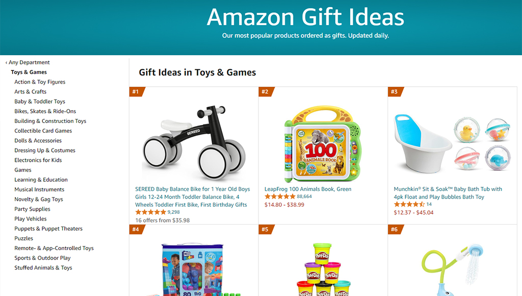
On this page, Shara could filter by product category, but it’s hard for her to find filters for age range or toy color. And since she’s browsing on a tablet with weak eyesight, the font used in the filter section can be difficult to read – these are the kinds of usability issues that you try to solve.
So, To solve them you have to KNOW the user. There is a simple three-step process approach to getting to know the user:
Define Pain Points > Create Journey Maps > User Personas
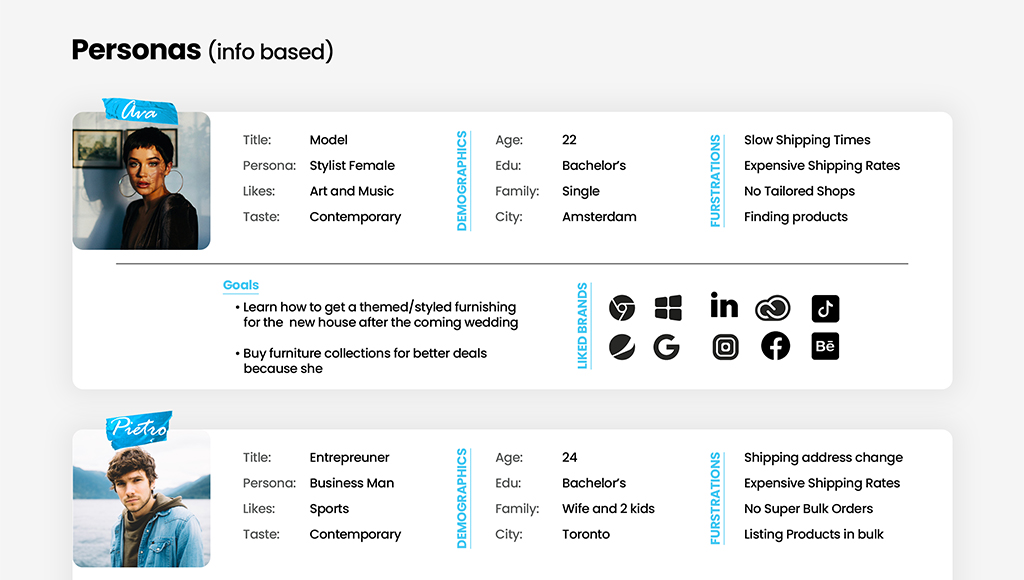
We’ll use MOLDO: a sample case study project I was involved in as an example. “Moldo” is an online shopping app for furniture and interior ware.
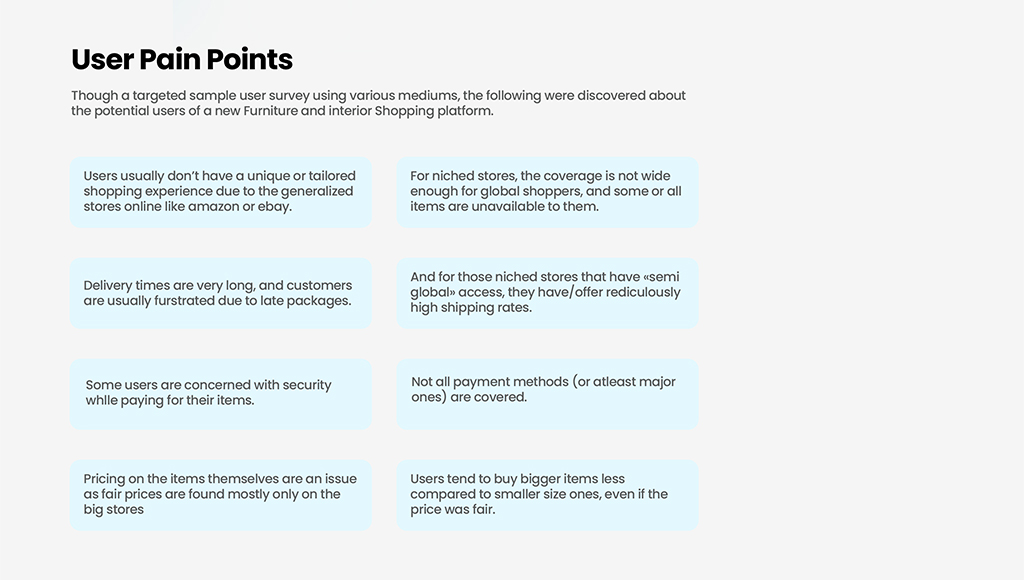
To understand our users’ needs, my team conducted research through surveys. We analyzed the results, prioritized the feedback, and identified the most common pain points that users were experiencing:
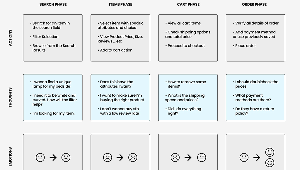
Then, we analyzed the major phases the user will have to go through on the App, and for each phase, we mapped user emotions, actions, and opportunities.
And finally, we have our personas …
Great UX design should consider the following factors:
- User’s Goals. As we already saw above: these are User Needs.
- User’s Emotions. How does the user feel when using the product?
- User’s Behavior and Actions. How does the user behave when using the product? Are they able to complete their tasks efficiently?
- User’s Context. Where and how is the user using the product? Are there any environmental factors that affect the user’s experience?
You will need to put yourself in the user’s shoes so that ultimately you can be able to create an intuitive design.
What is intuitive design? A design that is easy to use and understand, even for first-time users. This means that the product should be developed to align with the user’s expectations and mental models.
Here is another example …
Our home page has a clear and prominent call to action – a form that explicitly tells users what they need to do next.

The text clearly states the purpose of the product, which is to design UI with code-backed components. It is concise and free of distractions, making it easy for the user to focus on the main message and CTA.
The initial CTA is “Try for free”, which guides the user to take action and try the product. And even tells the user that we prefer their work email.
Again, this is why UX always comes before UI. UX is the why, and UI is the how.
Make it functional, then make it pretty.
We’ve written extensively on this topic in our blog – like Heuristic Evaluation, and UX Requirements feel free to browse around after you finish reading this one.
We even have a free ebook: Guide to Usability Testing.
Pillar #2: Design (UI)
UI Design focuses on the visual elements of a product, based on UX research findings. Visual elements are the ones a user directly interacts with, such as buttons, menus, and typography.
Its primary objective is to ensure that these interfaces are not only visually appealing but also user-friendly, enhancing overall satisfaction and efficiency in task completion.

I’ve been a UI Designer for half of my career, and let me tell ya, it’s fun. We worry about design movements, hierarchy, layout, interactions, and so on …
To start with, There are three types of UI Elements, Input, Output, and Helper elements, we cover them broadly in an article about UI elements, but let’s look at them quickly:
- Input elements. These elements allow users to enter data into the interface. Examples include text fields, checkboxes, radio buttons, drop-down menus, and sliders.
- Output elements. These elements display information to the user. Examples include labels, text, images, and icons.
- Navigation elements. These elements allow users to move around. Examples include buttons, links, menus, and breadcrumbs.
The UI Design Process
As I mentioned before, UI Design mainly involves the visual design and prototyping (and testing phase shared between UX and UI) part of the design process.
Depending on who you ask, Wireframing is part of UI design. Wireframes are the blueprints for your interface. So it goes like this:
Wireframing > Sketching > Lo-fi Prototype > Hi Fidelity Prototype > Mockup
But for brevity, we’ll stick to:
Wireframing > Sketching > Prototyping
Usually, the UX Designer would provide the IA (Information Architecture) of the app/website, and based on that we can start sketching out the project design scope.
IA is just a fancy term meaning a graph or map of how the content and pages should be structured, and it usually looks something like this:
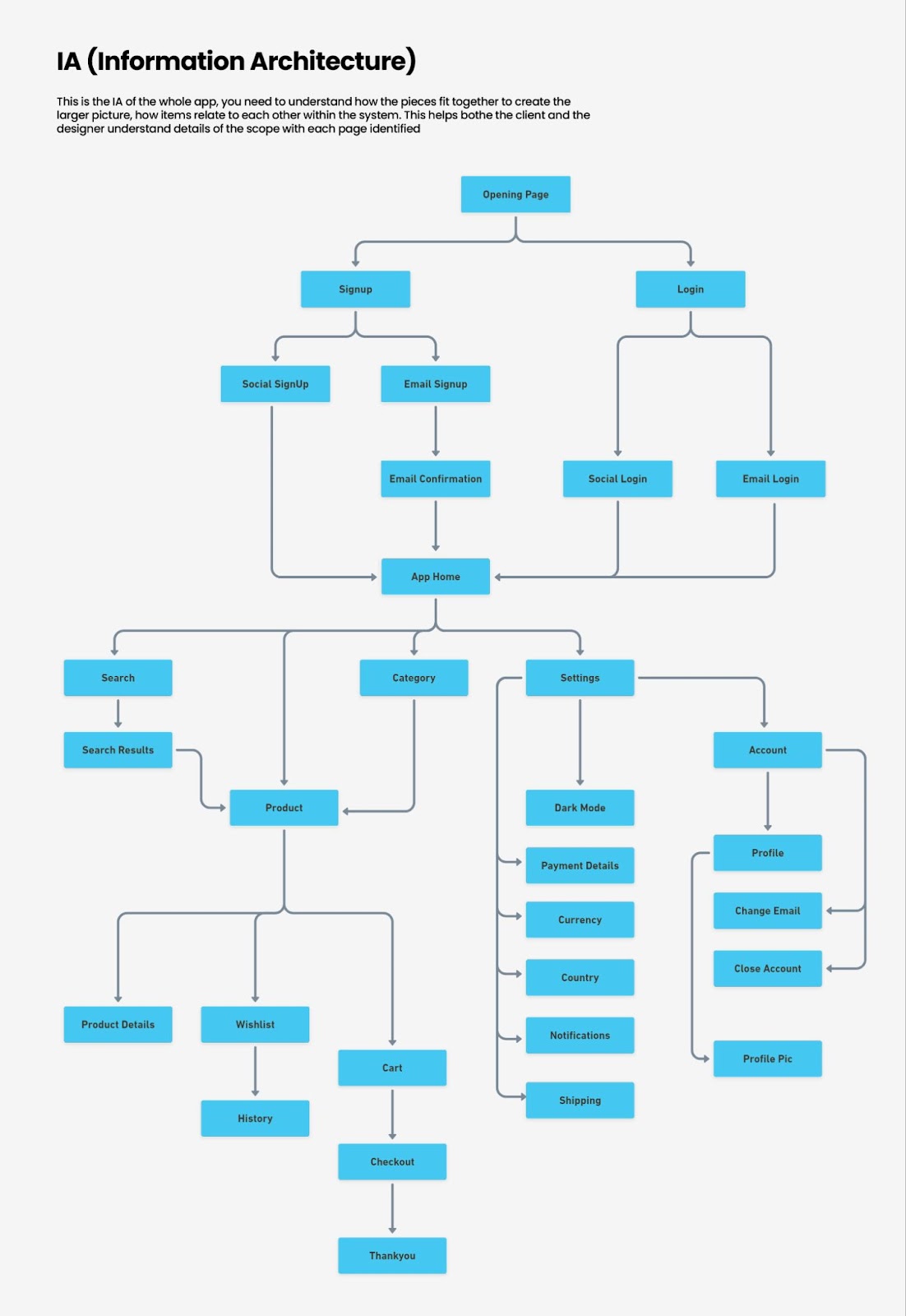
But it’s the foundation of Wireframing which is the next step.
We use wireframes to define page elements (buttons, forms, images), Arrange content (headers, sidebars, main content areas), and Show basic interactions (click paths, transitions).
You can create wireframes by hand (on paper) or digitally using tools like UXPin or Figma.
Getting back to the MOLDO example, here is what the wireframe looked like:
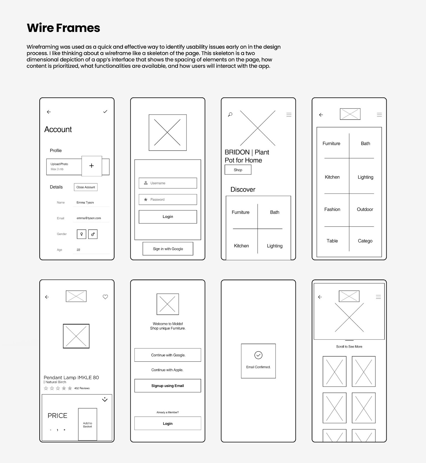
For most ecommerce products we found that the navigation was visually not inviting or was bulky. So we wanted to make sure that we have our UI balanced between obvious but not lame …
Beyond the optimized design itself, We also adjusted the size of buttons to be particularly bigger than what’s usually a standard in mobile apps.
The point of having a wireframe is to change and iterate to your heart’s content. As you progress through the design process there will naturally be less wiggle room so this is your way of telling your clients, “hey … here is what I’m thinking” and gathering feedback.
As you can see the wireframe stage makes it easy to know what goes where.
Next, you flesh out the Lo-fi and Hi-fi versions. Lo-fi usually is the flat but colored version of the wireframes. And Hi-fi almost looks like the real product. Sometimes we simply use a prototype and then a mockup.
You can see what a visual design prototype might look like in a design tool, with all the visual elements and layout finalized.
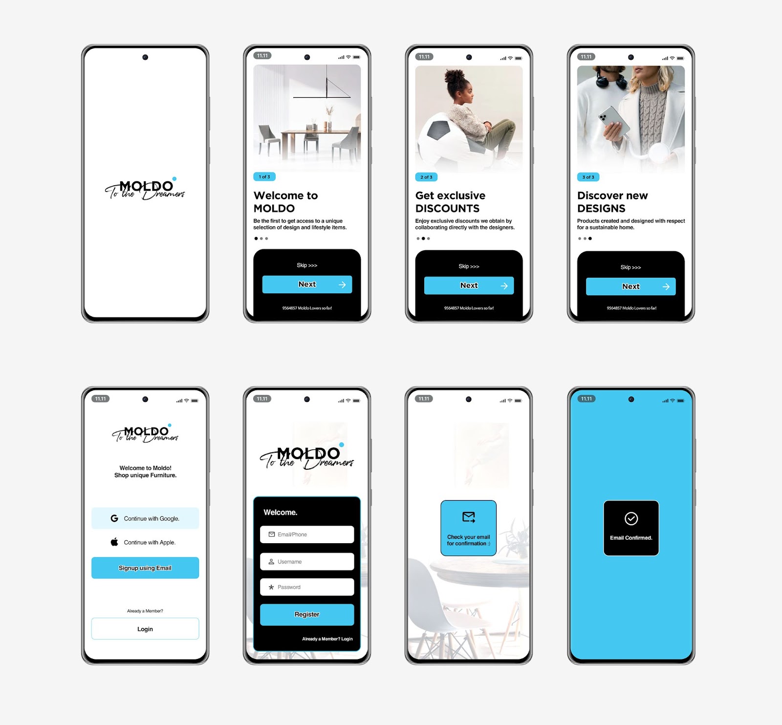
And then finally the polished Mockups … yay!

As UI Designers, we don’t only design how elements look but also how they behave during interactions. AKA animations.
And I’m not necessarily talking about transitions or motion animation.
Animations that guide and interact with the user in a way that feels natural, but consistent. That gives users feedback about their actions, so they know what’s happening.
We call these micro-interactions. are small, purposeful animations triggered by specific user actions (clicking a button, hovering over an icon … so on).
For example: When you click a button, it slightly depresses/shrinks to give visual feedback that your action has been registered.
UI Motion Principles
- Consistency. As a user, I should experience familiar motion patterns across different parts of an application. I should be able to predict how interactions will unfold. If a button slides in from the right on one screen, it should do the same elsewhere.
- Hierarchy. Primary actions (like submitting a form) deserve more attention than secondary ones (like canceling an operation). That’s just an example, but prioritize animations based on their importance within the user flow and website structure.
- Realism. UI animations should mimic real-world physics to feel natural. Depending on what you’re going for Objects should accelerate when they start moving (ease-in) and decelerate when they stop (ease-out).
- Context. Animations should align with the context and purpose of the interaction. A loading spinner during data retrieval makes sense. A playful bounce effect on a serious error message might not.
Pillar #3: Accessibility
Accessibility in UI design goes beyond just color. Color can not be used as the only way to convey information. Surely, many other disabilities are not related to the human eye.
According to a survey, more than 1 in 4 adults in the United States have some type of disability. That’s a population of more than 83.5M!
Accessibility refers to whether a product or service can be used by everyone, regardless of their abilities or disabilities.
Read: Web Content Accessibility Guidelines (WCAG)

Check out the full list of tools curated by W3.Org.
According to the WCAG, a website should do the following to be accessible:
- Perceivable. Content should be presented in ways that users can perceive (e.g., through text, images, or sound).
- Operable. Users should be able to navigate and interact with content (e.g., using keyboard shortcuts or voice commands).
- Understandable. Content should be clear and easy to comprehend (avoid jargon, provide instructions, etc.).
- Robust. Content should work reliably across different technologies and devices.
WCAG also has Levels of Conformance ranging from A to AA and AAA.
At UXPin we are very serious about accessibility. With UXPin’s accessibility features, you can design for all users, both disabled and nondisabled.
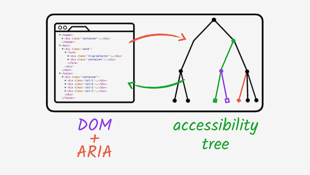
Image Source: Web.Dev
Accessibility Ground Rules:
- Color Contrast and Text Legibility. Poor color contrast can make text difficult to read, especially for people with limited vision or color blindness. The solution is to use high-contrast combinations (e.g., dark text on a light background or vice versa). Avoid relying solely on color to convey information. Use additional cues like icons or patterns.
- Alternative Text (ALT Text) for Images. People who use screen readers rely on ALT text to understand images. ALT text Describe the image’s purpose or content concisely.
- Keyboard Navigation and Focus States. Some users rely on keyboard navigation (e.g., screen reader users or those with motor impairments). All interactive elements (buttons, links, form fields) should be keyboard-navigable.
- Semantic HTML and ARIA Roles. Proper HTML structure aids screen readers and other assistive technologies. Learn more about ARIA attributes (Accessible Rich Internet Applications).
- Captions and Transcripts for Multimedia. Deaf or hard-of-hearing users rely on captions for videos and audio content.
- Forms and Error Handling. Forms are critical for user interaction, but poorly designed forms can be frustrating. Label form fields clearly and provide error messages in a perceivable way.
- Test with Real Users. Real-world feedback is invaluable. Conduct usability testing with diverse users, including those with disabilities.
Pillar #4: Layout
Layout refers to the arrangement of visual elements within a given space. It is part of UI primarily but decided by factors in UX. A well-designed layout enhances user experience by making content easy to find and understand. Here are some common types of website layouts:
Grid Systems. In a grid-based website layout, elements like margins, flowlines, rows, columns, gutters, and modules work together to create a structured and visually appealing design. Margins define the edges, flowlines guide reading, rows and columns organize content, gutters provide spacing, and modules combine elements into organized groups.

Box Model. The box model represents how elements are rendered on a web page. It includes four components: margin, border, padding, and content.
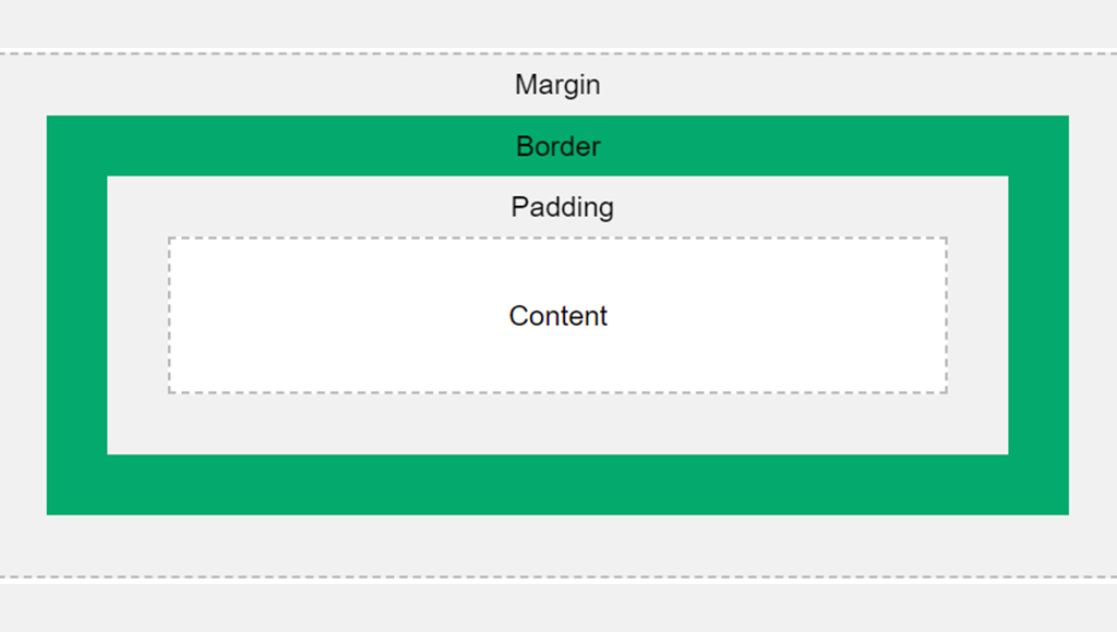
Image Source: W3
Flexbox. A powerful layout mode that allows flexible and responsive designs.
Key properties include display: flex, flex-direction, and justify-content.
Using a flexbox system is perhaps the best choice for managing responsive layouts.
Here are the primary types of website layouts, that provide a solid foundation for understanding web design principles:
- Fixed Width Layout. The content area has a fixed width, regardless of the screen size.
- Fluid Layout. The content area expands or contracts to fit the width of the browser window.
- Responsive Layout. A combination of fluid and fixed layouts, using CSS media queries or clamp functions to adjust the layout based on the screen size.
- Adaptive Layout. Similar to a responsive layout except it’s specifically arranged in the most suitable way for each device. (Separate layout for each).
- Grid Layout. A flexible layout that uses a grid system to organize content into columns and rows.
Learn more about website layouts and how they affect user psychology.
A fundamental principle that greatly impacts layout is balance, which web design relies on. Balance is all about distributing visual elements in a way that creates a sense of harmony.
There are two main types:
- Symmetrical Balance: Mirror-like fashion, creating a sense of formality and stability. This is often used in traditional designs and logos.
- Asymmetrical Balance: Arranged in a way that is not symmetrical but still feels visually balanced. This can create a more dynamic and interesting composition.
Another thing to keep in mind when working with layouts is Negative Space. This is an overlooked design element that differentiates between a noob and a pro.
Did I say “design element”? Yes!
In fact, thinking about negative space as an active element in web design will help you understand how layout works. It’s obvious that when a webpage is cluttered with too many elements, it becomes overwhelming for users.
But what is the point where it stops becoming clutter?
For example, look at this:
Unless you’re intentionally aiming for a busy, maximalist aesthetic and it makes sense for your audience, this approach can be detrimental to focus.
Modern WebUI is almost always incorporated with negative space like this:

Pillar #5: Typography
Typography is the art and technique of arranging type/letters, numbers, and symbols to make written language legible, readable, and visually appealing when displayed.
It’s an entire field of its own.
But in our context of web design, it involves choosing fonts, adjusting the spacing between characters (kerning), the space between lines (leading), and the overall layout of the text. Good typography guides your eye across the page smoothly without making you think too much about it.
It’s a big deal because it’s directly connected to clients’ ROI. So let’s take a look at some typography basics:
Font Families
A font family is a group of fonts that share a common design style. Think of a typeface as a broad category of fonts that share a unified look and feel. Within a typeface, you’ll find individual fonts that vary in size, weight, and style.
Font families are classified into types: Serif, Sans-Serif, Monospace, Display and Handwriting.
Let’s focus on the first three:
- Serif Fonts. Have small strokes (called serifs) at the edges of each letter. They exude formality and elegance. Think Times New Roman, Georgia, and Baskerville.
- Sans-Serif Fonts. Mostly used on UI and are sleek and modern. They don’t have those little serifs just clean lines. Arial, Helvetica, and Open Sans.
- Monospace fonts. Give every letter the same fixed width. Fonts like: Courier New, Consolas, and Inconsolata.
I once designed my own custom font, although I loved Proxima Nova. It took two months and gave me an insight into what works well on the web. It might even be one of the factors that I was nominated for Awwwards.
And from that experience, here are some tips that I’ve learned:
- Use
regularmedium font weights and anywhere between 18-21px for body text. - Don’t use more than two types of fonts. And always stick to one font for the body.
- When choosing a font for headlines or titles, feel free to explore more expressive options. Bold, playful, or unique fonts work well here.
- Use a clamp function for responsive text.
- Always use a different font style for links (usually bold or underlined).
- More typography tips.
Web-Safe Fonts
Web-safe fonts, also known as system fonts, are pre-installed on most operating systems. These fonts are readily available to users without requiring any additional downloads.
These should only be used as either a fallback font or if your client only wants raw performance and doesn’t give a dime about custom fonts. Or if other overarching elements on the site compensate for it.
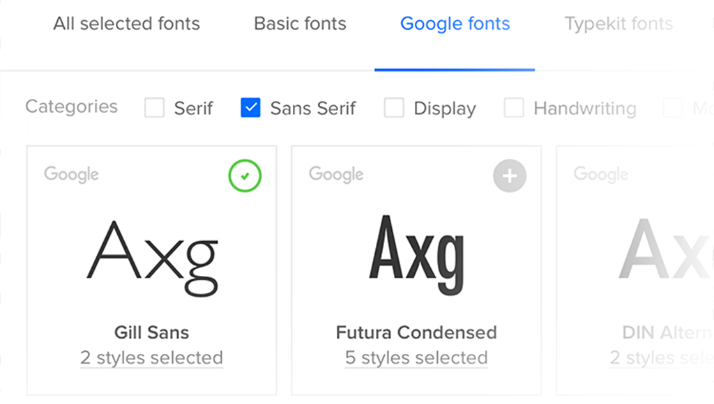
Google Fonts
Google fonts are hosted by Google, making them easy to incorporate into your web projects. You can use the API or directly download them and include them in your projects.
HTML Example:
<head>

<link rel="stylesheet" href="https://fonts.googleapis.com/css?family=inter">

<style>

body {

  font-family: "Inter", sans-serif;

}

</style>

</head>
Typeface Anatomy
I think while we’re at it it’s good for you to familiarize yourself with some common terms. Like “Glyphs”. So here is a quick rundown:
Each letter, number, punctuation mark, or symbol is a glyph. X-Height is the height of lowercase letters (excluding ascenders and descenders).
Ascenders and Descenders? They are upward-bound strokes of lowercase letters that extend beyond the x-height. The baseline is the invisible tightrope where letters stand. It’s their foundation the ground level.
Kerning is the space between individual characters. And tracking controls the overall spacing across a block of text.
Here is a better look:

Image Source: Yesiamadesigner
And again you can learn in more detail about typeface anatomy.
Pillar #6: Responsiveness
Responsive Design (not to be mistaken with Adaptive Design) is a web design approach that ensures a website adapts seamlessly to various screen sizes and devices
Responsiveness is the ability of a website to adapt its layout and content to different screen sizes and devices, such as smartphones, tablets, and desktops.
Design for mobile first!

It’s often easier to adapt a mobile design to a desktop than the other way around. Since larger screens can accommodate more content, it’s best to start by designing for mobile and prioritizing the most important elements.
Media Queries
Simple but if the user drags the window size they step towards the next set size.
Here is an example:
/* Tablets and smaller */
@media (max-width: 768px) {
.container {
width: 100%;
}
}
/* Mobile devices */
@media (max-width: 480px) {
.container {
width: 100%;
padding: 0 10px;
}
}
Clamp Function
The clamp() function in CSS lets you set a value that’s dynamic between a minimum and maximum. It adjusts based on the screen size or viewport width. So, instead of using media queries, you can have a property (like font size) scale naturally between limits.
Formula: clamp(minimum, preferred, maximum);
Example: Responsive Font Size with clamp()
h1 {
font-size: clamp(1.5rem, 5vw, 3rem); /* Between 24px and 48px */
}
With clamp(), you don’t need to set up media queries for every screen size. The text grows naturally between your set limits, and you don’t even have to calculate it by hand there are great free clamp() generators out there.
Responsive Images
Images can be a big hurdle when it comes to making a website responsive. They can slow down your site if not optimized, or worse, they might look distorted or too large on smaller screens. But, don’t worry, you’ve got a few tricks up your sleeve.
- Srcset. The srcset attribute is for delivering different image sizes based on the device. You’re telling the browser “Hey, use this image for mobile, this one for tablet, and this one for desktop.”
- Vector Images. SVGs (Scalable Vector Graphics) are amazing because they scale infinitely without losing quality. This makes them perfect for logos, icons, or any simple illustrations.
- Image Optimization. Beyond just choosing the right size, you can optimize images to load faster using lazy loading. You can use Webp or any other modern web image format. Read more about what matters for web performance.
Flexible Grid Systems
While responsive images handle the visual content, flexible grids manage layouts across different devices. These grids allow your design to flow naturally, adjusting based on the screen size.
1. CSS Grid
CSS Grid allows you to define rows and columns that automatically adapt to the size of the screen.
Here’s a basic example:
.container {
display: grid;
grid-template-columns: repeat(auto-fill, minmax(200px, 1fr));
gap: 10px;
}
2. Flexbox
While CSS Grid is perfect for two-dimensional layouts, Flexbox is awesome for one-dimensional layouts … think rows or columns.
Here’s how you can use Flexbox to build a simple responsive layout:
.container {
display: flex;
flex-wrap: wrap;
gap: 10px;
}
.item {
flex: 1 1 200px;
}
You can even combine both! For instance, use Flexbox to lay out different sections of your site, and then use Grid inside those sections for more complex layouts.
Now you need to think backwards FROM CSS towards your UI Design tool.
Pillar #7: HTML & Performance
Ultimately, your design will be brought to life in HTML, so having a basic understanding of HTML and CSS can be a huge advantage. It’s not a must for designers to know about this, but it sure helps a lot!
Browsers read HTML like a book, from top to bottom. They create a DOM (Document Object Model) as they go. The simpler this book, the faster it can be built. Believe it or not, it all starts with the designer.
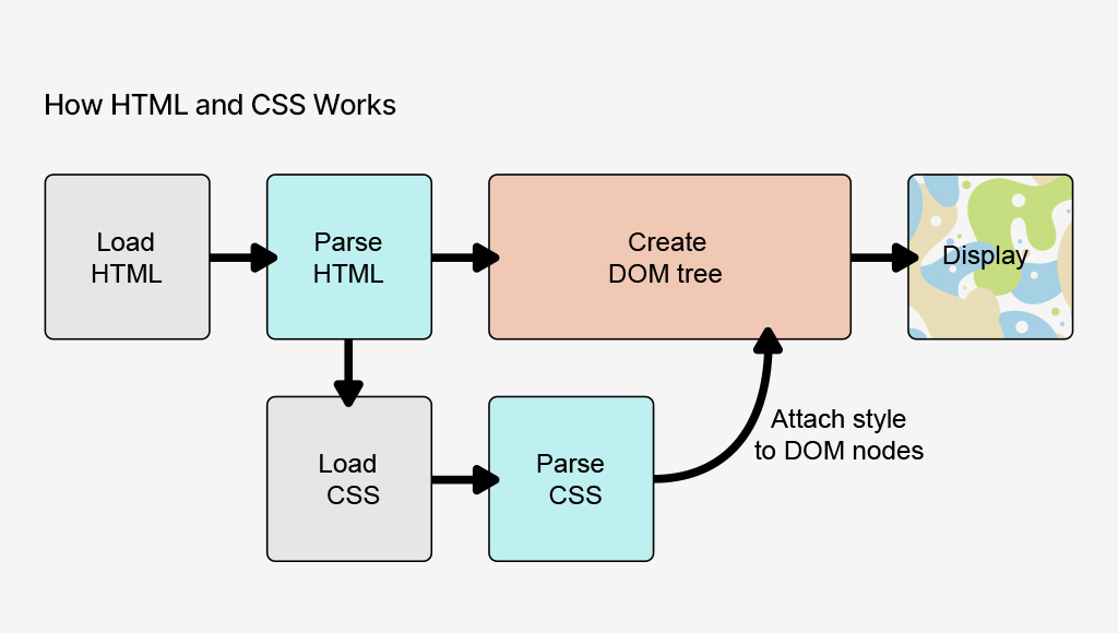
Image Source: Mozilla
If you’re a designer who understands this, you can start making decisions that not only look great but make life easier for the developer. For example, knowing how HTML is structured (with headers, paragraphs, images, and links) allows you to visualize how content will flow and stack across different devices. It also means you can avoid suggesting IMPOSSIBLE LAYOUTS that would take hours of unnecessary coding.
Benefits of Knowing Code as a Designer
- Identify and troubleshoot design issues more efficiently.
- Achieve precise control over the layout, typography, and styling of their designs, resulting in a more polished and professional final product.
- Experiment with more advanced techniques and create innovative designs that might not be possible for designers who rely solely on visual tools.
- Utilize a tool like UXPin much better because they can understand the code behind the elements.
The Handoff: Collaborating with Developers
The designer-developer handoff is often where dreams go to die, but it doesn’t have to be that way. Handoff is transferring a completed web design from the designer to the developer for implementation.
When you understand the basics of HTML and CSS, you’ll know what’s possible, what’s tricky, and how to meet halfway to create something that both looks great and works smoothly.
Developers will appreciate it, too, because you’ll be speaking their language or at least enough of it to avoid miscommunication.
Key Components of Handoff:
Design Files: These typically include:
- PSD, Sketch, or Figma files: Contain the visual elements, layers, and styles of the design.
- Style guides: Document the typography, colors, and other design elements used in the project.
- Wireframes: Provide a basic structure and layout of the pages.
Specifications:
- Measurements: Dimensions of elements, spacing, and padding.
- Typography: Font families, sizes, weights, and line heights.
- Colors: Hex codes or color names for all colors used in the design.
- Interactions: Descriptions of how elements should behave when clicked, hovered over, or focused.
Annotations:
- Notes and comments: Additional information or instructions for developers.
- Placeholders: Indicate where content will be added dynamically.
Design with Implementation in Mind
When designing a responsive navigation bar, knowing that developers can use CSS Grid or Flexbox to make it dynamic can inform your design decisions. You’ll create a flexible layout that adapts to different screen sizes, rather than specifying rigid pixel values for each breakpoint.
This approach streamlines the design-to-development process, reducing the need for back-and-forth revisions. By showing that you’ve considered the build process, you’re more likely to earn the development team’s respect and ensure that your design is implemented as intended.”
Suggest Solutions, Not Just Problems
We’ve all been there – pouring our hearts into a design, only to have it rejected due to technical limitations. But what if you could turn those limitations into opportunities? By having a basic understanding of HTML and CSS, you can collaborate with developers to find alternative solutions that achieve the same visual effect.
For instance, if an animation is deemed too complex, you can suggest using CSS transitions or animations that are easier to implement. This way, you’re not just handing off your design and hoping for the best – you’re actively working with the development team to bring your vision to life.
My favorite places to start learning CSS are: Kevin Powell, and Bro Code.
Web Designer Career opportunities
There are different ways web design can be added as a skill set of other professions like a web developer, freelancer digital marketer and so on but here are the major roles you can embody as a web designer:
- UI or UX Designer
- Web Design Consultant
- UX Researcher
- Product Designer
UI/UX Designers and Product Designers are the most common. I’ve personally worked in these exact roles myself.
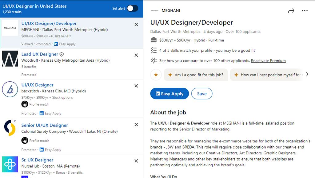
I just did a search on LinkedIn for “UI/UX Designer” and just today there are 1000+ offers available. And this is just in the United States.
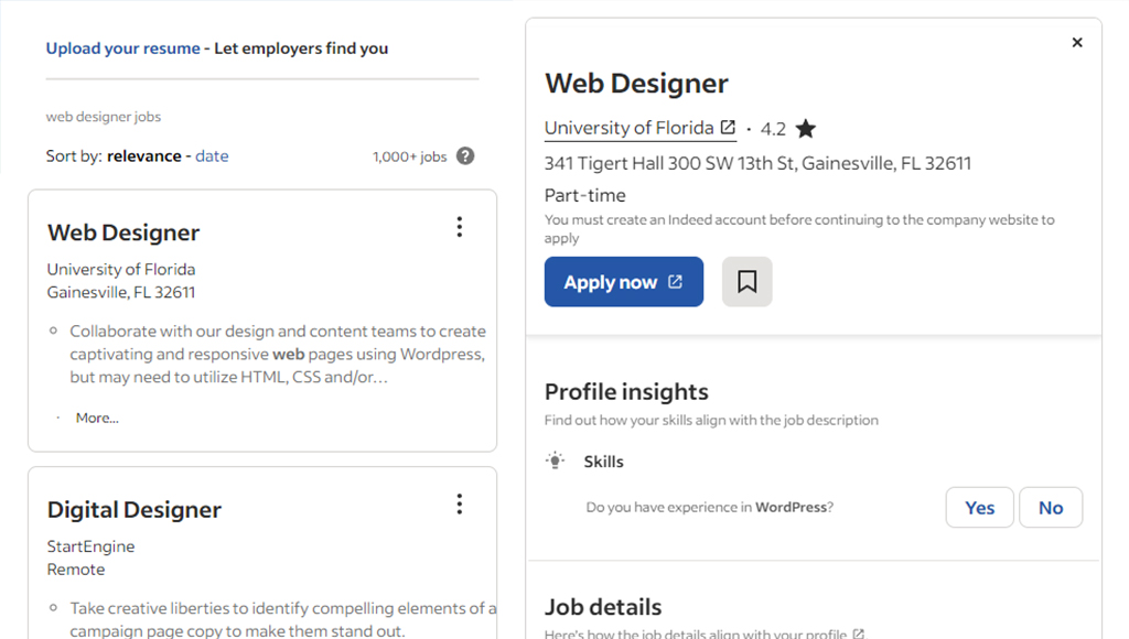
Taking a peek at Indeed shows another 1000+ results:
The best platforms for finding web design jobs are:
- Company Websites
- Dribbble and Behance
- Toptal
- Linkedin and Upwork
- Traditional Job Boards
Web-designers anywhere between $62K – $112K/yr according to GlassDoor.
You’d also be well-positioned to explore a wide range of entrepreneurial opportunities. Like freelancing, starting a web design agency, selling products, taking web design courses and workshops, and so on.
Resources and Tools
Resources
- The Guide to UX Design Process & Documentation
- Design Trends Collection
- DesignOps 101: Guide to Design Operations
Courses
- Google UX Design Professional Certificate
- Web Design for Everybody by the University of Michigan
- Ultimate Web Design Course by Webflow
- Fundamentals of UXPin on Udemy
Books
- Don’t Make Me Think by Steve Krug
- HTML and CSS by Jon Duckett
- The Elements of User Experience by Jesse James Garrett
- Laws of UX by Jon Yablonski
Conclusion
Even if you’re focused purely on the visual side of things, web design isn’t just about making things pretty. A site has to work in real-world conditions: it needs to load fast, be responsive, and be accessible. Knowing the pillars helps you think beyond the surface and consider what makes a site functional. That also makes working with developers smoother you’re speaking the same language, and you’re both aiming for a seamless user experience.
The perfect website balances purpose and functionality with beauty and simplicity. It’s easy to navigate, works on any device, loads quickly, and is accessible to all users.
At the end of the day, web design isn’t about you, it’s about the people using your product.
UXPin empowers teams to create seamless, interactive prototypes of websites and apps with realistic, fully functional components. Try UXPin for free.


