Best Phone Design Pattern Ideas for Your Mockup
Want to create an awesome but not so time-consuming design? Phone design patterns will help you prepare a perfect design for a mockup. The best ones show you an easy way to present menus, features, and information to users. Ideally, a new user should intuitively know how to use your smartphone application just by looking at the design. For example, they might include:
- “Play buttons” that people know will play a song or video.
- Hamburger menus that users know will open to show more navigation options.
- Icons that communicate to users what they will find by pressing each button.
Whether you want to use lo-fi mockups without text or hi-fi mockups that draw from a design system, the following represent some of the best options.
Simple phone design pattern for an app’s first page
The first page of a smartphone app should present information in a simple, straightforward way. This simple design from Adobe gives you an idea of how to place your introductory image, a short message, and a button.
The design shows four well-matched colors. No matter which one you prefer, you get an eye-catching mockup that makes your logo stand out on the page.
If you don’t have a logo for your business or app, you can follow advice from Chiara Aliotta, the creative force behind the Italian design firm Until Sunday. In an interview with UXPin, she says that some of the latest branding and logo design trends include:
- Using custom typography instead of relying exclusively on drawings and pictures.
- Creating logos that express something about the brand’s personality.
- Developing animated, interactive logos.
A simple phone design pattern for your mockup can make your job easier, but you still need a memorable logo. A pattern and a mockup can’t get the job done on their own.
Productivity app transition mobile design pattern
Aliotta believes that designers will rely more often on animated logos. You can also apply that approach to your entire phone application design pattern.
In this design, you find a productivity app that tells users when they complete their goals. The app doesn’t open immediately to a static page, though. Instead, the phone’s screen dissolves away to reveal the app’s workstation.
The design works well because it engages users – exactly what you want from a productivity app! It also has a place to personalize the screen with the user’s name. You could replace it with your client’s name to make it a little more appealing. With UXPin, you can also make unique designs for each accomplishment in the mobile app design. Why not replace the existing icons and messages with real data that applies to the buyer’s real life?
Smartphone design patterns for a messenger app
You don’t necessarily need to create a new design from scratch when you build a messaging app. Why reinvent the wheel when you really want to show how your technology works? A smartphone pattern like the one above provides all of the basic design elements that you need to present your app concept. So, all you need to do is simply include those in your design!
Later on, when you move from your design to a prototype, you may want to add some distinguishing features. When you first propose a messenger project, though, you don’t need to worry about design specifics. You just want an attractive layout that displays texts and images from more than one person.
Mobile design pattern for calendar and daily schedule
Google Play and the App Store have hundreds of calendar apps that users can download for free (with advertisements) or at low prices. Whether you want to break into this area of the app market or you need to create an in-house scheduling app for a company, you can start with a phone pattern that lets you concentrate on how the app works instead of what it looks like.
The above calendar app design works well because it lets users tap a date to see what they have scheduled for that day. It also lets multiple users share their accounts, which makes it useful for teams and families that need to communicate with each other quickly and easily.
The only problem with this phone mockup design pattern is that it uses lorem ipsum instead of real text. You might not mind using nonsense text during the first stage of your design process. Eventually, though, you will want a prototype that shows potential users what they can really expect from your app.
UXPin replaces lorem ipsum with real data instead of forcing you to waste time generating your own content for prototypes.
Get inspired by your design tool’s library patterns
To create your mobile app design you need some inspiration and some of the best ones you can probably find in your UX tool pattern library!
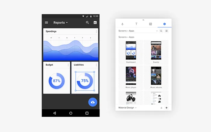
At UXPin we have a lot of ready design patterns that you can use right away in your design or mockup, like Material Design. Take a look:

We’ve all kinds of screens for apps like reports, music albums, events, players, etc.
View your design with a phone preview
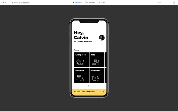
What’s the best way to preview your mobile design? Well, a phone of course! Your design tool should have an option of phone preview so that you can see the design on the phone model you choose.
You’re then sure whether some of your design choices work or maybe there’s room for improvement. Here’s how it looks at UXPin phone preview:

We also have an option that can help you in viewing the prototype on your real mobile device! It makes your design come to life, allowing you to feel it and see how it behaves.
Use the Mirror app on your device and scan the code to view the prototype.
UXPin makes it easier to create your own phone mockup design patterns
If you want to speed up the design process use UI kits to create mockups. No matter what approach you take, you will eventually need to develop elements that make your product unique.
Now, that you have all the ideas from design patterns and options to preview your prototype – it’s time to prepare a nice mockup!
UXPin gives you an easy way to create designs and prototypes that use real data. Additionally, you have all needed design pattern libraries if you want to get some inspirations or just need a quick mockup! Start a free trial today to see how UXPin can turn your ideas into impressive prototypes. You might find the tool so easy to use that you stop relying on phone design patterns for mockups from other people.

