Mobile Design Systems – Tips and Examples
Many digital products only exist on mobile, but they often adapt web component libraries for native mobile apps. According to a Clarity 2020 talk, “less than 10% of public design systems support platforms other than the web?”
Unlike web-based design systems, mobile design systems must adapt to native operating systems and platform-specific UI patterns.
What if you could sync the code components from a mobile design system and use them in design? UXPin’s Merge technology allows you to bring coded UI components to UXPin’s design editor and use them to build functional prototypes. Reach the new heights of consistency. Request access to UXPin Merge.
The Importance of a Mobile Design System
Many design systems include responsive components, which are great for web app usage but might not be suitable for native mobile applications. For example, UI elements like alerts, snackbars, date pickers, etc., render differently on iOS vs. Android native applications.
It’s not unusual for an Android app to use a floating action button (FOB), whereas this component doesn’t exist on iOS, which may confuse Apple users.
So, a responsive design system alone isn’t enough when designing a native user experience. UX designers must create a mobile design system that adheres to platform-specific policies, guidelines, UI patterns, best practices, and constraints.
Maintaining Cohesion and Consistency
One of the most significant benefits of a design system is cohesion and consistency. Teams deliver projects with minimal design drift and errors when everyone uses the same component library.
Native applications can disrupt this cohesion and consistency by rendering shapes, sizes, colors, and other UI elements differently to the design system’s guidelines.
A great example of this inconsistency is how Trade Me’s component library changed after implementing a mobile design system. You will notice that the app’s buttons looked more like native buttons before implementation. The redesign helped align these components with the web component library to deliver a more consistent and cohesive cross-platform user experience.
Tips for Creating a Mobile Design System
Identifying Mobile Design System Components
Building a mobile design system starts with listing your product’s components. It’s good to screenshot user interfaces from iOS and Android versions of your product to visualize your product’s aesthetics across platforms.
The aim is to identify each UI element while looking for inconsistencies. For example, you might find you have different button styles for iOS and Android, which may differ from your web component library.
Leveraging Native UI Design Patterns
Google’s Material Design and iOS Human Interface Guidelines provide comprehensive libraries of components and documentation for building respective native applications.
UX designers can use this documentation as a foundation to guide design decisions to deliver a familiar user experience. For example, how can designers leverage a feature like Android’s FOB to enhance the product and user experience? And how will that component look in the product’s design system?
Component Library Theming
If you’re building a mobile design system from scratch, adapting an open-source component library is an excellent strategy for developing and scaling fast.
UX designers can leverage expertly designed component libraries thoroughly tested for usability and accessibility to focus on building and scaling their products instead of creating everything from scratch.
Open-source mobile React libraries like MUI, Ant Design Mobile, NativeBase, and UI Kitten provide themeable components UX designers can adapt to meet brand and product specifications.
Bottom-Up Designing With Atomic Design
Using Brad Frost’s Atomic Design principles gives designers a bottom-up approach to designing elements, components, and UI patterns. The idea is to start from the smallest elements, or atoms, and scale your designs to complete pages.
Applying Atomic Design practices enables designers to create a solid foundation of reusable components to develop and scale a design system. This Atomic approach also encourages the DS team to reuse the same building blocks (“atoms,” “molecules,” and “organisms”) for designing new UIs rather than creating new parts from scratch–thus keeping the design system lean and efficient.
5 Great Examples of Mobile Design Systems
These five high-quality open-source mobile design systems offer comprehensive libraries of themeable components for developing native and cross-platform applications.
We’ve chosen these five because they provide clear design language, UI kits, and component libraries, so designers and engineers can collaborate using the same UI elements. These examples offer dark/light themes, accessibility features, and adaptive designs for multi-platform product development.
You can customize these mobile design systems to meet brand and product requirements or use the component libraries as inspiration for building your design system from scratch.
NativeBase
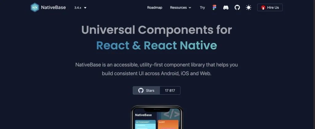
NativeBase is a cross-platform React toolkit for developing iOS, Android, and web applications. The themeable component library makes it easy to change the global color palette, type scale, font stacks, breakpoints, spacing, border-radius values, and more.
NativeBase is fully accessible using React Native Aria, “React Hooks to build accessible React Native design systems,” giving design and engineering teams a solid foundation for building accessible products.
NativeBase includes a component library for engineers and a matching UI kit for designers. The library provides comprehensive documentation for usage, best practices, theming, and templates for building mobile applications.
UI Kitten
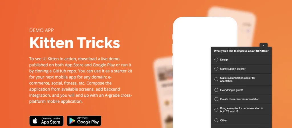
UI Kitten is a React Native UI library version of the Eva Design System. Designers can use UI Kitten and Eva to develop multi-platform applications for any device. The comprehensive UI ecosystem includes Eva Icons with over 480 commonly-used icons to complement its UI components.
Eva and UI Kitten are highly customizable, with features designed specifically for enterprise design. UI Kitten provides documentation for implementing the design system for new and existing products, with comprehensive step-by-step getting started guides.
Material Design System
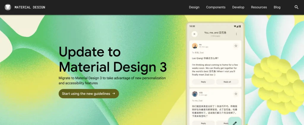
Google’s Material Design System is one of the largest and most comprehensive design systems in the world. In 2022, Google released Material Design 3, which includes important native updates for foldable devices and Android 12.
Even though Material is a Google/Android product, the design system includes a library of iOS-specific native components, so designers can easily build cross-platform applications.
Material Design is highly customizable with theming for color, typography, dark/light mode, shapes, spacing, and more. Designers also have over 2,500 Material Symbols (icons) in three styles to complement their designs accordingly.
UXPin includes Material Design’s UI kit and MUI’s React component library built-in–no additional plugins, extensions, or uploads are required. Sign up for a free trial to use these component libraries to develop your mobile design system today.
Ant Design Mobile
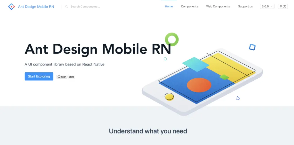
Ant Design Mobile is an open-source design system used by many Chinese-based organizations, including Alipay, Koubei, and Taobao, to name a few.
The comprehensive design system includes native mobile and web component libraries to build multi-platform digital products. Ant provides platform-specific UI patterns for Android and iOS, so designers simply drag and drop to start prototyping and testing.
Ant Mobile Design offers UI kits for popular design tools and component libraries for React, Vue, and Angular, making it one of the most versatile design systems worldwide.
REI Cedar
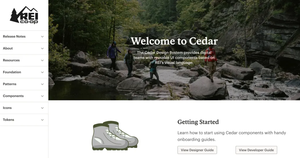
REI’s Cedar is a cross-platform design system with platform-specific (Android, iOS, web, etc.) components and patterns. Cedar’s excellent documentation includes resources for designers and developers with CodeSandbox examples of every element.
Cedar includes guidelines, behavior, best practices, dos and don’ts, and accessibility recommendations below every component and UI pattern. The UI kit and component library use design tokens to customize color, sizing, spacing, motion, forms, breakpoints, typography, and more.
Bonus – More Cross-Platform Design Systems
We highly recommend checking out these design systems for inspiration and guidance when developing your own design system.
These design systems are for creating products on the respective platforms rather than building standalone applications, but it’s helpful to see how these organizations use components, write documentation, etc.
- Shopify Polaris
- Atlassian Design System
- Microsoft Fluent UI
- Salesforce Lightning Design System
- GitHub Primer
Building, Managing, Scaling, and Sharing Mobile Design Systems in UXPin
UXPin offers a solution no matter where you are in design system maturity. You can create your own design system from scratch or import an established code-based component library using our Merge technology.
Building a Design System From Scratch
Designers can use UXPin’s built-in design system feature to build a design system from scratch. UXPin automatically segments the system into Colors, Typography, Assets, and Components, with the option to add descriptions for documentation.
The design system team can set permissions for the design system and its components to prevent unauthorized changes. They can also share the design system with team members, external collaborators, and stakeholders–even if they don’t have an active UXPin account.
Engineers can use the design system’s style guide to create theme tokens for development to streamline future design handoffs.
Merge Design and Development
Use UI coded components from your design system as a single source of truth. Request access to UXPin Merge. Merge syncs code components from a repository to UXPin’s editor, so designers and engineers use the same design system.
Using the same component library means designers and engineers work within the same constraints, thus streamlining design handoffs and product development workflows.
With standardized, approved components, engineers no longer have to interpret design files, prototypes, and documentation; they simply copy/paste from the repository and any UXPin changes to begin the development process.
Designers can use code components to build fully functioning prototypes that enhance usability testing with meaningful, actionable results from end-users. Merge also improves feedback from stakeholders who can use and interact with prototypes as they would using the final product. Request access to UXPin Merge.


