Photo credit: Jeremy Keith, Creative Commons
Responsive web design has exploded in popularity — thanks to the need to create sites that work across numerous devices.
However, responsive design comes with some problems of its own. The issue of slow-to-load sites is now well documented. Let’s walk through some of the tricks designers are using to better load content and images on different devices.
Media Queries to Call Styles
One of these tricks is the use of media queries, which work to call styles to the user device based on its dimensions. There has been some debate in the past on whether media queries are the best solution when it comes to mobile-first, and that debate still continues. However, the Responsive Issues Community Group (RICG) and W3C have looked at ways to implement element queries, which some believe would be a better solution. Why? Because they don’t depend on the viewport, but on the container within it. Media queries are a simple and effective way to serve different content to a range of devices and the most commonly used queries are those that deal with the viewport’s height and width.
Call Using External Stylesheet or in a Stylesheet
Like we described in the free e-book Mobile UI Patterns, media queries first check the media type against the user agent string before going on to check for the physical attributes of the viewport. They are a CSS declaration that can be called using an external stylesheet, or be written directly inside a stylesheet.
For example, the external call would look like this:
<link rel=”stylesheet” media=”screen and (min-width:320px) and (max-width:480px) “href=”css/yourstylesheet.css” />
And the CSS direct call would look like this:
1 @media screen and (min-width:320px)
2 and (max-width:480px){
3/*Insert your styles here
4 }
Here we can see that these CSS declarations are called only for devices with those height and width properties. Media queries are not modular, so this can make them difficult to work with, as discussed by Ian Storm Taylor. However, others are pushing for the use of elemental queries, as pointed out by Richa Jain in her excellent article “Beyond Media Queries — It’s Time to Get Elemental.” But it’ll be some time before we see them implemented, if indeed they are at all, so for the moment we’re stuck with media queries and the issues that surround their use.
Element Queries Not Yet Supported
There have been some innovative developers out there who have come up with workarounds, such as Tyson Matanich, who has come up with an element query ‘polyfill’.
Other workarounds include (found thanks to Richa Jain):
- Elementary by Scott Jehl
- EQ.js by Sam Richards
- CSS Element Queries from Marcj
An element query is similar to a media query because it uses CSS when certain conditions are met. However, they are based on elements rather than the browser, which are currently unsupported in CSS3. Element queries are gaining momentum, especially since they complement media queries. This means that both can eventually work together to create more modular and flexible designs.
Getting Started With Media Queries
First, it’s important to understand the difference between media queries based on ‘width’ and ‘device-width’. The former describes the width of a mobile devices’ rendering surface, while the latter describes the device’s actual screen width.
Photo Credit: Tribehut, Creative Commons
In other words, you’ll only be applying a rule to the width of a document window using the ‘width’ media query. Whereas with ‘device-width’, you’ll be using the entire screen. It’s an important distinction to make. That’s because ‘device-widths’ don’t always match the viewport layout and could really impact your design. See a more in-depth explanation in Ryan Reese’s SitePoint article.
As Ryan points out:
“For reference, you should know that the iPhone 4 has a regular screen layout viewport of 640×960. This means that, in this example, the device-width of the iPhone4 is 320×480. This is the case because Apple realizes that not every website is built responsively (shame on them) and tries to please everyone by having around 980px width to accommodate the desktop view of the website. This means, that if there is no meta viewport tag in place, the iPhone4 will take your website, render it as if it were 980px wide, squish it into a 320px display, and as a result, would be zoomed out to the user.”
However, you don’t have to be constrained by using device-based media queries. You can implement media queries on resolutions that break the layout, no matter the screen size. For example, the responsive framework Foundation has media queries based on three core breakpoints — small, medium and large. Small covers all screens. Medium covers screens 640px or wider. Large covers screens 1024px or wider.
Adding Queries for Different Viewports
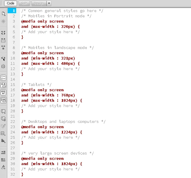
As you can see, we’ve added queries for landscape and portrait viewports, as well as set parameters for some common screen sizes. Around five sizes will cover most devices, but you can include as many as you like. You can also add additional styles according to how you want the content to look on each device.
For example, if you want the content on a mobile device to be displayed in a certain font or you want a different background color, then add the following under where we’ve marked /* add your style here */:
1 .site-content {
2 font-family: Georgia;
3 background: blue;
4 }
Working With Images
Scaling images for responsive design is simple enough. However, there are few issues to look out for, such as loss of detail and images being squeezed down to fit the container while taking up most of the page on smaller devices.
To create scalable images, simply add the following code to your stylesheet:
1 img {
2 max-width: 100%;
3 }
This will scale down the image to fit within a container that is smaller than the image’s width. Setting the max-width to 100% means that the image won’t scale up any bigger than its actual size when called for larger viewports.
However, this can be a problem when it comes to site performance because you’re essentially delivering a full-size image to every device. There’s no one simple solution to this, especially if you’re working on a site which has legacy images. However, Adaptive Images is a plugin which can optimize your images based on screen sizes and has an excellent reputation. And the responsive framework Foundation also allows you to swap images based on screen sizes.
When working with images you should use SVG, web fonts, web type and CSS wherever possible. For further reading, check out Chris Coyier’s post on CSS-Tricks and Sherri Alexander’s Smashing Magazine article.
Other Media Queries
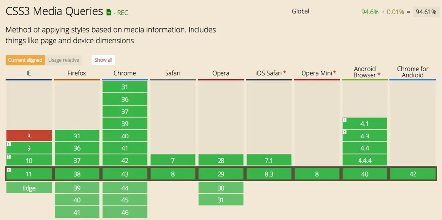
Can I Use has a complete list of browsers and the media queries that they support, as well as usage stats for various countries around the globe and their known issues.
Image source: Can I Use
You can also find a complete list of media queries and if they are supported or not on CSS Media Queries. There’s also an area where you can test out queries that you’ve created too.
Take Care With Performance
Media queries are used in responsive web design, which allows for a site to be viewed on a variety of screen sizes and browsers. As we said, media queries aren’t modular, so this can cause design issues that can be difficult to work around. There are a huge amount of resources to be found online to help you with this, such as code snippets and frameworks.
It’s important when working with media queries to ensure that you understand performance and its impact on UX and conversions. A slow loading site will frustrate users and have them abandon their purchases. And that will end up costing the owner a lot of cash in lost revenue
The mobile revolution has ensured that we will no longer tolerate a horrible web experience. When designing a responsive site, you should consider using conditional loading to reduce the amount of content that’s sent to a target device.
Social media sharing buttons slow sites down too, especially on mobile. Just three social buttons for Facebook, Twitter and G+ make up a total of 19 requests and take 246.7k in bandwidth. With this in mind, consider using web fonts on your front page for your social media URLs rather than images and limit the number of sharing buttons on your blog posts.
Alternatively you can use jQuery plugins to speed the social media sharing buttons up a little.
There are tons of online tutorials to help you with responsive web design and media queries. We hope we’ve given you a great starting point so you can get going with media queries.
If you’d like to learn more about front-end visual design, take a look at our free e-book Mobile UI Patterns. We’ve analyzed 46 of the most effective yet flexible design patterns based on their use by top companies like Spotify, Pinterest, Uber, Instagram, Flipboard, and many others.


