Login Page Design – Guide for SaaS Websites

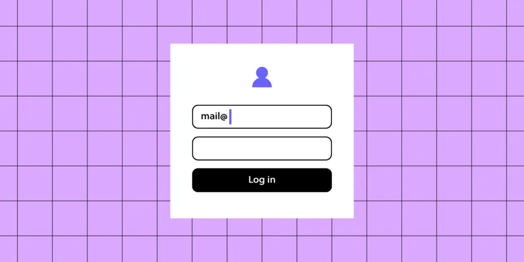
Login page design refers to the user interface and experience of the entry page where users input their credentials to access a platform or app. An effective login page is far more than a basic entry form—it’s often the first interaction a user has with the product, setting the tone for the entire experience. A well-designed login page can streamline user access, enhance security, and boost user retention.
For SaaS websites where branding and security are paramount, UXPin supports brand consistency by integrating design systems and styles that make the login page both polished and trustworthy. Designers can also easily share interactive prototypes with stakeholders and developers, who can view specs and documentation directly from the prototype, ensuring an efficient and accurate handoff. UXPin empowers you to create a professional, accessible, and secure login experience that reflects your brand and sets the right impression for users from their first interaction. Try UXPin for free.
Table of Contents
- What is a Login Page?
- How to Design it in UXPin?
- Step 1: Start with a New Project or Page
- Step 2: Set Up the Login Form Layout
- Step 3: Design the Action Buttons
- Step 4: Customize the Visual Design
- Step 5: Add Conditional Logic for Error States
- Step 6: Add Interactive Elements
- Step 7: Add Security Features
- Step 8: Test Interactions and Usability
- Step 9: Conduct Usability Testing
- Step 10: Share with Stakeholders or Developers
- Top Tips for Login Page Design for SaaS Websites
- Summary
What is a Login Page?
A login page is a web page or screen where users enter their credentials—typically a username or email and password—to access a secure area of a website, app, or platform. It serves as a gateway to restricted content, personal accounts, or subscription-based services, ensuring that only authorized users can enter. So, it’s like a security measure that authenticates users, provides controlled access, and helps protect user data.
Beyond fields for username and password, login pages often feature additional options, like “Forgot Password” links, two-factor authentication (2FA), or single sign-on (SSO) options (e.g., logging in with Google or GitHub).
This small but vital part of user experience design influences users’ trust and perception of the product from their very first interaction. That’s why it’s important to follow best practices when designing it.
How to Design it in UXPin?
Designing a login page in UXPin allows you to create an interactive, high-fidelity experience that’s close to the final product. Here’s a step-by-step guide:
Step 1: Start with a New Project or Page
Create a new project in UXPin or add a new page to an existing project if you’re integrating the login page into a larger prototype.
Step 2: Set Up the Login Form Layout
Add Text Fields
Use UXPin’s input fields to create the username/email and password fields. Customize these with placeholders like “Enter your email” or “Password” to guide the user.
Add Labels and Instructions
Label each input field to ensure accessibility and clarity. If needed, include hints or instructions, such as password requirements or validation info.
Step 3: Design the Action Buttons
Add a Login Button
Create a button labeled “Login” using UXPin’s button element. Adjust its size, color, and style to match your brand and make it visually prominent.
Add Secondary Actions
Include other essential actions like “Forgot Password?” and “Sign Up.” These can be text links or secondary buttons, positioned below the login button for easy navigation.
Step 4: Customize the Visual Design
Apply Brand Colors and Fonts
Customize the login page with your brand’s color scheme and typography, ensuring consistency with the rest of the app or website.
Add Background and Logo
Incorporate the brand logo at the top of the page to reinforce the brand identity. For background options, consider a minimalist look or subtle imagery to keep the design clean and focused.
Step 5: Add Conditional Logic for Error States
Set Up Error Messages
UXPin allows you to add conditional logic to elements, so you can simulate error messages. For example, if a user leaves the password field blank or enters the wrong credentials, display an error message below the field.
Highlight Errors Visually
Add color indicators (like red outlines or icons) around fields with incorrect input to guide users on how to correct them.
Step 6: Add Interactive Elements
Checkboxes for “Remember Me”
If you want to include a “Remember Me” checkbox, add a checkbox element and place it under the login fields. This can be styled and customized to match the overall look.
Password Visibility Toggle
Use UXPin’s interaction options to add a password visibility toggle (like an eye icon) to the password field. Set up interactions to show or hide the password when the user clicks the icon.
Step 7: Add Security Features
Simulate Two-Factor Authentication (2FA)
If your login page includes 2FA, add a new screen or modal that prompts the user to enter a verification code. Set up navigation and interactions to display the 2FA screen after clicking “Login.”
Set Up Success or Error Pages
Design a success message or transition to the main app interface upon successful login. For incorrect login attempts, route users to an error page or display an error state directly on the login page.
Step 8: Test Interactions and Usability
Use UXPin’s preview mode to test interactions and confirm that all links, buttons, and conditional logic work as expected. Check for smooth navigation and verify that error states appear as intended.
Step 9: Conduct Usability Testing
Conduct usability testing directly within UXPin by sharing the prototype with users. Collect feedback on user flows, error handling, and general ease of use to identify any improvements before finalizing the design.
Step 10: Share with Stakeholders or Developers
When your login page is complete, share the UXPin prototype link with stakeholders or developers for feedback or handoff. UXPin’s developer mode allows teams to view CSS, measurements, and style guides, streamlining the transition from design to development.
Top Tips for Login Page Design for SaaS Websites
Here are essential tips for crafting an effective, user-friendly login page that enhances UX and UI for SaaS websites. Let’s cover key areas like accessibility, branding, developer handoff, security, and microcopy to ensure your login page sets the right tone and functions seamlessly.
- Minimize Complexity: Keep the login page straightforward and avoid distractions. Focus users’ attention on logging in without overcrowding it with unnecessary links or information.
- Visual Hierarchy: Direct users’ attention to input fields and the login button. Place secondary options like “Forgot Password?” and “Sign Up” in less prominent, but accessible, areas.
- Keyboard Navigation: Ensure that users can tab through all interactive elements (input fields, buttons, checkboxes) logically. Test this flow for ease of navigation by keyboard.
- Labels and Alt Text: Include accessible labels for fields (username, password) and alt text for icons (like the password toggle). This helps screen readers convey information to visually impaired users.
- Color Contrast: Ensure sufficient contrast between text and backgrounds, especially on buttons and error messages, to improve readability for visually impaired users.
- Integrate Brand Identity: Use brand colors, fonts, and logo placement to reinforce brand identity. Avoid over-styling—keep it clean and professional.
- Subtle Animations: Thoughtful animations (e.g., button hover effects) create a polished look. Keep animations quick to avoid distracting from the main action.
- Friendly Language: Label fields clearly, use placeholders (e.g., “Enter your email”), and add welcome messages like “Welcome back!” for a friendly touch.
- Helpful Error Messages: Avoid vague messages like “Invalid credentials.” Instead, specify (e.g., “Incorrect password. Please try again.”) and use real-time validation if possible.
- Password Recovery: Make the “Forgot Password?” option easy to find and use, minimizing friction for users who need to reset their credentials.
- Two-Factor Authentication (2FA): Offer 2FA as an option for enhanced security, along with simple setup instructions if available.
- Password Visibility Toggle: Add an eye icon to toggle password visibility, especially helpful for mobile users.
- SSL and Encryption: Make sure login forms are secure by using HTTPS and encrypting data, crucial for protecting sensitive user information.
- Define States and Interactions: Document button and field states (default, hover, active, disabled). Developers need this for accurate functionality.
- Style Guides: Provide exact specifications for colors, fonts, padding, and spacing. UXPin’s developer mode can help by generating specs from the prototype.
- Interactive Prototyping: Create a clickable prototype in UXPin to show how the page behaves with user inputs, error handling, and API calls, ensuring a clear handoff.
- Responsive Design: Ensure the design adapts well to both desktop and mobile layouts. Elements should adjust properly on smaller screens to maintain usability.
- Touch-Friendly Elements: For mobile logins, make sure buttons and input fields are large enough for easy tapping to reduce user frustration.
- Preempt Common Errors: Guide users to avoid mistakes with placeholder hints (e.g., “example@domain.com”).
- Clear, Actionable Error States: Use red outlines and clear messages for fields with issues (e.g., “This field is required” for blank fields) to help users correct input easily.
- Single Sign-On (SSO): For B2B SaaS, consider SSO options (e.g., Google, Microsoft) to streamline login, especially useful for enterprise users.
- Convenience for Frequent Users: Allow frequent users to save login credentials securely (e.g., a “Remember Me” option) for easier daily access.
- Usability Testing: Test the login page with real users to uncover usability issues. Use insights to adjust elements like field placement, button size, or error messaging.
- Gather Analytics: Track metrics like failed login attempts and password reset frequency. High drop-off points may indicate design areas needing improvement.
Summary
A well-designed login page is essential for SaaS websites, providing users with a secure, efficient entry point that sets the tone for the overall experience. Effective login design combines simplicity and accessibility, guiding users through the login process without distractions. Accessibility features like clear labels, keyboard navigation, and color contrast ensure usability for all users, while brand consistency and concise microcopy reinforce trust and make the experience welcoming.
Security elements like two-factor authentication, password visibility toggles, and SSL encryption protect user data and build confidence. Testing and iterating based on real user feedback allows for continuous improvements, creating a login page that’s secure, accessible, and user-friendly.
UXPin is the ultimate tool for designing high-quality, interactive login pages that streamline user experience and improve handoff to development. With UXPin, designers can create data-connected, real-code prototypes that mirror the final product, complete with dynamic elements like password toggles, real-time error handling, and conditional logic for seamless user interactions. Try UXPin for free.


