Design System Checklist for 2024

A well-structured design system checklist guides your team through each essential step of creating a design system, ensuring that nothing gets overlooked—from auditing current design patterns to standardizing elements like typography, color palettes, and spacing. It serves as a roadmap that helps you prioritize what’s most important, streamline collaboration between designers and developers, and ensure that the design system evolves as your product grows.
By following a checklist, you can avoid common pitfalls, maintain consistency across your UI, and create a system that is scalable and adaptable to new challenges. A design system checklist is not just a to-do list—it’s a strategic tool that helps you build a robust, sustainable design system that empowers your team to work more efficiently and deliver high-quality user experiences every time.
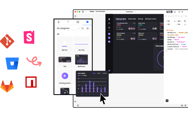
Manage your design system with UXPin’s code-to-design solution. Share your design system easily, document on the fly, and create advanced prototypes with interactive components. Discover UXPin Merge.
Checklist for Building an Effective Design System
Here’s a structured 14-step checklist that ensures you build an efficient, consistent, and scalable design system.
1. Create the Patterns Inventory
A patterns inventory in a design system is essentially a collection of all the design patterns or UI elements used across a product or set of products. It’s like a catalog or checklist that helps teams identify, organize, and evaluate the consistency of the various components within the interface. These patterns can include things like buttons, form fields, navigation elements, typography, colors, icons, and more.
The goal of this process is to create a foundation for building or refining the design system, ensuring that every component is accounted for, standardized, and reusable. It also serves as a reference point for designers and developers to maintain consistency across the product as it evolves.
Here’s a design system checklist for running patterns inventory:
- Collect Design Patterns: Take screenshots of design patterns or collect them directly from design project files.
- Organize Patterns: Categorize patterns based on your frontend architecture, if available. Common categories include elements, modules, and components.
- Consult Developers: Check if the frontend architecture is modular, and use it to organize patterns into categories.
- Categorize Without Modular Architecture: If there’s no modular architecture, manually categorize patterns (e.g., buttons, form fields, etc.) to identify inconsistencies.
2. Create the Colors Inventory
A color inventory in a design system is a comprehensive audit of all the colors used across a product or set of products. It involves identifying and cataloging every color used in the user interface, including variations in shades, tints, tones, and any color variables defined in the code (like in CSS or design tokens).
Here’s a design system checklist for color inventory:
- List All Colors: Traverse code files and list all the color variables or colors used in CSS.
- Organize by Common Denominators: Group colors by hue, shades, tones, or similarity (e.g., grays, reds, greens).
- Identify Anomalies: Take note of anomalies, like too many shades of gray, and streamline the palette.
3. Create the Typography Inventory
A typography inventory is an essential step in ensuring that your design system maintains a consistent, scalable approach to text styles across your product or projects.
Here’s a design system checklist for typography inventory:
- Review Text Styles: Walk through the UI, checking all text styles through the browser console.
- Form a Typographic Scale: Organize text styles by their importance (e.g., from H1 to small text). Create multiple scales if necessary.
- Match Code with Styles: If CSS preprocessors (e.g., Sass) are used, note mixins and variables used to generate text styles.
4. Create the Icons Inventory
An icons inventory in a design system is a comprehensive audit and cataloging of all the icons used across a product. It is designed to assess the consistency, quality, and relevance of the icons in the UI and to ensure that the icons adhere to the brand’s visual guidelines.
Here’s a design system checklist for icons inventory:
- Inventory Icons: Identify all icon libraries used across the product.
- Mark Inconsistencies: Look for mismatches (e.g., different icons for the same action or mismatched icon families).
- Review Implementation Methods: Understand how icons are implemented (e.g., inline SVG, icon fonts) and note inconsistencies.
5. Create the Space Inventory
A space inventory helps standardize and streamline how space is used in the UI, making designs more consistent, scalable, and easier to maintain. It creates a solid foundation for your design system’s layout, ensuring that spacing remains predictable and intentional throughout the product.
Here’s a design system checklist for space inventory:
- Document Grid Systems: List and document grid systems used across the product portfolio.
- Check Padding and Spacing: Analyze container padding to spot inconsistencies.
6. Get the Support of the Organization
- Team Presentation: Explain the inventory process, highlight key inconsistencies, and present the design system as the solution.
- Stakeholder Presentation: Focus on how inconsistencies affect costs and development speed. Highlight measurable data (e.g., 62 shades of gray) to demonstrate the need for a design system.
7. Build a Multidisciplinary Systems Team
- List Skills Needed: Identify the necessary skills for fixing inconsistencies and managing the design system long-term.
- Allocate Time Realistically: Ensure that team members can allocate time to work on the design system, even if part-time.
- Clarify Roles and Sprints: Define roles, decision-making processes, and the length of sprints (e.g., one or two weeks).
8. Make Key Decisions and Establish Rules
- Decide on System Foundation: Choose whether to build the system from scratch or use an existing product as the foundation.
- Technology Stack: Decide whether to use the existing tech stack or introduce new technology.
- Define KPIs: Set measurable goals for the design system, such as improving consistency or speed of implementation.
- Formulate Design Principles: Define shared values for the design system, such as consistency, craftsmanship, or accessibility.
9. Build the Color Palette
- Unify Colors: Use the color inventory to create a consistent color palette, ensuring no redundant or unused colors.
- Naming Conventions: Choose between abstract, actual, or functional names for colors (e.g., pigeon-gray, silver-base).
- Test the Palette: Ensure the palette works well across the UI and follows accessibility standards (WCAG).
- Implement and Present: Implement the palette in CSS, test the changes, and present it to designers for feedback.
10. Build the Typographic Scale
- Create a Consistent Typescale: Build a typographic scale that includes font size, weight, line-height, etc.
- Test and Implement: Test the new scale across the UI, then implement it in CSS. Involve designers in the feedback process.
- Finalize and Document: Finalize the scale, document it, and make it available in design tools (e.g., UXPin, Sketch).
11. Implement the Icons Library
- Finalize the Icons: Decide which icons to include and how they’ll be implemented.
- Test and Review: Thoroughly test icons on a test server and ensure consistency across the product.
- Document and Deliver: Add icons to design system documentation and make them accessible in design tools.
12. Standardize Other Style Properties
- Standardize Grid, Space, and Styles: Apply the same standardization process used for color, typography, and icons to grid systems, spacing, and other style properties.
- Test and Implement: Ensure everything is tested and reviewed before finalizing and communicating to the company.
13. Build the First Design System Pattern
- Decide on Pattern Architecture: Choose an architecture for your patterns (e.g., Atomic Design, modular components).
- Build and Test: Implement one pattern (e.g., buttons), test it with developers and designers, and iterate based on feedback.
- Finalize and Document: Add the pattern to the design system documentation and make it available in design tools.
14. Run a Sprint Retrospective
In the context of a design system, the retrospective focuses on assessing how the team handled the specific tasks related to the system’s development, such as creating new components, documenting guidelines, testing implementations, or aligning design with code.
- Review the Sprint: Summarize the outcomes and KPIs from the sprint and reflect on improvements for future sprints.
What if You Need a Design System Fast?
If you need to create a design system fast and can’t afford to create a design system team, here’s what you can do.
Take advantage of the pre-built component libraries in UXPin, like the MUI kit, Ant Design kit, or Tailwind kit. These libraries are integrated directly into UXPin and offer a great way to get started. They’re fully coded, so you can share them with your devs. They are well-documented, so you don’t need a design system documentation right away. And they’re fully customizable, so you can match them with your style guide.
Your team will be able to share the same components and they will be able to use components right away, and you can focus on making sure everything fits your brand’s style, like colors and typography. UXPin also allows you to apply themes to these components (with the use of AI), which means your designs can start looking like they belong to your product without a lot of heavy lifting.
If time’s a factor, you don’t have to redo everything at once. You can instruct developers to use existing components with specific properties, and since UXPin keeps everything dynamic, any changes you make later will automatically update across the system. This saves a ton of time down the line.
I’d also recommend focusing your energy on the style guide—getting your colors, typography, and visual feel in order. These are the foundations that will tie your system together. Plus, understanding how these libraries work will help you ensure everything fits nicely with how your product is built.
In the end, design systems can be tricky, but using UXPin’s pre-built libraries makes the whole process a lot more manageable. It’ll give you more room to focus on the fun part—actually designing great products.
Empower Your Team with a Robust Design System
Creating a design system might seem like a daunting task, but with the right approach, it becomes a strategic investment that will enhance collaboration, ensure consistency, and improve scalability across your product. By following the checklist outlined above—from building a patterns inventory to standardizing spacing, typography, and iconography—you can ensure that your design system is well-organized, effective, and aligned with both design and development needs.
One of the key elements to making this process smoother is using a powerful tool like UXPin Merge. With UXPin’s built-in code libraries (MUI, Ant Design, React-Bootstrap or Tailwind kits), seamless integration with design and development workflows, and dynamic components, your team can create a design system that’s not only cohesive but also adaptable to future growth.
By taking incremental steps, focusing on key priorities like style guides and component libraries, and leveraging UXPin to align your design and development teams, you can build a system that ensures long-term success. So, don’t wait—start building your design system with UXPin today, and empower your team to create scalable, efficient, and beautifully cohesive products! Request access to UXPin Merge.


