Turn Figma Designs into Interactive Prototypes

Figma is a great tool for creating beautiful mockups and collaborating in real-time with other designers. It is one of the best for building a portfolio and showing off your skills. When working in an enterprise-level company, Figma might not be enough, as it’s difficult to translate its design into code.
This is where UXPin comes in. It helps designers and developers communicate and use a shared library of UI components which can be copied from design to development workflow. No translation needed. That’s why we decided to build a Figma plugin and help you bring Figma design to UXPin for more robust prototyping. Sign up for a free trial to build your first UXPin prototype today!
Table of Contents
Design in Figma. Prototype in UXPin.
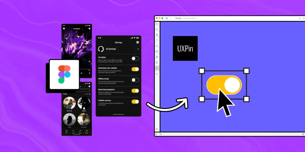
We get it. You love designing in Figma! But, you also prefer the higher fidelity and functionality you get from prototyping in UXPin. If this is you, UXPin’s Figma plugin gives you the best of both worlds–design your mockups in Figma, and copy your screens to UXPin for prototyping.
While this workflow offers the best of both worlds–and we encourage teams to implement solutions that work best for your product and circumstances–designers must use two tools when they can use UXPin for everything. UXPin is effective as a design and prototyping tool and comes packed with features to scale UX beyond what’s possible in any image-based tool.
Why does it make sense to prototype in UXPin vs. Figma?
Figma, Adobe XD, Sketch, and others render static vector graphics, meaning designers can’t replicate code, and when they do, it takes a lot of effort, workarounds, and additional tools.
UXPin is a code-based design tool. This doesn’t mean designers work with code; UXPin renders HTML, CSS, and Javascript behind the scenes to give designers the same fidelity and functionality as code.
These four features powered by code allow designers to create more advanced prototypes in UXPin.
States
UXPin States allows designers to create multiple states for a single component. For example, a button can have several states, which include different properties triggered by user interactions.
States also allow designers to create complex components like functioning dropdown menus, steppers, carousels, accordions, and more.
Interactions
Designers can create complex UXPin Interactions constrained by code rather than a design tool’s limitations. UXPin also offers many Triggers, Actions, and Animations to design immersive prototype experiences.
Conditional Interactions with “if-then” and “if-else” conditions allow design teams to create dynamic prototypes that respond to user inputs and triggers. This Javascript-like interactivity lets designers see how design decisions impact the user experience and pinpoint areas for improvement.
With these realistic interactions, stakeholders and engineers need little explanation making the feedback process and design handoffs more productive.
Variables
It’s impossible to test forms in most design tools, including Figma. Why? Because the fields are images rather than inputs. In UXPin, form fields function as if they were developed by an engineer. UXPin gives designers text inputs, checkboxes, radios, selects/dropdowns, multi-selects, and buttons ready to use out of the box.
With Variables, designers can capture user inputs from prototypes and use that data elsewhere in the application. For example, capturing a user’s information during signup and using the name field to create a personalized welcome message.
Expressions
UXPin’s Expressions enable designers to take prototyping far beyond the possibilities of any other design tool. Validate passwords and other form fields, design a functioning shopping cart that updates based on user interactions, create dynamic error messages, and more.
When combined with other UXPin features like States, Interactions, and Variables, Expressions enable designers to build prototypes, and user flows indistinguishable from code.
Learn more about these and other advanced UXPin features in this YouTube tutorial from UX design influencer Jesse Showalter.
5 Reasons to Turn Your Figma Mockups into Interactive UXPin Prototypes
1. High-Fidelity Prototyping
Figma: Beautiful-looking vector mockups that unfortunately don’t replicate real-like functionality or fidelity, making prototypes challenging to interpret for devs and stakeholders.
UXPin: Code-like fidelity and functionality allow designers to create immersive, dynamic prototype experiences indistinguishable from the final product–less documentation, smoother design handoffs, and faster time-to-market.
There is a big difference between a high-fidelity mockup (what Figma, Sketch, Adobe XD, etc. produce) vs. a high-fidelity prototype that looks and feels like the final product. UXPin offers genuine high-fidelity results where prototypes need little or no explanation because they respond to user interactions like code.
2. Bridging the Gap Between UI Design and REAL Prototypes
Figma: Design and develop UI design ideas in Figma
UXPin: Push past Figma’s limitations to create advanced prototypes in UXPin
While Figma offers the features to create beautiful designs and mockups, designers hit a brick wall at the prototyping stage. UXPin’s Figma plugin allows design teams to leverage the best qualities of both tools to create high-fidelity prototypes in UXPin.

Make changes and iterate on UI designs in UXPin, or only use it as a prototyping tool using Figma for designing and editing–the choice is yours!
3. Enhanced User Testing
Figma: Testing limited to basic click/tap interactions, user flows, and navigation
UXPin: Immersive prototypes that accurately replicate the final product
Figma’s vector-based constraints and limitations prevent accurate testing. Designers must use multiple frames to achieve basic interactivity, and many components are impossible to reproduce.
As a code-based design tool, UXPin enables designers to build prototypes limited only by the feasibility of what devs can build–without writing a single line of code! These complex, dynamic prototypes give design teams valuable insights to improve the user experience and identify business opportunities.
Designers also pinpoint critical usability and accessibility issues when testing with UXPin prototypes, resulting in less UX debt and higher quality design project outcomes.
4. Faster Iterations
Figma: Multiple frames and components to mimic end-product’s behavior–changes and redesigns are time-consuming
UXPin: Uses layers and states on a single screen allowing changes in a few clicks
One of the challenges with prototyping in Figma is that designers must create multiple frames and components to mimic code’s interactivity. These interactions feel awkward and non-intuitive. They’re time-consuming to design and make changes.
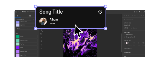
In UXPin, designers work with pages and layers. Instead of switching between multiple frames and pages, designers work on a single canvas, making changes via the Properties Panel. This workflow is more intuitive and facilitates faster iterations so that designers can solve issues much quicker.
5. Smoother Design Handoffs
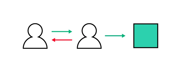
Figma: Lots of documentation, back and forth comms with devs, videos/GIFs to mimic interactions, and links to other tools
UXPin: Prototypes replicate the end-product experience and interactivity, reducing the need for lengthy documentation and additional tools
Designers often use tools like After Effects and others to replicate motion and interactions. Why? Because design tools lack fidelity and functionality. Designers also create transitions and interactions that engineers can’t reproduce due to technical constraints. Switching between multiple tools and files is also confusing, time-consuming, and increases errors.
With UXPin, designers don’t have to use additional tools because they can design components and interactions that accurately mimic code. No need for videos/GIFs, back-and-forth communication, and long-winded PDFs to explain what the prototype is supposed to do.
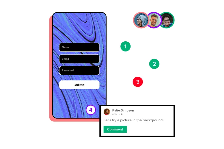
Designers can create documentation in UXPin with annotations on prototypes, so engineers and stakeholders don’t have to switch between multiple files–everything is in one place! Devs and stakeholders can use UXPin’s Comments on Preview to ask questions, tag team members, and even assign comments for edits.
With realistic prototypes, supporting documentation, and collaboration in one place, design handoffs are smoother with less friction in UXPin.
UXPin–An End-to-End Design Solution
While you can design in Figma and prototype in UXPin, it means using two tools when you only need one! UXPin offers a comparable design experience to Figma, including collaboration, wireframing, information architecture design, mockups, and designing components from scratch!
With UXPin’s end-to-end design solution, designers don’t need to switch between tools because they can do everything inside UXPin, including building, managing, and sharing a design system.
Reducing tools not only streamlines UX workflows but also reduces costs, allowing design leaders to reallocate valuable resources elsewhere.

Stakeholders have little time or patience to decipher image-based prototypes and the accompanying documentation. UXPin prototypes need less explanation, allowing stakeholders to enjoy a final product experience. This immersive experience elicits meaningful stakeholder feedback while increasing buy-in for design solutions.
Say goodbye to the limitations of image-based design, and hello to enhanced prototyping, collaboration, and design outcomes with UXPin. Discover how UXPin can revolutionize your product design workflows and deliver exceptional user experiences to your customers. Sign up for a free trial.


