The job of a UX designer is more difficult than ever.
User expectations are rising, and the bar is already set high for interaction design. This shouldn’t surprise you, but it means designers need more skill and knowledge than ever before. It’s important to understand the reasons behind the rise in interaction standards in order to deliver a truly futureproof experience today. The current spotlight on interaction design and user experience is spurred by larger trends:
- Large company buy in
- “Design first” startups
- Generally more experienced users
To meet (or exceed) user expectations, product designers need to:
- Question common interactions
- Avoid being lazy
- Always plan ahead
Large Company Buy-In
Either larger companies are buying into the importance of interaction design or savvy tech companies are growing larger. Either way, resources are being spent on user experience. This is great for the industry, but it means more users than ever are being exposed to well-planned, well-researched interfaces and workflows. A good example is adding a credit card in Uber’s app.
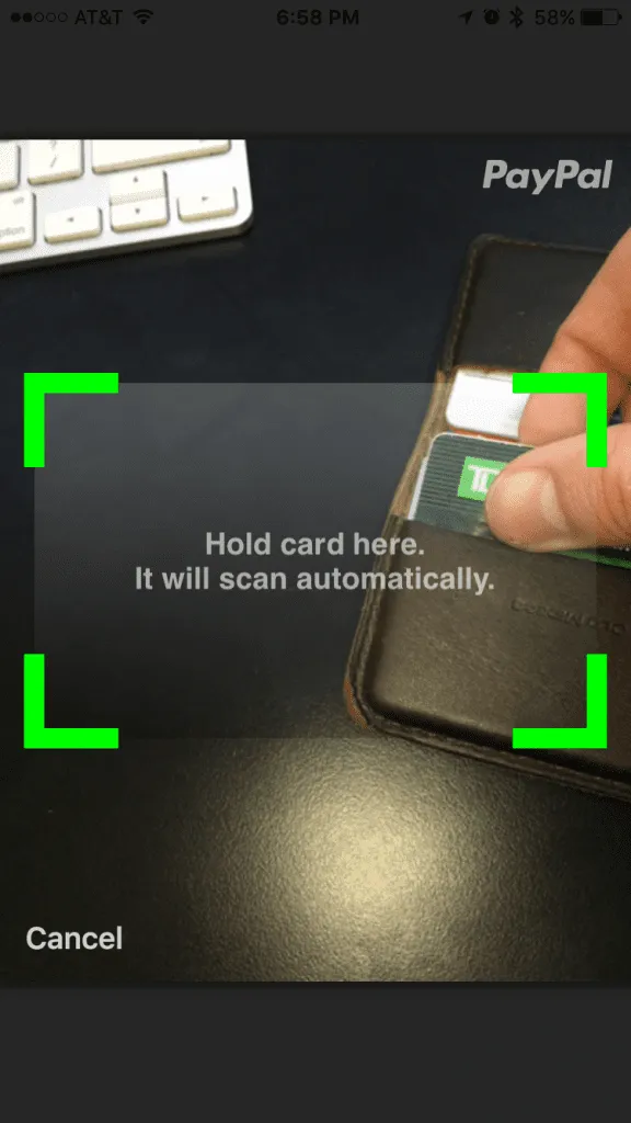 Photo credit:
Drew Thomas Credit cards are notoriously tedious to enter, especially on a mobile phone, but Uber lets users snap a photo of their card to capture all of the information. To put this into an interaction design perspective, in order to compete in today’s app market, not only do you have to manage credit card security and handle a multitude of complex ecommerce interactions, you also have to read the numbers off of a card with a mobile phone camera. It’s getting intense.
The Design-Focused Startup Boom
It’s becoming widely accepted that design has the power to make or break a business. A great example is Slack, and a lot has been written about the role design and interface played in Slack’s super fast success. This article was pretty popular on Medium.
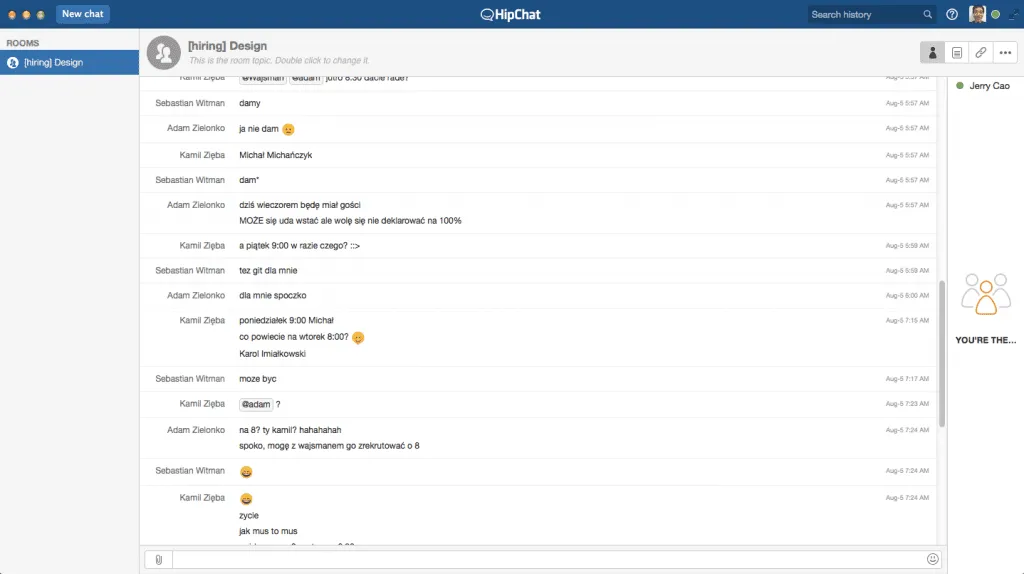
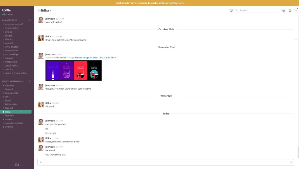
HipChat on the top vs. Slack on the bottom Slack is a team chat app that feels more like hangout area. The rich colors, random GIF generator, and soft edges all create a sense of friendliness and fun. But don’t let the delightful elements fool you – Slack is powerful. It’s fast, reliable, and undeniably useful. You can pin posts, turning Slack into an information hub for the whole company. You can send complex files to coworkers, then reference those files easily. Everything works at the speed of thought. Slack’s true success, however, is that it’s more than just a workflow tool. It’s a social tool that improves workflow at its core by encouraging more interaction between people. With Slack’s success being attributed to an attention to detail and an importance placed on user-focused design, other companies are looking to replicate their success in the same way. Now every new app or web service is required to demonstrate a certain level of interface polish, slick interaction design, and overall humane consideration for the user’s emotional and functional needs.
Users are Experienced in User Experience
Lastly, as users are exposed to more interfaces, they simply expect more and are less forgiving of interfaces that fall short. Once a user sees an interaction pattern or feature that’s simple and pleasurable, more complicated and less pleasurable experiences become intolerable. As explained in the guide Interaction Design Best Practices, here are just a few things users have come to expect from apps:
- Fast load time
- Easy setup
- Pain-free onboarding
- Location awareness
- Suggestions and autocomplete
- Contact and calendar integration
- Synced data across devices
- Offline capabilities
- Deep linking
- Twitter integration
- Facebook integration
- Privacy settings
Although this all may sound intimidating, there are ways to stay ahead of the industry and create experiences that delight users today and in the future. The key is to pay attention to important usability and interaction design techniques that will stand the test of time.
Question Common Interactions
Re-examine all of your interactions and ask how they can be better. It sounds simple, but often, everyday interactions are overlooked and “standard” elements or interactions are used incorrectly. For instance, on a form, if you require users to choose among specific options, a select element makes sense. Without too much thought, that interaction is decided and we shift our focus to other parts of the application design. However, consider cases where a second look could benefit the interaction. If users must select from a large number of elements, then an input with autocomplete could be much easier. Choosing a state in an address form is a good example of this situation. The state dropdown is infuriating, and everyone knows typing the state name or abbreviation is easier than choosing from 50+ options in a dropdown.
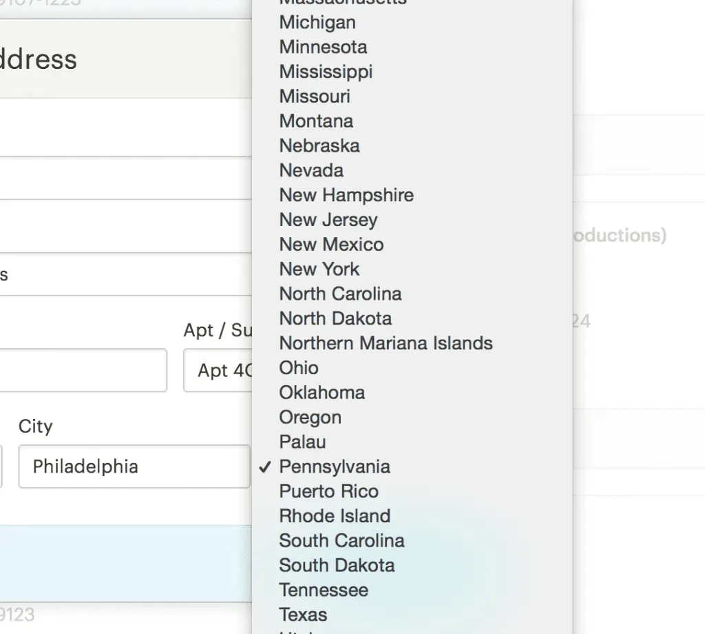 Photo credit:
Etsy To take that specific example a little further, though, consider that we can populate the city and state field from the zipcode field alone, which saves the user from filling out two whole fields. There’s no interaction pattern breakthrough or trend that will make that easier in six months. You just need to constantly rethink your decisions from the user’s standpoint. All for free Download 'Web UI Design Best Practices' FOR FREE!Grab design ebooks created by best designers

Do you want to know more about UI Design?

Don’t Default to Convenience
In design and programming, whether deadline-driven or motivation-driven, there’s a cut off point where enough is enough, and the product needs to ship. Skimping on interaction design for other priorities is typically a huge mistake, but it’s easy to do. In the last example of an address form’s state field, being lazy means using a standard dropdown. Instead of being lazy, take the time to create the right experience. Sometimes the smallest details can go a long way in creating that intangible satisfaction in an interface. With all the competition out there, you just can’t afford to be lazy.
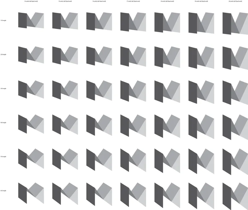 Photo credit:
Medium Medium is a modern company with a modern mindset that values design and detail. To see how in depth they go into interfaces and interactions, read about the underline on their links. Or read this fictional conversation about how they moved quotation marks outside of paragraphs. Even if that last one is funny, this is serious stuff! As explained in Interaction Design Best Practices, great design is all in the details. It might sound cliched, but it’s completely true. In your designs, everything a user can see or touch is considered part of the interface. While you might not need to spend hours crafting the right underline or obsessing over quotation marks like Medium, spend time designing all the right micro-moments. Details like micro-interactions and micro-copy matter more than you might think.
Plan Ahead to Stay Ahead
Interactions trends change quickly, and user tolerance changes just as fast. Great UX is relative. Users who experience a similar interaction that feels easier than your design will annoyed when they return to your product. Of course, there’s no way to stay on top of every interaction pattern and trend to implement it into your applications. But you really shouldn’t do that anyway. Instead, understand and plan for your user flow from end to end in great detail. Understand all of the paths, all of the use cases, and as much of your audience as possible. If you can truly create the best experience for their specific tastes and needs, you’ll nail your interface, and you may even start some trends of your own.
 If you’re really solving your users’ problems in the most efficient way possible, a new trend is unlikely to work better than what you’ve already created. Ultimately, you can’t solve complex problems that you don’t thoroughly understand, so plan,
prototype, repeat. Forever.
The Hopper App: Timeless UX Design Done Right
Hopper is an app that watches flights, and their onboarding process feels both magical and invisible at the same time. The reason is that they really, truly understand what a user is trying to do when they first download the app – search for flights instantly. The point of the app, however, is to get alerts about price changes, so before you search, they quickly tell you why you need notifications, but they send you almost instantly to search.
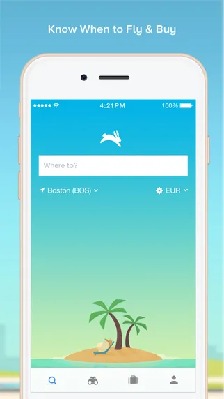 Photo credit:
Hopper Once you search, they make it really easy to understand what the app does (predict when the price will change), and they give you clear tips on adjustments to your trip that will save you money. It’s exactly what everyone wants to know. What can I do to find a cheaper flight? You need to have an account before you can purchase a flight through the app, but everything else is out in the open and simple to use. Before you realize you need an account, the app is tracking flight prices for you. The first time I used it, I literally found everything I needed the second I looked for it.
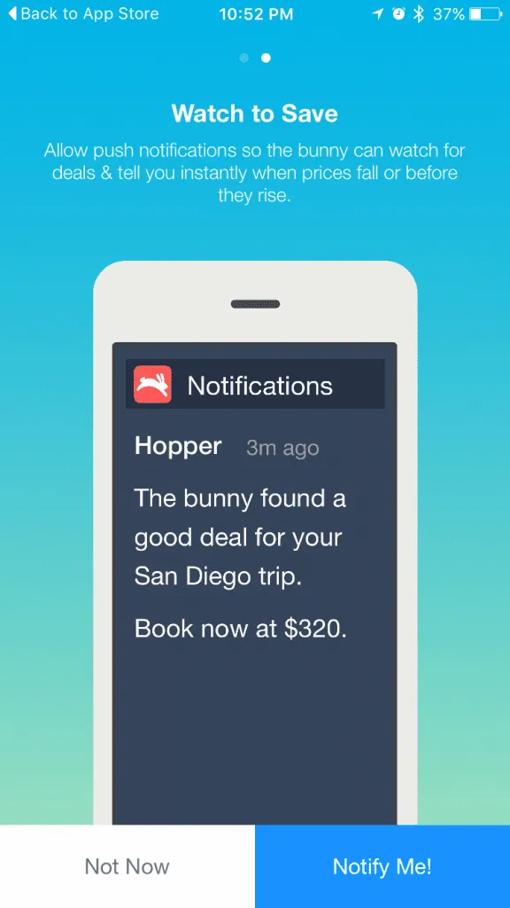 Photo credit:
Hopper The magic of the experience lies in the intelligence behind the user flows. A task that once required 20 minutes or more of browsing is reduced to one simple notification. Set it, forget it, and magically get your deal. The flat interface and clever mascot are certainly “trendy” considering all the talk about delightful design nowadays, but they mean nothing unless the product solves a real problem in a simpler way. Talk to users, learn their current habits, then simplify the tasks as much as possible in your design. Delight always grows outwards from usability.
Conclusion
In the end, thinking about your interfaces from a “big picture” perspective goes a long way. Trending techniques like gamification, personalization, and microinteractions only matter when they’re part of an easier workflow. No matter how high the baseline gets for UX design, and no matter how evolved our interfaces get, trends are only valuable as inspiration for ideas. Truly great interactions come from understanding users and their behavior. As the standards in our industry get higher and higher, we can always deliver if we remember who we’re doing this for. For more UX design advice, check out the free e-book Interaction Design Best Practices for 100+ pages of additional advice. Examples are deconstructed from 30+ companies like Apple, Google, Etsy, and Behance.