Any time a client comes to you, they are taking a big risk (especially the smaller ones on a tight budget).
To feel more comfortable—like they have more control over the risk—some clients become nearly over-involved in the design process. Don’t be surprised if they hand you a stack of pre-determined solutions to already-identified problems.
It’s enough to leave you wondering, “Why did they hire me in the first place?”
It’s smart for UX designers to read between the lines in these cases. There is always an underlying situation, so work to identify what’s really going on, as soon as possible.
For instance, clients may be nervous about investing a large sum of money, or feeling pressure from their boss to make the project a success. A few other possibilities might be that:
- They don’t want to look like they don’t know what they’re doing
- They don’t want to be wrong
- They don’t want you to be wrong
- They have a hard time submitting to other people’s opinions or insights.
Working around their struggles (or hangups) may sound like walking on eggshells, but how you establish yourself to the client is imperative at the beginning of the process. As a freelance UX designer at Slayter Design, I’ve found that the clients most likely to recommend me to others are those I’ve spent extra time educating and reassuring.
Table of Contents
Uncover the Real Problems.
The only way to get the to the real problem is to ask the right questions and conduct the right research. How do you do that, or know if your questions are good?
Often, those pre-determined solutions the client suggests are fundamentally “off” because the the wrong questions were asked from the start. For example asking “Why is our revenue dipping?” instead of “Why are our users unhappy?”

Photo credit: Chris Thelwell for UXPin
If you’re lucky, the client will have raw analytics for you to analyze. If not, ask for any other company data you can collect, such as customer service complaints or feedback the company has received. This will at least give you enough to do a SWOT analysis, empathy map, and/or potentially a few lightweight personas.
Data helps prove to your client that you have their goals at the forefront and will happily guide them during this new venture. It can be frustrating to feel like you have to continuously prove your points. While some clients will be less receptive than others, never lose your cool. Be just as empathic with clients as you are with your users.
Just Test It.
Sometimes, the client likes a bad idea and needs convincing. If they aren’t open to your suggestions or proof, the solution might be to “just test it.”
Depending on the problem, you’ll find countless methods for testing and research to choose from:
- Focus user interviews
- User testing
- A/B testing
- Analytics
- or a combination of testing methods.
On one of my projects, we decided to leave “the definitive answer” up to the audience.
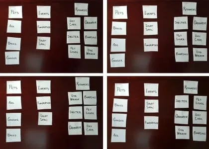
We were unable to agree on subcategories and how they should be organized, so I suggested that we go straight to the users and ask what made sense to them. After we explained card sorting, we had them take over and define how they thought the subcategories would fall.
Here are a few end results:

This answered some critical navigation questions, and helped us move forward. The real test was coming up: how would users respond to a prototype?
I’ve encountered numerous clients that aren’t open to suggestions and won’t back down from a bad idea. In these cases, testing is pretty much the only way to go. Once the data comes in, good or bad, it’s nearly impossible to refute. This is assuming that you’ve selected the right testing method for the problem, tested with an appropriate number of users, and have allowed the proper data to be collected (more on that in The Guide to Usability Testing).
If you find your results have rendered only a direction, but not a concrete solution, you can still work with this. Follow that direction and assure your client this will be an area that is kept under close watch for further insight.
I always tell clients that the product we’re launching is an educated hypothesis—but a hypothesis, nonetheless. One of the hardest things to do is educating your client to understand that the end application isn’t really the end, but more the first ‘final’ iteration, which will be improved upon with testing and analytics.
Educate, Don’t Patronize.
When working with clients, the most important things that you can do are to:
- Help your client see their project from the user’s point of view.
- Disconnect their personal biases.
This helps you avoid the dreaded reasoning of “I don’t know why, but I just don’t like it.”
When faced with a conversation like this, don’t overwhelm them—you only need to supply targeted evidence to get your point across. Establishing your knowledge and expertise at the beginning of the project ought to be enough—after all, they did hire you for a reason—but they might want proof to support your statements.

The first step is to always give your client credit for their suggestions. I often find myself saying “That’s a really good point, but what about…?” or “I think that’s a great suggestion but what do you think about…?” or “I see what you’re saying but have you considered…?”
Since there’s really no such thing as a bad idea (even from your client), it’s your job to let them know why there might be a better solution.
It doesn’t hurt to respond with “I’d love to send you some evidence on the topic.” This buys you time to investigate quality data and/or proof to support your stance. There are plenty of highly-respected resources to corroborate your recommendations, such as Nielsen Norman Group, Smashing Magazine, and UXPin’s ebooks, to name a few.
A very fine line exists between educating and patronizing; you can help clients see past their fears while providing them with quality information, but it’s also important not to push them on the subject.
Pick Your Battles.
It’s important to know which battles are worth fighting. You don’t want the client to feel like you’re pushing too hard even for what they see as insignificant things. If you go overboard, it can come off like you’re disputing just to dispute.
For instance, the hierarchy of information on the page is usually more important than logo size. If you have to sacrifice a smaller battle to win another that’s more important for the users, do it.
That being said, don’t be afraid to question their suggestions. Once you’ve identified more pressing issues, make your points known on the lesser important issue and move on. You can always revisit the smaller issues later.
Everybody Wins or Nobody Wins.
What happens if you don’t fight for your ideas? What if you just sit on the sidelines and wait for someone to tell you what to do?
You’ll end up with a project you aren’t proud of that doesn’t deliver desired results to your client. Regardless of how difficult they made it, it’s rare that they know just how difficult they were. The blame is likely to come back onto you, since as far as they are concerned, they sought out your expertise to help them.
UX designers are only worth as much as their insights and knowledge, so nobody wins if you let that go to waste. True, you’ll inevitably come across that one client that hates the color green, but you’ll know when to pick your battles.
Always put forth your reasoning, all the way through to the finish.
If you found this post useful, check out the free 100+ page e-book UX Design Process Best Practices.


