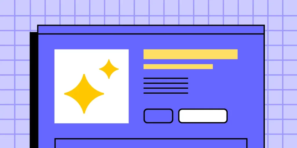
How to Design a Product Page – A Quick Tutorial
Designing an effective product page is essential for any eCommerce site or online store. It’s where customers make their purchasing decisions, so every element needs to be thoughtfully crafted to ensure a seamless user experience. A well-designed product page can significantly impact conversion rates, helping turn casual browsers into loyal buyers.
In this quick tutorial, we’ll guide you through the process of designing a compelling product page using UXPin’s built-in MUIv5 library components. With the power of UXPin and the versatility of MUIv5, you can create intuitive and visually appealing product pages that provide all the necessary information while maintaining a clean, user-friendly layout. Discover UXPin Merge.

What is a Product Page?
A product page is a specific webpage on an eCommerce or company website dedicated to a single product. Its primary purpose is to provide detailed information about the product to help potential customers make an informed purchasing decision. Product pages are a crucial step in the online shopping customer journey, as they aim to convert visitors into buyers by highlighting the benefits and features of the product.
Key Elements of a Product Page
- Product Title: Clearly states the name of the product, often including key attributes like brand, model, or size.
- Product Images and Videos: High-quality images from various angles, sometimes accompanied by videos, to give a clear visual representation of the product.
- Product Description: Detailed text that provides information about the product’s features, specifications, usage, benefits, and any other relevant details.
- Pricing Information: Displays the price of the product, including any discounts, sales, or promotional offers.
- Call to Action: A prominent button or link, such as “Add to Cart” or “Buy Now,” that encourages the customer to take the next step towards purchasing the product.
- Customer Reviews and Ratings: User-generated reviews and ratings that provide social proof and help potential buyers understand others’ experiences with the product.
- Availability and Stock Information: Indicates whether the product is in stock or if there are any shipping delays or limitations.
- Additional Details: This may include information about shipping, returns, warranties, and customer support.
- Related Products or Recommendations: Suggests other products that might be of interest to the customer based on the product they are viewing.
What is the Purpose of a Product Page?
The main goal of a product page is to provide all the necessary information a customer might need to decide whether or not to purchase the product.
It serves as a virtual salesperson, guiding the customer through the features, benefits, and purchasing process. Effective product pages are designed to be user-friendly, informative, and persuasive, aiming to convert site visitors into paying customers.
How to Design a Product Page in UXPin
In this tutorial, we’ll walk you through the process of designing a product page using UXPin’s built-in MUIv5 library components. With these powerful design elements, you’ll be able to create a professional and conversion-focused product page in under 15 minutes.
Step 1: Start a New Project in UXPin
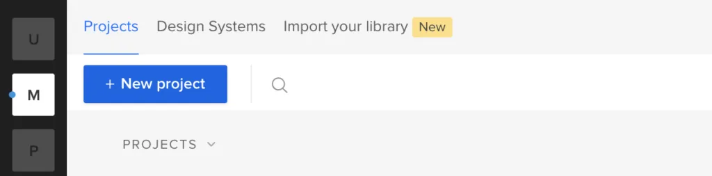
Begin by logging into your UXPin account and starting a new project. Once you’re in the editor, select a Page 1 and name it “Product Page.”
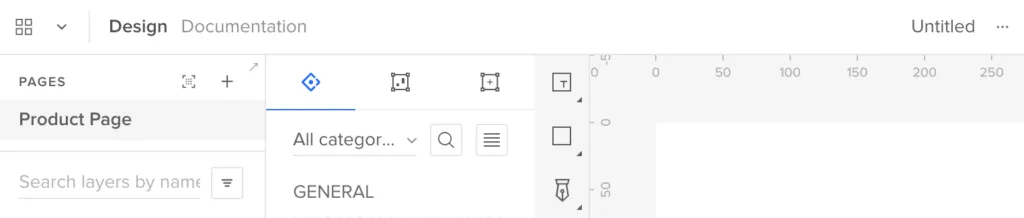
Step 2: Set Up Your Layout
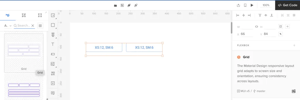
To establish a strong visual hierarchy and ensure your product page is user-friendly, start by setting up a grid layout. You can easily do this by selecting the “Layout” tool from the top menu and choosing a grid that suits your design needs—typically, a 12-column grid is ideal for most eCommerce layouts.
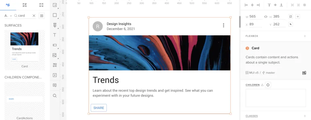
Step 3: Add a Product Image Component
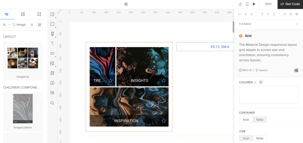
A high-quality product image is essential for any product page. To add an image component:
- Go to the MUIv5 library in UXPin.
- Drag and drop the ImageList component onto your canvas.
- Adjust the size and placement to make the image a prominent feature of the page.
Make sure to use high-resolution images and include multiple angles or variations if available. You can customize the ImageList component to display a gallery of product images, allowing users to swipe through different views.
Step 4: Insert Product Details
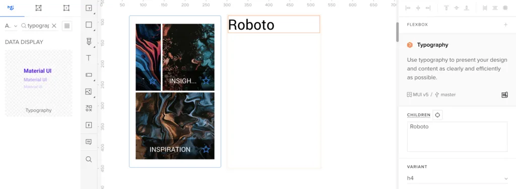
Next, you’ll want to add the product title, description, and price. Here’s how you can do it:
- Product Title: Drag a Typography component from the MUIv5 library. Set the variant to “h5” for a prominent headline, and type in your product name.
- Product Description: Below the title, drag another Typography component and set the variant to “body1.” Here, you can provide a detailed description of the product, highlighting its features, benefits, and specifications.
- Price: Finally, use another Typography component for the price. Set it to a slightly larger variant like “h6” to make it stand out. You can also use a different color to draw attention.
Step 5: Add a Call to Action
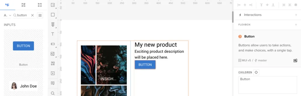
Your product page needs a clear and compelling call to action. For most e-commerce sites, this is the “Add to Cart” or “Buy Now” button. To add this:
- Drag the Button component from the MUIv5 library onto the canvas.
- Place it below the product details and adjust its size and position.
- Set the button’s variant to “contained” for a solid, noticeable look. You can customize the color to match your brand’s theme.
Make sure your CTA is prominent and easy to find—this is key to driving conversions.
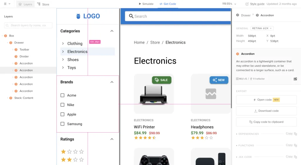
Step 6: Include Customer Reviews and Ratings
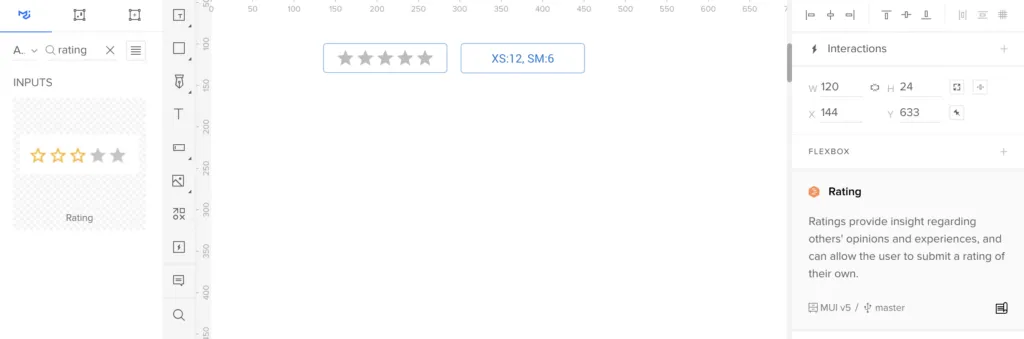
Customer reviews and ratings build trust and provide social proof. To add a review section:
- Use the Grid component from MUIv5 to create a structured layout.
- Inside the grid, use the Rating component for displaying stars and Typography components for review text.
- You can also add an IconButton with a “thumbs up” icon to allow users to like reviews, enhancing engagement.
Step 7: Add Related Products or Recommendations
To encourage cross-selling, add a section for related products or recommendations:
- Use a Card component from the MUIv5 library.
- Add an image, title, and price to each card, mimicking your primary product layout but on a smaller scale.
- Arrange these cards horizontally or in a grid layout below the main product information.
Step 8: Finalize and Preview
Once all components are in place, fine-tune the alignment, spacing, and visual hierarchy to ensure a cohesive and polished design. Use UXPin’s Preview Mode to test your design and make any necessary adjustments.
Check out UXPin’s example page to see how Preview mode works at UXPin.
Step 9: Share and Collaborate
After finalizing your product page design, share it with your team or stakeholders for feedback. UXPin allows for easy collaboration, so you can quickly iterate on the design based on their input.
Create Your Own Product Page Design in UXPin
And there you have it—a fully functional and visually appealing product page designed in under 15 minutes using MUI components. With these steps, you’ve created a user-friendly product page that not only looks great but is also optimized for conversions.
Give it a try and see how quickly you can design a product page that will impress your customers and drive sales. Discover UXPin Merge.


