How Netsmart builds healthcare technology using UXPin – case study

Health technology is developing fast. The times when people would frantically boil water and shred sheets when someone needed medical help are, luckily, coming to an end. With Dr. Quinn, Medicine Woman forever in our hearts, we’ve welcomed the times of online medical support platforms, heartbeat monitors, earlier diagnosis, less invasive treatment options, patient portals, and all kinds of digital healthcare services. When we are the most vulnerable, we can rely on technology.
No pressure, health tech companies, no pressure.
Table of Contents
Who Netsmart is and how they make the world a better place
Netsmart is one of the companies that decided to stand up to the challenge of providing reliable solutions and building experiences in the medical tech department. They are a US-based healthcare IT company with over two thousand associates. They provide technology for a variety of healthcare markets, such as behavioral health, family services, and post-acute care.

Needless to say, this industry is very demanding. Not only because people’s lives are at stake, however big of a reason this is anyway. From the product development point of view, the big challenge is still that you have to adapt to all sorts of user experiences that will both benefit the healthcare technology processes and the end-user.
There are a lot of different care settings, that have complex UX needs, to be addressed with the products designed and developed by Netsmart. What they do is provide products that combine all kinds of features that answer different needs, from rehabilitating a knee replacement over a couple of weeks to managing depression over a lifetime.
How the Netsmart design team operates
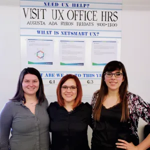
A very resourceful team of three is collaborating in one office, based in Kansas City Metro. Adding new features to existing tools or building brand new products to serve a big portion of the market.

Doing research, mockups, wireframes, user testing, and passing the design over to engineers – the entire UX process is all in their hands. In fact, wireframes are not used in Netsmart as much, but actually more high-fi design which is very important when it comes to the toolset on which they choose to work.
Is there a doctor in the house?
How did Netsmart work look like before they decided to move their work lives to the next level with UXPin, a full-stack collaborative design tool? They would generate flat mockups using Illustrator, and to describe interactions, they would type out a paragraph.
Because the company grew a lot in the last four years, their design process had to be scaled as well. There’d be more and more products to design and test, and most of all, to develop. They tried to explain their ideas to the stakeholders and users but the pitching and user testing are not easy in this particular industry. Graciela Brewer, Senior UX Engineer at Netsmart admits they have been using Axure for real interactions, but somehow it was a pain as they weren’t able to edit well.
“Our prototyping usually involves full workflow design, and interactions that just link to another page simply don’t cut it for our team.” – Grace Brewer, Senior UX Engineer at Netsmart
The design and engineer work started to duplicate and the team would start from scratch each time. The burning question had arisen. How to make it uniform?
Key pain points the Netsmart team decided to address
- The company had a lot of prototyping needs for all sorts of products.
- The healthcare industry is not familiar with technology so it was hard to explain the ideas.
- Users could barely complete the tests.
- The team had to start over with each design.
- It was hard to keep consistency throughout the whole design process.
Why and how Netsmart chose UXPin
Although Netsmart is a company with thousands of associates, the design team was and still is pretty small. With the company’s overall growth and raising expectations, they had to adapt to the new, faster work pace so they needed a toolset that could expand along with the demand for design and prototypes.
This tool also had to allow the designers to generate UI designs that feel like the real product so that their user testing could work and stakeholders could get a better understanding of what the design team had in mind. They were looking forward to smoothing the collaboration, too. Not just among each other, but most of all with the dev team.
Grace and her team had the freedom to choose a design tool and so they decided it had to have the three main traits. It had to be:
- scalable,
- interactive,
- collaborative.
After a lot of research, having a go with Webflow, Sketch, and InVision, they felt UXPin was the best match. It all happened in 2016 and that’s the way they keep making design happen ever since.
How Netsmart work looks like now
What kind of design work does Netsmart create with UXPin? As an all-hands type of design team, the Netsmart uses UXPin to creating all sorts of assets from hi-fi interactive app UI through web design to collateral.

Since a lot of their work is showcased to the management for approval before the development (as it happens), they happily exploit all the interaction features. It’s no longer a bunch of static images where you have to go through each of them and explain each action, like what this button does, what happens when the user clicks that box. They can simply set a variable and show that easily.
What Grace Brewer also emphasized is that in their field, accessibility features are highly helpful. Creating a UI design for vulnerable people or people with disabilities is a very complex and sensitive work. You have to be mindful of all the special needs your end-user might have.
“The addition of the accessibility features has been very valuable to our team. Being a healthcare software company, accessibility is extremely relevant and important to our clients. The ability to actually show our stakeholders how designs may look to those with different forms of color blindness has been a particularly meaningful addition.”
UXPin being browser-based is a big relief as well. The online repository allows quick access to all their work. They can simply share a prototype to cooperate easily and edit during deadlines. Not having to switch through a lot of tools or look for the most recent version but simply maintaining one common prototype saves them a lot of unnecessary work. Which at the end of the day, saves the company money, as you hire designers not to send files back and forth, but for their creativity and expertise.
UXPin’s top features according to Netsmart
- Browser-based,
- Accessibility,
- Conditional Logic,
- Variables,
- Interactions,
- Spec Mode,
- Symbols,
- Design Systems,
- Comment Mode.
What did Netsmart gain with UXPin?
First of all, in simple words, they can create images and make them interactive. And that changes a lot when your work is generating healthcare apps. The time they save while eliminating double work of design, describing interactions, handoff to the developers, is incomparable.
They created their own look and feel and it lined up with the Design Systems. This way instead of doing the mundane work of creating all the designs from scratch, the team can rather focus on software solutions and usability. User testing became much easier too with the prototypes that look and feel almost like the real product.
“The ability to create full, realistic interactions has helped stakeholders better understand our designs, enabled our clients to usability test our prototypes more effectively, and allowed other roles in the org to demo our work with much more ease.”
What has kept the Netsmart team excited to use UXPin for almost three years – Grace admitted – are all the helpful improvements and new features added in that time. With UXPin as their design tool of choice, they can create technology that helps people when they need it the most.

