“Really, those sites aren’t the ugliest, crappiest websites of the 90s”, we wrote In a recent post about progress in design where we compared the design of popular websites the time they launched and their present looks. And we really ment it; we didn’t pick up the crappiest, funniest ones. Then we liked the concept of really collecting them – just to back up the thesis;)
Because, if you think those were funny, you’re going to enjoy this gallery:)
Arngren
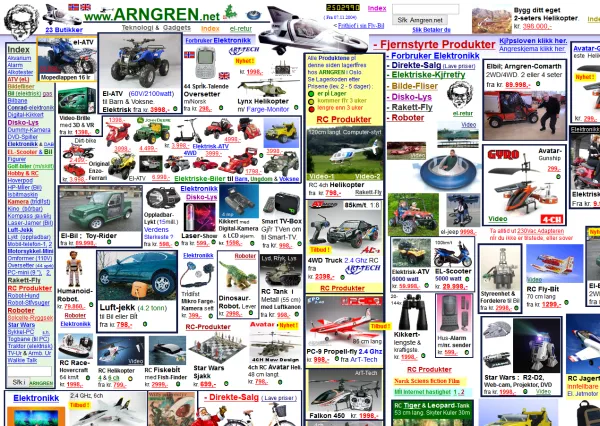
I think I’ll call it the pangea design.
It just instantaneously warped me to an universe where everything is everywhere and all at once. I think in such an universe I would just stop and stand in one place and let things happen; I could be everywhere at the same moment. That’s what I did when I first made contact with this design. Absolutely no idea what to do next on this site. I never used the whole Swiss Army knife all at once – maybe that’s why.
This is what this kind of design does – make you think of something else rather than the contents.
Club Baccardi
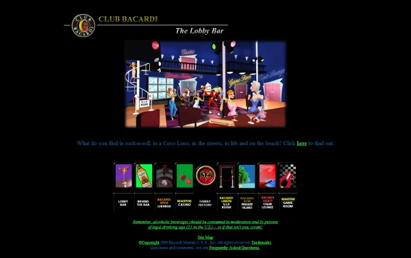
Funny, because this site apparently wants you to:
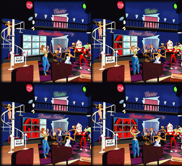
And if you don’t fell like dancing, that’s ok – step in for some:

Ron Oslunds Home Page
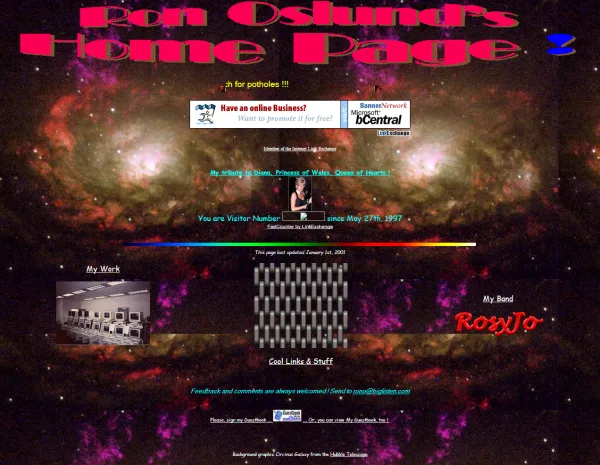
“Like all good Web Pages, this one’s under construction too !!!”
Funny. But then again… if you look closer, you can spot the symptoms of the 90s trends.
For example:
-
<"meta name="GENERATOR" content="Microsoft FrontPage Express 2.0">
-
<table> everything </table>
- Comic Sans MS
-
<marquee width="25%">
- overwhelming awesomeness-centric background graphics
Nothing makes you think “will 20 years from now people laugh at my skeuomorphic app design/OpenGL project” more than a sad-but-true momnent of treacherous web design trends;)
Space Jam
This site
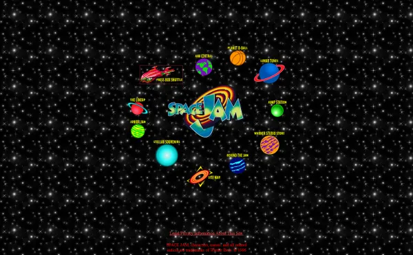
is
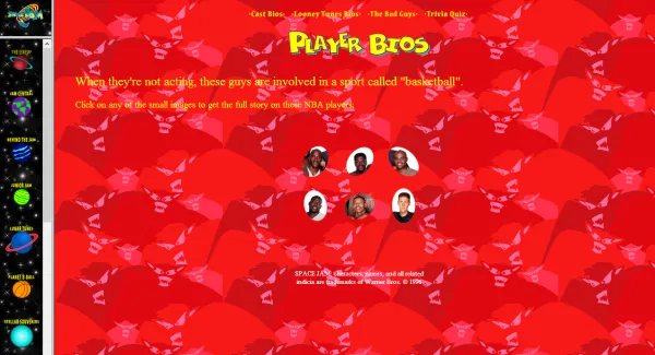
still
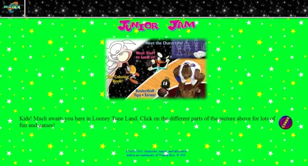
live: http://www2.warnerbros.com/spacejam/movie/jam.htm:)
I think that for its time, this was a quite exceptional site. If you take a look at the contents (and boy, this site is huge!) you can see many similarities to the contemporary concept of a website devoted to a movie. Making of, facts, bonus content (screensavers, ect.), games, movie trailers (“The jamminest two minutes of trailer time that ever hit a theater. It’s 7.5 megs, it’s Quicktime, and it’s worth it.” is just priceless;)) and above all, it’s movie-themed (planets, galaxies, space, branded graphics etc.). Sounds familiar, right?
Moreover, it even shares the same problems with similiar contemporary themed sites. The problem is that the more you try to erase the boundaries of a website, the more they become visibile. Timeless and universal almost like a ancient Greek tragedy. Here’s what I mean:

The image was designed to send you to the movie – it would be such a wonderful world if it could (similar problem described in the top 10 web design mistakes of 2005 by Nielsen).
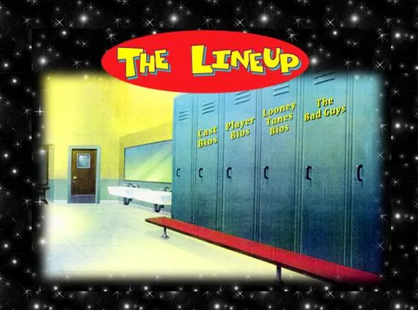
Unfortunalety the image of a door handle didn’t become a door handle. It remained an image. The whole effect became something like a rainforest survival game with an little screen on every tree displaying a tutorial. Not fun, however very funny:)
McDonalds
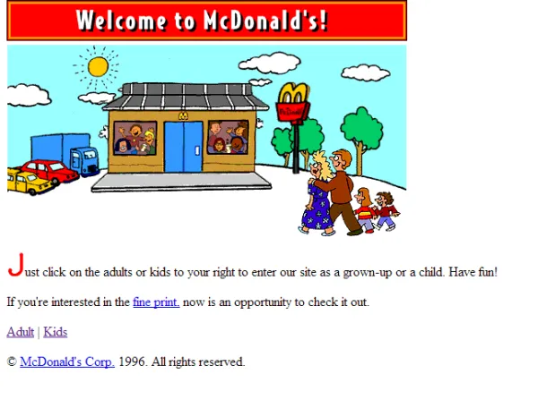
“Just click the adults or kids to your right to enter our as a grown-up or a child. Have fun!”. Looks like intentions don’t count that much in the user experience design world. :)
Dokimos
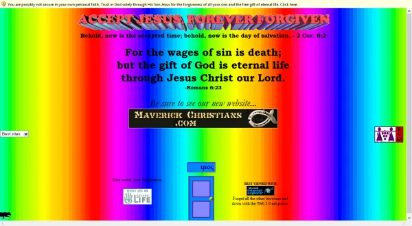
Oh, this one is easy – too much faith in the saving power of the internet. :) Hate to make a H.P. Lovecraft moment here, but there’s something… something that just can’t be described by mere words, take only one peek and then come back before you damage your eyes – this site is also still live.
Hold tight, this is the last slope of this ride!
DPGraph
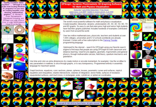
This is actually quite an ambiotious endeavor. Think about it. This is the background you have to work with:

And your job is to communicate something other than this image, while keeping the background in the background:) Honesty in design is something different than courage in design;) Hmm, I wonder what’s the contemporary equivalent of a gif animation. Or is there something that’s as willingly exploited as the gif animation in contemporary design. A while ago I would answer: the “wet floor effect”. :)
Sum up
Well, this

seems to be enogh said.
However, one might also wonder, should designers worry that their work may become hilarious from a 10/20/30 years perspective? All our design methods and thechniques are pretty much focused on the “now” or the “latest”, thus we hardly ever get the broader future perspective.
This just makes me wonder, how quick people will take a look at Webby, FWA, Awwwawards of the 2010s and think
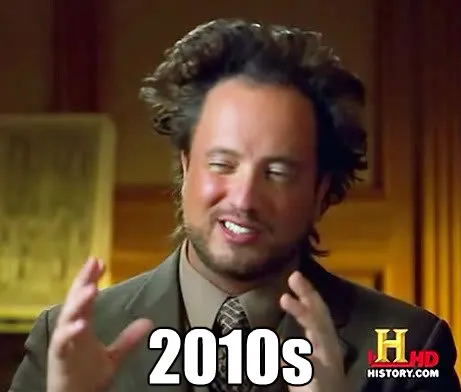
and should us designers worry about timeless design. What’s your opinion?
Thanks for reading! And remember – user experience design always counts!


