FinTech Design System – How to Start it?

FinTech design systems help product teams solve fundamental usability issues while moving fast to stay ahead of the competition. But, building a FinTech design system requires significant resources to create, scale, and mature.
Create a single source of truth for your FinTech app with the world’s most advanced design and prototyping tool. Visit our Merge page for more details and how to request access to this revolutionary technology.
Table of Contents
- A Design System Must Guarantee Consistency
- More Than a Style Guide
- Don’t Overcomplicate Your System
- Prioritize Accessibility
- Build a System that Serves the Entire Organization
- Leverage an Existing Design System
- A Design System Must Serve a Purpose
- Track and Report Your Design System’s Success
- Design System Adoption
- Scaling FinTech Design With UXPin Merge
A Design System Must Guarantee Consistency
Consistency is one of the primary reasons organizations build a design system. Design consistency “ties UI elements together with distinguishable and predictable actions,” which increases trust, adoption, and usage–vital for successful financial products and banking apps!
Consistency doesn’t only benefit the user experience. It also creates more efficient workflows while reducing front-end and UX debt.
Creating a single source of truth means product teams, user experience designers, and engineers all work with the same components, increasing cross-functional collaboration, streamlining design handoffs, and reducing time-to-market.
More Than a Style Guide

A FinTech design system must be more than a style guide. A true single source of truth is a design system where designers and engineers use the same component library–what Iress refers to as “fully integrated” or stage four of design system maturity.
While style guides solve many foundational design challenges and inconsistencies, they lack interactivity, and functionality. Design teams can create beautiful user interfaces, but image-based prototypes don’t provide accurate testing or meaningful feedback.
In the highly competitive FinTech landscape, designers must deliver high-quality customer experiences with UIs that enable users to complete tasks effortlessly. The only way to achieve quality outcomes is through high-fidelity prototypes and testing–beyond the limitations of an image-based style guide.
From style guide to component-driven prototyping
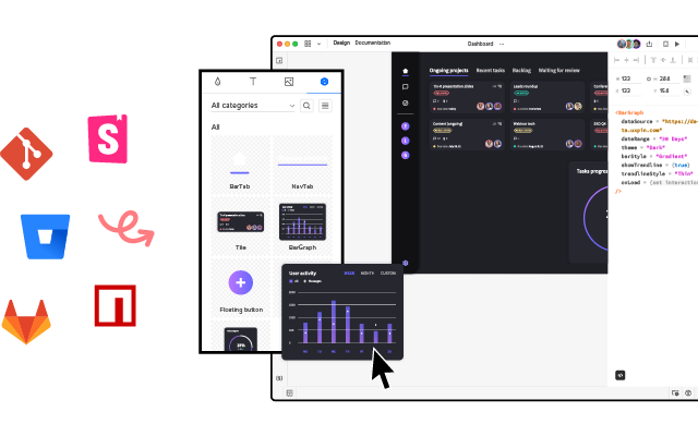
This component-driven prototyping workflow allows FinTech UX design teams to build prototypes that look and feel like the final product–something that’s usually only possible with the help of UX engineers or front-end developers.
Merge syncs a design system from a repository to UXPin’s design editor, so designers use an interactive component library instead of a style guide or UI kit to build prototypes.
Merge prototypes look and feel like the final product, enabling FinTech product design teams to go beyond the limitations of traditional design tools and style guides. These immersive, dynamic prototype experiences solve usability issues and pain points while identifying opportunities.
Don’t Overcomplicate Your System
Organizations must view their design system as any other product. It must be user-friendly and solve user problems–in this case, product development member problems.
Codifying a design system into a searchable hub with guidelines, principles, documentation, tutorials, and governance procedures makes it easy to use while providing design teams with clear guidance about using components and building products.
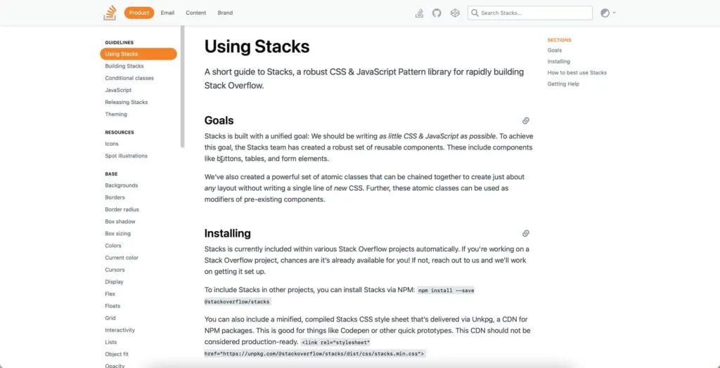
One of our favorite design systems is StackOverflow’s Stacks Design System. Stacks uses four categories for its guidelines:
- Product: software development and individual component guidelines
- Email: email-specific instructions with templates
- Content: principles, voice, tone, grammar, etc., for written content across StackOverflow touchpoints
- Brand: how to represent StackOverflow through design, including logo usage, typography, color, data visualization, etc.

When a design system is easy to use, it creates many benefits for the organization and its customers:
- Simplifies workflows for faster time to market
- Streamlines onboarding
- Increases output consistency and reduces errors
- Gives designers more time to focus on users
- Improves cross-functional collaboration and handoffs
- Ensures design projects meet deadlines (within budget)
- Facilitates scalability
Prioritize Accessibility
Accessibility is crucial for any digital product, especially FinTech design, where users make critical financial decisions. Designers must consider how design decisions impact users from many backgrounds, including those with disabilities.
One of the challenges with accessibility is it requires attention to detail, adding time to design projects. Design system accessibility allows organizations to solve foundational issues at the component level, reducing the time and effort to make products accessible for all users.
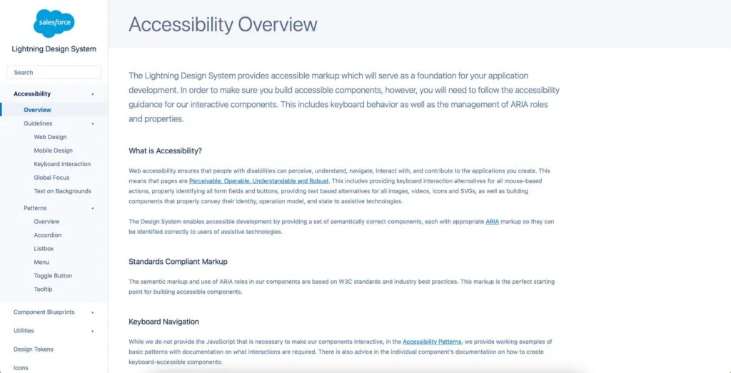
Salesforce’s Lightning Design System includes detailed accessibility guidelines for content, interaction design, and patterns to ensure every product meets W3C standards.

Further reading: Our web accessibility checklist and design system accessibility resources provide an overview of where to start.
Build a System that Serves the Entire Organization
Your FinTech design system must serve the entire organization. Not only will this help with collaboration, but it’ll help with design system buy-in from stakeholders.
Delivery Hero’s product team built a solid design system business case by demonstrating its value for engineering teams and solving front-end debt. The team proved that Marshmallow wasn’t just a system to make the design team’s lives easier; it had business value and would generate a positive ROI for the organization.
A good design system encourages feedback from every department to ensure it generates maximum value while encouraging design system adoption.
Leverage an Existing Design System
Building a design system is expensive and time-consuming. Many FinTech startups (and large organizations) lack the resources to create a design system from scratch.
Adopting an existing themeable, open-source design system is a fantastic way to overcome the expense of building from scratch while delivering an on-brand, high-quality user experience.
Open-source design systems aren’t just for startups.
A Design System Must Serve a Purpose
Think of a design system like any other digital product or feature–does it serve users’ needs? Are your motivations for building a design system based on solving core product development issues?
You won’t get stakeholder buy-in or adoption if you don’t identify these needs and demonstrate the design system’s value.
- How will your design system solve workflow bottlenecks and roadblocks?
- Do you suffer from design drift and inconsistencies? How will your design system solve these?
- What is your current time to market? Can you conduct experiments to demonstrate that a design system will reduce this and what are the cost benefits?
Metrics and KPIs matter when pitching a design system to stakeholders.
Amber Jabeen of Delivery Hero failed to secure buy-in for the Marshmallow design system several times before getting approval. Amber’s six key takeaways from this process include the following:
- Start with a real pain point: what problem will you solve? More importantly, what is it costing the company? Stakeholders take notice when they see actual, provable numbers.
- Build a value proposition: how will your design system solve this problem? Be realistic!
- Identify your biggest supporters and sponsor: finding leaders and stakeholders who believe in your solution will give your argument merit and weight.
- Show before you tell: prove your solution’s effectiveness with results from a case study or experiment.
- Talk business metrics: show what this problem costs the company and how a design system will fix this.
- Don’t go alone – build your network: get input and support from multiple team members and departments impacted by the problem(s) you’re trying to solve and confirmation that they support your idea.
Track and Report Your Design System’s Success
A design system is not a “one-and-done” solution. You will have to continually prove its positive benefits and ROI to secure the resources necessary to maintain and scale the design system.
Stakeholders want to see that their investment creates a positive change and, more importantly, that team members use it!
In What to Do After Launching a Design System, we highlight three critical KPIs for getting continuous buy-in and support:
- Team efficiencies: how long does it take to deliver design projects with vs. without a design system? How does this figure improve with increasing adoption?
- Speed to market: does the design system improve delivery from concept to final release?
- Effect on code: how does the design system improve design handoffs and reduce designer/engineer friction? Does the design system reduce technical debt?
The design system team must also collect data and feedback on other areas of the business, including:
- Increase sales/conversions
- Reduced tech support calls
- Brand satisfaction
- Reduced rework or errors
- Employee retention
- Labor cost savings
Identifying areas where your design system creates positive benefits and efficiencies are vital for its long-term success.
Design System Adoption
Adoption is another vital metric for a design system’s success. Delivery Hero’s DS team used a gamification strategy to increase organization-wide adoption. The three-step process included:
- Gamify: awards for various adoption levels and usage
- Socialize: included team members in naming the design system, designed an internal emoji, hosted events, surveyed users regularly, and kept everyone updated with a regular newsletter
- Celebrate: Delivery Hero’s DS team made a point of celebrating adoption milestones and Marshmallow’s most prominent users
Delivery Hero’s adoption strategy won’t work in every organization, but it demonstrates that increasing a design system’s usage takes time and effort.
Scaling FinTech Design With UXPin Merge
Design systems can create real impact in terms of process improvements. But the change won’t be sustainable unless you have the right tools that make it easy to share coded design system components, bring them to design, and hand over prototypes that behave like real products. Visit our Merge page to learn more.


