Let me start by telling you a story.
Once upon a time, a woman got lost in a forest. A beast kidnaps her. They eventually fall in love and live happily ever after.
Heart wrenching isn’t it?
Ok, so maybe I missed a few parts of the Beauty and the Beast. A story told with the primary goal of getting someone from beginning to end as quickly as possible just doesn’t have the emotional impact as one that takes someone through the whole narrative arc.
But isn’t getting a user from beginning to end as easily as possible exactly what we do from time to time with our digital projects? We try to minimize the clicks and steps to get users to a particular piece of content. We don’t always put as much thought into the story we want to tell along the way.
As humans, we are much more inclined to forget random facts than we are to forget experiences. According to a study cited in the New York Times article Your Brain On Fiction, a story activates the brain emotionally in a similar way to a personal experience.

Photo credit: Jon Eikenes. Creative Commons.
As a UX architect for the experience design agency GS, my team is constantly talking about the best ways for our clients to inspire and motivate their customers. The things a company sells may be ingredients in the customer’s passion, but they are very rarely the source of their passion.
Storytelling helps tap into the true source of their passion and open up a much deeper emotional connection than products alone could do.
In this post, I’ll deconstruct one of my favorite sites and explain how to strike a balance between functional and emotional content.
An Example of UX Storytelling Done Right
BikeTiresDirect.com and Salsa Cycles are two companies I love. Both sell the bikes and cycling components that get me out on the trails for my cycling passion.

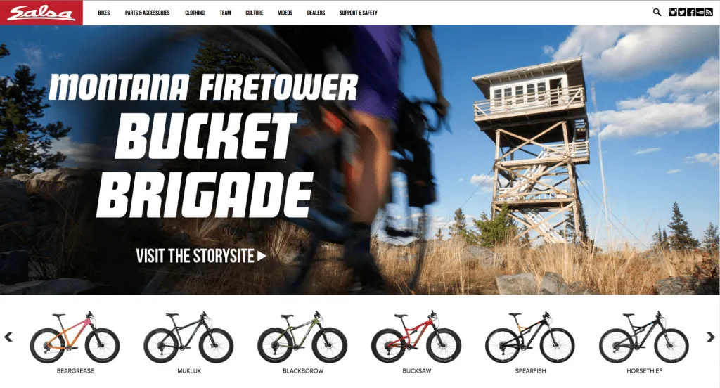
However, of the two, I have a much deeper emotional connection with Salsa Cycles because of the way they weave storytelling into their experience.
Now don’t get me wrong, I love BikeTiresDirect.com. They have great prices, a nice loyalty program and an easy website that gives me the data I need to make a purchase. But there is very little about the BikeTiresDirect website that fuels my passion or helps me dream.
Compare that with how Salsa Cycles weaves storytelling and experience into nearly every aspect of their brand. The website details countless epic rides while the printed product brochure showcases a collection of stories that perfectly compliment their product offerings. They even offer in-person demo rides to give customers (or prospective customers) the opportunity to create their own experiences.
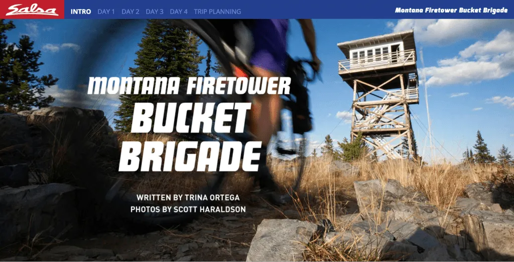
Photo credit: Salsa Cycles
Both of these companies have a place in my life. I’m not prescribing that everyone should necessarily have the same approach to how they relate to their customers. But the questions I want to propose are:
- At what level should your company be emotionally engaging customers?
- How can helping your customers fuel their passion provide you with a more profitable relationship?
- How can you slow down the experience to weave storytelling into a customer’s interactions?
How to Apply Storytelling Without Reducing Efficiency
Storytelling shouldn’t make the interactions feel less efficient. Here are a few things you can do to ensure storytelling is seamlessly integrated in the overall UX.
1. Understand your users’ motivations and needs
Performing user research such as interviews, surveys, and/or contextual inquiry is essential to creating the clearest picture of user needs and behaviors.
From these activities, you can then create personas and context scenarios to ensure content matches user expectations at different stages of the journey (before, during, after service).
For instance, if we were designing the Salsa Cycles website, we could interview 5-10 cyclists of varying backgrounds (from beginner to pro-am) to understand their passion and needs for cycling equipment. From there, we’d start to see our main personas (e.g. Greg the Beginner, Sarah the Weekend Warrior, James the Aspiring Pro Rider).
The interviews would also help reveal the core tasks common to all persona groups such as browsing items by price, finding on-sale items, etc. We’d also understand the emotional and functional reasons for why they chose cycling as a sport (e.g. to escape corporate stress, to live out larger fantasies of adventure, to exercise outdoors, etc.)
2. Be clear about your story
Once we know the core tasks and persona types, we can start to stitch together a cohesive narrative.
My favorite approach is the story mapping approach advocated by Jeff Patton.
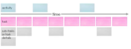
Photo credit: Jeff Patton
As Patton recommends, we map out user stories on a timeline based on the following categories:
i. Activity
A high level user story. For example “As a beginning cyclist, I want to find an affordable bike so I can test out the sport”.
ii. Task
Now you can break down the details for the user story. For the above user story, you’d include functional tasks like “Browsing pictures of bikes”, “Comparing prices for bikes”, “Checking reviews of bikes.”
You’d also want to include persuasive tasks like “See cycling adventures” because our beginner user is still unsure if the sport is the right fit. Multimedia stories might help them live vicariously for a moment, thus emotionally persuading them to move towards purchase.
iii. Task Details/ Sub-Tasks
You describe how you might execute the task (e.g. the preferred UI patterns). For example, “Browsing pictures of bikes” might entail task details like a lightbox gallery and HD photography.
3. Define an overall messaging model.
Once you’ve created a story map, an overall messaging model helps guide the tone and type of content to clarify when it’s appropriate to inspire and when it’s appropriate to inform.
We might learn from user interviews that all bike riders seek inspirational material to plan their next trip, which then informs what gear they will buy.
- Salsa’s messaging starts by inspiring riders to get out and do something they have always wanted to do.
- Next the brand speaks to how they can help riders make that happen with their portfolio of products.
- Moving deeper into the products, the content changes to be much more informational and a little less emotional.
- Finally, the content explains how the features and specifications of a particular product benefits each rider.
4. Make sure your story never gets in the way.
You may have the most inspirational, emotional, and engaging story to tell. But if your customer is just looking for a piece of product data, your story could actually act as a barrier.
Check the specific activities (as shown in your story map) and the overall narrative (in the messaging model) to make sure you’re delivering properly paced content.
Below, let’s examine how Salsa Cycles strikes the perfect balance.
Salsa’s bike family pages lead with content related to bike’s benefits and specs. Since we’re farther along the messaging model, the page includes less aspirational content (it’s deprioritized further down to not interfere with informational nature).
The aspirational content, however, doesn’t live in a vacuum. It still acts as a subtle selling technique for the product by conveying a message like “By buying a similar bike, you too can indulge in rich adventure”.
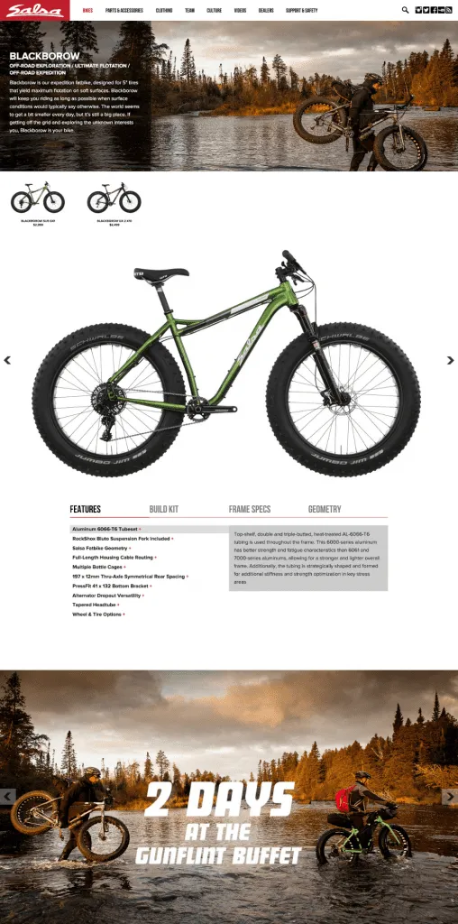
Photo credit: Salsa Cycles
When we create a detailed story map and messaging model, we ensure that we tip the balance in the right direction. For any given page, you get a more accurate idea of whether users need more aspirational or functional content.
On the above page, that balance is roughly 70% informational and 30% aspirational based on screen real estate.
Conclusion
Every design tells a story. Every story has a design.
It’s the designer’s job to connect the two.
The task feels completely intangible, but the techniques described above will hopefully help you build more structured frameworks for the story you want to tell.
If you’d like to learn other UX design best practices, check out the free Definitive 2016 UX Design Trends Bundle. The bundle includes over 350 pages of best practices and 300 examples of the best mobile, web, and UX techniques.
Feature photo credit: UX Matters

