The Difference Between Design Systems, Pattern Libraries, Style Guides & Component Libraries
You’ll often see the terms design system, pattern library, component library, and style guide used interchangeably. While these concepts are connected, they refer to different parts of a whole.
There’s also confusion about a design system vs. a component library. Design systems have component libraries, but a component library is also a stand-alone ecosystem, like MUI, React-Bootstrap, and others.
Confusing? Don’t worry; this article will help define all of these terms and put everything into perspective. We also explore the benefits of design systems and component libraries and how designers and developers use these differently.
Integrate your design system directly into the design tool. Use UXPin Merge to design with dev-ready components and eliminate the discrepancies of design to code translation. This not only speeds up the handoff process but also ensures that your final product is visually consistent, user-friendly, and true to your brand. Discover UXPin Merge.
What is a Design System?
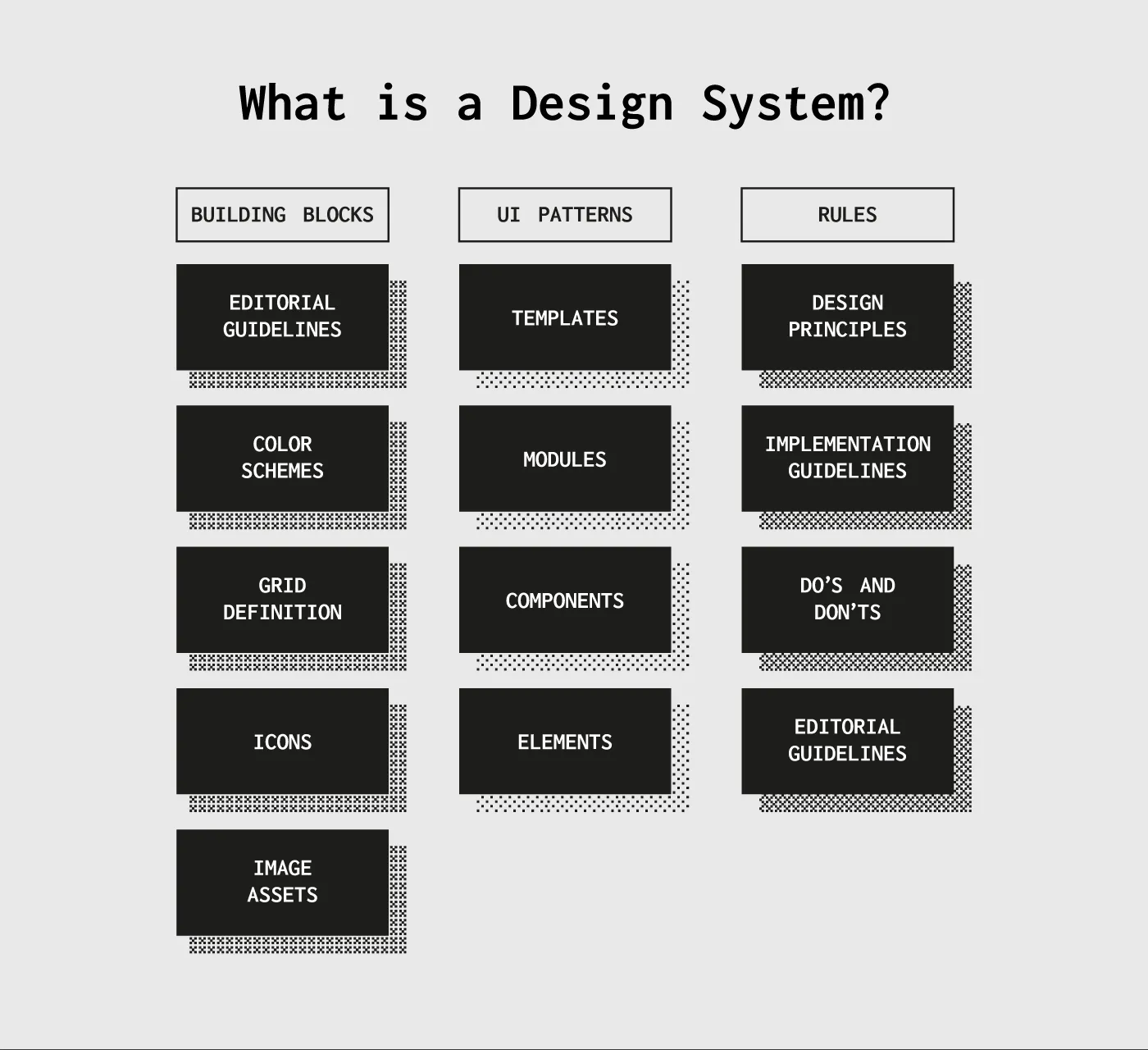
A design system is a complete set of design standards (style guide) and documentation accompanying a UI tool kit, including UI patterns, UX design principles, and components. When we look at a design system in this context, it incorporates everything designers and developers need to build and scale digital products.
Some other things you’ll find within a design system include:
- Brand guidelines
- Accessibility guidelines
- UI Design guidelines
- Governance
- Best practices
- Design system roadmap and releases
- Code snippets
- CSS variables & design tokens
- UI kit (an image-based version of design system components)
- Downloadable assets
Pattern Library vs. Component Library–What’s The Difference?
Another big cause for confusion is “the difference between a pattern library vs. a component library.” Most designers use these terms interchangeably. To some extent, that’s not incorrect, but it’s also not completely accurate.
The difference between components and patterns is best explained using Brad Frost’s Atomic Design methodology:
- Atoms: The foundational design elements that you cannot break down further. For example, buttons, icons, forms, etc.
- Molecules: Created by combining atoms to create larger UI components or patterns, like pagination, breadcrumbs, etc.
- Organisms: Complex UI patterns comprising of atoms and molecules. These patterns shape a user interface with cards, navigation bars, logos, search fields, etc.
- Templates: Complete layouts and wireframes which include atoms, molecules, and organisms. A template starts to resemble parts of a webpage or mobile application.
- Page: A page brings everything together on one screen.
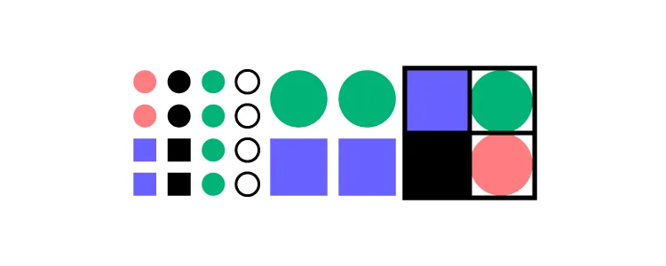
Using Atomic Design, we can define patterns and components as follows:
- Component library (Atoms): A component is a reusable block of code that can stand alone or form part of multiple UI patterns–for example, a button. A component library is a collection of UI components within a design system.
- Pattern library (Molecules & Organisms): A pattern is a group of components that designers use to solve usability issues–for example, a navbar with a logo, links, search form, and CTA button. A pattern library is a collection of UI patterns within a design system.
What is a Style Guide?
And lastly, we have a style guide. A style guide is a piece of documentation that provides context and instructions for a design system’s patterns and components–for example, color HEX codes, typography scales, usage, dos and don’ts, etc.
Design System vs. Component Library
When people talk about component libraries like MUI, React-Bootstrap, and others, things get even more confusing. Aren’t these design systems?
Although these component libraries have extensive documentation and guidelines, they’re not design systems. Designers and engineers can use these open-source component libraries however they choose.
They can edit the library’s components without limitations (so that they’re indistinguishable from the original), build new patterns, combine with other libraries or create custom components.
A design system is different. Designers and engineers must use the components as building blocks. They must follow the system’s guidelines, style guide, principles, and other documentation to design consistent-looking user interfaces–like following the instructions to build a Lego set.
If team members want to change a component or introduce a new pattern, they must follow the design system’s governance procedures. In some cases, the design system team will have the final say about how to build that new component.
Design Systems in Practical Sense
Design systems might seem restrictive, but there’s a good reason for these processes and protocols. Let’s take Atlassian as an example. Atlassian has a suite of business tools with a global userbase.
The company’s biggest selling point is that organizations can use and sync Atlassian’s product suite for a cohesive, consistent experience across the company, from customer support to sales, design, and development.
It’s challenging to achieve that level of consistency when you have a global team of designers, product teams, and engineers. So, Atlassian’s design system stipulates how teams must design its products for a seamless user experience.
In another example, Shopify allows third-party applications, themes, and other integrations. These add-ons come from freelancers and agencies worldwide–which is even more challenging to maintain cohesion and consistency than Atlassian!
Shopify developed its design system Polaris to ensure a consistent user experience, which both internal and third-party developers use to build Shopify products. The design system includes a UI kit for designers and React component library for engineers.
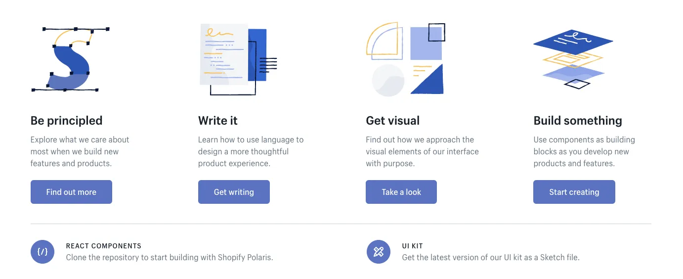
In this case, Polaris is the complete design system of principles, written content, visual properties, and UI components. The style guide is simply the static documentation on the Polaris website which describes how to use the design system. The pattern library is part of the “Components” in the Polaris design system.
The differences are subtle but unmistakably important when it comes to improving product development. A style guide on its own becomes quickly outdated since documentation requires maintenance. A pattern library lacks the instructions and principles for coherent implementation.
The design system ties everything together.
Creating a Design System
Now that you know what these terms mean and how they work together, let’s quickly review how to build a design system. Here’s a quick overview of the steps involved from our 50-page e-book Creating a Design System: The 100-Point Process Checklist.
1. Create the UI inventory: First list and describe all of the design patterns currently used in your interface and note the inconsistencies therein.
2. Get support of the organization: Present your findings and explain the utility of a common design language to everyone. As explained in our Evangelizing Design Systems templates, estimate the number of design and engineering hours wasted on redundant work and how product coherence can improve NPS scores.
3. Establish design principles: Codify your practices. You’re now starting to work on the style guide for the design system.
4. Build the color palette: When building the UI inventory, we found 116 different shades of grey that needed consolidation. Create the palette and its naming convention.
5. Build the typographic scale: You can optimize the scale to serve existing styles, or you might try to build a harmonious scale using the golden ratio or major second. When building the scale, don’t forget that you’re not only setting the size of the font, but also weight, line-height and other properties.
6. Implement icons library and other styles: Decide which icons from the UI inventory will become part of the design system, then standardize the implementation.
7. Start building your first patterns: This is the task that will never end. Patterns should always either reflect the truth about the product, or reflect the aspirational state of the product in the near future.
Learn More About Design Systems
We’ve defined and organize the terms design system, style guide, and pattern library into a hierarchical structure. We’ve also quickly described how to build your own design system.
For a step-by-step walkthrough of how to build a design system, download the 50-page ebook Creating a Design System: The 100-Point Process Checklist. All the advice is based on UXPin CEO Marcin Treder’s experience building the internal design system.
Once you build the system, there’s still things to do to ensure its success. We prepared a checklist of things that you should do after releasing a design system at your organization.
On Using a Component Library
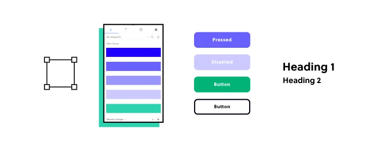
Component libraries provide design and engineering teams with a comprehensive collection of UI elements and components for digital product design.
The most significant benefit is that teams don’t have to start from scratch–they can begin prototyping and testing immediately using a thoroughly tested component library.
MUI (based on Google’s Material Design UI), one of the world’s most comprehensive and widely used component libraries, even provides customization through theming, so you can separate your UIs from competitors–even if they’re using the same component library.
While component libraries are customizable, they also provide a single source of truth between design and development–something particularly challenging, especially in the early stages of a product’s lifecycle.
Using the same components as engineers gives designers some constraints to minimize drift. At design handoff, engineers simply copy the component library’s components and make changes according to the designer’s mockups and prototypes.
Another significant benefit of a component library is that it gives solo engineers and startups professionally styled UI elements to build products and prototypes, making it easier to enter the market and compete.
How Can Designers and Engineers Use Design Systems?
Designers and engineers follow the same design principles but the guidelines and documentation differ.
For example, with Polaris, designers and engineers must follow Foundations and Experiences to understand the principles, brand requirements, and approach to designing Shopify products. This knowledge is essential to know before you can start designing and coding.
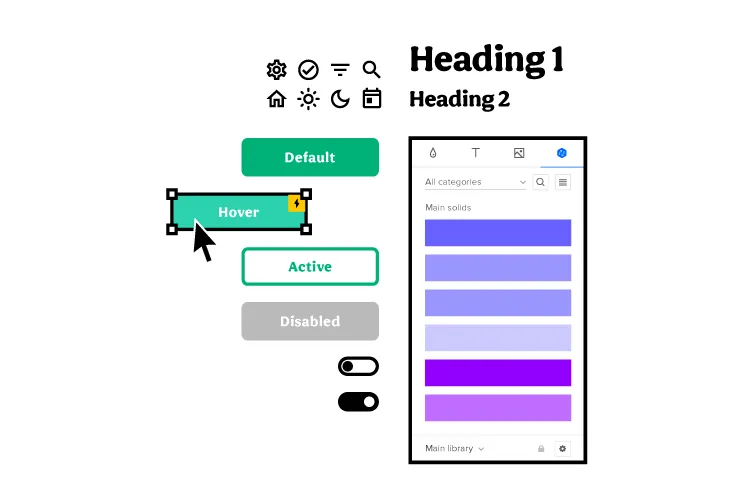
Polaris also includes a Resources section with a UI kit, Polaris tools (icons set), Polaris GitHub page, links to Shopify’s blogs, additional developer documentation, and forums/communities.
Polaris’ Content and Design is designer-specific documentation for designing Shopify products. The Design section includes a style guide with Polaris’ design language, colors, typography, illustrations, sounds, icons, states, spacing, and data visualization.
Developers must familiarize themselves with Polaris’ design documentation (especially if it’s a solo developer) to understand the reasons behind design decisions and build layouts accordingly, but they have separate documentation under Components.
The Components section includes interactive example components with a code snippet and a link to open it in CodeSandbox. Devs can explore each component and use the snippet as starter code to develop a Shopify product.
Using Component Libraries and Design Systems with UXPin Merge
UXPin Merge allows you to sync any design system or component library hosted in a repository to UXPin’s editor. Instead of using a UI kit, designers build mockups and prototypes using fully functioning code components.
The design system team can set constraints and provide flexibility via the component’s props with our Git integration (for React) or Args with Merge’s Storybook integration (Vue, Ember, Angular, and more). Any updates the DS team makes to the repository automatically sync to the design editor, and UXPin notifies teams of the changes–creating a single source of truth across the organization!
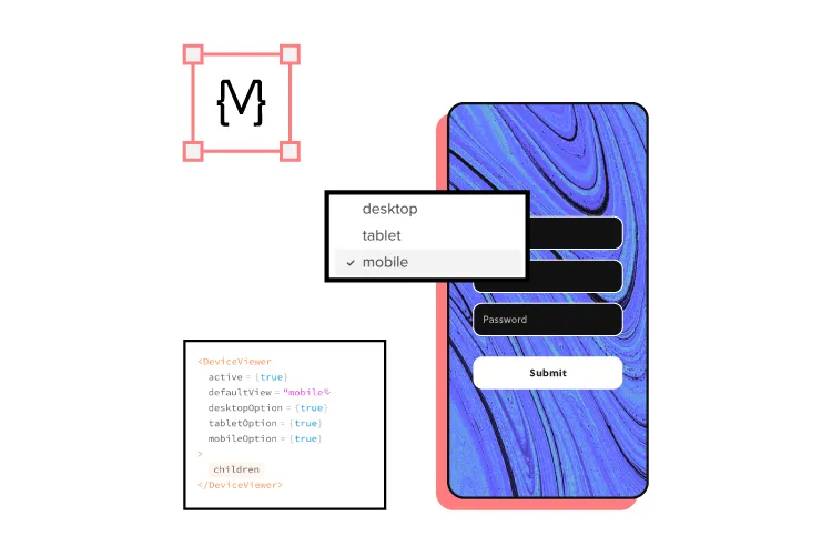
Designers can make adjustments to components via UXPin’s properties panel or switch to JSX to edit code directly–perfect for you designer/developers who want the best of both worlds. At design handoff, engineers copy each component’s JSX properties to develop the final product.
UXPin also generates an automatic design system with interactive components generated from your code. You can also include a style guide and other documentation, keeping your entire design language in one place. Instead of downloading and importing assets and components, design teams grab what they need from the Design Libraries Panel to build layouts. Discover UXPin Merge.

