Design System Naming Conventions – How to Set Them
Design system naming conventions are the standardized rules and guidelines used to name elements within a design system. This includes naming design tokens, components, patterns, styles, and any other elements that are part of the design system. A well-defined naming convention is crucial for maintaining clarity, consistency, and ease of use across both design and development teams.
If you’re looking to elevate your design system and create a more consistent, efficient workflow, UXPin Merge is the solution for you. By integrating design and development into a unified process, Merge helps you build a robust design system that scales with your organization and meets the highest standards of quality and consistency. Request access to UXPin Merge.

What is the Naming Convention for Design Systems?
Design system naming conventions are a set of rules for naming the different parts of a design system, like colors, fonts, buttons, and other components. These rules help keep names clear and consistent, making it easy for everyone on the team to understand and use the design system.
Design system naming conventions are typically set by the team responsible for creating and maintaining the design system. It can be governed by a dedicated group of designers and developers who focus on building and managing the design system or design leaders at a company. They establish naming conventions to ensure consistency and ease of use across the system.
Why Are Naming Conventions Important in a Design System?
By following these naming conventions, teams can work together more smoothly and keep the design system organized and easy to update. Design system naming systems help in:
- Clarity and Readability: A good naming convention helps team members easily understand what each element is and how it should be used. This is especially important as the design system grows and more people across different teams start using it.
- Consistency: Consistent naming reduces confusion and helps ensure that everyone on the team uses the design system in the same way. This is essential for maintaining a cohesive and unified user experience across all products and platforms.
- Scalability: As your design system expands to include more components and tokens, a well-structured naming convention makes it easier to organize and manage these elements. It provides a scalable framework that can accommodate new additions without causing confusion or requiring significant restructuring.
- Collaboration: Clear and consistent naming conventions improve collaboration between designers and developers by reducing miscommunication. When both teams use the same language and terms, it’s easier to maintain alignment throughout the development process.
9 Key Elements of Design System Naming Conventions
Design Tokens
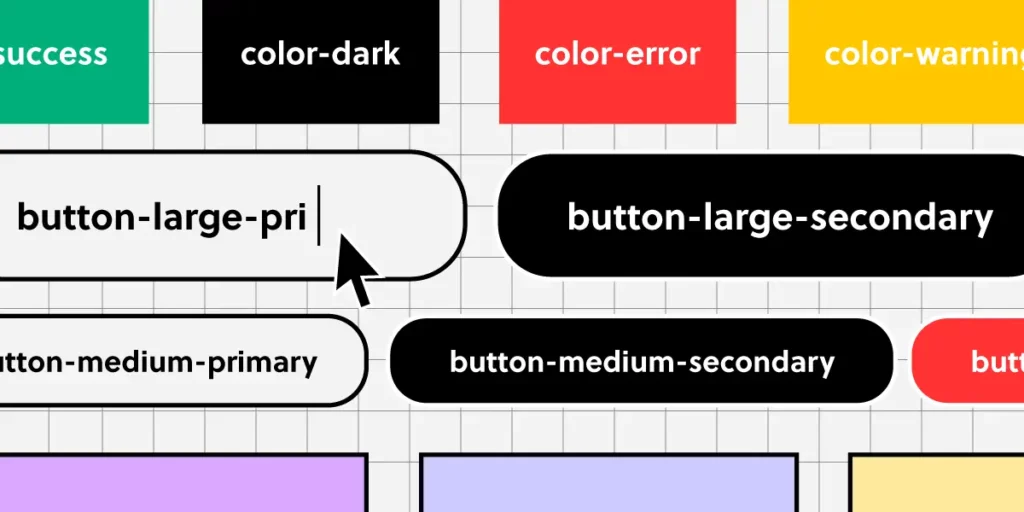
Design tokens are the core variables that define a design system’s visual properties, such as colors, typography, spacing, and shadows. Naming conventions for tokens should reflect their purpose and usage rather than specific values, ensuring flexibility and scalability. Examples include color-primary, font-size-heading, or spacing-small.
Components
Components are the building blocks of a design system, representing reusable UI elements like buttons, forms, cards, and navigation bars. Consistent naming for components ensures they are easily identifiable and logically grouped, enhancing usability and collaboration. Examples include ButtonPrimary, FormInputText, or CardWithImage.
Patterns
Patterns are reusable combinations of components that address specific design problems or create common UI layouts. Naming conventions for patterns should describe their function clearly, such as LoginForm, NavbarSticky, or ErrorMessageModal.
Modifiers
Modifiers represent variations or states of a base component or token, such as different sizes, colors, or behaviors. Consistent naming for modifiers typically indicates the relationship between the base element and the variation, using a pattern like BaseComponent–Modifier. Examples include ButtonPrimary–Large, ColorPrimary–Dark, or Card–WithShadow.
Utilities
Utility classes or styles are often used for quick, specific adjustments that apply common design tokens, such as margin or padding. Naming conventions for utilities are typically short and descriptive, indicating the property they affect. Examples include u-margin-small, u-padding-large, or u-text-center.
States
States define different conditions of a component, such as active, disabled, focused, or error states. Clear naming for states helps communicate these conditions within the design system. Examples include Button–Disabled, Input–Error, or Link–Active.
Responsive Variants
These are variations of components or styles that adjust based on screen size or device type. Naming conventions for responsive variants typically follow a pattern that indicates the screen size they target. Examples include Button–SmallScreen, Grid–Desktop, or Image–Responsive.
Accessibility Features
Elements or tokens that enhance accessibility might have specific naming conventions to denote their purpose. For example, Button–AriaLabel or Text–HighContrast indicate elements tailored for accessibility.
Brand-Specific Elements
In some design systems, elements may be specific to different brands or themes. Naming conventions for these elements should clearly indicate their association. Examples include Button–BrandA, Navbar–BrandB, or Typography–Corporate.
Top 10 Best Practices for Naming Conventions in Design Systems
A well-organized design system is the backbone of consistent and scalable design work. Naming conventions play a crucial role in this organization by making your design system intuitive and easy to use. Here are ten essential best practices to help you establish effective naming conventions for your design system:
1. Be Descriptive but Concise
Why It Matters: Clear and concise names help everyone on your team quickly understand what each element is for. Long or vague names can lead to confusion and mistakes, slowing down the design and development process.
How to Implement: Choose names that clearly describe the element’s purpose or function without being overly detailed. For example, instead of naming a primary action button btnSubmitActionPrimary, use ButtonPrimary. This name is direct, easy to remember, and effectively communicates the button’s role.
2. Use Consistent Patterns Across the System
Why It Matters: Consistency in naming makes your design system predictable and easy to navigate. When team members know what to expect from the naming structure, they can find and use elements more efficiently.
How to Implement: Establish a naming pattern like [Category]-[Modifier] for design tokens (color-primary, spacing-small) and ComponentName–Modifier for components (Button–Large, Card–WithShadow). Stick to these patterns throughout your design system to maintain consistency.
3. Avoid Specific Values in Names
Why It Matters: Naming tokens with specific values like 16px or #FFFFFF limits flexibility. If the values change, you would need to rename tokens throughout the system, which is time-consuming and error-prone.
How to Implement: Focus on naming tokens based on their function rather than specific values. For instance, use font-size-base instead of font-size-16px. This approach allows you to adjust the value without changing the name, making your system more adaptable.
4. Reflect the Design Intent, Not Just Implementation
Why It Matters: Names should convey how and when an element should be used, rather than just describing what it is. This helps designers and developers understand the intent behind each element, promoting consistent usage across different contexts.
How to Implement: Use names that indicate the purpose of the element. For example, instead of a generic name like color-red, use color-error to specify that the color is intended for error messages. This provides clarity and reduces the risk of misapplication.
5. Document Your Naming Conventions Clearly
Why It Matters: Clear documentation ensures that everyone on your team understands and follows the naming conventions. This is particularly important as new team members join or as the design system evolves.
How to Implement: Create a comprehensive section in your design system documentation dedicated to naming conventions. Include the reasoning behind each rule, along with examples of correct and incorrect naming. Update this documentation regularly to reflect any changes or additions.
6. Use Readable Naming Formats like Camel Case or Kebab Case
Why It Matters: Readable formats such as camel case (ButtonPrimary) or kebab case (button-primary) make it easy to distinguish different parts of a name at a glance, improving clarity and reducing errors.
How to Implement: Decide on a naming format that aligns with your team’s coding standards or design practices. For instance, use camel case for component names (ButtonPrimary, CardWithImage) and kebab case for CSS class names (button-primary, card-with-image). Apply this format consistently.
7. Include Context in Names When Necessary
Why It Matters: Elements that could be used in multiple contexts should have names that specify their intended use. This prevents confusion and ensures elements are applied correctly across different parts of the design.
How to Implement: When naming tokens or components that serve specific functions, include contextual information in the name. For example, use spacing-card-small instead of just spacing-small to indicate that the spacing value is intended for card components.
8. Plan for Scalability from the Start
Why It Matters: A scalable naming convention allows your design system to grow without needing significant changes to existing names. This is crucial as your system evolves to include more components, tokens, and patterns.
How to Implement: Anticipate future needs by choosing flexible naming conventions. For example, if you might add different button types, start with names like ButtonPrimary, ButtonSecondary, and ButtonTertiary. This approach leaves room for expansion without causing confusion.
9. Minimize the Use of Abbreviations
Why It Matters: Abbreviations can make names shorter, but they also risk making them unclear, especially for new team members or collaborators. Only use abbreviations that are universally understood within your team.
How to Implement: Stick to full words unless an abbreviation is commonly accepted and widely recognized. For instance, btn for button is standard, but using fs for font-size might not be immediately clear to everyone.
10. Regularly Review and Update Naming Conventions
Why It Matters: As your design system grows and changes, your naming conventions might need to evolve. Regular reviews help ensure your system remains intuitive and efficient for all users.
How to Implement: Set up periodic reviews of your naming conventions with key stakeholders. Gather feedback from designers and developers to identify any issues or areas for improvement. Be open to making changes that enhance clarity, consistency, or scalability.
Build Prototypes that Are in Line with Your Design System
Establishing effective naming conventions is crucial for any design system’s success. By being descriptive but concise, maintaining consistent patterns, and regularly reviewing your conventions, you can ensure that your design system remains organized, scalable, and easy to use.
Consistency is key to any successful design system. It ensures that your UI components are cohesive, scalable, and easy to maintain across different teams and projects. But achieving this level of consistency can be challenging, especially when it comes to bridging the gap between design and development. That’s where UXPin Merge comes in.
UXPin Merge is a powerful design technology that allows you to integrate real, production-ready code components from your React-based design system directly into your design tool. This integration creates a unified source of truth for both designers and developers, ensuring that everyone is working with the exact same components and styles. Request access to UXPin Merge.


