Design System Tips from Developer’s Point of View
Today we’re sharing a guest post by Nick Moore that originated from collaboration with StackBlitz. Build code-backed prototypes and open them in StackBlitz in one click. Request access to UXPin Merge.
If you know how to ride a bike now and wait five years to ride one again, you’ll likely do just fine once you get back on. Bicycles are intuitive once you’ve learned how to ride them, and the basic design is unlikely to change over time and across bicycles. Reaching this level of usability in software is a little more difficult.
Developers and designers often have to iterate too rapidly to reach bicycle-level reliability, but the intuitive experience of a user logging onto your app as if they were hopping on a bicycle is still something we should aim for—and design systems are the best way to do so.
Even though it’s a high bar, this level of usability pays dividends. Users will adopt your app more readily (reducing churn), use it to greater effect (and feel the benefits), and strengthen your marketing efforts as engaged users recommend and amplify your app.
Building and using a design system is one of the best ways to clear this high bar because design systems allow development and design teams to build and ship quickly while relying on standardized components that reduce friction and confusion.
If you’ve ever encountered a bad design system, then you know the issue: A great one can lift you up, but a bad one can hold you back.
The key is to treat your design system like a fully-fledged product that must remain effective and dependable over time. Without enough investment, design systems will only offer marginal help; with enough investment, design systems can provide consistency and stability while improving the pace of development.
Build responsive layouts fast! Try UXPin Merge, a technology that helps designers and developers create prototypes that are production-ready from the start. With our integration, open UXPin Merge prototypes in StackBlitz with one click. Request access to UXPin Merge.

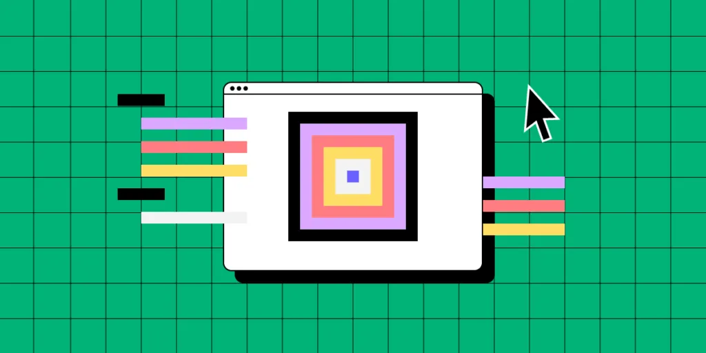
Build design systems via iteration, not waterfall
For developers, design systems often feel like intrusions from the outside in. The design systems team might have their best interests at heart, but developers know that a bad process with good intentions will still likely lead to a bad product.
After all, developers are well-versed in building a product and iterating over time, with user feedback informing every iteration. Any whiff of a waterfall or waterfall-esque process – where teams build a product in a silo and release it all at once – will make them justifiably skeptical.
The solution is to focus on simplicity over comprehensiveness—at least at first—and build design systems bit by bit over time. By breaking the problem down, platform teams can build simple but essential features, prove the concept’s value, and get feedback that will inform the rest of the work.
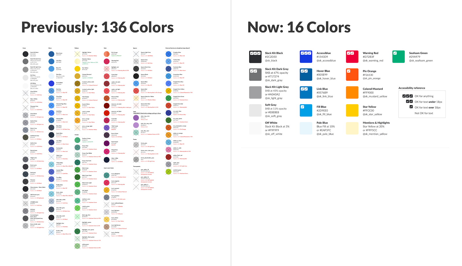
Slack provides a good example of this methodology. Back in 2016, millions of people were using Slack, and the company’s codebase was, according to Zack Sultan, Lead Product Designer at Slack, “built in a way that favored time-to-market over maintainability, consistency, or reusability.”
Like many young companies, Slack prioritized finding and pursuing product/market fit before building a codebase suited for scalability and reliability. Some companies encounter breaking issues first and decide to reassess potential tech debt issues, but Slack kept ahead of itself.
“We never encountered a single breaking point in our user interface,” Sultan writes, “but rather a slowly cascading series of inconsistencies, quirks, and discrepancies.” The momentum of the business was growing, and as Slack added more product teams (and more products and features), components started to drift.
(Source)
Questions soon abounded, Sultan writes. “What does a button look like in Slack? How do you build it? What words do you put in it? It was up to individual teams to make these decisions.”
Many companies correctly notice the problem and then build a mediocre solution by asking a group of developers to cook up a new design system in isolation. Some slowing down is to be expected as companies grow, but a design system developed this way can cause development to come to a screeching halt.
Slack was wary of this potential and focused on finding ways to rebuild and standardize its components without slowing down overall development. “It was a bit like taking a car engine apart piece by piece, and cleaning, repairing, and replacing each part while it accelerated down the highway,” Sultan writes.
(Source)
Like building a minimum viable product (MVP), design systems need to have core features built well and not many features built poorly. Early on, you’re looking to demonstrate value–not comprehensiveness–even if it means building one single component really well.
“Just one component, thoroughly documented, was immediately valuable,” Sultan writes. By building components one at a time and ensuring each was complete and well done, they were able to create a “virtuous cycle for the system.”
The value of each component, as simple and small as each isolated chunk was, demonstrated the value of the work as a whole. Developers remained invested throughout, and Slack eventually launched its design system, Slack Kit.
Maintain design systems or lose them to tech debt
Let’s imagine, for a moment, that the platform team and design team have worked together – alongside developer feedback – to build the perfect design system. Every developer takes a look and gives it a thumbs up.
Why, then, could you take any one of those developers aside and hear some wariness in their voice when they talk about actually using the design system?
The issue is that developers are very familiar with what happens when a product doesn’t have a maintenance plan. They’ve built products that have fallen by the wayside and created beloved internal tools that managers deprioritized until they died. Eventually, even a great product will fall prey to tech debt if there’s no plan to keep it alive.
For teams building design systems, the solution is to build a flexible design system that they can iterate, maintain, and update over time.
Design systems, by their nature, tend to offer some level of standardization, but over-focusing on standardization can lead to an overly rigid system. If the design system is good, people might not complain at first, but if even a good system is hard to keep up to date and hard to use in non-standard scenarios, people will eventually stop using it.
Instead, platform teams need to build design systems with maintenance as a first principle and map each component across a spectrum of flexibility.
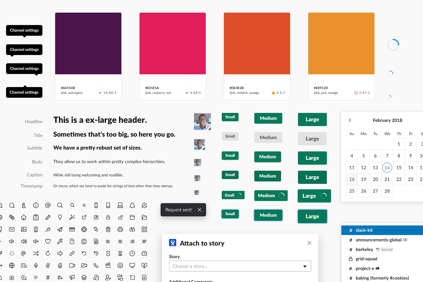
To make this a little less abstract, let’s look at an example from Spotify.
The team behind Encore, Spotify’s design system, faced the same issue we’ve talked about here. As the product changes and the development team grows, writes Charlie Backus, design systems engineer at Spotify, “it can sometimes seem like the team is outgrowing the current set of components and styles.”
(Source)
As you can see in the selection above, there was a dire need for consistency, despite an equal need for teams to remain creative and driven.
To find a balance, Backus recommends teams develop “an abstract shared vocabulary around component properties” or ensure that the “base properties remain accessible for modification by end consumers.”
The best way to think about this strategy is to imagine a spectrum between configuration (high-abstraction components that developers pass additional parameters to in order to add varied behaviors) and customization (low-abstraction components that developers just add custom styles to).
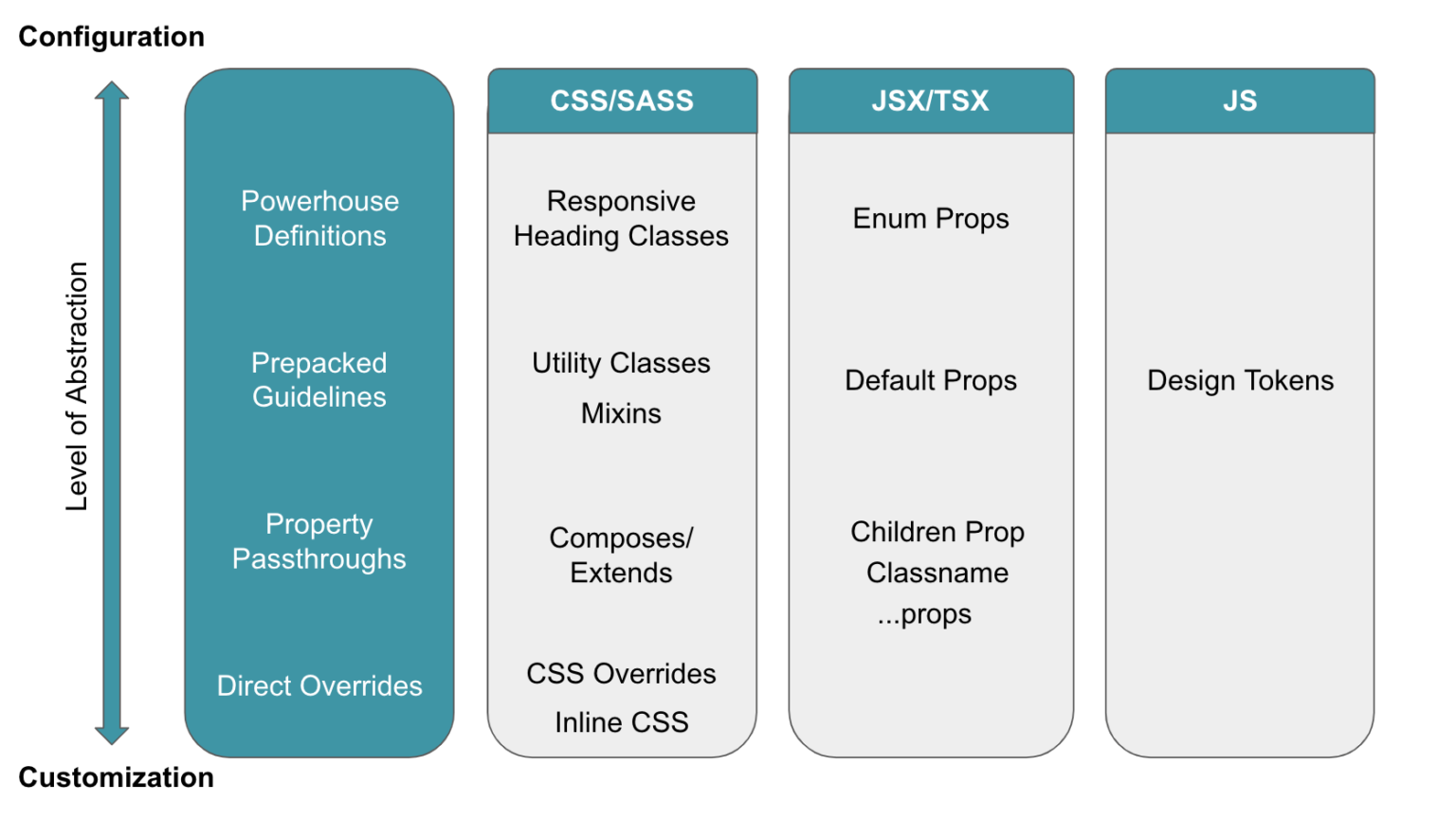
(Source)
This spectrum-based approach is useful because it forces teams to think about tradeoffs ahead of time.
On the one hand, as Backus writes, “A more abstract configuration approach can increase consistency and maintainability but at the risk of the system being a bottleneck for outgoing features.” By increasing abstraction, a design system can make development more consistent but potentially slow down development.
On the other hand, Backus continues, “The less abstract customization approach enables quicker feature development; however, the overall consistency of the product can suffer as a result.” Speed increases, in this case, but the likelihood of inconsistencies increases, too.
Backus recommends thinking about maturity to find your spot on the spectrum for any given component. “The more mature a product or feature is, the more beneficial and feasible a configuration approach is. However, the iterative and low-level nature of customization makes it more suitable for prototyping and features which are bespoke, or are still subject to change.”
Like in the Slack example, we’re incorporating concerns that lie outside the immediate purview of the design system. With Slack, they were thinking about the growth of the company, and with Spotify, they were thinking about the growth of features. Mature, well-tested, well-known features can be standardized, but new, still-growing, and one-off features require more flexibility.
Avoid rework by aligning developers and designers
Developers and designers alike often decry meetings, wishing they had more time and space to work. Don’t get us wrong – too many meetings can be a huge drag on focus – but a good meeting can also save you a lot of work. An aligned team, delayed by a meeting, will always be more effective than an unaligned team working hard on the wrong things.
This dynamic is true within teams and departments, but alignment issues can be much more severe between different departments. A development team and design team working on different things, for example, can end up negating each other’s work if the designs are for a feature that isn’t built yet and the feature is built for a design that hasn’t been sketched yet.
Design systems magnify this issue. If a design system isn’t well thought out, all the effort toward building one can be wasted if developers and designers don’t start out using it in an aligned way and maintain alignment over time.
As we said in the first section, the design system can’t feel like a third party designed from the outside in. In the same way, it can’t be a tool that developers and designers only call on occasionally or when absolutely necessary. Instead, a design system should be a language for the design and development teams—both a result of alignment and an anchor that continuously shows how well the teams are aligned.
To see what we mean when we refer to design systems as language, look at Airbnb. Back in 2016, Airbnb was growing rapidly and adding feature after feature. Karri Saarinen, then Principal Designer at Airbnb, writes, “One-off solutions aren’t inherently bad, but if they aren’t built upon a solid foundation, we eventually find ourselves having to pay back accrued technical and design debts.”
To reset these efforts and ensure ongoing sustainability, the Airbnb team looked toward language as a guiding metaphor. “Visual language is like any other language,” Saarinen writes. “Misunderstandings arise if the language is not shared and understood by everyone using it. As a product or team grows, the challenges within these modalities compound.”
Airbnb built a new language via a new design system by looking at where their old designs failed. “We started by auditing and printing out many of our designs, both old and new,” Saarinen writes. “Laying the flows side by side on a board, we could see where and how the experiences were breaking and where we needed to start making changes.”
By focusing on the miscommunications first, Airbnb was able to build a language that used a consensus understanding of shared components as its foundation.
(Source)
“We felt that we were all working together towards the same idea,” Saarinen writes. “Reviewing our collective work at the end of each day, we began to see patterns emerge. We course-corrected when necessary and started defining our standardized components.”
The team knew they were onto something when, even before the design system was finalized, productivity and consistency sped up in tandem. “One day,” Saarinen remembers, “While putting together a last-minute prototype, our team was able to create nearly 50 screens within just a few hours by using the framework our library provided.”
The early and ongoing boosts to productivity and standardization were a result of building a design system like a shared language. By thinking of the design system first and foremost as a way for developers, designers, and others to communicate and understand each other, the entire company benefited.
Treat your design system like a basecamp
One of the biggest worries developers can feel when a platform team or engineering leader proposes a design system is the tension between the freedom to do new work and the restraints standardization can impose.
Developers often fear that design systems, even when they introduce welcome consistency, can inhibit experimental and exploratory work. Ultimately, developers want to code, and design systems can sometimes feel like a way of reducing coding to boilerplate work.
With this fear and its real risks in mind, companies have to take a different approach to making design systems work for developers: Design systems should be like basecamps for developers and designers on the frontiers of exploration.
The base camp is more stable than the frontier, and the work done there is more routine. In this metaphor, the ultimate purpose of the design system is to give designers and developers resources so that they can explore further with every trek. The design system acts as a dependable foundation, but it doesn’t replace all the work that needs to be done.
With the lessons we’ve outlined here—iterating over time, thinking carefully about flexibility and maintenance, and aligning developers and designers—you can create a design system that developers trust, one they will gladly return to before exploring further.
Create fully functional, production-ready prototypes from the start. With UXPin Merge, what you design is exactly what gets built—eliminating handoff issues and speeding up development. Plus, with our seamless integration, you can open your UXPin Merge prototypes in StackBlitz with a single click for an even smoother workflow. Ready to elevate your design and development process? Request access to UXPin Merge today.


