10 Examples of Design Decisions and How to Make them

Design decisions define the direction and outcome of design projects. Designers use research and data to validate assumptions and eliminate biases during the decision-making process.
Making decisions is one part of this process. Design teams must also articulate their thought process to get stakeholders, engineers, and product owners on the same page.
Articulate your design decisions using UXPin Merge to create high-quality interactive prototypes that accurately replicate the final-product experience. Visit our Merge page for more details.
Table of Contents
What are 10 Examples of Common Design Decisions?
The types of decisions a designer makes during the design process will vary depending on an organization’s size and the product’s maturity.
For example, designers make fewer design decisions for products with a design system. The design system’s style guide, design language, and other guidelines reduce decision-making so designers can focus on solving user needs.
These are ten examples of common types of design decisions:
- Color palette selection
- Typography selection
- Design layout
- Visual hierarchy
- Media selection (images, video, maps, etc.)
- Interaction design
- Microinteractions, animations, and motion
- Accessibility considerations
- Content design
- Iconography and graphics
In isolation, these decisions are somewhat straightforward. Designers can choose a trendy color palette and typeface to make a UI look cool, but how do these elements impact accessibility? What is the impact on performance, and how will interfaces change across multiple platforms?
When you zoom out, design decision-making is a complex process involving multiple factors and considerations.
4 Ways Designers Make Decisions

There are four ways UX designers make decisions:
- Experience
- Intuition
- Imitation
- Reference
Experience
Experience decision-making comes from a UX designer’s knowledge and past work. Over time, designers make these decisions unconsciously, like creating layouts, alignment, and spacing.
This experience provides designers with a boilerplate to begin work, but it won’t solve every problem and quickly becomes outdated–meaning, experience alone is unreliable, which leads us to intuition.
Intuition
Intuition can inspire designs and decision-making, particularly early in the design process, which relies on out-of-the-box thinking and making many decisions fast.
Intuition and experience are also great for collaborative design exercises–bringing diverse ideas and perspectives together to find the best solution.
Imitation
Much of design is imitation. For example, designers rely on universally recognized design patterns to solve fundamental usability issues. You’ll find variations of these UI patterns across multiple products and industries.
Sometimes imitation is necessary to remain competitive. Meta launched Reels to compete with TikTok, and Twitter launched Spaces in answer to Clubhouse.
Reference
Reference is similar to imitation, but instead of copying, designers use one another’s work to form new ideas and outcomes–similar to how musicians remix old songs.
Design teams also reference competitors, industry standards, accessibility guidelines, and other external sources to formulate decisions about solving specific user problems.
How to Make Good Design Decisions

Start with research
UX designers cannot make decisions in a vacuum. They rely on UX research to identify problems and formulate ideas that solve user needs. Some research methods that guide the decision-making process include:
- User research (interviews, surveys, etc.)
- Market research
- Competitive analysis
Of these three categories, user research is the most critical for decision-making. Designers must pinpoint a specific problem, understand why it’s happening, and design a solution for that user persona.
UX designers reference user research such as personas, customer journeys, empathy maps, and problem statements throughout the design process to keep users at the forefront of decision-making.
Using data and analytics
Data and analytics help designers make informed decisions backed by evidence, eliminating assumptions and biases. Some examples include:
- Product analytics: web and app analytics from tools like Google Analytics help designers identify bottlenecks, dropoffs, and opportunities. Designers also use these metrics to define a baseline before a redesign and measure the project’s success after delivery.
- A/B testing: helps designers choose the best decision between two options. A/B testing works best when designers want to test subtle differences, like color choice, headlines, and CTAs.
- Heatmaps: inform design teams how users interact with user interfaces and content. For example, do most users use the primary CTA or look for another option in the navigation menu?
Incorporating business needs
Designers must balance user needs with an organization’s business goals when making decisions. Meeting with stakeholders is key to prioritizing and incorporating these business needs.
Achieving successful business outcomes and delivering a positive return on investment is critical for designers as this determines future buy-in and resource allocation.
Test early, test often
User testing is vital for a designer’s decision-making process. The results from every test drive the next decision through wireframing, mockups, high-fidelity prototyping, and final delivery.
During the early stages of the design process, designers use sketches and paper prototypes to iterate on many ideas fast. During this phase, UX designers and collaborators use experience and intuition to drive decision-making based on the problems they’ve identified during user research.

By the time designers begin digital wireframes and mockups, they have a foundational user flow and information architecture. They test wireframe prototypes to finalize the steps in the user flow and navigational elements.
The final step is high-fidelity testing using interactive prototypes. UX designers test these prototypes with end-users and stakeholders to gather insights and make educated decisions about the final result.
Document design decisions
Documenting design decisions is critical, and many teams fail to do this properly. They often record what works and leave out what doesn’t. Documenting every design decision–good and bad–allows designers to see what’s working and what other team members have already tried.
Knowing where others have failed prevents designers from duplicating design decisions that don’t work. Conversely, documenting the process behind design decisions implemented by previous designers will help future teams understand why the solution exists the way it does.
Product Designer Edward Chechique offers practical advice in this Medium article about the importance of documenting design decisions.
Articulating design decisions

Articulating your design decisions is just as important as making them. It’s a challenge many designers battle with. As UX designer Mirela Ignat puts it in a 2019 Medium article about design decisions, “I believe an essential thing that makes us better designers is the ability to explain the “why” behind the solutions we propose. And if you’re lacking this ability, there is a high chance of ending up on the losing side of the argument, forced to make some changes you will not agree with.”
Mirela argues that designers must become better communicators, using analogies and storytelling to relate with stakeholders, product managers, and developers. These people often don’t understand user experience or design thinking, so they don’t have the framework to understand the “why” behind design decisions.
Using user stories
UX artifacts that describe users’ stories are excellent for getting stakeholders to understand problems and empathize. User personas help humanize users, while journey maps and storyboards illustrate their challenges.
Using these user research tools to tell user stories helps non-designers understand how designers get to their decision while providing the foundation for stakeholders to offer meaningful input and feedback.
Showing through prototypes
Often the best way to articulate design decisions is by showing stakeholders using prototypes. When stakeholders experience how your design solves a problem, they’re more likely to trust your decision-making.
For example, you might create two prototypes. One using their proposal and a second based on user insights and data. They’ll understand why your design works better when they experience the prototypes from a user’s perspective.
Making Better Design Decisions With UXPin Merge

The problem with traditional image-based design tools is that they make poor prototypes. Designers are limited by what they can create and test–making it challenging to articulate design decisions and get buy-in.
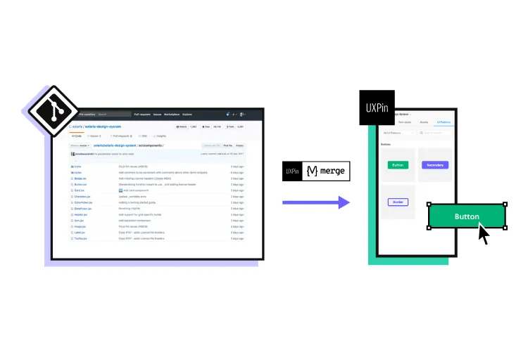
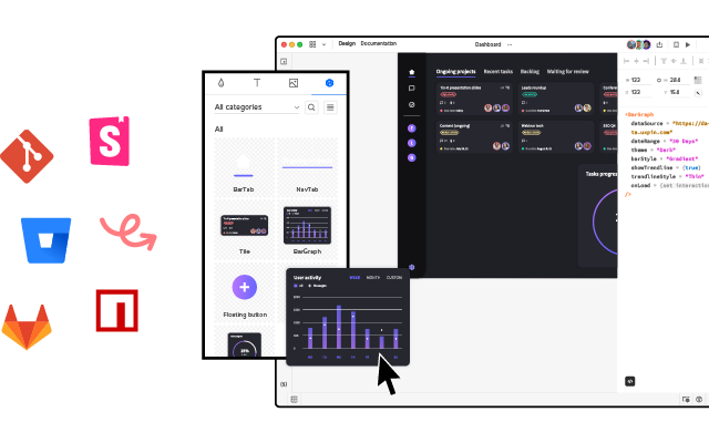
UXPin Merge is a code-to-design technology that bridges the gap between design and development. Organizations can bring a design library hosted in a repository to UXPin’s design editor, giving designers interactive components to build fully functioning prototypes that look and feel like the final product.
Streamline decision-making
Merge components include properties and interactivity defined by the design system, so designers can spend more time building user interfaces to solve user problems rather than making component-level decisions.
This Merge workflow has reduced time-to-market for many organizations, including FinTech giant PayPal.
“Now that we’re using UXPin with Merge, my design philosophy and productivity have gone way up! I’m confident that I can implement a prototype in 30 minutes or less. Whereas with the tools I was using previously, it would take me half a day.” Erica Rider UX Lead EPX at PayPal.
Better understanding from stakeholders
Erica and her team also benefit from better stakeholder feedback: “The C-suite people and the directors are able to give us stronger feedback about the ultimate direction because they experience the features and goals of these prototypes rather than just commenting about how these boxes don’t look like a text field, for example.”
With meaningful feedback and accurate insights from usability testing, designers can solve more problems while making better decisions during the design process using UXPin Merge.
Build better product experiences for your customers with the world’s most advanced design tool. Visit our Merge page.


