Designing the user interface of a mobile application is tricky due to the large amount of data and content you are trying to fit onto a relatively small screen. One of the best ways of addressing this issue is by incorporating the right design patterns into your mobile system. The most successful mobile application companies, such as Houzz, Instagram, Pinterest, and Wunderlist, have already done the hard work of innovating patterns that make data and content management as simple and intuitive for the user as possible. Rather than innovating from scratch, we may instead leverage these existing design patterns to our competitive advantage.
Of course, innovation is always good and I am not saying we don’t have to innovate anymore. Instead I believe that by recognizing and understanding the design patterns that have already been proven to work, we become smarter in our innovation – and cognizant enough to integrate similar patterns into our own innovative mobile design, should we choose to do so.
Effective display of data and content on your mobile UI is important for a sound user experience. In this article, I show you 5 different design patterns utilized by some of today’s best mobile application companies for the purposes of effectively managing data and content.
1. Interactive Content Layers
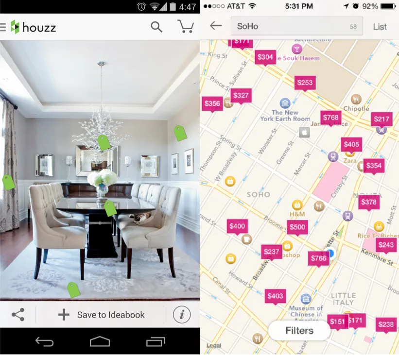
Interactive content layers create an “augmented reality” by allowing the user to interact with the content in further detail. For example, Houzz places a price tag icon on individual items that are being sold in a picture view, and tapping on the price tag reveals further information about that particular item. By allowing the user to interact with the different content layers in an intuitive manner, Houzz also adds an element of playfulness as the price tags swing around as you move and change the orientation of the screen.
2. Circles
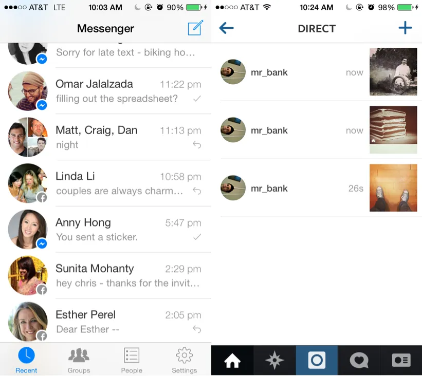
Circles (versus square or rectangular buttons) are gaining popularity as a design pattern. Possible reasons for this trend include:
- Circles may provide a more optimal action button feel since they more closely match the rounder shape of your finger; thus they provide a more intuitive target for touch screens
- Circles take up a smaller area than squares of the same size (since circles have no corners), leading to a cleaner UI and more space between adjacent content
- Circles add variety to the traditional rectangles that are more commonly found on web and mobile UI’s.
Examples include Path and Google+, which popularized this mobile design pattern. Apps like Tinder and Swarm use circles almost exclusively now, whereas LinkedIn uses circles to distinguish between action buttons and other media.
3. Cards
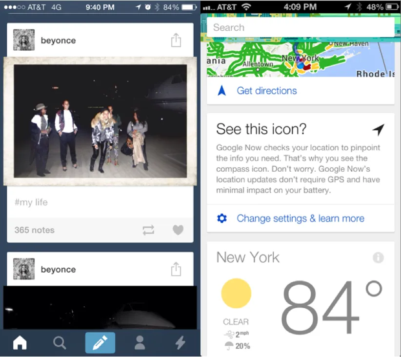
As we are continuously looking for ways to provide a more intuitive way for users to interact with an increasing amount of content on a small mobile UI, the card design pattern becomes extraordinarily useful. Popularized by apps such as Pinterest, cards are bite-sized snippets of information that can be manipulated to show more information, if the user wants it. They allow users to quickly browse and interact with the app’s content while providing a cleaner and less cluttered UI. Examples of this UI design pattern can be seen in apps like Tumblr and Facebook, in which each post represents a “card” of data and information that can be viewed or manipulated individually.
4. Empty States
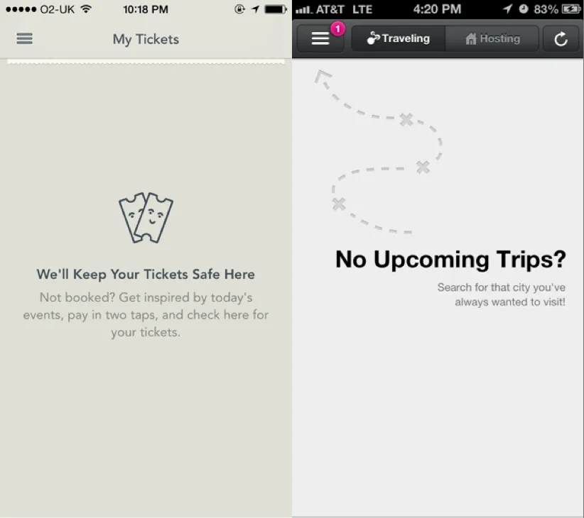
Designing for the empty state, i.e. the situation in which there is no user data, is important because this is usually the initial state of your UI and could be one of the first things users see. Users want to know why a section of the mobile application is empty and what they should do next. By providing instructions for users or showing examples for getting started, knowledgeable implementation of the empty state can play a major role in convincing people to continue using the app.
5. Direct Manipulation of Content & Data
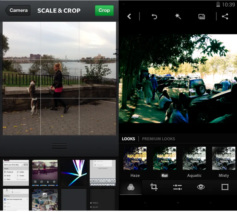
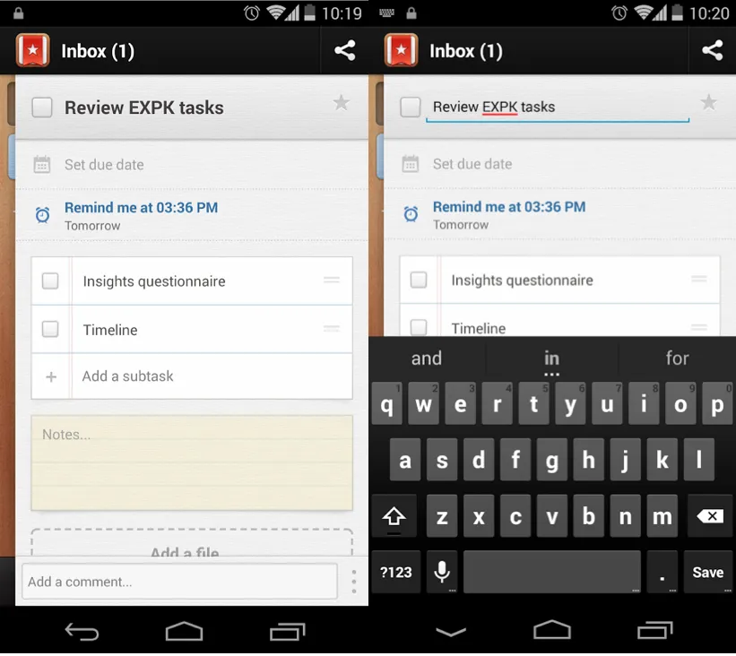
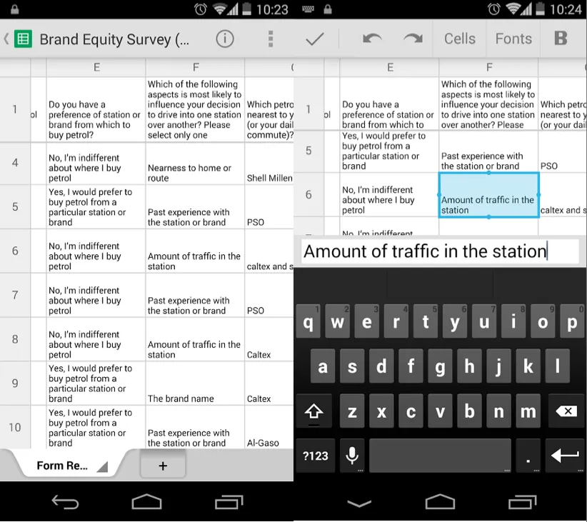
The whole point of mobile UX design is to allow users to interact with the application in the most direct and intuitive way. Buttons or context menus may detract from the overall user experience since these items create an extra layer separating the user from the desired action. Instead, by incorporating direct manipulation, there are fewer context layers for the user to learn, which makes the UI so much easier for people to use.
- In Wunderlist, you can directly tap on task names to edit or delete, instead of having to toggle between individual CRUD (Create, Read, Update, Delete) states
- Instagram and Photoshop allow users to directly see the results of different filters on selected photos instead of requiring the user to choose from a list of filter names, hoping for the best.
- Instead of including specific zoom in or turn around buttons, most mobile applications for maps allow users to intuitively perform those actions with their fingers.
These design patterns were taken from just one section of the larger and more comprehensive free ebook by UXPin, Mobile UI Design Patterns 2014: A Deeper Look at the Hottest Apps Today. Be sure to grab your own copy to learn all about today’s most useful design patterns for your mobile UI.

