When conducting a UX review, you need to focus on actionable insights.
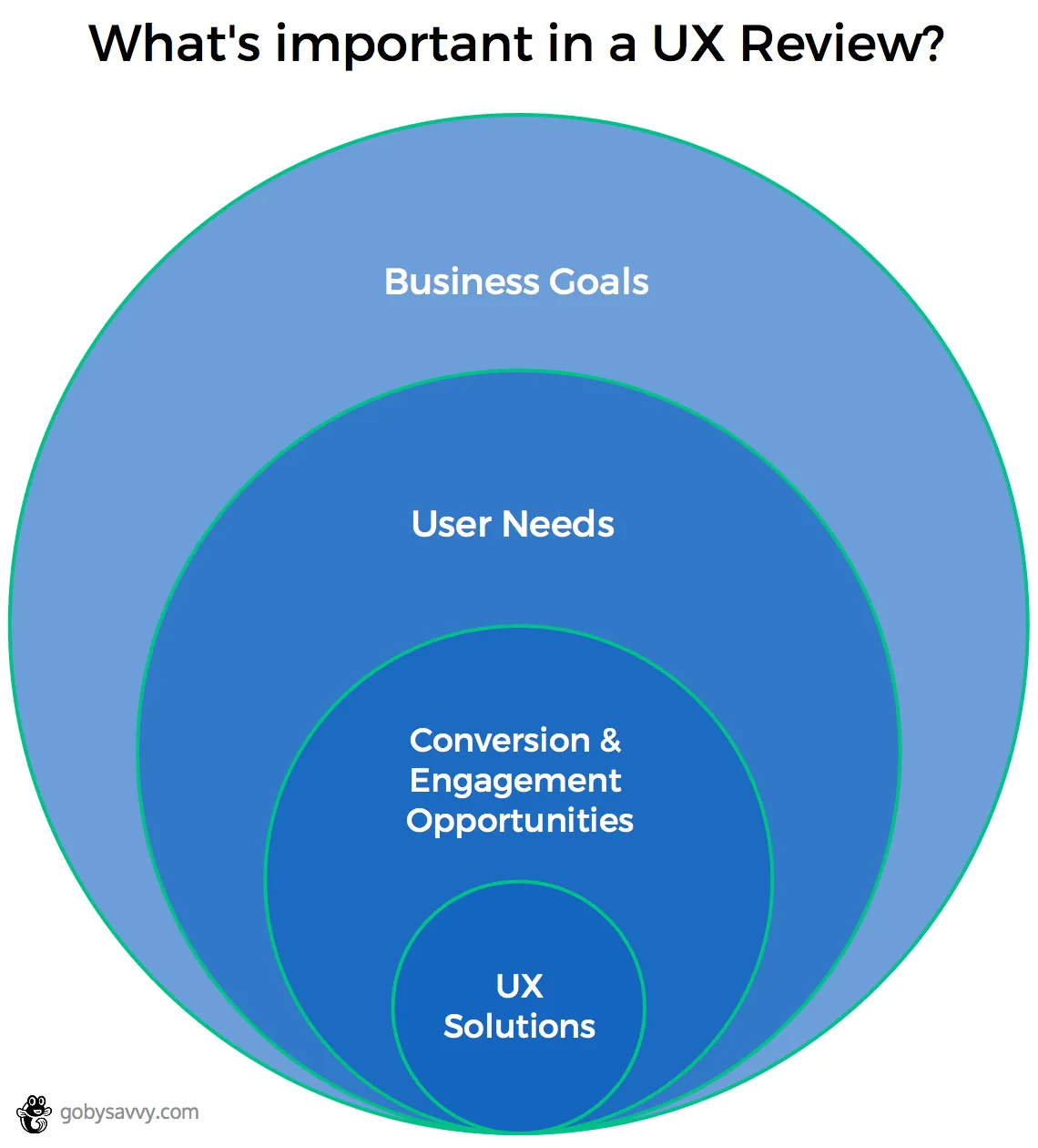
An audit is not an just a laundry list of usability issues. Triage, prioritize, and deliver clear next steps to our stakeholders and clients. Beyond fixing glaring issues, you also want to reveal new opportunities for conversion and engagement.
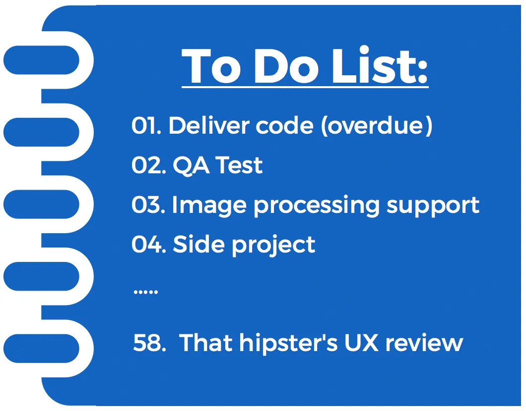
Unless you present a clear plan, your audit will just get left in some developer’s to-do list purgatory:
At GobySavvy, we follow a 9-step process for UX reviews. In our experience, the process helps us actually get our recommendations implemented.
I’ll explain exactly how this process works, using our project for online retailer SkyMall as an example.
Table of Contents
1. Identify Business Goals and User Needs
For revealing business goals and user needs, the process can be light and lean (simple questionnaire and a 1-hour discovery) or in-depth (user interviews, shadowing customer support, and multiple stakeholder interviews).
For SkyMall, we followed the light & lean approach to fit a tighter budget and timeline. They werein the midst of a website revamp, and wanted to make sure they were heading in the right direction.
They approached us to learn about current pitfalls in their website’s UX, UI design, and content strategy, and to discover what rebranding options were available. Their bottom line goal was increasing revenue with higher conversions.
Knowing this, we prepared a questionnaire and hopped on a 1-hour call with their project leaders. We made sure to ask about:
- Primary and secondary user groups
- Specific business metrics for conversions and engagement
- Important actions/tasks we want users to accomplish in our flows
- Primary sales channels
- Brand values
- Important web pages
- Top competitors, etc
All of this information feeds into our simple personas and user flows to guide the review (more on that later).
Learn more: Balancing User Goals vs. Business Goals
2. Diving Into Analytics
If you can’t access analytics directly, ask for reports for specific timeframes and segments.
With SkyMall, we weren’t able to access analytics ourselves, so we asked their team to put together reports of popular landing pages with bounce rates and time on page, ecommerce conversions data, mobile and web statistics, and user flows (Behavior Flows in Google Analytics).
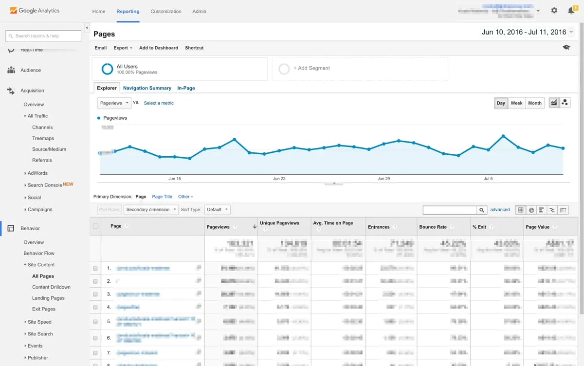
Google Analytics showing key pages ordered by popularity. Time, bounce rates, and page value shown.
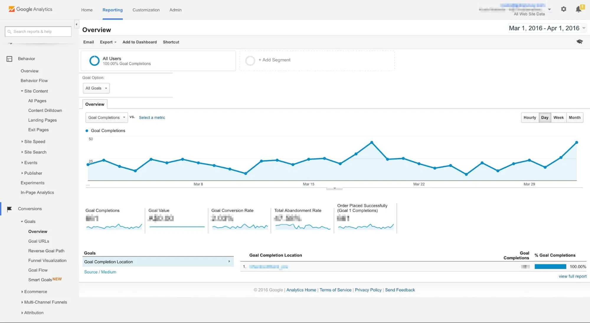
Google Analytics showing eCommerce Goal completions. Although only one goal is listed here, additional goals might be: newsletter signups, contacts, free content downloads, etc.
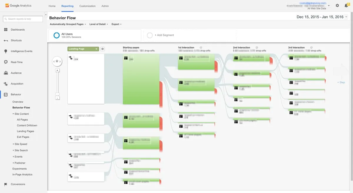
Google Analytics showing behavior flows from landing pages through checkout.
By looking at this data for SkyMall, we saw that most people entered through 2 key paths:
- From a variety of referral sources to a specific product page
- From google search directly to the home page.
The people landing on a specific product page have a higher rate of eCommerce conversions (sales), lower bounce rates, and a simpler behavior flow.
The biggest problem area was visitors coming in through the home page. A majority of visitors clicked a product on the home page, viewed that product, browsed around to other products, and then bounced.
We now knew the main user flow to optimize: people landing on the home page, clicking around on products without any clear goals on what they want (browsing), and bouncing. Users either could not find their product easily or none of the products caught their attention.
Learn more: An Actionable Strategy for Data-Informed Design
3. Simple Personas & User Flows
Now that we’ve seen where to focus, we can build simple personas and user flows to guide the rest of the UX review.
Personas
For SkyMall, we identified 4 main personas from the initial stakeholder questionnaire session:
- A general user who stumbles across SkyMall without a general purpose except for browsing
- A middle-upper class homeowner looking for the right decor
- A gift giver looking for one-of-a-kind suggestions
- A compulsive buyer looking for something fun to impress.
With these personas, we built a total of 20 user flows, but ended up only choosing the top 5 most relevant to SkyMalls business goals. Remember: the key to a useful UX review is focusing and prioritizing.
User Flows
Based on analytics and conversations with the SkyMall project leads, we found two main flows were most useful:
- People search for a product on Google, like “unique gifts for mom” then land on a specific product page or category page like “gifts for mom”. They browse various products, add one or more to their cart, and check out.
- People land on the SkyMall home page, browse hot items, view various product pages, add products to cart, and check out.
Like I mentioned before, we created a total of 5 flows. In addition to the above two, we also created flows for browsing through the main navigation, landing on categories or product pages from email, and cross-sells of other products.
However, we focused first on fleshing out flow #2 since it showed the largest percentage of people bouncing before adding products to cart. For this flow, we designed the full purchase path.
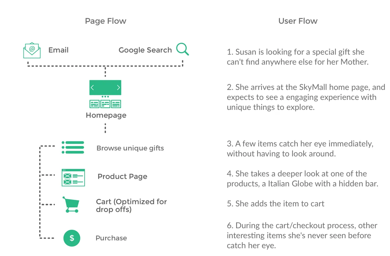
Key page flow (#2) with accompanying user story to guide the UX review.
For the rest of this article, we’ll focus on the most important flow seen above.
Learn more: Creating Perfect User Flows for Smooth UX
4. Identify Issues
We’ll follow user stories step-by-step through each page, specifically looking for problems areas that affect engagement and conversions.
When you move through the user flows, consider the user goals on each page (“When the user lands on this page, they might immediately look for…”).
Each expert has their own approach to how they create the report itself. I recommend Google Slides, because it’s easy to collaborate with others, can be accessed from anywhere, and can be shared via URL or exported as a PDF.
In Google Slides, I will distinguish sections by page or flow, such as “Home”, “Navigation”, “Product Page”, “Cart”, “Checkout”, etc. When conducting the review, I’ve found it most efficient to detail issues, opportunities, and solutions as I go, rather than making organizing a long list later.
You’ll find a wide variety of UX checklists, UX principles, and UX research easily accessible around the web that you can use. For each issue you reveal, I follow Jakob Nielsen’s 4 point system of prioritization.
When writing about issues, keep it brief, unless the issue is critical and ranks at least a 3 or 4 on the below scale:
- 1 = Cosmetic problem only—Need not be fixed unless sufficient time is available on a project.
- 2 = Minor usability problem—Low-priority issue that is less important to fix.
- 3 = Major usability problem—High-priority issue that it is important to fix.
- 4 = Usability catastrophe—It is imperative to fix such an issue before releasing a product.
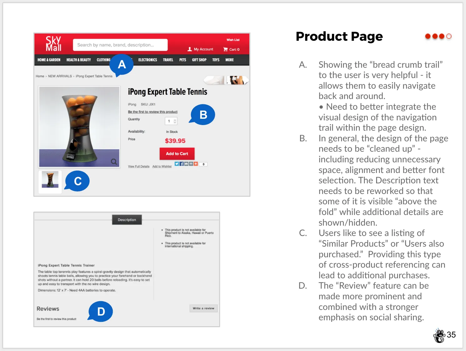
Slide detailing issues on a product page for user flow #2. We ranked the entire set of issues as 3 “Major usability problem” (top right). The most important issue was the lackluster product reviews functionality.
5. Provide Actionable Solutions and Opportunities
Finding issues is the easy part. Clients and companies pay for solutions.
As we find issues, we describe the best solution, and include a screenshot from another website to support the description. And if we’re ever unsure about the best solution, we recommend user testing as a next step after the UX review.
Above all else, we must be as prescriptive as possible. We break everything down at each step of the flow. It’s always better to over-communicate than risk your audience making dangerous assumptions.
a. BAD: “Add more vibrant colors to the home page to reflect your brand and engage users.”
b. GOOD: “Add variations of your 3 brand colors to the home page. Main color: purple, to give hints of elegance. White: simplicity and clarity to allow focus on images. Black: Elegance and contrast. Purple can be used for the main banner background and for some icons and headers. White should be used for most backgrounds. Black should be used to contrast purple; can be used for main call-to action buttons.”
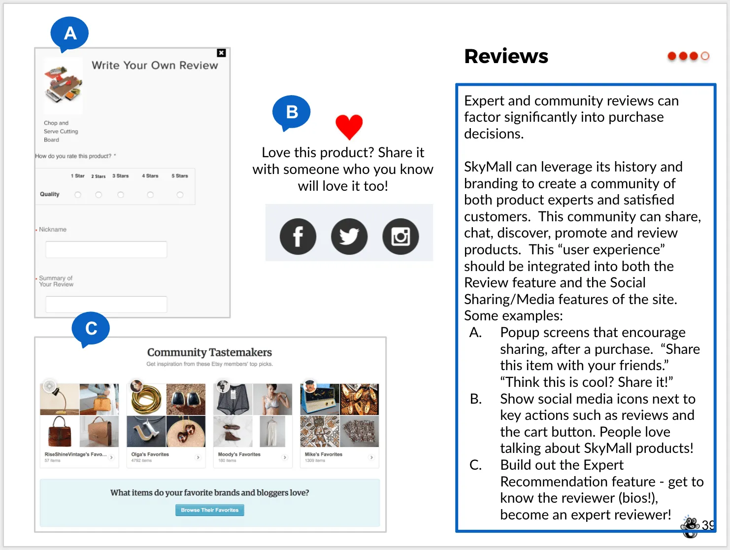
Slide detailing solutions to the issues in the prior slide.
The most challenging, yet potentially rewarding part, is identifying opportunities for conversion and engagement opportunities. This part is not as straightforward as fixing issues. If you’re a UX designer with less than 3 years of experience, this is a skill that gets stronger and stronger over time.
For example, maybe we see an opportunity for a website to use an exit-intent pop-up offer in a non-intrusive way to recapture some leads or purchases. Or, maybe we notice that the website can make use of persuasive design techniques like exclusivity or time pressure to upsell people to the higher value product. These techniques aren’t exactly “issues”, but rather opportunities tailored for business impact.
For SkyMall, one of the major opportunities we identified was adapting their massive brand appeal for online consumption. The SkyMall website brand, design, and layout was missing the “unique” feel that SkyMall’s products used to create for people browsing their airplane catalogs.
In the modern digital age, we decided to focus on curated content for a specific audience. In our case, this was a unique message, an “experts recommend” feature, a retro collection of age-old popular products, etc.
By increasing the opportunities for Skymall to present products in a fun and consumable manner, we aimed to increase the soft-sell conversions.
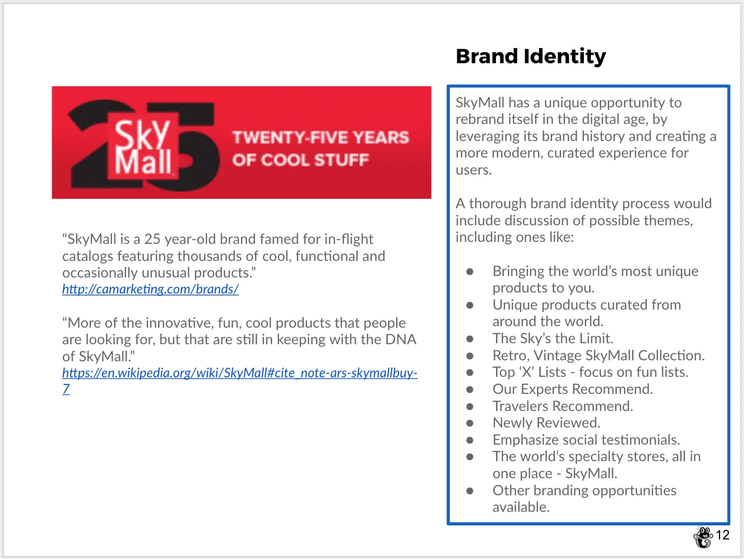
Slide providing high level brand opportunities, which we described in detail during a follow-up meeting.
6. Tips on Searching for Issues & Solutions
Every UX designer wonders if they missed any issues or solutions. Let’s be honest: we use Google just as much as our own personal repositories of UX principles.
Here’s some quick tips to help focus your search endeavors:
- Search Google for the underlying principle you think is poorly designed. Ex: “E-Commerce checkout signup UX”.
- If you aren’t sure of the principle, or the proper term (ex. tooltip vs popover vs modal), look for Q&A links on google first, to see the questions others have about the topic. Here are some good general terms to append onto any search: “UX” “Principles” “Best Practices” “Usability” “Patterns” “Optimal”.
- Don’t spend too much time searching. If you can’t find a principle or solution, post your question on an online community and resolve the issue later. The following communities usually respond quickly: Quora’s User Experience, LinkedIn groups such as User Experience Professionals Network or UX Professionals, Slack’s User Experience Design channel (request access), or the Stack Exchange’s User Experience community.
- Always keep an eye out for great samples. Tag them in Evernote.
- Don’t be afraid to browse popular apps and sites, and see how they do it. Galleries like UI-Patterns, awwwards, and siteinspire are great shortcuts to effective design patterns.
Want to learn more? Get your free e-book: UX Design Process Best Practices
7. Remember, It’s Somebody’s Baby
Usually a UX review is read by someone who is passionate about the digital product under review: a founder, CEO, product manager, designer, or developer.
Make sure to balance out all the bad with some good. Remember the principles of good design feedback.
Include a section about what has been done well. This not only cools down the room, but also ensures that the team earns praise for their current best practices (which incentivizes them to keep doing so).
Power dynamics always plays a role in how well your suggestions are received. Nobody wants to look like they’re a fool in front of their boss.
8. Peer & User Review
This step is optional, but highly recommended.
After looking at an interface for hours and hours, you start to become biased and overlook obvious issues and opportunities.
Even if it’s just 30 minutes, try to budget in an outside UX expert’s review, to give you pointers, tie things back to business goals and user needs, catch major issues, catch opportunities from their area of expertise, etc.
Even better, run some guerilla usability tests. If you’re designing for mass-market consumer audiences, buy 5 Amazon gift cards ($10-20 a piece is enough) and head to your local Starbucks. Test with 5 people, then include their feedback in your final report.
Services like UserTesting and 5 Second Tests are also highly affordable for scaling targeted tests in a hurry.
9. Next Steps
A UX review is designed for quick wins. It’s a cheap simple insurance policy against obvious UX issues choking the bottom line.
Start outlining a plan of action with suggested dates. Of course, you aren’t a project manager or product manager. But at least you’re closing the conversation in terms they respect and understand.
For SkyMall, we ended our report with a high-level roadmap of activities. We would create a more detailed roadmap for our next conversation.
- Explore new branding leveraging existing branding and modern trends: styles, tone, personality, imagery, iconography, colors, etc
- Content Strategy: create an overall content strategy revolving around holidays and building buzz for unique products
- Usability testing: Start an open discussion with customers. Get to know them, profile them, and build a long lasting relationship so you can adapt to their growing needs.
- UX Designs & UX Reviews: Leverage GobySavvy’s UX team as an unbiased, outside perspective to support internal efforts. We can guide major efforts, conduct audits of future designs, and ensure all pieces of product strategy align.
Once you’re finished, it’s time to start implementing the recommendations. Good luck!
If you found this piece useful, get more UX advice by downloading UX Design Process Best Practices. The guide explains useful activities and strategic documentation.

