Bootstrap Alternatives in 2025
Bootstrap has long been a go-to framework for many front-end developers. It offers a solid foundation for building responsive, mobile-first projects with ease. However, as your skills evolve, you might find yourself seeking alternatives that provide more flexibility, performance, or simply a different approach to building web interfaces. In this article, we’ll explore some of the best alternatives to Bootstrap that cater to the needs of senior front-end developers.
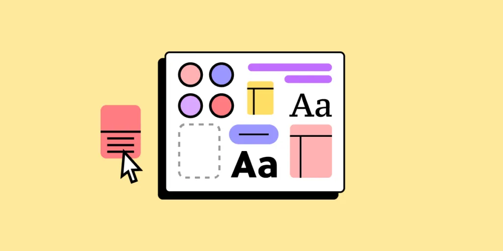
Build responsive user interfaces without the need of learning another framework. Use our visual UI builder and assemble ready-to-develop UIs in a flash. With a drag-and-drop editor, design system tool, and code export, you’re all set to create UI for your apps. Try UXPin Merge for free.

Tailwind CSS
Tailwind CSS has gained significant traction in the development community due to its utility-first approach. Unlike Bootstrap, which provides predefined components with specific styles, Tailwind offers low-level utility classes that you can combine to build custom designs directly in your markup.
- Pros:
- Highly customizable without the need to override default styles.
- Encourages reusability and consistency across your codebase.
- Reduces CSS bloat by purging unused styles in production builds.
- Cons:
- Steeper learning curve if you’re accustomed to component-based frameworks like Bootstrap.
- Potential for messy HTML if not carefully managed.
Tailwind is ideal for developers who want full control over their design system and prefer a more granular approach to styling.
For those of you who build React apps, we’re recommending the official React library for Tailwind – Tailwind UI. It’s fully synced with UXPin and you can test it on trial. You can use ready-made components, generate full sections with AI Component Creator or paste the code off the Tailwind UI website to have it in UXPin. Try UXPin Merge for free.
Bulma
Bulma is a modern CSS framework based on Flexbox, making it a powerful alternative to Bootstrap for building responsive layouts. It emphasizes simplicity and ease of use, with a focus on clean, readable code.
- Pros:
- Built on Flexbox, providing a modern approach to layout design.
- Simple syntax and easy to learn.
- No JavaScript dependencies, making it lightweight and easy to integrate with any JS framework.
- Cons:
- Fewer components compared to Bootstrap.
- Limited customization options out of the box.
Bulma is an excellent choice for developers who prefer a lightweight, modern framework with a focus on simplicity and Flexbox-based layouts.
Kendo UI
Kendo UI is a comprehensive UI toolkit designed for building sophisticated and feature-rich web applications, making it a powerful alternative to Bootstrap, especially for enterprise-level projects. It offers an extensive collection of UI components, with a focus on functionality, customization, and seamless integration with popular JavaScript frameworks.
Pros:
- Provides a vast library of advanced components, including grids, charts, and schedulers.
- Highly customizable with built-in features like data binding, templates, and localization.
- Cross-platform support ensures responsive and consistent performance across devices.
- Dedicated libraries for Angular, React, Vue.js, and jQuery for tight framework integration.
- Enterprise-level support with professional documentation and regular updates.
Cons:
- Steeper learning curve compared to Bootstrap, especially for more advanced features.
- Commercial product with licensing costs, which may not suit all project budgets.
- Smaller community compared to Bootstrap, though offset by professional support.
Kendo UI is an excellent choice for developers working on complex, enterprise-level applications that require a wide range of advanced components and robust support, particularly when integrating with popular JavaScript frameworks.
If you want to connect UXPin Merge with Kendo UI, reach out to us.
Material UI
Material UI is a popular React component library that implements Google’s Material Design principles, making it a powerful alternative to Bootstrap for building modern, visually consistent web applications. It offers a wide range of ready-to-use components that adhere to Material Design, with a focus on usability and a polished, cohesive look.
Pros:
- Comprehensive implementation of Material Design, providing a sleek and modern user interface.
- Extensive library of components designed specifically for React, making development faster and easier.
- Strong theming capabilities, allowing for customization while maintaining Material Design consistency.
- Active community and strong ecosystem with numerous third-party extensions and tools.
- Excellent documentation and resources to support developers at all levels.
Cons:
- Heavily dependent on React, which limits its use to React-based projects.
- The design can feel restrictive if you need a custom look outside of Material Design.
- Some components can be complex to configure, requiring a deeper understanding of React.
Material UI is an excellent choice for developers working within the React ecosystem who want to build modern, responsive applications with a cohesive and polished design, especially when adhering to Material Design principles.
Test Material UI components in UXPin and build fully responsive interfaces without any coding. Try UXPin Merge for free.
Ant Design
Ant Design is a comprehensive design system and React UI library, originally developed by Alibaba, that offers a powerful alternative to Bootstrap for building enterprise-level web applications. It emphasizes a consistent and elegant design language, with a focus on providing a wide range of components and tools to streamline the development process.
Pros:
- Extensive library of high-quality components designed for enterprise applications.
- Provides a consistent design system that promotes a unified user experience across applications.
- Strong support for complex data-driven applications, with components like tables, forms, and charts.
- Built-in internationalization support for multi-language applications.
- Robust documentation and active community, especially popular in Asia.
Cons:
- Primarily designed for React, which may limit its applicability to non-React projects.
- The design system can be prescriptive, making it harder to implement highly custom interfaces.
- Larger bundle size compared to lighter frameworks, which might affect performance in some cases.
Ant Design is an excellent choice for developers working on enterprise-level projects, particularly those using React, who need a comprehensive and consistent design system with a wide array of components to support complex, data-rich applications.
Build your first UI with Ant Design components. AntD components are available on UXPin’s trial. Try designing with them and check out how to copy the code behind the elements with UXPin. Try UXPin Merge for free.
Semantic UI
Semantic UI is a unique front-end framework that uses natural language principles to create a human-friendly syntax. It’s designed to make the code more readable and intuitive, which can be a significant advantage for collaboration and maintenance.
- Pros:
- Human-readable class names, making the code easier to understand.
- Extensive theming options for complete control over the design.
- Rich set of components and UI elements.
- Cons:
- Heavier framework with a steeper learning curve.
- Potential for conflicts with other libraries due to the use of common class names.
Semantic UI is perfect for teams that value readability and maintainability, especially in large projects where collaboration is key.
Foundation
Foundation is a responsive front-end framework developed by Zurb, known for its flexibility, modularity, and emphasis on creating accessible, mobile-first web projects. It offers a robust set of tools and components that are highly customizable, making it a strong alternative to Bootstrap for developers who need more control over their design and functionality.
Pros:
- Modularity: Foundation is highly modular, allowing developers to include only the components they need, which can help reduce bloat and improve performance.
- Advanced Customization: Offers extensive customization options, enabling developers to tailor components and styles to their exact needs.
- Accessibility Focus: Designed with accessibility in mind, ensuring that web projects are usable by a wider audience, including those with disabilities.
- Flexibility: Provides a flexible grid system and a variety of responsive utilities, making it easy to create layouts that adapt to different screen sizes.
- Professional Support: As a product of Zurb, Foundation comes with the option of professional support and training, which can be valuable for larger or enterprise projects.
Cons:
- Steeper Learning Curve: Foundation’s advanced features and customization options can result in a steeper learning curve, especially for developers new to the framework.
- Smaller Community: While Foundation has a loyal user base, its community is smaller than Bootstrap’s, which means fewer third-party resources and plugins.
- Complexity: The framework’s flexibility and modularity can introduce complexity, making it more challenging to manage in large projects without proper planning.
Foundation is an excellent choice for developers and teams that need a highly customizable and modular front-end framework. It is well-suited for complex, large-scale projects where control over design and functionality is crucial.
UIkit
UIkit is a lightweight and modular front-end framework that offers a clean, modern design and extensive customization options. It’s a strong alternative to Bootstrap for developers seeking more control over their web projects, with a focus on performance and flexibility.
Pros:
- Modular Structure: Allows inclusion of only necessary components, reducing file size and improving performance.
- Clean Design: Provides a polished, modern aesthetic out-of-the-box.
- High Customizability: Offers extensive customization through LESS and Sass variables.
- Advanced Features: Includes components like animations and parallax scrolling for dynamic user experiences.
- Responsive Grid System: A flexible grid system for creating responsive layouts.
Cons:
- Smaller Community: Less widespread use means fewer third-party resources and community support.
- Learning Curve: More complex to learn compared to Bootstrap’s straightforward approach.
- Less Popularity: Not as commonly recognized in the job market or industry standards.
UIkit is an excellent choice for developers who want a customizable, modern framework with a focus on performance and advanced UI features.
Which Bootstrap Alternative Is Right For You?
Choosing the right Bootstrap alternative depends on your specific project needs, desired flexibility, and the development approach you prefer. Here’s a quick guide to help you decide which framework might be best for you:
1. Tailwind CSS
- When to Use: If you want full control over your design system and prefer a utility-first approach to styling.
- Pros: Highly customizable, reduces CSS bloat, encourages code consistency.
- Cons: Steeper learning curve, potential for messy HTML.
2. Bulma
- When to Use: If you need a lightweight, modern framework with a focus on simplicity and Flexbox-based layouts.
- Pros: Simple syntax, easy to learn, no JavaScript dependencies.
- Cons: Fewer components, limited customization out-of-the-box.
3. Kendo UI
- When to Use: For enterprise-level applications that require advanced components and robust support, particularly with Angular, React, or Vue.js.
- Pros: Extensive component library, highly customizable, enterprise-level support.
- Cons: Steeper learning curve, licensing costs, smaller community.
4. Material UI
- When to Use: For React projects where you want to implement Material Design with a polished, cohesive UI.
- Pros: Comprehensive Material Design implementation, strong theming, active community.
- Cons: Limited to React, restrictive design system, complex configuration for some components.
5. Ant Design
- When to Use: For enterprise-level React applications requiring a consistent design system with a wide array of components.
- Pros: High-quality components, consistent design, internationalization support.
- Cons: React-specific, prescriptive design, larger bundle size.
6. Semantic UI
- When to Use: If you value readability and maintainability, particularly in large projects where collaboration is key.
- Pros: Human-readable syntax, extensive theming, rich component set.
- Cons: Heavier framework, steeper learning curve, potential for conflicts with other libraries.
7. Foundation
- When to Use: For large-scale projects that require high customizability, modularity, and accessibility.
- Pros: Highly modular, advanced customization, strong accessibility focus.
- Cons: Steeper learning curve, smaller community, can be complex to manage.
8. UIkit
- When to Use: If you want a customizable, modern framework with a focus on performance and advanced UI features.
- Pros: Modular structure, clean design, high customizability.
- Cons: Smaller community, more complex to learn, less industry recognition.
The choice of framework should align with your project’s technical requirements, your preferred development approach, and the overall goals for the user experience. Whether you’re seeking unique designs, better performance, or greater flexibility, there’s a Bootstrap alternative that can help you achieve your objectives.
Conclusion
While Bootstrap remains a powerful and widely-used framework, developers choose to abandon it in favor of alternatives for a variety of reasons, including the desire for unique designs, better performance, more flexibility and control, alignment with modern development practices, and specific project needs. The choice of framework often reflects a balance between the project’s technical requirements, the developer’s preferred workflow, and the overall goals for the user experience.
Streamline your UI development process and bring design and development closer together. Use UXPin Merge to build, test, and iterate on fully functional user interfaces using the same components you would use in production. With its powerful drag-and-drop editor, design system integration, and seamless code export, UXPin Merge helps you create responsive, production-ready UIs faster than ever.
Whether you’re working with Tailwind, Material UI, or any other framework, UXPin Merge syncs your design and development, enabling you to design with real components and maintain consistency across your entire application. Try UXPin Merge for free.


