Today, I walked to work as I always have.
But I wasn’t alone. All around me, from the sidewalks lining the storefronts and restaurants of the street to the green lawns of the city parks, people roved around with their phones held up in front of them. Random areas like alleys and park entrances were filled with throngs of people, arbitrarily gathered there by a computer algorithm.
This is Pokemon Go.
Pokemon erupted as a national phenomenon almost two decades ago. People loved the idea of finding and catching Pokemon, and they were content to use the Gameboy as the platform for it.
Over the years, the buzz around Pokemon games began to fade, as no new iteration seemed to produce the magic behind the first games. But with Pokemon Go, millions of loyal fans and even non-gamers flocked to the game. 2 weeks in, Pokemon Go is estimated to have 75 million downloads.
Unfortunately, it’s not all sunshine and butterflies.
The game still has a ton of bugs, and there are a lot of UI issues that make even learning how to play the game difficult. Even as an experienced gamer, I still spent the first couple of minutes trying to figure out how to find and capture a pokemon. Despite the numerous raving articles, we can’t ignore the fact that many players have accepted frequent, periodic server crashes to be a normal experience for the game.
In this piece, we’ll be taking off our rose-colored glasses. We’ll delve into the good and the bad of Pokemon Go’s user experience.
The Good
First, let’s explore what makes Pokemon Go’s UX so compelling.
Profile Building
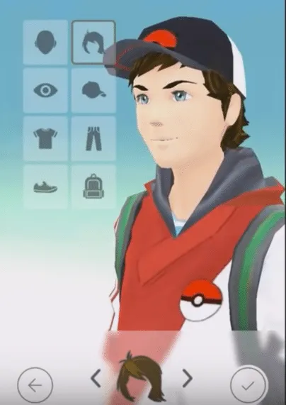
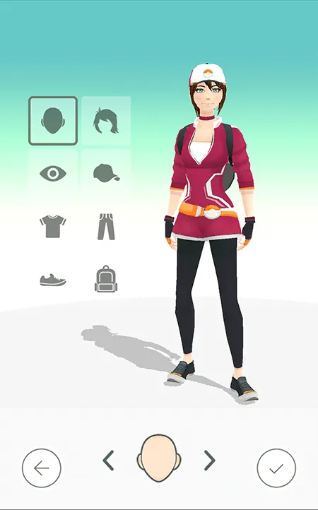
Customization. Everyone’s favorite part of a game.
The thing about immersive-world games like Pokemon, which includes both regular Pokemon games and Pokemon Go, is that people like to really feel they’re in the game itself. They want to explore the world and experience it as if they themselves were on the Pokemon journey.
The quickest and easiest way to bring the user closer to the game is by allowing the user to create and customize their character.
Nintendo first realized this when they allowed their players to choose between being a boy and being a girl in the second generation of Pokemon games, and it helps their case now that they’ve created their most immersive game yet. And there are many more customization options in Pokemon Go than there are in other Pokemon games.
Style of Gameplay
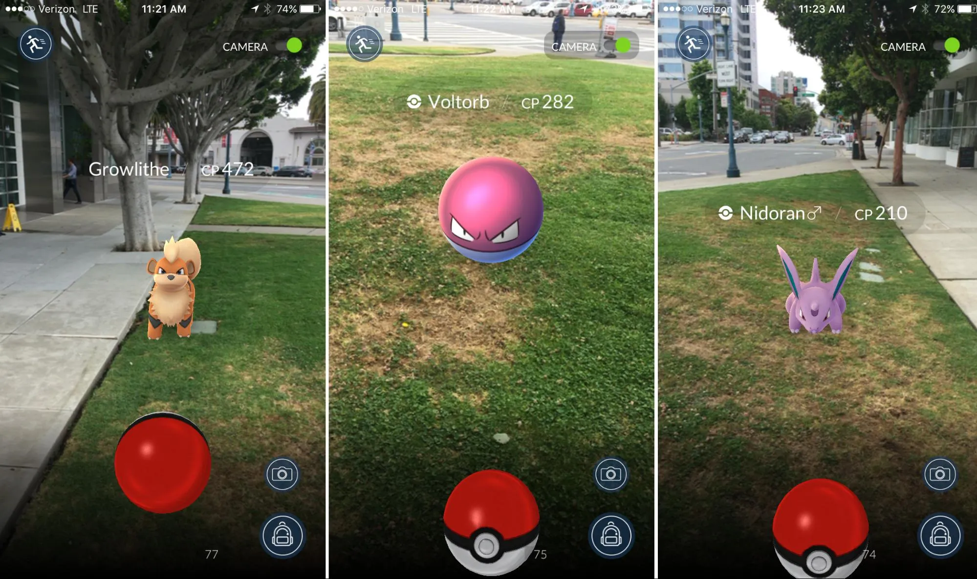
One of the signature elements of Pokemon games is the moment when you’re walking through tall grass and you run into a pokemon out of nowhere. Nintendo took that experience and made it infinitely more real and exciting by combining it with augmented reality technology.
Once in the game, you can quite literally find Pokemon almost anywhere. It inspires that same feeling of excitement people first felt when Pokemon first released on Gameboy in 1996. There’s a rush, a jump as you locate the pokemon on your screen and engage in “battle” with the Pokemon to catch it.
The key is that, much like the regular Pokemon games, victory isn’t assured at the first throw. Sometimes your aim is off, the Pokemon deflects the ball, the Pokemon escapes after a couple of Pokeball shakes, or the Pokemon even runs away.
That feeling of chance is what makes the game exciting to play. It hooks people by keeping the journey to Pokemon master interesting. I’ve explained the phenomenon of Pokemon Go below with Nir Eyal’s Hook Model Canvas:

Social Sharing

Nintendo and Niantic designed Pokemon Go as a social game. People only derive value from the game if other people, including their friends, play the game as well.
The more people playing around you, the more Pokemon you can find. Pokemon Go is inherently viral, based on population density and the amount of people playing the game at a time.
Players, once they reach level 5, are divided into 3 teams. After that, the game encourages friendly competition between the teams as players battle to control Gyms, which can be taken over by any team. People get very competitive, and it makes the game that much more exciting.
On top of everything else, Nintendo added a very useful feature to Pokemon Go’s UI. Most people, especially if they’re playing with their friends, want to share their experiences with others. When a player sees a rare pokemon or something else that’s interesting, their first instinct is to take a screenshot with their phone. Luckily, Nintendo included a screen capture button in Pokemon Go’s interface that makes capturing cool moments much, much easier.
The Bad
Now we’ll discuss the unfortunate aspects of Pokemon Go’s UX.
Unhelpful Onboarding UI
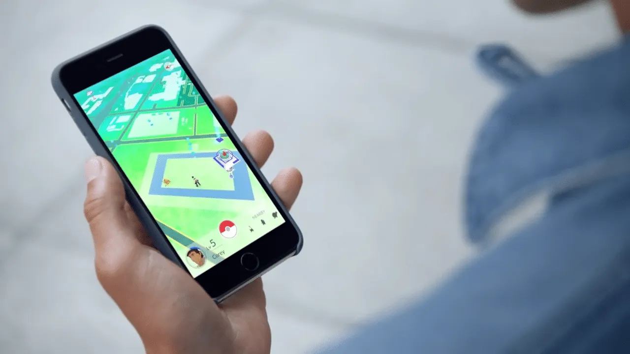
Let’s start from the beginning.
From the moment you finally manage to launch the game after attempting to create a profile through sluggish servers, you’re barely given any help on how to interact with the environment.
Fortunately, you are directed to a few pokemon on the screen immediately after arriving in the world of Pokemon Go. However, there are no clear instructions on how to actually capture the pokemon. You’re simply left to figure it out on your own, which can delay that “aha” moment for non-gamers or casual gamers.
The onboarding only skims the surface. You won’t find any progressive disclosure informing users about core actions like:
- Transferring your pokemon to the Professor will net you candy to evolve your pokemon
- How certain items like the Razz Berries work in-game
- How you can press on specific nearby pokemon to find more of that species
All of the above actions help the user deepen their interactions with the game, so the UI should at least drop contextual hints.
Server Issues
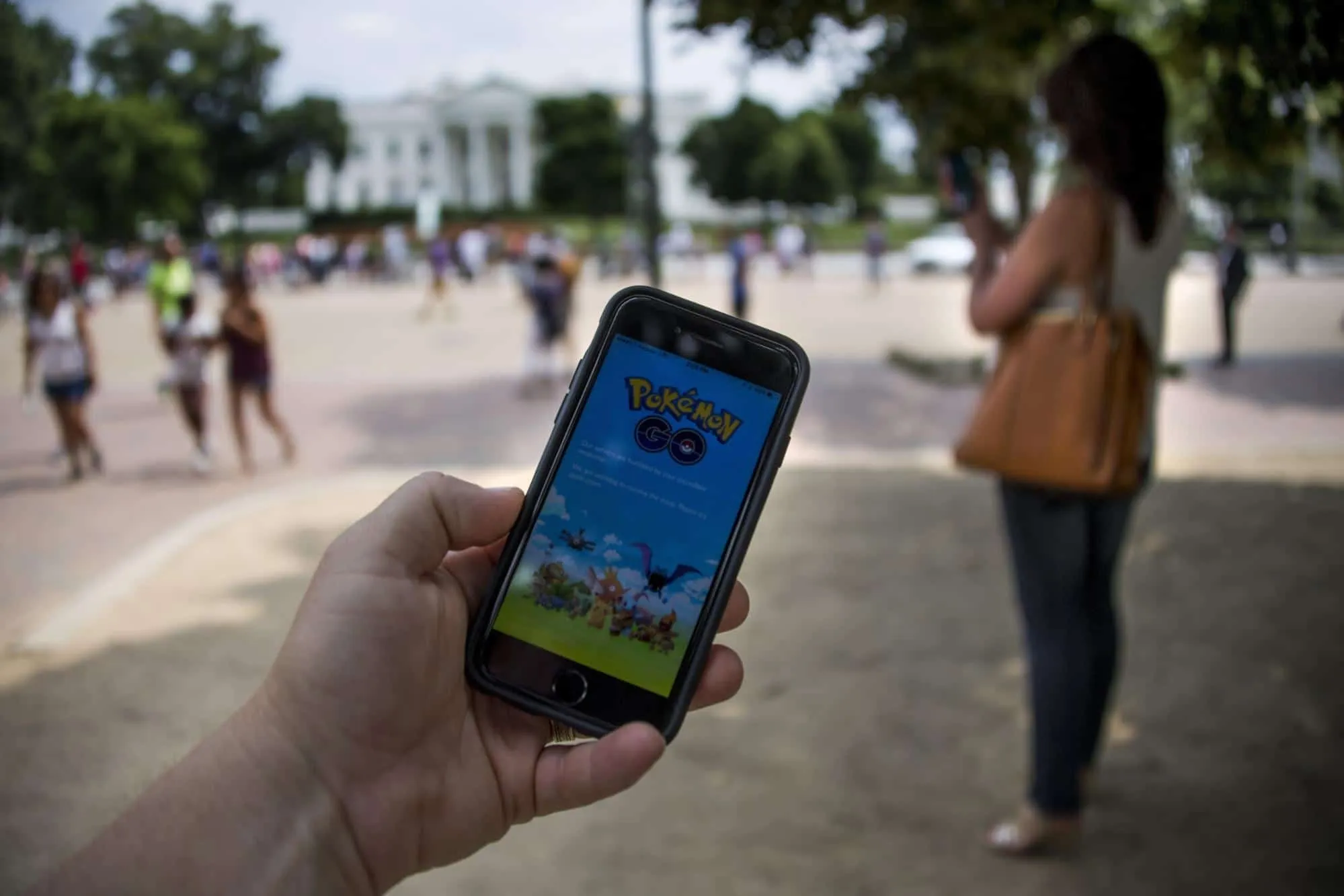
The most crippling negative of Pokemon Go’s UX is awarded to the server issues.
From the moment the user tries to create an account, the user is confronted with long loading times and frequent game-ending crashes. Within the first week of the game’s release, many users couldn’t even create an account. Of those who were able to successfully launch their avatar into Pokemon Go’s world, a large amount of people still couldn’t play the game due to severe game lag, bugs in the catching and battling mechanics that would force the user to quit the game, and more crashes.
All of these issues result in an incredibly frustrating user experience for Pokemon Go players. Not only is it difficult for the user to even start the game, but the interaction flow is broken up by a series of bugs and glitches that disrupt the immersion.
The gameplay and the social aspect of Pokemon Go are fun, but only when they work.
Fortunately, Nintendo and Niantic recently released an update to deal with the server issues. It hasn’t completely fixed the loading times or the crashes, but it’s a step in the right direction.
Not Enough Sustaining Functionality
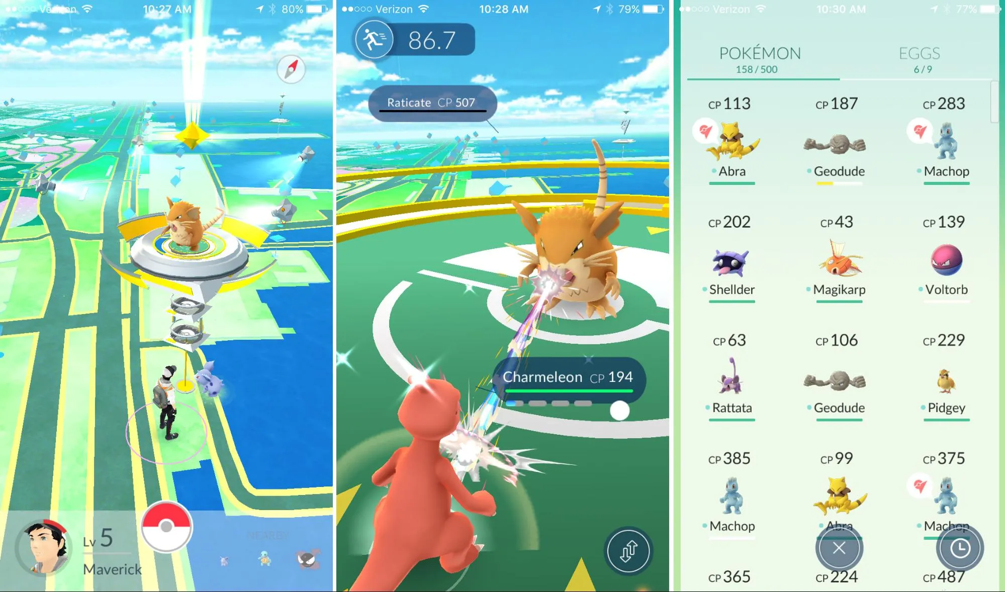
Playing Pokemon Go is fun. You can travel around the world, capturing pokemon and battling Gyms…but that’s about it.
Pokemon Go operates off two core gameplay mechanics: capturing and battling.
- Capturing is capped at 250 unique species. When the number of people playing the game at a time decreases, so does the number of available Pokemon.
- Battling takes place at Gyms interspersed throughout the world. Most Gyms, particularly in areas with high population density, are located near each other. However, in less-populated areas, Gyms are much rarer and receive much less traffic, which leads to fewer battles taking place. That alienates users in less populated areas.
Once the user recovers from the initial excitement of the game, the “grind” sets into the game. The “grind” refers to the tedious work required for advancement.
After the user becomes accustomed to the basic gameplay, Pokemon Go starts to overstay its welcome. With fall and winter approaching as well, colder temperatures may also force more users inside. Nintendo and Niantic will need to add careful features to overcome stagnation and seasonality.
Lessons Learned
In closing, let’s recap our takeaways from Pokemon Go:
- Onboarding should match the user’s existing level of familiarity. Pokemon Go’s audience consists of a wide base of first-time gamers, casual gamers, and experienced gamers. As such, a bit more handholding might actually help.
- Product doesn’t need to be airtight upon launch, but beware of accumulating UX and technical debt. While the product doesn’t suffer from feature creep, plenty of in-game bugs and server issues still need fixing.
- Be prepared to evolve your product. While Pokemon Go’s value proposition is strong enough to drive initial rapid growth, the novelty of AR won’t last forever. Users still can’t battle their friends (a huge selling point of past games). On the monetization end, it’s also totally possible that Niantic and Nintendo will partner up with vendors (e.g. restaurants, coffee shops, etc.) to encourage more foot traffic.
For more UX best practices, check out the free e-book Real-Life UX Processes. Peek inside design at Slack, Autodesk, 3M, and Sumo Logic.


