Responsive Design: Best Practices, Principles & Examples (2026)
Responsive web design is the practice of building interfaces that adapt fluidly to any screen size — using fluid grids, flexible images, and CSS media queries — so users get a consistent, fast experience on mobile, tablet, and desktop. It is a baseline requirement for SEO, Core Web Vitals, and accessibility in 2026.
This guide covers the core principles, updated best practices (including container queries, fluid typography, and design system integration), and real-world examples — with everything you need to apply these techniques today.
What Is Responsive Web Design?
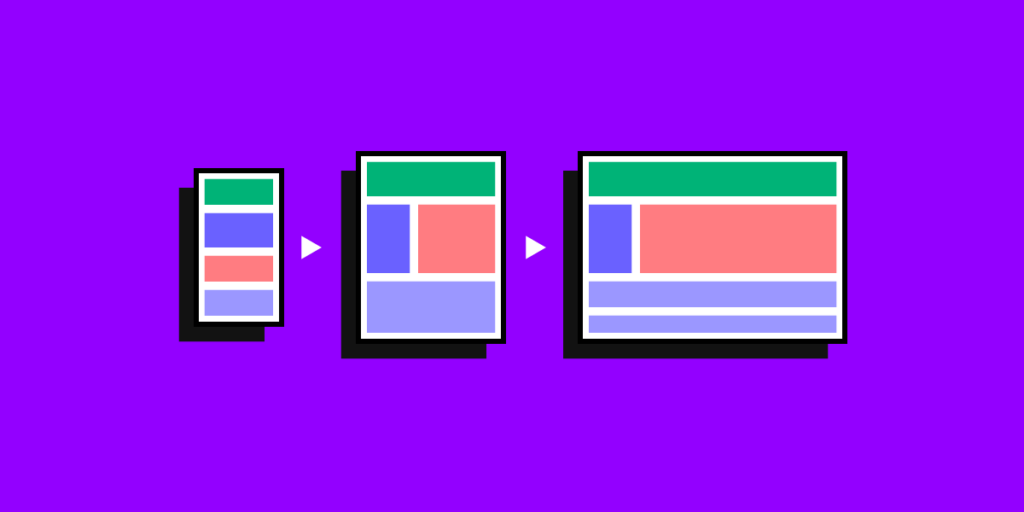
Responsive web design (RWD) means your layout, typography, and media scale or reflow based on the user’s viewport. Rather than building separate mobile and desktop sites, a single responsive codebase serves all devices — adjusting column counts, image sizes, and navigation patterns through CSS breakpoints and fluid units.
Three foundational techniques underpin every responsive layout:
- Fluid grids — columns sized in percentages or
frunits rather than fixed pixels - Flexible media — images and video that scale within their containers
- CSS media queries — rules that apply different styles at specific viewport widths
In 2026, two additions have become standard practice alongside these three: container queries and fluid typography with clamp(). Both are covered below.
Why Responsive Design Still Matters in 2026
Mobile-first indexing is the default
Google indexes the mobile version of your site first and uses it for ranking. A layout that breaks on smaller screens directly harms organic search performance — not just user experience.
Core Web Vitals are a ranking signal
Responsive design decisions directly affect your LCP (Largest Contentful Paint), CLS (Cumulative Layout Shift), and INP (Interaction to Next Paint) scores. Poorly sized images, missing width/height attributes, and unoptimized fonts are among the most common causes of CWV failures on mobile.
The multi-device reality
Users move across devices throughout the day — researching on mobile, purchasing on desktop, checking status on tablet. A responsive interface removes friction at every step. An unresponsive one creates exit points.
Core Principles of Responsive Design in 2026
1. Fluid Grids
Build layout columns using relative units. CSS Grid and Flexbox make this straightforward:
.grid {
  display: grid;
  grid-template-columns: repeat(auto-fit, minmax(280px, 1fr));
  gap: 1.5rem;
}
This single rule creates a grid that stacks to one column on mobile, spans two or three on tablet, and fills the full layout on desktop — no media queries required for the column behaviour itself.
2. Container Queries (The 2026 Standard)
Viewport-based media queries have a fundamental limitation: they respond to the browser window, not to the component’s available space. A card inside a narrow sidebar needs different styling than the same card in a full-width hero — but both see the same viewport width.
Container queries solve this:
.card-wrapper {
  container-type: inline-size;
}

@container (min-width: 400px) {
  .card {
    display: grid;
    grid-template-columns: 200px 1fr;
  }
}
Now the card adapts to its parent’s width, not the screen width. This is the shift from page-level thinking to component-level thinking — and it maps directly to how design systems work. Components should be self-contained and context-aware.
Browser support: Container queries are fully supported in all modern browsers as of 2024 and are safe to use in production.
3. Fluid Typography with clamp()
Hard breakpoints for font size create jarring jumps. Fluid typography scales smoothly between a minimum and maximum:
h1 {
  font-size: clamp(1.75rem, 4vw + 0.5rem, 3rem);
}

body {
  font-size: clamp(1rem, 1.5vw + 0.5rem, 1.25rem);
}
The clamp(min, preferred, max) function sets a floor, a viewport-relative scaling value, and a ceiling. Type stays readable on a 320px phone and doesn’t blow up on a 2560px monitor — with zero extra breakpoints.
4. Flexible Media
Images and video should never overflow their containers:
img, video {
  max-width: 100%;
  height: auto;
}
Beyond this baseline, use srcset and sizes to serve appropriately sized images at each viewport:
<img
  src="hero-800.webp"
  srcset="https://www.uxpincdn.com/hero-400.webp 400w, https://www.uxpincdn.com/hero-800.webp 800w, https://www.uxpincdn.com/hero-1600.webp 1600w"
  sizes="(max-width: 600px) 100vw, (max-width: 1200px) 80vw, 1200px"
  alt="Dashboard interface"
  width="1600"
  height="900"
  loading="lazy"
/>
Always include explicit width and height attributes to prevent CLS. Use modern formats — WebP or AVIF — for significantly smaller file sizes than JPEG or PNG.
5. Breakpoints That Follow Content
Don’t set breakpoints at specific device sizes — set them where your content starts to break. The common starting points are roughly 360px, 768px, 1024px, and 1440px, but your layout should define these, not a device list.
A practical five-breakpoint system:
| Breakpoint | Typical target |
|---|---|
| 360–480px | Mobile portrait |
| 481–767px | Mobile landscape |
| 768–1023px | Tablet portrait |
| 1024–1279px | Tablet landscape / small desktop |
| 1280px+ | Desktop |
Test both portrait and landscape orientations for mobile and tablet — these are distinct layout contexts.
Responsive Design Best Practices
Design Mobile-First
Start with the smallest viewport and scale up. Mobile-first design forces prioritisation — you can only include what’s essential — which produces cleaner, faster layouts that scale gracefully rather than compressing poorly.
In CSS, this means your base styles target mobile and you use min-width queries to add complexity as the viewport grows:
/* Base: mobile */
.nav {
  display: none;
}

/* Tablet and up: reveal */
@media (min-width: 768px) {
  .nav {
    display: flex;
  }
}
Use SVGs for Icons and Logos
SVGs scale infinitely without quality loss, unlike raster images. Every icon, logo, and illustrative element should be SVG where possible. They also respond to CSS colour values, making dark mode and theming straightforward.
Prioritise and Progressively Disclose Content
Limited screen space requires honest decisions about hierarchy. Use progressive disclosure patterns — accordions, tabs, drawers, modals — to surface secondary content on demand rather than hiding it unconditionally.
The most common pattern: collapse primary navigation behind a hamburger menu on mobile, expand it inline on desktop. This pattern works because navigation is rarely the first thing a mobile user needs — content is.
Build Components, Not Pages
The shift in 2026 is from designing page layouts to designing responsive components that work in any context. A button, a card, a form field — each should be independently responsive so it behaves correctly whether it’s in a sidebar, a modal, a hero, or a data table.
This is where design systems and responsive design converge. When components are built to be responsive by default, teams stop re-solving the same layout problems repeatedly.
UXPin Merge takes this principle to its logical end: designers work with the actual React components from the production codebase. Because those components already encode responsive behaviour, designers cannot accidentally create layouts that break at specific viewports — the components handle it. What’s designed is what’s built.
Make Touch Targets Large Enough
Interactive elements on mobile need a minimum tap target of 44×44px (Apple’s HIG recommendation) or 48×48px (Google’s Material Design guideline). This doesn’t mean the visible button must be that large — you can extend the clickable area with padding:
.icon-button {
  padding: 12px;
  min-width: 44px;
  min-height: 44px;
}
Also ensure enough spacing between adjacent targets. Accidentally tapping the wrong element is a leading cause of mobile frustration.
Minimise What You Load
A responsive layout on a slow mobile connection is still a bad experience. Performance is part of responsive design:
- Lazy-load images below the fold
- Set
fetchpriority="high"on your LCP element (usually the hero image) - Use
aspect-ratioon containers to prevent CLS before images load - Ship only the CSS needed per viewport — split critical styles from non-critical
Test on Real Devices
Browser DevTools device emulation is fast and useful, but it doesn’t replicate real touch behaviour, font rendering, or network conditions. Test on actual devices at key breakpoints — especially mid-range Android devices, which represent a large share of mobile traffic globally but are under-tested by most product teams.
Responsive Design Examples (2026)
Rather than static screenshots, here’s how three categories of real-world products handle responsive design in 2026:
News and Content Publishers
The best content publishers — The Guardian, The New York Times, Bloomberg — use a card-grid system that collapses from four or five columns on desktop to a single editorial stack on mobile. The lead story stays prominent at every breakpoint using a size hierarchy rather than position alone. Navigation collapses to a drawer. The content itself — headline, image, excerpt — remains unchanged across devices; only its presentation changes.
The key technique: A grid-template-areas layout that names regions and reassigns them across breakpoints, so the editorial hierarchy is expressed in CSS rather than DOM order changes.
SaaS Dashboards
Data-heavy interfaces — analytics dashboards, admin panels, CRMs — face the hardest responsive challenge: tables and charts don’t naturally collapse. The best implementations use container queries to switch chart types at narrow widths (a bar chart becomes a simplified number card), and convert data tables into card stacks on mobile where each row becomes a card with labelled values.
The key technique: Components that are self-aware of their available width and choose their presentation accordingly — exactly what container queries enable.
E-commerce
Leading e-commerce interfaces prioritise the product image at every breakpoint, then reorganise supporting content (pricing, reviews, options, CTA) around it. On mobile, the buy button is fixed to the bottom of the viewport — always accessible without scrolling. Filter and sort controls collapse to a full-screen overlay on mobile rather than a sidebar.
The key technique: A fixed-position CTA that only activates on small viewports, combined with a bottom sheet pattern for secondary controls.
Responsive Design and Design Systems
The most persistent source of responsive design failures in large organisations isn’t technical knowledge — it’s inconsistency. A component is built responsively in one part of the product and rebuilt with different breakpoints in another. The design system says one thing; the implementation does another.
Solving this requires treating responsive behaviour as a property of the component, not the page. When a button, a modal, or a data table knows how to respond to its context, every team that uses that component gets the behaviour for free.
This is the promise of code-backed design tooling. When designers prototype with real components — not static representations of them — responsive behaviour is built in from the first frame. There’s no gap between what was designed and what behaves correctly in production.
What’s New in Responsive Design in 2026
Container queries are now default practice. What was an advanced technique two years ago is now the expected approach for component-level responsiveness.
The :has() selector changes layout logic. CSS :has() lets parent elements respond to their children — enabling patterns previously only achievable in JavaScript. For example, a card that changes layout when it contains an image vs. text-only.
View Transitions API is gaining traction. Smooth, native-feeling transitions between pages and states are now achievable in CSS without JavaScript frameworks. This has a direct impact on mobile experience quality.
AI-assisted UI generation requires design system constraints. As AI tools generate more UI, enterprises are discovering that AI generates off-brand layouts if it has no access to the actual design system. The responsive behaviour of AI-generated components is only reliable when the AI is working from production components — not generic conventions. This is an emerging governance problem that design system leads are actively solving.
FAQs: Responsive Design in 2026
Q: What is responsive web design?
Responsive web design is the practice of building layouts, typography, and media that adapt to any screen size or device using fluid grids, flexible images, and CSS media queries. The goal is a consistent, performant user experience on mobile, tablet, and desktop from a single codebase.
Q: What is the difference between responsive and adaptive design?
Responsive layouts resize fluidly based on available space. Adaptive layouts switch between a set of fixed layouts at predefined breakpoints. Responsive is simpler to maintain and handles the full range of viewport sizes — including the gaps between common breakpoints — more gracefully.
Q: What are container queries and why do they matter?
Container queries (@container) let a component respond to the width of its parent element, not the viewport. This makes components genuinely reusable — they behave correctly whether placed in a full-width hero or a narrow sidebar. Container queries are fully supported in all modern browsers and should be part of every responsive design workflow.
Q: What are the standard responsive breakpoints?
Rather than device-specific breakpoints, let your content define them. Typical starting points: 360–480px (mobile portrait), 481–767px (mobile landscape), 768–1023px (tablet), 1024–1279px (small desktop), 1280px+ (desktop). Test portrait and landscape for mobile and tablet — they are different layout contexts.
Q: What is mobile-first design?
Mobile-first means you design and code the smallest viewport first, then progressively enhance for larger screens using min-width media queries. It forces content prioritisation and produces leaner, faster base styles.
Q: How do I make images responsive?
Set max-width: 100%; height: auto; as a baseline. Use srcset and sizes to serve correctly scaled images at each viewport. Use WebP or AVIF format. Always include explicit width and height attributes to prevent layout shift (CLS). Lazy-load images below the fold and set fetchpriority="high" on your LCP image.
Q: How does responsive design affect SEO?
Google uses mobile-first indexing — the mobile version of your site is what Google primarily evaluates for rankings. Responsive design also affects Core Web Vitals (LCP, CLS, INP), which are a direct ranking signal. A poorly responsive site with layout shift, slow image loads, or content that overflows on mobile will underperform in search.
Q: What are Core Web Vitals and how do they relate to responsive design?
Core Web Vitals are Google’s performance metrics: LCP (how fast the main content loads), CLS (how much the layout shifts during load), and INP (how quickly the page responds to interaction). Responsive design decisions directly affect all three — image sizing and format impact LCP, missing width/height attributes cause CLS, and JS-heavy layout changes affect INP.
Q: How do you handle navigation responsively?
On mobile, primary navigation typically collapses behind a hamburger or menu button, revealing a full-screen drawer or bottom sheet. On tablet and desktop, navigation expands inline. The key principle: navigation is secondary to content on mobile. Always ensure at least one entry point (home, search, or back) remains visible without interaction.
Q: What touch target size should I use for mobile?
44×44px is the minimum recommended by Apple; 48×48px by Google’s Material Design system. Use padding to extend the clickable area without changing the visual size of the element. Space adjacent targets at least 8px apart to prevent accidental taps.
Q: How do I prevent design-to-development inconsistency in responsive layouts?
The most reliable approach is to treat responsive behaviour as a property of the component, not the page — and to ensure designers are working with the same components developers deploy. When designers prototype with real, code-backed components (such as in UXPin Merge), the responsive behaviour is already encoded. There’s no translation step where breakpoints get misinterpreted or lost.
Q: What tools should I use to test responsive design?
Browser DevTools device emulation for fast iteration; Lighthouse for Core Web Vitals; real-device testing for touch behaviour, font rendering, and true network conditions. Test on at least one mid-range Android device — it represents a large share of global mobile traffic and is frequently under-tested.
Summary
Responsive design in 2026 is not a single technique — it’s a set of compound practices that compound into a consistent user experience across every device.
The foundations remain: fluid grids, flexible media, and CSS media queries. The updates that matter now: container queries for component-level adaptability, clamp() for fluid typography, and treating responsive behaviour as a design system concern — not a one-off per-page problem.
The organisations that get this right don’t solve responsiveness page by page. They build components that are responsive by default, so every team that uses them inherits the behaviour automatically.
UXPin Merge lets designers work with real React components — including their existing responsive behaviour — directly in the design canvas. What you design is what developers deploy. Learn more about UXPin Merge


