5 Art Portfolio Examples that Will Leave you Awestruck

An art portfolio is a curated collection of an artist’s best work. It promotes the artist’s work and attracts potential employers, clients, galleries, or educational institutions. Most professional artists present their portfolio in form of an artist website and today we’re going to go through a couple of artist portfolios to help you build one.
Website builders feel stifling? Create a custom web design with UXPin, a prototyping tool that doesn’t limit your imagination. Add UI elements that you need, test your prototype with users, and easily build cross-platform, user-friendly digital products you feel proud of. To design even faster, use our Tailwind UI library and copy and paste fully coded web design sections that can be customized. Try UXPin Merge for free.
Table of Contents
What is an art portfolio?
An art portfolio is a collection of an artist’s work that showcases their skills and style. It serves as a professional curation, often used for presenting their work to potential clients, applying for jobs or academic programs, and presenting at exhibitions or galleries.
An art portfolio can be physical or digital, but in the modern context, online art portfolios are more prevalent. Most artists have their own websites that they use to post their work, stay in touch with the art world or even run an online store where people can buy their work.
5 Art Portfolio Website Examples
Julia Plath
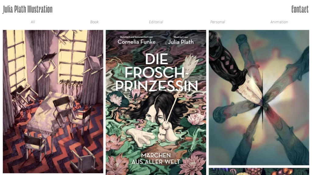
Julia Plath’s online art portfolio website effectively showcases her work with a minimalist design that emphasizes the artwork. The site excels in visual presentation and simplicity, making it easy for users to focus on the illustrations, admire the artist’s technical skills, and find contact information.
The website is visually appealing, using a minimalist and clean design. It focuses on the artwork with a white background that highlights the images without distraction. When it comes to typography, simple, sans-serif fonts are used, consistent with the minimalist approach. The text is legible and complements the visual elements without overshadowing the artwork.
A predominantly black-and-white color scheme ensures the artwork stands out. Colors used are minimal and primarily come from the art pieces themselves, drawing attention to them.
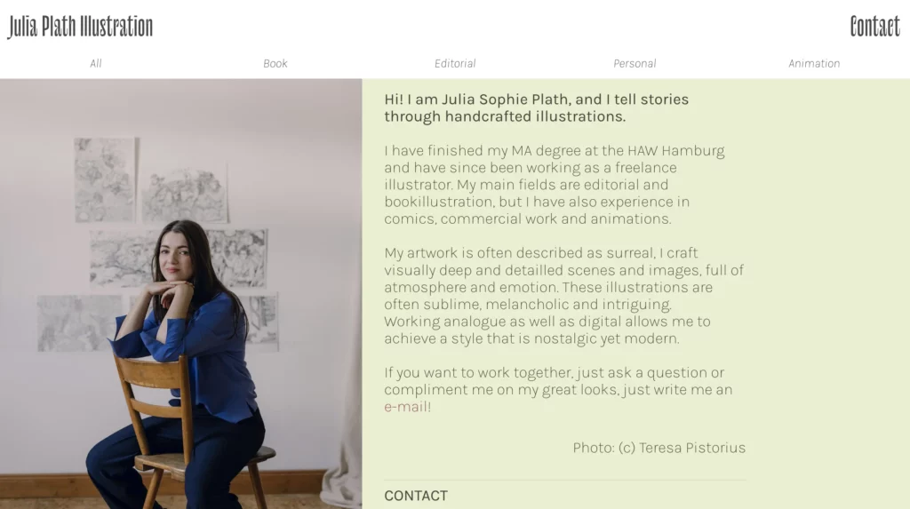
The website has intuitive navigation. The menu is clear and accessible at the top of the page, leading to sections like Home, Portfolio, About, and Contact.
While the design is visually appealing, the site could improve on accessibility aspects. For instance, adding more descriptive alt text for images and ensuring text contrast is high enough for readability.
The website has limited interactivity, focusing mainly on viewing the artwork. There is a subtle hover effect on images, enhancing the user interaction without overwhelming the design.
Bonnie White
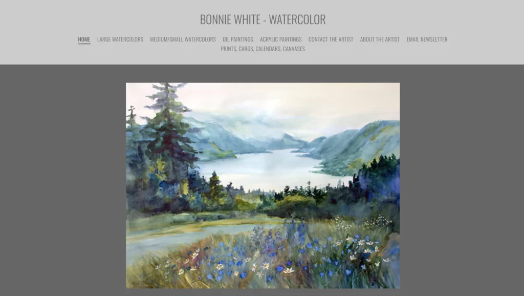
Bonnie White’s portfolio site showcases a distinct approache to digital portfolio design and brings to mind traditional fine art websites. It’s well-made in terms of SEO, featuring a blog that adds dynamic content to the site, engaging visitors with updates and insights into the visual artist’s process and activities.
Her design portfolio embraces a warm, vibrant aesthetic with a soft color palette that complements her folk art, creating an inviting and personal atmosphere. Artwork is well-organized and displayed with ample spacing. Each piece is accompanied by titles and descriptions, offering context to viewers. The portfolio is accessible directly from the main menu, making it easy to browse.
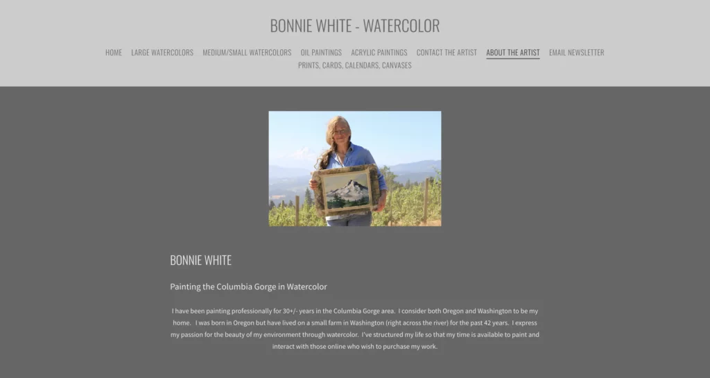
Fonts are clean and readable, with a mix of serif and sans-serif. The titles use a decorative serif font that adds a personal touch, while body text is in a simple sans-serif, balancing readability with style.
The use of earthy and pastel colors aligns well with the folk art theme. The colors are not overwhelming and help create a cohesive look that reflects the artist’s personality.
The site is fairly accessible with reasonable text contrast and alt text for images. However, some improvements could be made, such as ensuring all text is large enough for readability and enhancing keyboard navigation.
Camille Walala
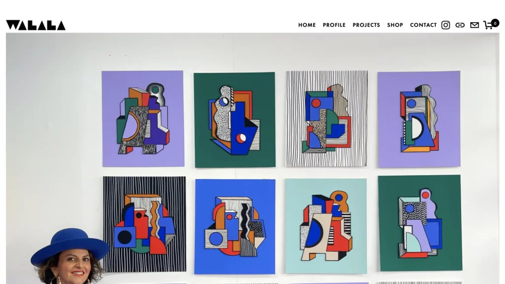
The art portfolio of Camille Walala has a dynamic and vibrant design that mirrors the artist distinctive graphic design-like style. It uses bold colors and geometric shapes throughout, effectively capturing the essence of her work.
The homepage features full-screen images of her most striking projects, giving a dramatic presentation that immerses the visitor in her world of art. This approach effectively showcases the scale and impact of her installations.
The top navigation menu is straightforward, with clear labels like Work, About, and Contact. This simplicity ensures that users can quickly find what they’re looking for without distraction.
The website design incorporates a vivid color palette, primarily consisting of bright blues, reds, yellows, and blacks. These colors are consistent with Walala’s artistic style and create a cohesive visual experience.
The typography is playful yet clean, featuring bold fonts for headings and simple, sans-serif fonts for body text. This balance maintains readability while adding to the site’s energetic feel.
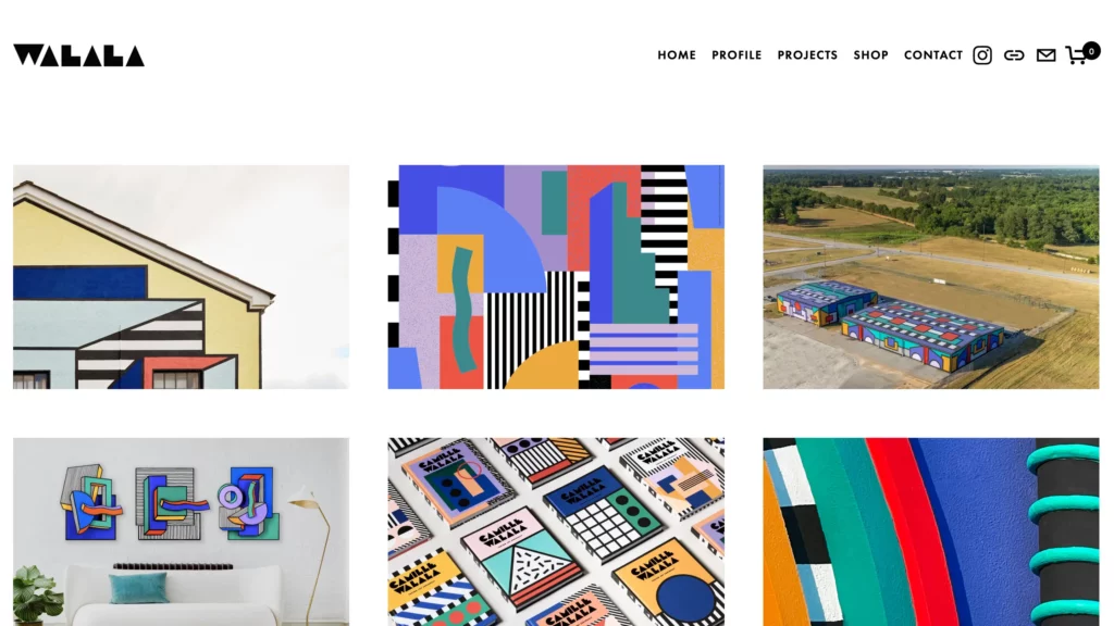
High-quality images of Walala’s work are prominently displayed. The website effectively uses full-screen images and slideshows to showcase her projects in various settings, making her portfolio visually impactful.
While the site is well-optimized for performance and user experience, there are areas for potential improvement, particularly in accessibility and SEO, which could further enhance its effectiveness and reach.
Timothy Goodman
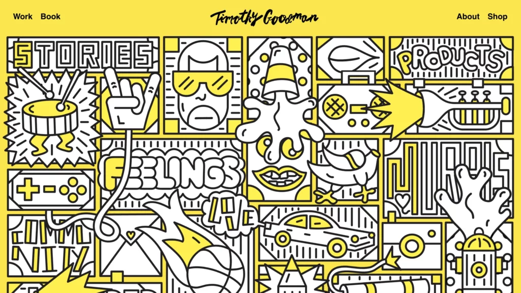
Timothy Goodman is another visual artists whose online art portfolio is a great example of good web design and a great presentation of visual arts. Based in New York City, Goodman is known for his distinctive graphic style and has created numerous public art installations, illustrations, and typographic works throughout New York and beyond.
Timothy Goodman’s own portfolio successfully captures the essence of his artistic style through its bold, vibrant, and playful design. The intuitive navigation, responsive layout, and engaging visual elements create a positive user experience. The site effectively showcases his diverse body of work while providing clear paths for exploration and interaction.
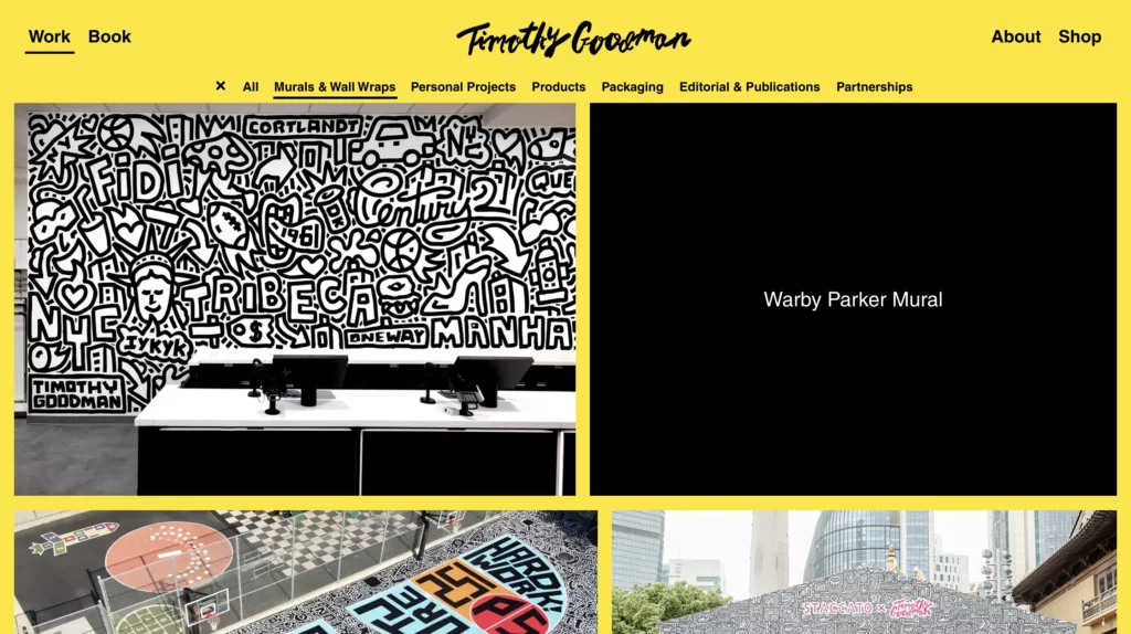
Hovering over project thumbnails in the Work section triggers visual feedback, such as color changes, zoom effects, or brief overlays with project titles. This interaction invites users to explore and signals that the images are clickable.
Navigation buttons and links change color or style upon hovering, providing a clear indication of their interactivity.
Each project thumbnail is clickable, leading to a dedicated page with detailed images, descriptions, and context for the project. This interaction makes it easy for users to delve deeper into specific works that interest them. Clicking on project links dynamically loads the new content without refreshing the entire page, ensuring a seamless user experience.
Lily Clementine Orset
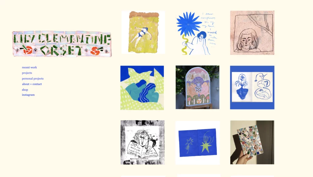
Lily Clementine Orset uses a unique and unconventional approach to present her art. The web design of this online art portfolio reflects an experimental and DIY aesthetic, aligning with her artistic vision and providing a different experience compared to traditional portfolio websites.
The interface allows users to click and drag elements, enhancing the interactive and hands-on feel of the site.
The use of textured backgrounds and layered images gives the site a tactile, handmade quality that complements the DIY ethos of her work.
The website employs a mix of hand-drawn and digital fonts, contributing to its quirky and artistic vibe. The variety in font styles adds to the visual interest but might affect readability in some areas. Font sizes vary across the site, which adds to the eclectic feel but can create challenges in maintaining a clear visual hierarchy and readability.
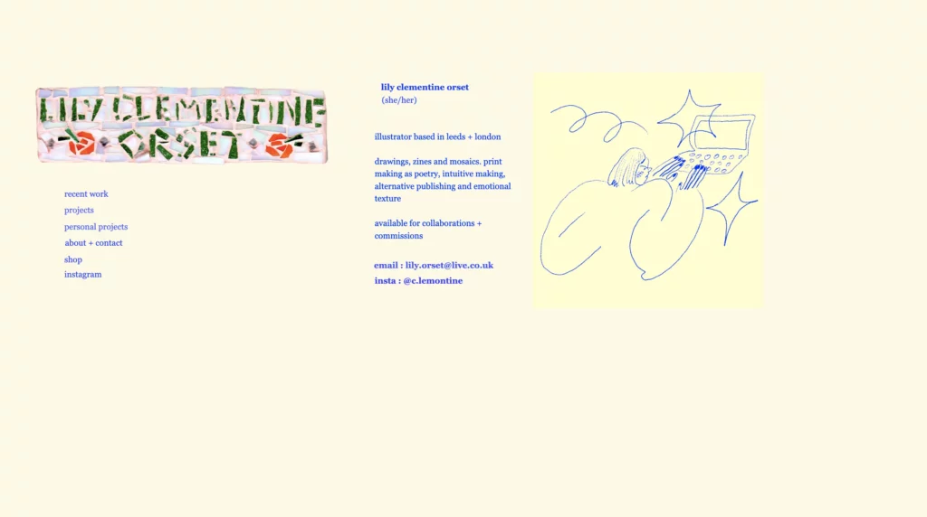
The site is designed primarily for desktop use, with the interactive elements best experienced on larger screens. On mobile devices, the navigation and interactions may be less effective or more cumbersome. Elements might not scale well on different screen sizes, potentially affecting the browsing experience on tablets and smaller screens. Having said that, the interactive design invites exploration and encourages users to spend more time on the site, though it may also create some usability challenges.
10 UX and UI tips based on those art portfolios
Effective UX and UI design is crucial for art portfolio websites to showcase the artist’s work, engage visitors, and create a memorable browsing experience. Here are some tips to follow when creating your art portfolio website:
- Align with Art Style: Ensure the website’s design reflects the artist’s style. Use colors, fonts, and layouts that complement the artwork.
- Showcase Artwork Effectively: Use high-resolution images that capture the details and colors of the artwork. Include full-screen images, close-ups, and various views to give a comprehensive presentation.
- Use Neutral Backgrounds: Opt for neutral backgrounds to make artwork stand out. A simple color scheme (e.g., white, black, or gray) ensures the focus remains on the art.
- Apply Readable Fonts: Use clean and readable fonts. Ensure font sizes and colors provide good readability against the background.
- Clear Menu Structure: Provide a simple and intuitive navigation menu with clear labels such as Home, Gallery, About, Blog, and Contact. Make sure the menu is accessible from all pages.
- Breadcrumbs: Use breadcrumbs or a similar mechanism to help users understand their location within the site and easily navigate back to previous pages.
- Responsive Design: Ensure the website is fully responsive. Design layouts that adjust smoothly across different devices and screen sizes, including desktops, tablets, and smartphones.
- Interactive Elements: Incorporate subtle hover effects and clickable images to enhance interactivity. Ensure that interactions are intuitive and provide visual feedback, such as highlighting clickable elements or changing colors on hover.
- Categorize Work: Organize artwork into categories or series. This helps visitors find specific types of work quickly and provides a structured browsing experience.
- Optimize Performance: Optimize images and code to reduce loading times. Fast performance is crucial for keeping visitors engaged and reducing bounce rates.
Design your own website today
We’ve seen five totally different art portfolios today and what would you say about creating your own with UXPin? Drag and drop interactive UI elements that have code behind them, arrange the perfect layout of your website and then, copy the code to build your own site. Try UXPin Merge for free.
