When it comes to helping users manipulate on-page content, we see a few popular UI patterns persist through the years.
In this piece, we’ll explore examples and best practices for the following patterns:
- Drag & Drop Actions
- Flagging/Reporting
- Discoverable Controls
- Overflow Menus
- Context Menus
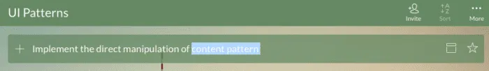
- Direct Manipulation
- WYSIWYG Editors
Let’s explore popular techniques for letting users manipulate content the way they need.
Table of Contents
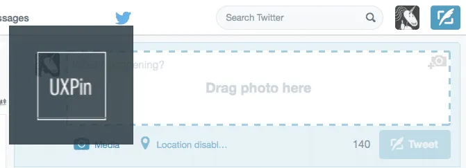
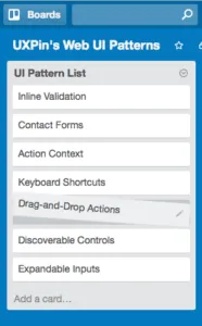
1. Drag & Drop Actions
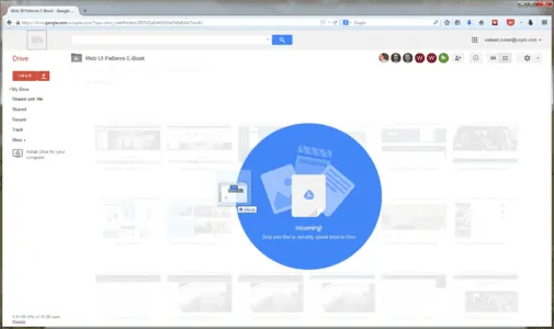
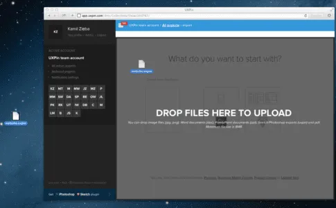
UXPin (Photoshop & Sketch integration)
Problem
Moving and organizing content is too much effort.
Solution
The drag-and-drop functionality is a preferred method of organization for most users: it’s intuitive because it’s based on reality, and often something user try instinctually when first using a UI.
Drag-and-drop provides a level of direct manipulation that other methods can’t match. While it’s more organic with the gesture controls of mobile, it has already become ingrained on desktop sites as the most effective way to rearrange items in a list, or move documents from one place to another.
Tips
- Give some visual indication that drag-and-drop is available. This could be something obvious like Google Drive’s large notification, or it could be more inconspicuous, such as changing the colors of the window’s borders.
- For responsive web apps, the drag-and-drop action in the desktop version helps create a snappier design and strengthens consistency across mobile devices.
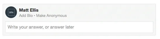
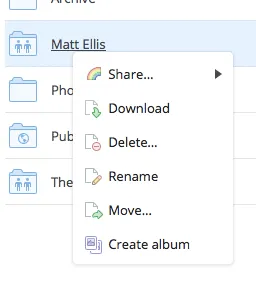
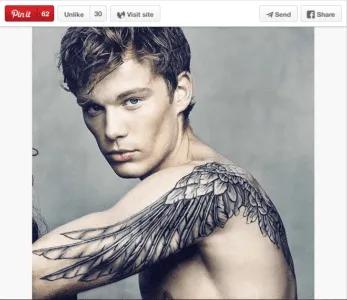
2. Flagging/Reporting
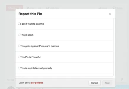

Problem
Inappropriate content gets in the way of user task flows.
Solution
Let users report inappropriate content (or other users) for administrator review and removal. Inappropriate content could mean a variety of things:
- Obscene content, whether images or text
- Offensive, insulting, or bigoted content
- Content that is mislabelled, misplaced, or categorized incorrectly
- Spam and solicitations
- Violations of site policy
- Copyrighted work
- Descriptions/solicitation of illegal acts
This pattern takes the pressure off you to regulate every piece of content that comes through your site, and gives the users themselves some authority, which they appreciate.
Tips
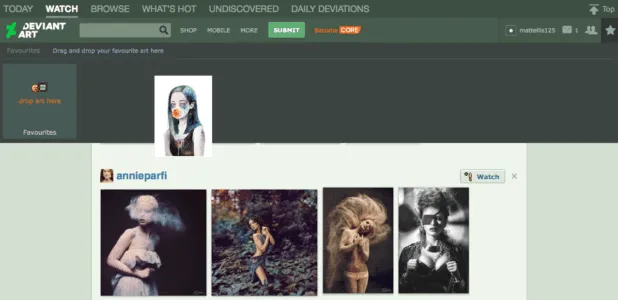
- The option to flag or report is essential for sites with user-generated content, but it doesn’t have to be stand out. Having a small flag icon in the corner (Pinterest), or even tucking the option in a pull-out menu (Tumblr) are acceptable.
- If the questionable content was posted directly on the user’s page, the action of flagging/reporting can also double as removing it, saving them an extra steps.
3. Discoverable Controls


Problem
Displaying controls for each piece of content clutters the screen.
Solution
Hide the controls until they’re needed. Discoverable controls (a.k.a., hover or hidden controls) are one of the most useful UI patterns, and widely adopted. They are so popular, in fact, that if users are confused, they will now hover over questionable items expecting something to appear.
Discoverable controls are an effective space-saver without sacrificing user functions.
This pattern also makes the controls more comprehensive, especially together with the card grid (a common pairing). Discoverable controls make it clear which card the controls apply to. Universal controls can get confusing with multiple posts, so having the controls appear within the post itself clears this up.
Tips
- A practical necessity for the cards layout, when the user is able to interact in multiple ways with each card. Controls reveal themselves upon hover for desktop and tap for mobile.
- Avoid using discoverable controls for essential actions, as they’re always a chance they’ll go undiscovered. As a rule of thumb, ask yourself if users can still enjoy the interface without these controls — if so, it’s safe to hide them.
- For more information, interaction design expert Dan Saffer discusses modern solutions for discoverability.
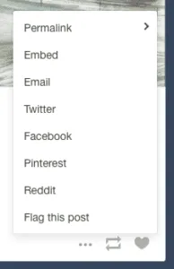
4. Overflow Menus
Problem
Too many options are cluttering the screen.
Solution
Move the extra options to a second menu. Overflow menus are a smaller, more manageable alternative to slideouts.
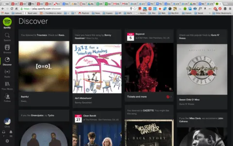
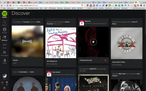
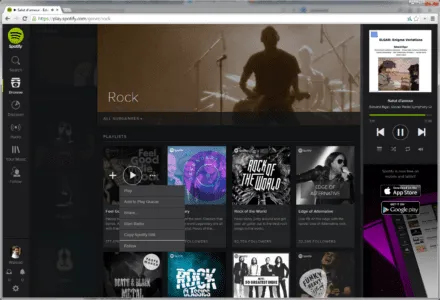
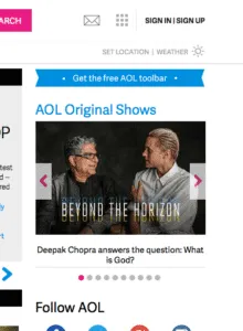
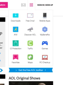
Overflow menus present all the secondary options that aren’t necessary and keep them hidden unless they’re needed. These could hide links (like the extra page links in AOL’s grid icon) showcase controls, as with Spotify or more detailed features (like the advanced search in Behance).
In fact, Behance demonstrates the ideal use of the overflow menu: detailed search is a useful but not primary feature, and so can be hidden from the main screen.
Tips
- Animating the appearance of an overflow menu, such as sliding out, adds weight to it and reinforces the connection with the triggering element.
- Treat overflow menus as slideouts, but smaller. The same rules apply to both, such as only including secondary content and using recognizable icons.


