User interactions have evolved so rapidly during the last few years that designers can barely keep up—making it tempting to use interaction design techniques from other media (or even legacy app design) when we build mobile applications.
In reality, it’s important to remember that our interaction patterns and interaction design need to change when the medium changes.
The first step toward this kind of thinking was seen during the transition from mouse and keyboard desktops to touchscreens (Apple’s new 3D Touch is a current and more granular example). From entirely new interaction patterns to smaller interaction details and trends, every new device, environment, pattern, and gesture comes with possibilities and pitfalls.
Photo credit: Apple
It takes serious work just to know what’s out there—let alone to design for it—so here are a few assumptions you should avoid in your mobile app design.
Table of Contents
1. Users always need to create an account
They don’t, and a lot of times they won’t and shouldn’t have to.
As a developer, it’s much easier to lock users out until they’ve solidified an entry in the user database. But from the user’s perspective, that’s almost devious.
Why would anyone sign up before knowing what they’re in for? The process is mental and physical work. It has to be worth it.
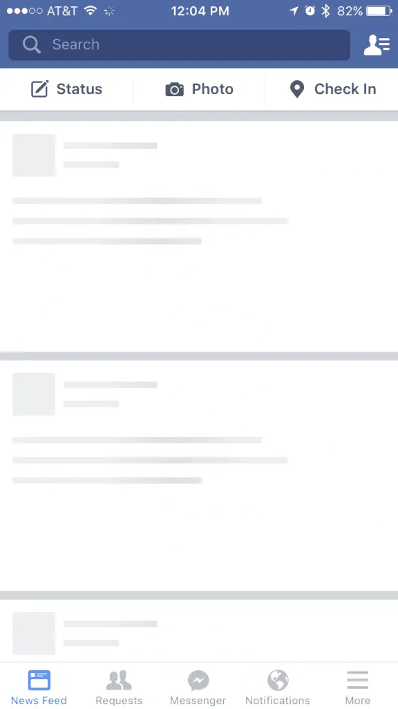
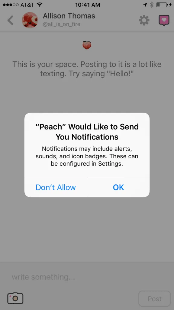
Instead, user data can be stored locally and eventually transferred to an account if and when the user ultimately decides to create one. Or, consider “guest” or “trial” mode access to key functionality (like Wunderlist below), showing off what your app can do, but with limited or watermarked features.
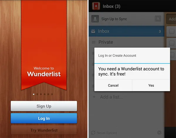
Photo credit: Wunderlist
Once you prove your app’s value, the decision to sign up will be no problem for a user. Before that, it’s a big ask.
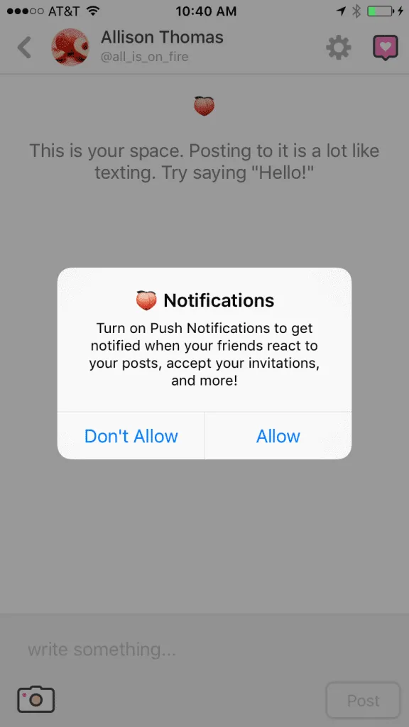
2. Users need a tutorial to show them how awesome your app is
Show them how awesome your app is by letting them use it. Explaining that it’s awesome is much less powerful. Plus, onboarding is typically skipped and often forgotten.
Users who swipe through instructions aren’t getting much out of the Onboarding Show.
If you feel you absolutely need a full-attention, step-by-step onboarding (some apps do), then keep it as short as possible and offer it through a help menu. It will make a lot more sense after they’ve used the app for a while.
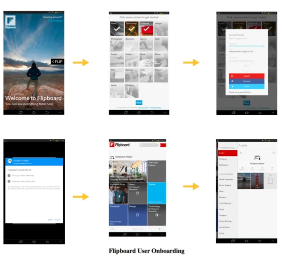
Photo credit: UXCam
3. Don’t assume what works for one app works for another
Even common interaction patterns should always be evaluated in light of the specific circumstances of your application.
A common example of this is a dropdown “State” field in an address form. Since state names may be written in a couple of different ways, it makes logical sense as a dropdown of predetermined, standardized values. This may be acceptable on a desktop (although that’s debatable), but dropdowns are the worst choice for mobile usability.
App interactions are also a great opportunity for brand reinforcement. There are a handful of really memorable, branded “moments” in apps today, such as the Twitter bird when the app goes from splash screen to feed, Snapchat’s animated profile picture, or Hopper’s loading graphic (more on this in assumption #5).
The point is that we shouldn’t assume the tried and true method is the only approach to making our app stand out.

Hopper App’s loading screen.
4. App design is the same as responsive web design
While responsive design is similar to mobile app design, there’s a big difference between designing for any device versus standalone applications.
Users expect certain interaction patterns and interface elements in mobile apps.
For example, it’s common in an iOS app to have a “back” button in the top left for returning to the previous screen. In a mobile browser, there’s no need for a back button on the site itself; it’s generally omitted because it would be too similar to browser chrome.
While that’s a fairly basic and obvious example, there are nuances to everything from menus and forms to “popovers” and font sizes. What we design on the web often feels awkward or unpolished in a mobile app—not necessarily because something is wrong, but because it’s different.
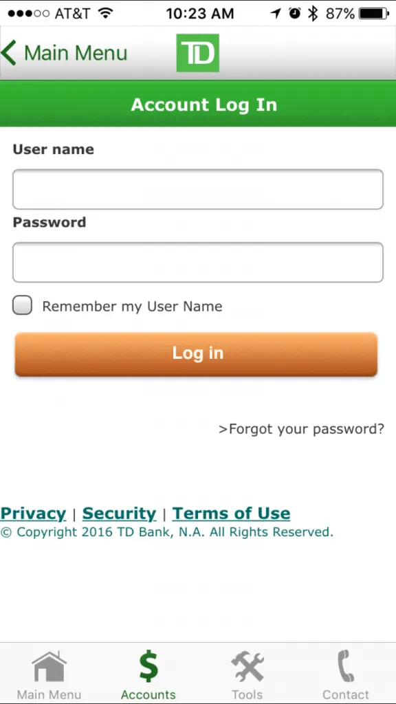
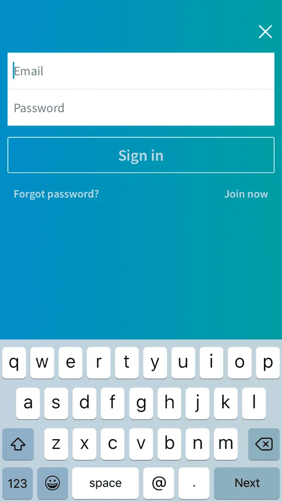
Credit: TD Bank iOS app sign-in and LinkedIn iOS app sign-in
Compare the TD Bank iOS app sign-in screen with the LinkedIn iOS app sign-in screen.
In the TD Bank app, you’ll see that they treat the main UI elements like an app, with a top left back button and a visible menu across the bottom (consistent with iOS patterns). What they didn’t do was style the sign-in form itself (and other page content) like an app. Default iOS rounding and shadow are used for inputs, the checkbox is tiny, links have been underlined, and there’s even a copyright notice in the UI. It lacks the distinctive feel of an app.
In contrast, the LinkedIn iOS app does feel like an app, though not because of any specific design or interface element. It’s because they didn’t port over web code and wrap it as an app. They designed for an app, not the mobile web—and we can tell the difference.