It’s the beginning of a new project.
You’ve got all these ideas bouncing around your head, but they’re too incomplete to express clearly. What do you do?
Same thing you did in school — grab something to write with and some paper (or a whiteboard, or a cocktail napkin) and sketch out what you’re thinking.
In the early stages of design, sketching helps take our abstract and undefined details and turns them into something real. UX sketches are the earliest foundations we build upon, the bridge between nothing and something.
… but they can always be better, can’t they?
We’ve collected the advice of 5 different UX designers for 5 different techniques guaranteed to improve your UX sketching.
Table of Contents
1. First Write Down the User Problem
UX Consultant David Mannheim’s process of structuring sketches starts by writing out the user problem. He then draws on his experience with other interfaces to determine how to solve the problem.
Knowing this, the lo-fi structure starts to fall into place.
Mannheim, a sketching enthusiast in general, likens digital design structure to classic cartooning. You first outline the navigation menu and the main content, the basic outlines of the cartoon’s head and body. Only later comes the secondary content and details, the arms, legs, and facial features.
He also recommends using the age-old golden ratio, 1:1.6, a “gold standard” of aesthetics for over 4,000 years. Try sketching out the golden ratio first, and then drawing your ideas on top of it for guidance.
Following the golden ratio, the main content area might have 640px and the sidebar 400px.
2. Sketch in Layers with Increasingly Darker Pens
Sketches don’t need to be perfect, but they shouldn’t be sloppy either.
Senior UX Specialist at Universal Mind, Peiter Buick recommends sketching in layers using a darker instrument for each successive layer. This is an efficient approach to sketching:
- Multiple drafts build on each other instead of starting from scratch
- You can outline the structure of your sketch before considering the details
- Early mistakes aren’t as noticeable
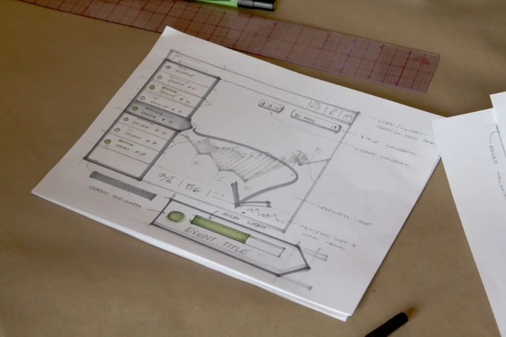
Photo credit: “The Messy Art of UX Sketching.” Peiter Buick. Smashing Magazine.
Buick suggests starting with a light-gray marker, 20-30% gray. Depending on how many layers you intend to create, incrementally increase the hue of the instrument.
When you’re ready for the final details, use a 60% gray marker or comparable instrument.
3. Start with the Smallest Screen and Work Up
This advice isn’t just for sketches, but for all aspects of the design process. The mobile-first approach explained in UX Design Trends 2016 starts with the smallest screen and works upwards, typically something like mobile => tablet => desktop.
Adam Fairhead explains why this approach just makes sense:
- You have no choice but to prioritize content right from the start. Whatever you choose to fit into the mobile screen becomes the core content of bigger screens. This makes mobile-first a content-first approach.
- Making additions, not subtractions. As you scale up, you add content, which is a lot easier than the alternative. Starting with desktop means taking pieces away as you advance, and could lead to complications and backtracking.
- Constraints encourage creativity. Working within the limitations of small screens means coming up with solutions you wouldn’t have thought of.
The goal is for your site to look good on all devices, but designing first in a larger screen tends to make mobile versions seems like a “lesser” version of the “original.”