When I began doing UX design, I had a mentor who said to me, “The only way you will know if your design works is to build it and see for yourself.”
She was discussing a particular project, but the underlying message is that observation is the most critical thing we can do when making spaces that add to quality of life.
I started my career as an urban designer. Constant observation is in my blood (same as other urban designers and architects). We watch how people interact with a space. We make notes about being in good (or bad) designs, even while traveling—everything from scale and proportion to rhythm and activities. We learn what could have been better, note the unexpected successes, and apply it appropriately in our next design.
When it comes to UX, we need to take into account the same considerations. Are we creating experiences that are enjoyable because a visitor can consume what they see? Achieve what they want? Relate to a brand?
For urban designers, this kind of observation is only possible after a costly project is built. It’s different for UX designers – we have the luxury of user testing and prototyping.
From the start, we can use observation to build things that work in people’s lives.
Make It People-Sized
Designing to the scale of a person draws people into the experience, rather than giving them a reason to leave.
Humans are visual creatures. In the world of architecture and urban design, scale is everything—it can change the feeling of space instantly.
Frank Gehry’s buildings are iconic pieces of art designed to make a visitor feel small. The experience is the building itself, not necessarily its context as part of a larger urban fabric.

Photo credit: John O’ Neill
In contrast, Disneyland’s Main Street draws us further and further into the park. The visitor’s experience is being in the community, with its park benches, streetlights, and vendors. In urban design, we call it being “pedestrian friendly.”

Photo credit: Leo DeCandia
Where one place turns its back to the community around it, the other draws us in and encourages exploration. How does that translate to UX?
Humans have limited attention spans. To help shape positive experiences, better UX starts with breaking down content into digestible chunks and creating digital versions of “pedestrian friendly” features.
Scrolling page after page can be tiresome, and long lines of text can strain the eyes.
Instead, let the content breathe comfortably, so people aren’t overwhelmed by what they see. Use relevant, interesting images to give eyes a respite from reading, and be sure to use whitespace as a form-giving element. (UXPin has some really great writing on this in their e-books Zen of Whitespace in Web UI Design and Web UI Design for the Human Eye.)
Numerous science-backed resources can help you capture and hold the attention of a visitor. For example, BufferApp created an infographic of the optimum lengths for various social media posts, videos, and so on. You might also check out an exceptional piece on the organization of information and hierarchy in Vignelli Canon, by the late designer Massimo Vignelli.
Know Your Audience
Seems simple right?
Even though a site may look amazing, it may not be the best solution to your particular project. We get all excited and want to showcase our amazing talents, but the truth is, there is no greater tool than good old-fashioned research.
How people actually live is dependent upon their cultural heritage, their socio-economic background, their age, and many other factors. In the world of urban design, we might visit places that fit our target demographic, but how we carried out the design depended on our research.
What would happen if we applied a design that responded to Arizona’s climate and tried to apply it to a project in Massachussets? Or what if we took the beautiful cascading designs of the Amalfi Coast in Italy and tried to apply them to plains of Iowa?
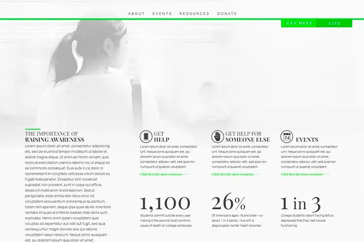
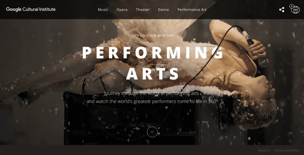
We might take different approaches for the call-to-action, or use color more sparingly in one and more liberally in the other. Statistics might be perfect for Example A, whereas imagery and stories are best for Example B.
Example A: Millennials For Mental Health Awareness project by Brand Cure

Example B: Google Cultural Institute.

Give People Options
We love choices, so why not build that into your design? Design a few unexpected gems, but have a clear path, as well.
William Whyte’s documentary, The Social Life of Small Urban Spaces, explores numerous, documented instances where flexibility and choice increase the viability of urban plazas. The more reasons somebody has to be in a place, the more people flock to the space to people watch, thus increasing the number of people, and so the cycle begins.
Visual points of interest (such as public art, water features, street vendors, and street performers) give people something to look at or look at more closely. Movable seating allows people to form groups as small or as large as they need. Options for shaded or sun-soaked areas also appeal to visitors.
From my personal experience in urban design, I’ve seen how these distractions add to the vibrancy of a city street or plaza.
Our digital designs should also give people a reason to stay, but not overload them to a point they cannot complete their task at hand. No matter how vibrant the activity on a home screen, if somebody can’t find the entrance to their desired path, it proves to be a frustrating experience.
Just think about how often do we drive around looking for a place before finally giving up and looking for another option.
We may like the little distractions and discoveries, but it’s the efficiencies and clear directions in the user flows that allow us to get straight to the point.
Observe Carefully
Design. Test. Refine. Test. Refine. Test. Refine.
We should always be striving to improve upon the last project. Observe how people move through a site. Is the call-to-action too hard for people to find? Is the hamburger menu too confusing for older users? Is there an ability to search?
Ideally, setting up groups of users and recording their reactions would be best. But sometimes we don’t have that time or those resources built into a project. When this happens reach out to the non-designers in the office, and let them navigate your site or app. Begin these user tests during low fidelity wireframes and continue them until launch.
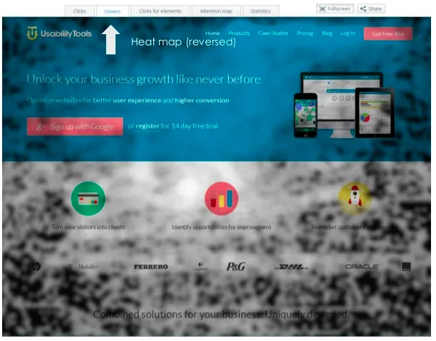
When a project’s complete and is live, use heat maps. See what people are clicking on and respond to that information. You may find that there should be a call-to-action added to help increase conversion rates.

And lastly, sit with the SEO expert in your office. Walk through the analytics with them. Understand what has been performing well and identify key elements that you could apply again.
Conclusion
Charles Eames may have said it best, “If it is the function of design to solve the evolving problems of man, then the designer’s first concern must be the true need.”
As designers, our job is never done; there is always something we can learn from past projects, other projects, and even other disciplines.
If we truly believe our job is to make lives easier or quality of life better, then we need to be observing the world around us and paying close attention to how people actually live, as opposed to a utopian ideal that, in the end, could have the exact opposite effect we hope for.
For more UX advice, get the free UX Design Trends Ebook Bundle.


