10 Worst Design Failures of All Time

Design faux pas happen. But that doesn’t stop us from enjoying looking at some of the biggest problems and wondering who on earth thought that was a good idea. Bad product design is rampant and it can be pretty interesting to watch the car wreck from a distance.
The real problem starts when bad product design destroys products (Google Wave, Macintosh TV…), or whole companies (OQO). Let’s check out the top 10 worst product designs of all time. There’s an important lesson in each and every one of them. Have fun!
10. Motorola ROKR w/ iTunes (2004)
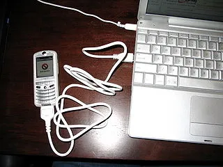
Author: Matt Ray. File licensed under Creative Commons Attribution-Share Alike 2.0 Generic
Way back in 2004, Apple decided to jump into the smartphone market with the Motorola ROKR. Motorola integrated the iTunes player into the operating system. The idea was a sound one, but the actual execution was a disaster. The interface was poorly designed. You could only save a limited number of songs. The end result was a total crash in sales once the iPod nano came out and Motorola no longer used iTunes with their next iteration of the phone.
9. OQO Model 1 (2004)
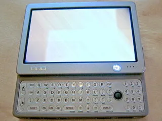
Author: Philosophygeek. File licensed under Creative Commons Attribution-Share Alike 2.0 Generic
When it comes to bad product design, tablets have also had their fair share of issues. The absolute worst though was OQO, a US-based hardware company. They designed the Model 1, announced as the world’s smallest Windows XP computer. The tiny 5×3″ screen made it completely unusable with Windows XP. OQO went out of business in 2009.
8. Eyetop Wearable DVD Player (2004)
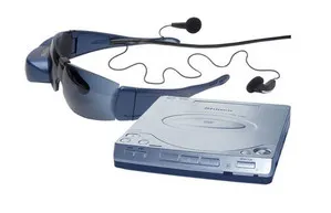
The concept of using glasses with a built-in screen has been around for a while, but Google Glass wasn’t the first one. In 2004, the first glasses with a 320-240 pixel screen built-in on one side were designed to let you watch a DVD. There were three major problems with the design. First, people got motion sick . . . a lot. Second, they had to carry the DVD player with them. And finally, the movie only played in one eyepiece, so people had trouble focusing on it.
7. Google X (2005)
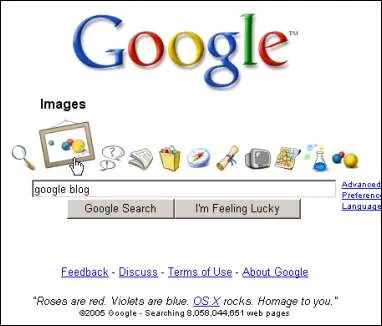
Not all bad product design occurred in physical products. Google X was a terrible online interface that debuted for a single day in 2005. It was meant to copy the Apple OS X design, but it was a complete mess with ugly icons and failed connections. It was immediately removed.
6. Google Wave (2009)
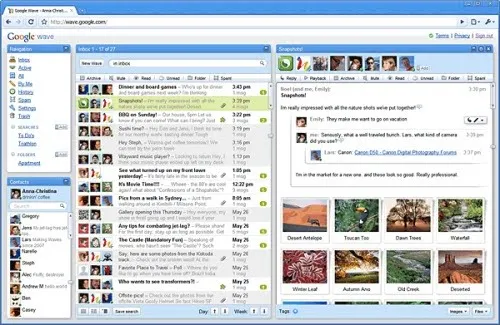
Author: Akae. File licensed under Creative Commons Attribution-Share Alike 2.0 Generic
Launched in 2009, Google Wave announced failure in 2010 and was completely gone by 2012. Google Wave was an interesting project that was supposed to improve collaboration. Again, a good concept was ruined by bad product design.
5. Macintosh TV (1993)
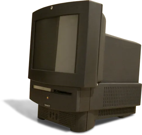
Author: Ben Boldt. File licensed under Creative Commons Attribution-Share Alike 2.0 Generic
Apple isn’t without a design sin. Originally, the company mixed TV and computer in the Macintosh TV and it was a case of doing nothing well. Just 10,000 units ran off the assembly line before Apple canceled the project due to bad product design.
4. Nokia N-Gage
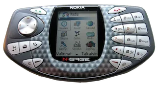
Author: J-P Kärnä. File licensed under Creative Commons Attribution-Share Alike 2.0 Generic
Nokia has a reputation for sturdy phones, but this phone/gaming console was a terrible idea. The speaker and microphone were on the side of the phone, which made using the phone awkwardly, plus you had to remove the battery every time you changed games. Not Nokia’s finest hour.
3. Sony Remote for Google TV
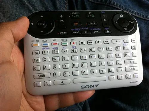
Author: Special*Dark. File licensed under Creative Commons Attribution-Share Alike 2.0 Generic
This remote was possibly the most ridiculous thing to ever come out of Google. Needless to say, the company updated the design fairly quickly.
2. Windows Mobile
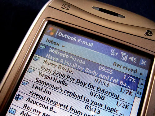
Photo Credit: James Cridland via Compfight cc
Windows never worked well on small screens, but Windows Mobile was originally an option for mobile devices. It was the worst OS to be used on a phone ever. With a major mess to deal with, even app designers gave up.
1. Shutdown process in Windows 8
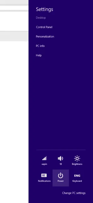
If you were ever lucky enough to shut down a computer with Windows 8, you know just how difficult this was. It was such a poor design that it took a very long time to shut down your computer and most people rarely bothered to do it.
Want to avoid bad product design yourself? You should give us a try.

